Session 5 - Choropleths & Vector geoprocessing
16 Nov 2021Introduction to GIS · Sciences Po Urban School
Lecturer: Raphaëlle Roffo
I. Session 5 Overview
Download the slides
- Use cases; why may you need to buffer, clip, intersect?
- “Crossing” multiple layers: common geoprocessing tools
II. Tutorial
Goals:
- Building a choropleth
- Defining relevant class breaks
- Running simple geoprocessing tools
- Adding map layout elements (legend, title, etc.) using the Print Layout Composer
- Exporting a map as an image, PDF or SVG vector
Context:
This is part 2 of a tutorial in which we’re exploring the theme of cycling to school (find part 1 here).
In the context of the Covid pandemic, the question of safely getting kids to attend school has become a key element in many countries’ economic recovery strategies. Taking into considerations the pressing challenges of reducing carbon emissions, walking and cycling to school represent sustainable and safe ways for children and their parents to get to school, as long as proper cycling infrastructure exists.
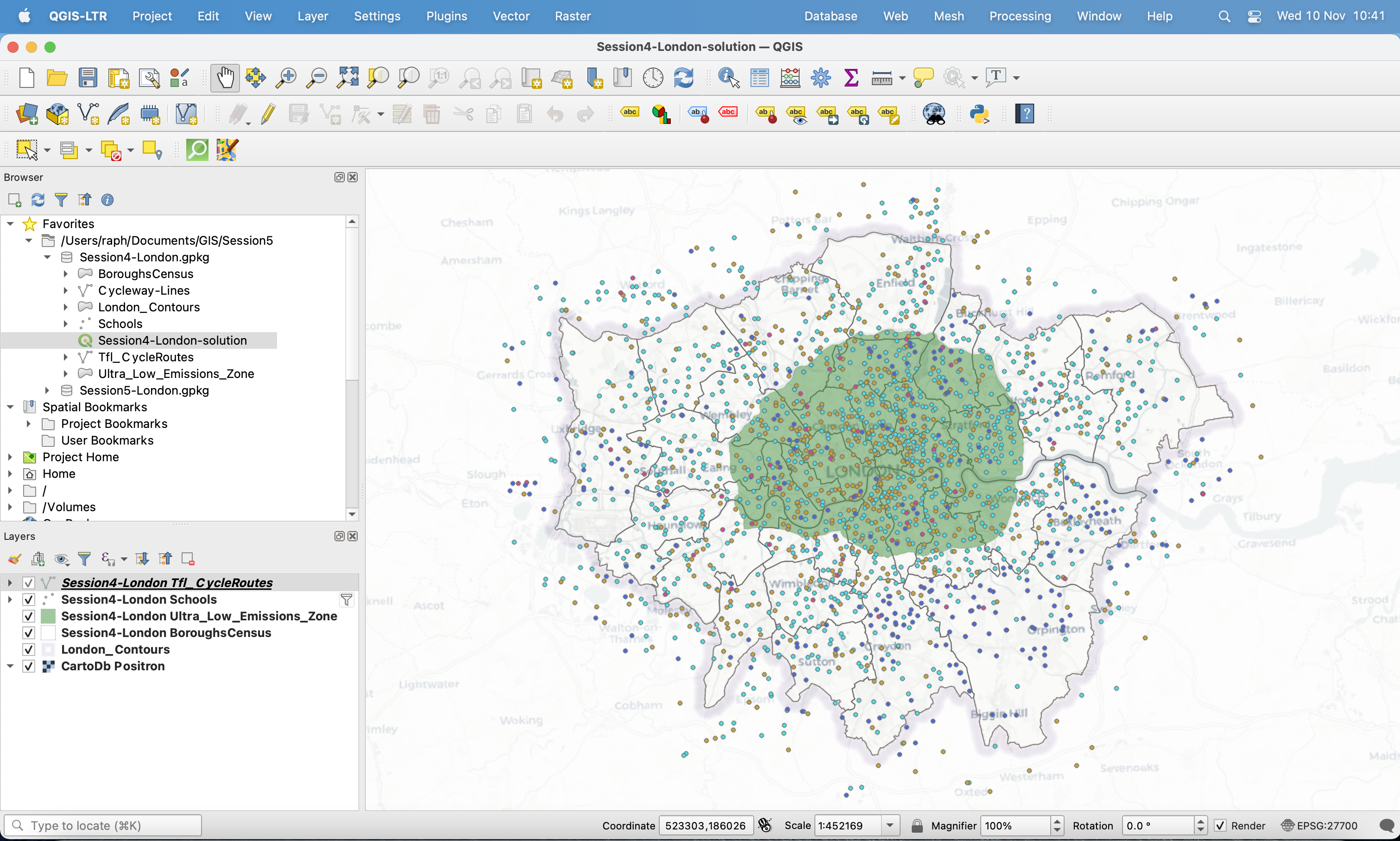
We are focusing on the accessibility to public transport score available in the census data. We’re crossing information from the census with locations of primary schools in Greater London, and existing and planned major cycling routes. This is within the context of the GLA (Greater London Authority) plan for reducing carbon emissions, in particular with an expansion on the Ultra Low Emission Zone since 25 October 2021.
Data:
We will pick up from where you left at the end of Session 4; you can directly work from the project file Session4-London inside the Session 4 geopackage. Make sure the CRS is set to EPSG:27700 and try using a basemap of your choice from the XYZ Tiles section of your Browser panel (go back to the Session 3 tutorial for more information on how to load basemaps). I’m using CartoDb Positron.
Please also download the geopackage for this session here to access a completed version of this tutorial.
III. Building a choropleth
We will now focus on the London boroughs. More specifically, one field in the London Borough census data is of interest to us: The Average Public Transport accessibility Score. We’d like to create a choropleth in which each borough takes a colour that symbolizes the “intensity” of that score. For instance, we could pick a white to dark blue colour ramp. The darker the blue, the better the boroughs scored in terms of accessibility to public transport.
3.1 Changing a field’s data type
We want to apply a Graduated symbology. However, our accessibility score field does not appear when we try to select a value. Can you guess why?
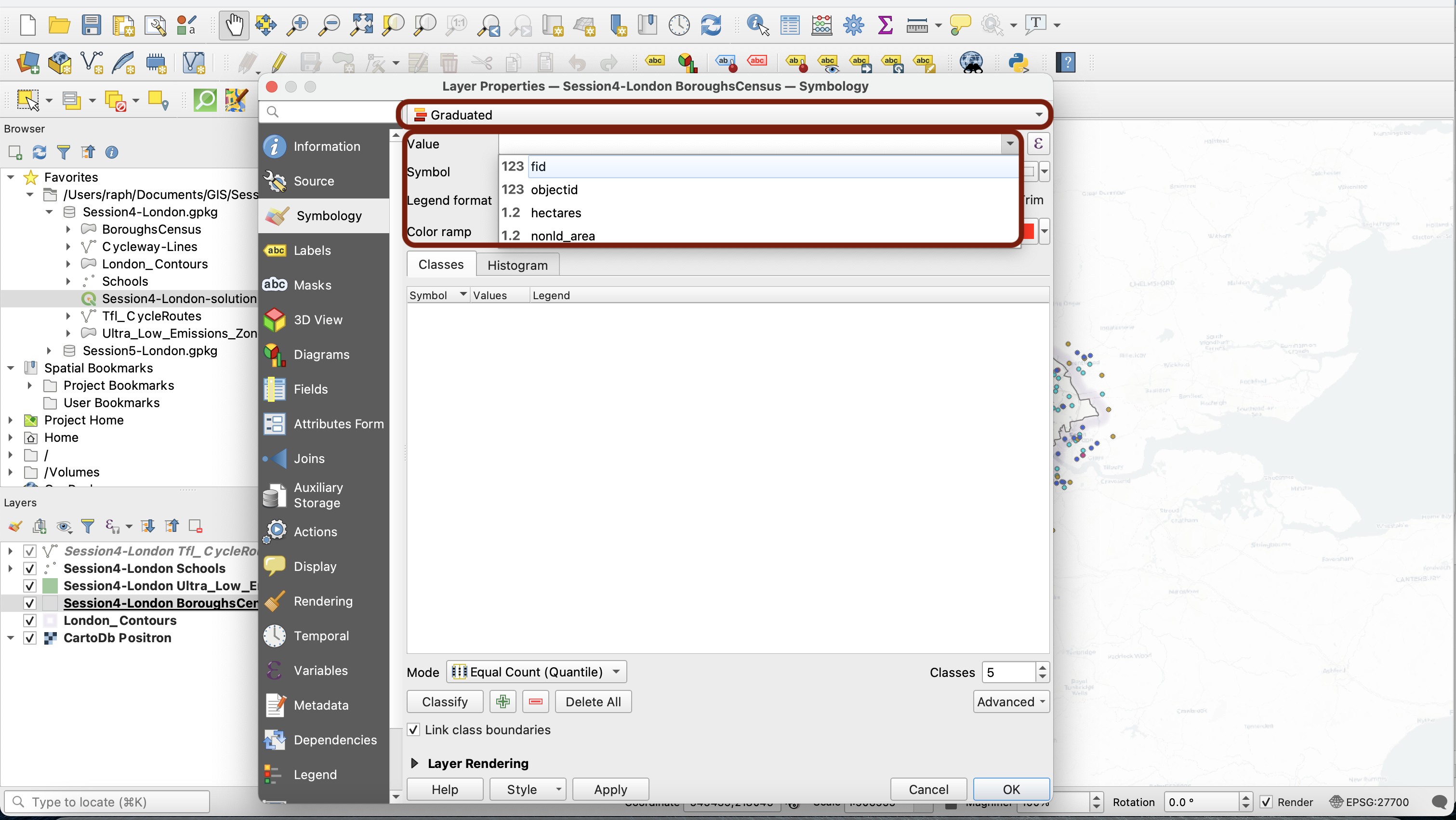
Let’s inspect our values. You can see in the attribute table that the values in this field are numeric, decimal values. However, in your Layer Properties window, under the Fields tab, you can see a little abc symbol in the Id column. This means that your field is of a data type string (text). Strings cannot be used to create a graduated symbology, because each value is treated like an individual category and not like a number part of a continuous variable.
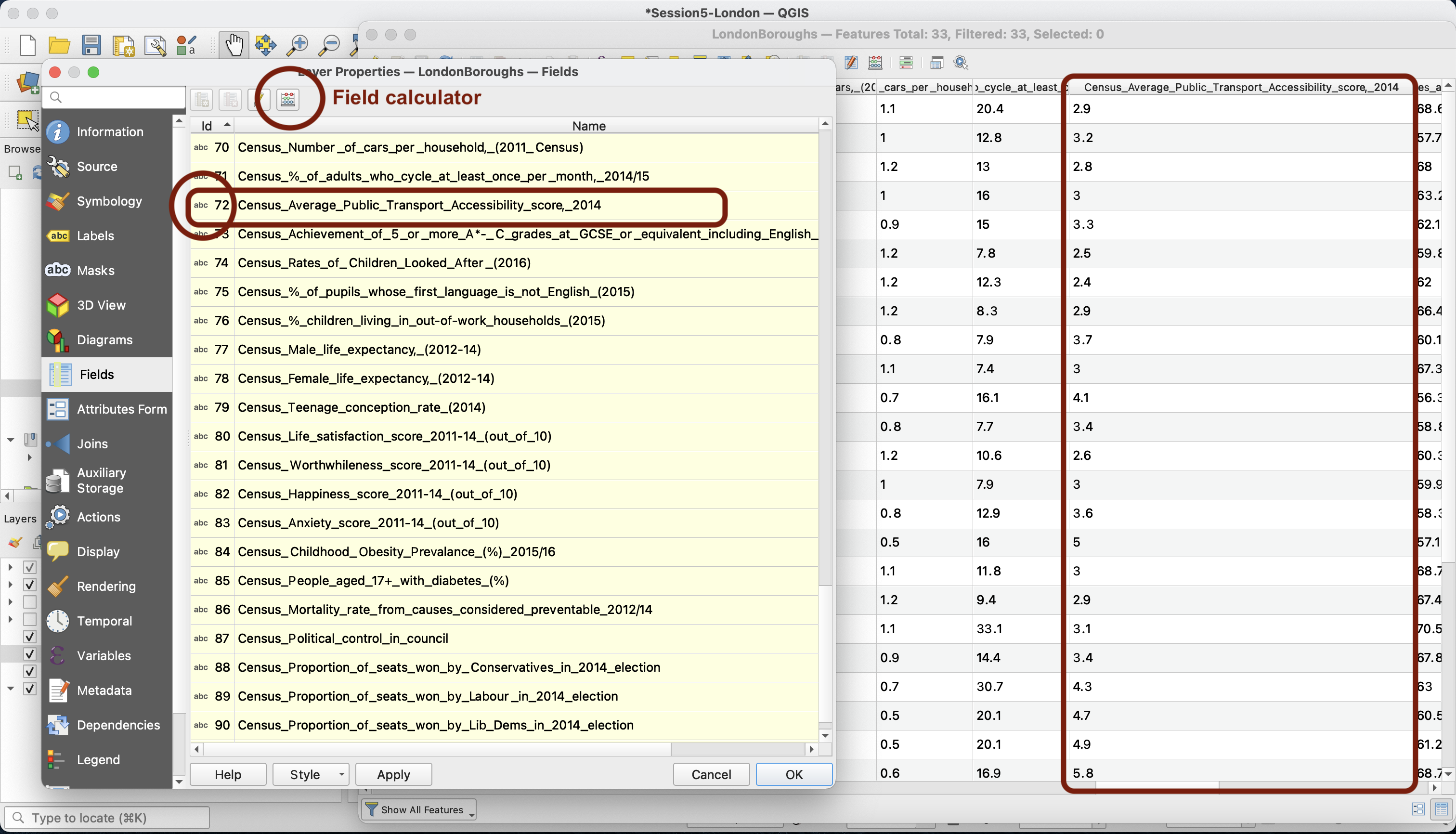
We need to transform the data type of this field. More precisely, we will create a new field that takes the same values as our score but save them as decimal numbers instead of strings.
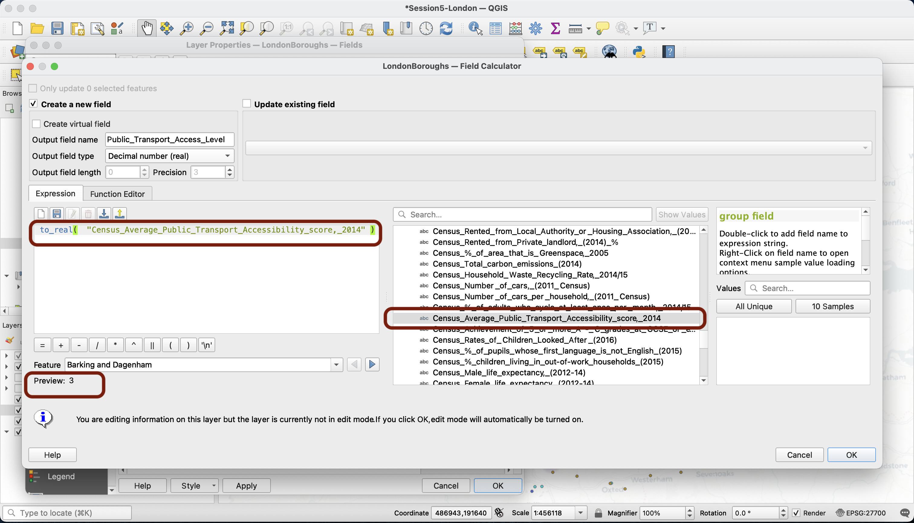
In your Fields tab, click on the little calculator. This opens a window that probably looks familiar to you by now! What you want to do is to create a new field. Give it a meaningful name, for instance Public_Transport_Access_Level, and make sure you select Decimal number (real) as your Output field type.
Next, let’s find the function that will help us convert the data type. Unroll the Conversions category, and find the to_real function whose name is pretty self-explanatory. DOuble-click to bring it to your expression area.
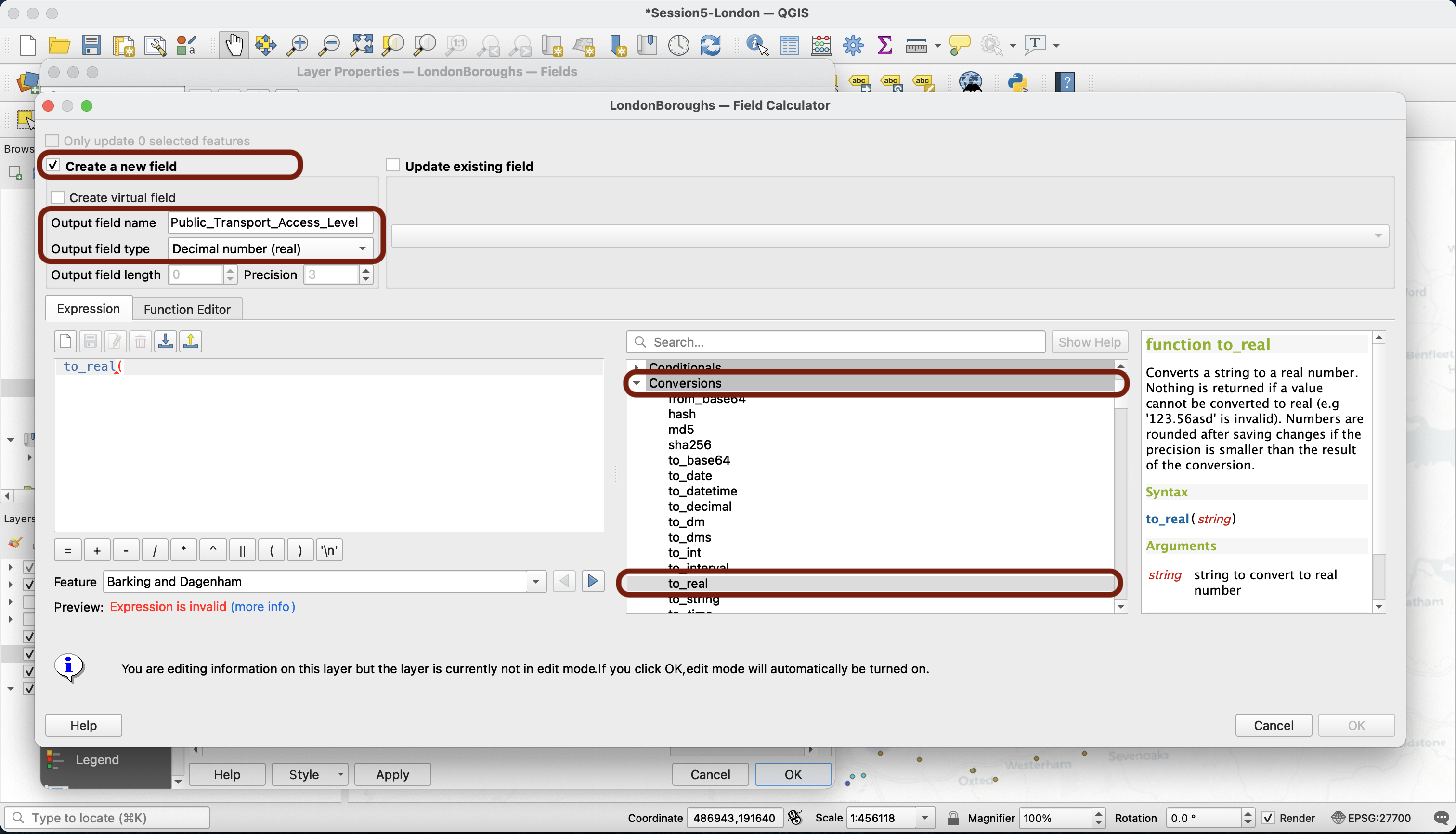
In the middle section, unroll the Fields and Values category and double click Census_Average_Public_Transport_Accessibility_score,_2014. Make sure you close the brackets after your field name so that the expression is valid. Press OK.
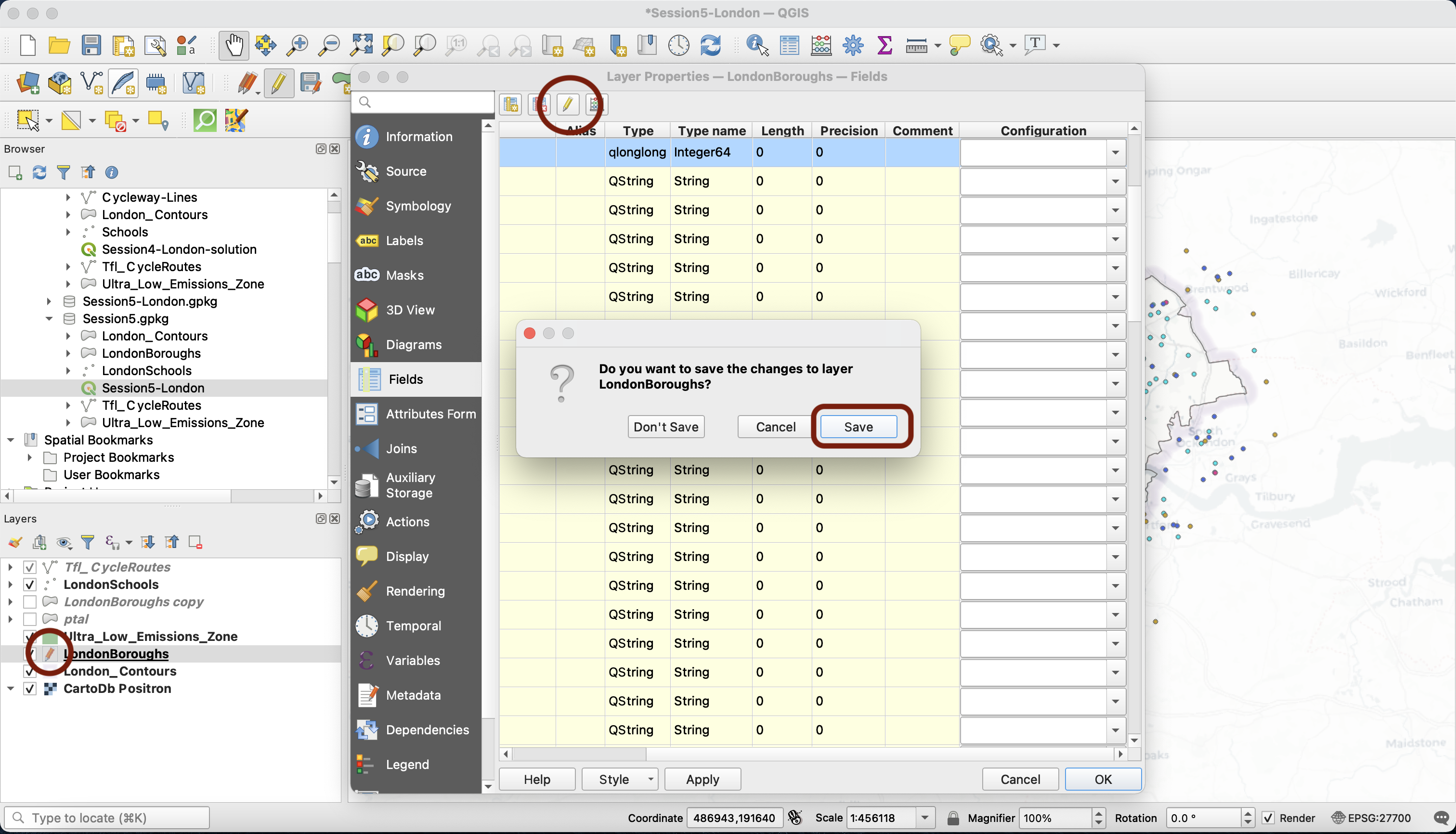
Your new field is now available as the last field in your Fields tab and in your attribute table. Notice that now the yellow pen is activated (you can see it in your layer list and at the top of your Fields tab). This means that you have entered the Edition mode; you are actually altering the dataset you’re working with. This is a big difference from everything we’ve done so far! Now press the yellow pen and click Save. The additional column you have created is now part of the source dataset - the dataset file on your computer has been permanently modified. This is why we chose to Create a new column rather than directly modifying the initial column - we wanted to make sure that we have a backup of the original column in case we made a mistake.
3.2 The Refactoring tool
Note that instead of using the calculator to create a new field, you could have used the Refactor fields tool in the Processing toolbox. This tool allows you to create a copy of your layer, but where you have edited data types, fields names or even which fields you want to be present in the new attribute table and in which order.
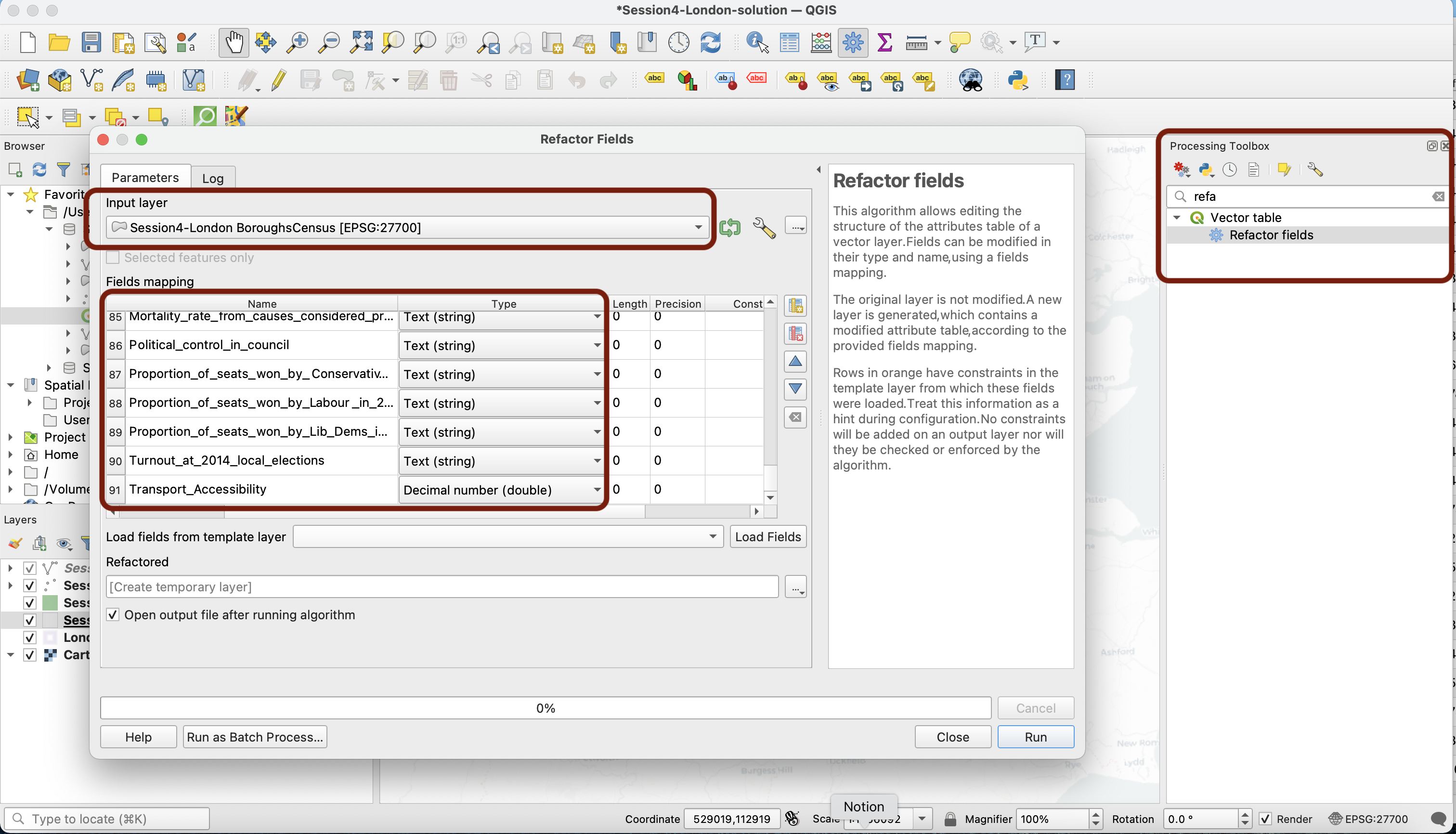
Give it a try!
3.3 Defining class breaks
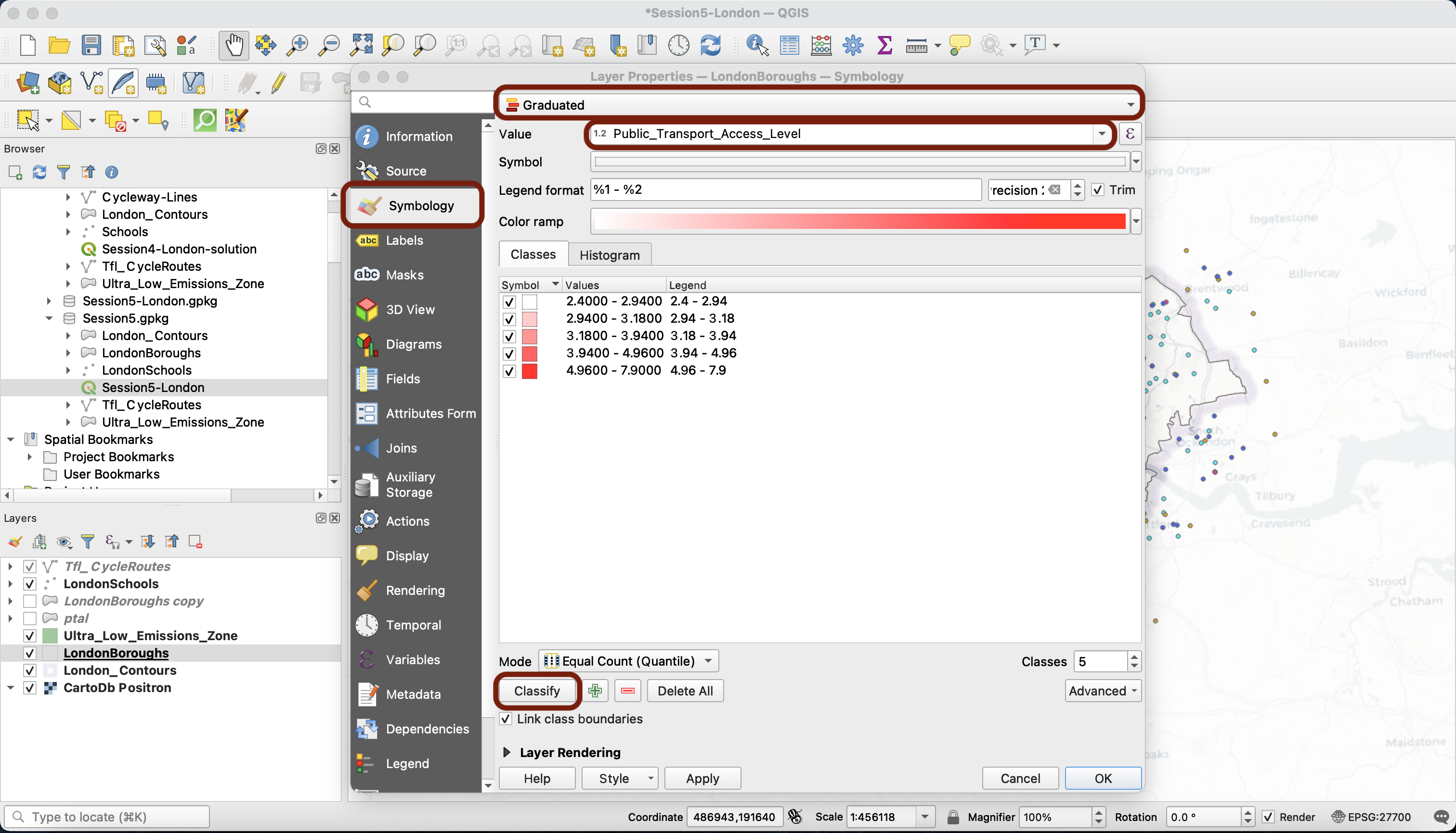
If you navigate back to your Symbology tab and select the Graduated symbology method, you will notice that your new field is available as a Value. Click Classify to bring up the values of that field. You can see that values range from 2.4 to 7.9
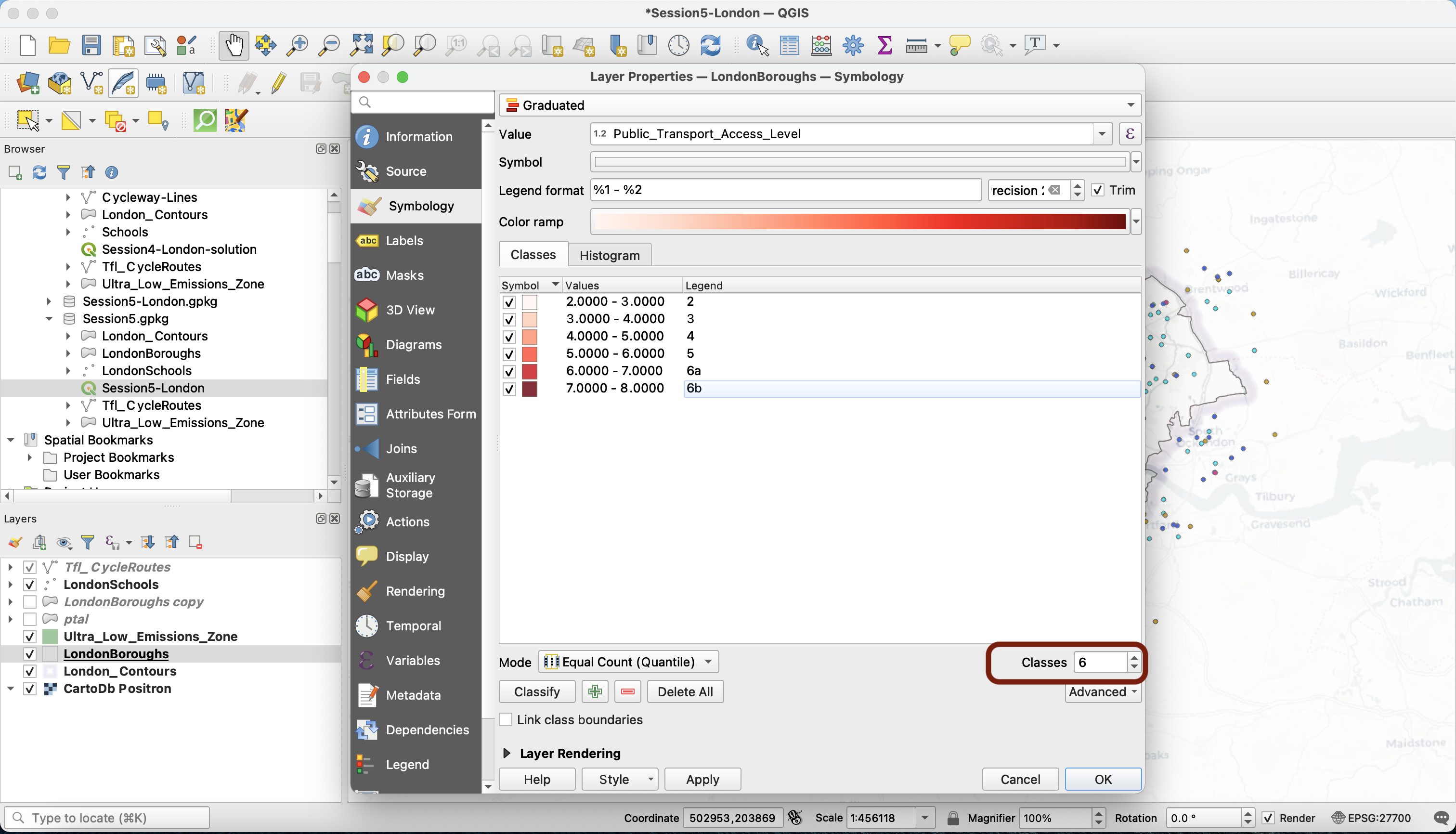
Now it’s time to think about the way we’re going to classify this data. Because we’re working with data from an index, we will first have a look at the methodology documentation of this index. It turns out this data comes from the Public Transport Access Level Score (PTAL), which is published by Transport for London, available on the London Datastore and with a methodology note available. The values range from 0 (poor access) to 6b (excellent access). This directly gives us the class breaks we should use to respect the proper classification, the way it was designed to be used (each integer is a class break, and 7 is actually the break for “6b” in the official classification). We don’t have anything between 0 and 2, so for this map we’ll limit our legend to the range that’s actually present in our data:
| 2 | 3 | 4 | 5 | 6=6a | 7=6b |
Note that if we did not have official “instructions” on how to define class breaks, we would go in the Histogram tab and press Load values to bring up a histogram of your variable’s distribution. We would then examine where the mean and standard deviations are located, and look for identifiable clusters or natural breaks in this histogram
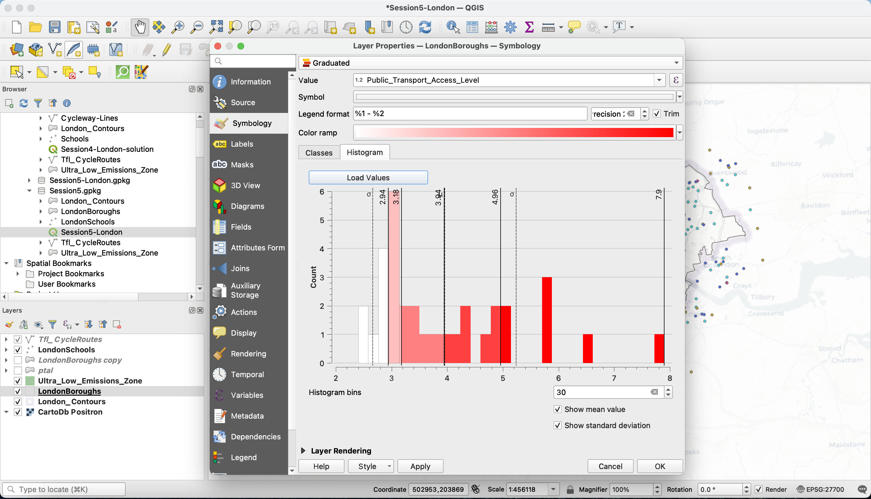
Note: when you try to figure out the class break method, you can try out the candidates you have in mind and get back to the histogram to get a preview of the class break projected onto the histogram. You can also use Apply to preview what it looks like on the map.
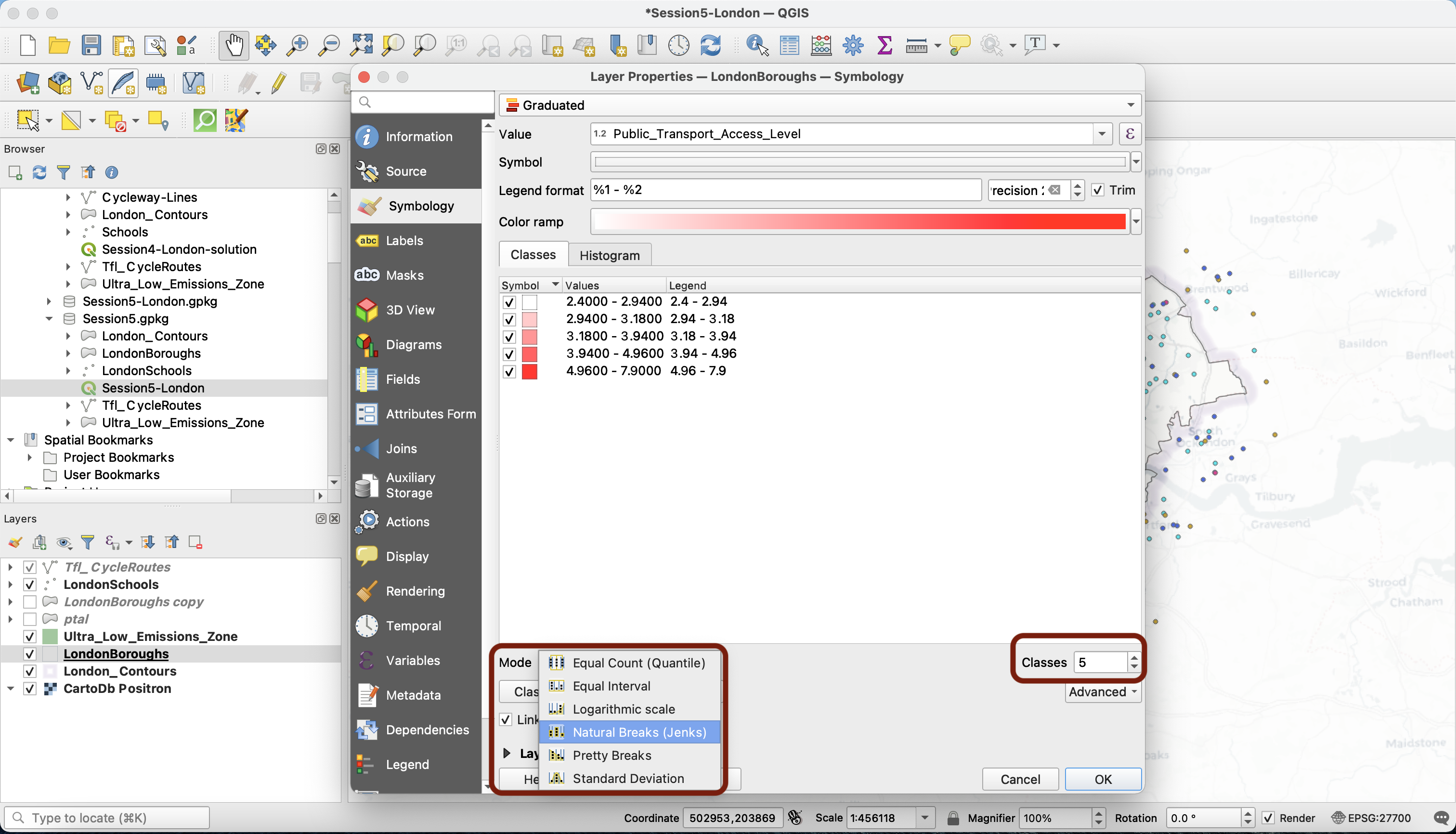
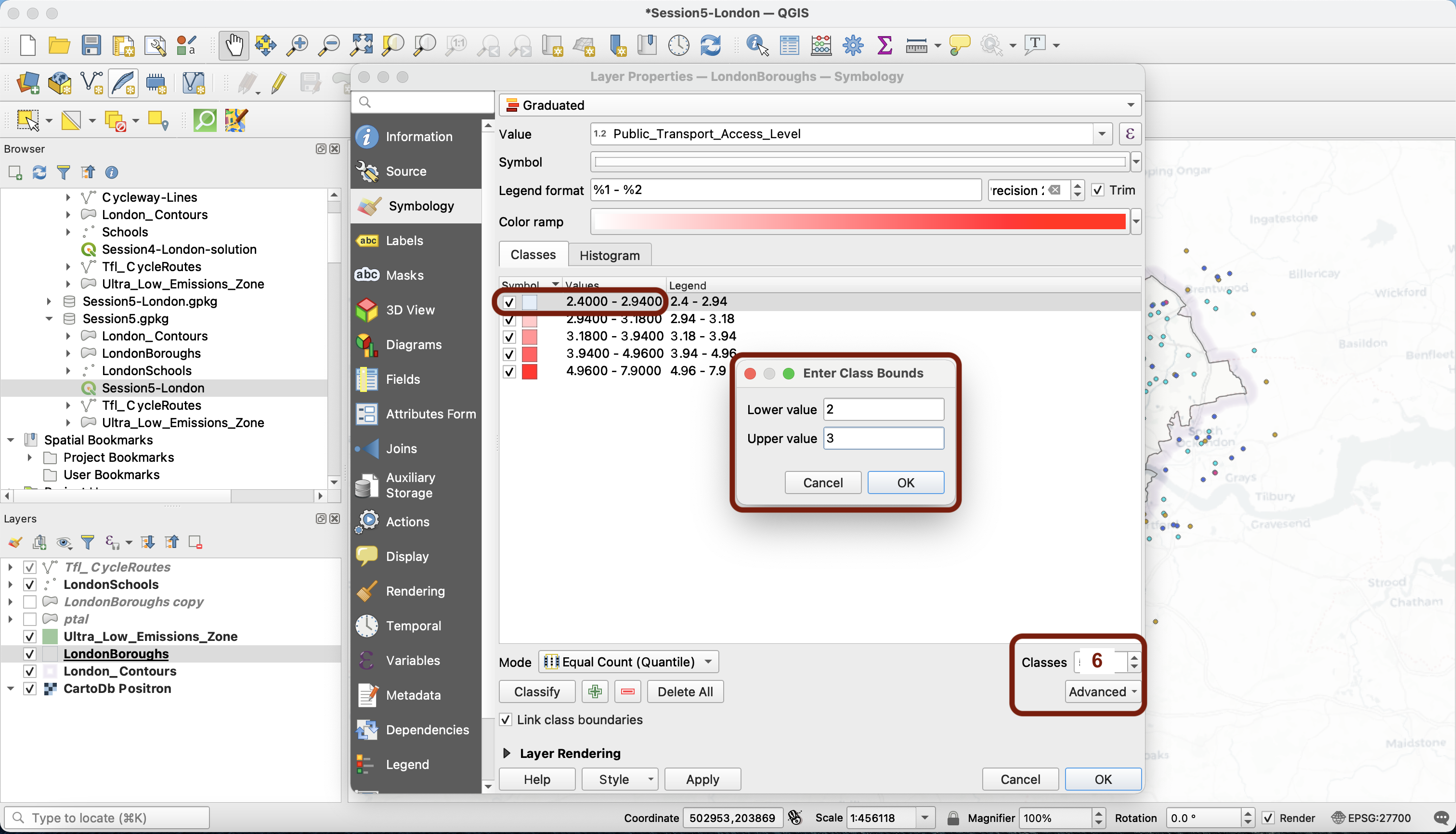
For now, let’s manually edit our categories. First, make sure you change the classes number to 6. Then, just double click on the values and a pop-up will prompt you to enter the class bounds. Finally, click on each legend item to edit its value to the official PTAL score.
This is the result you want. Press Apply.
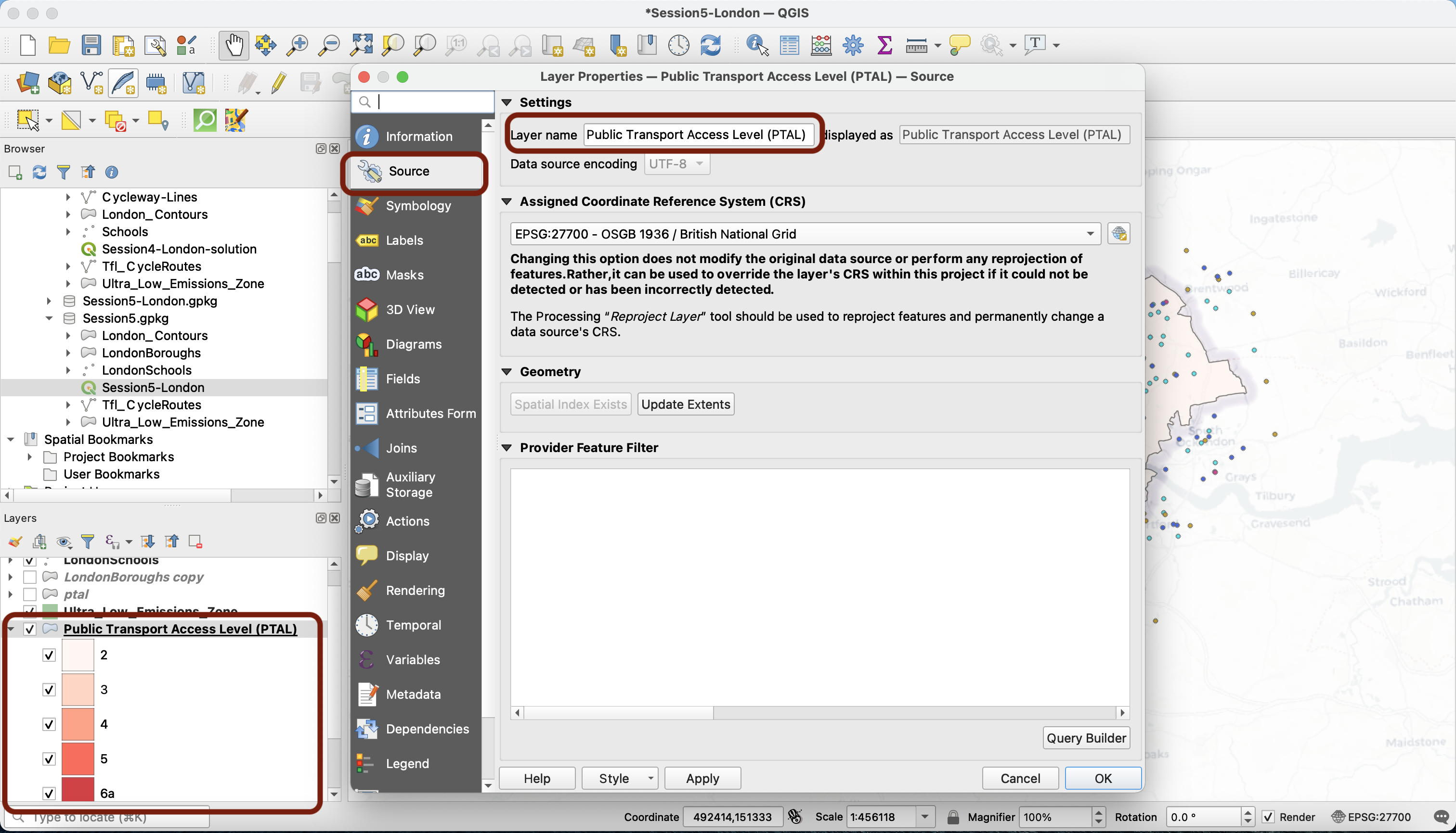
What we can do now is also rename our layer Public Transport Access Level (PTAL). Navigate to the Source tab, change the name and click Apply. You can see that this has affected your layer in the Layers panel.
3.3 Defining symbology
Now go back to your Symbology tab. We pick a simple colour ramp that ranges from white to dark blue.
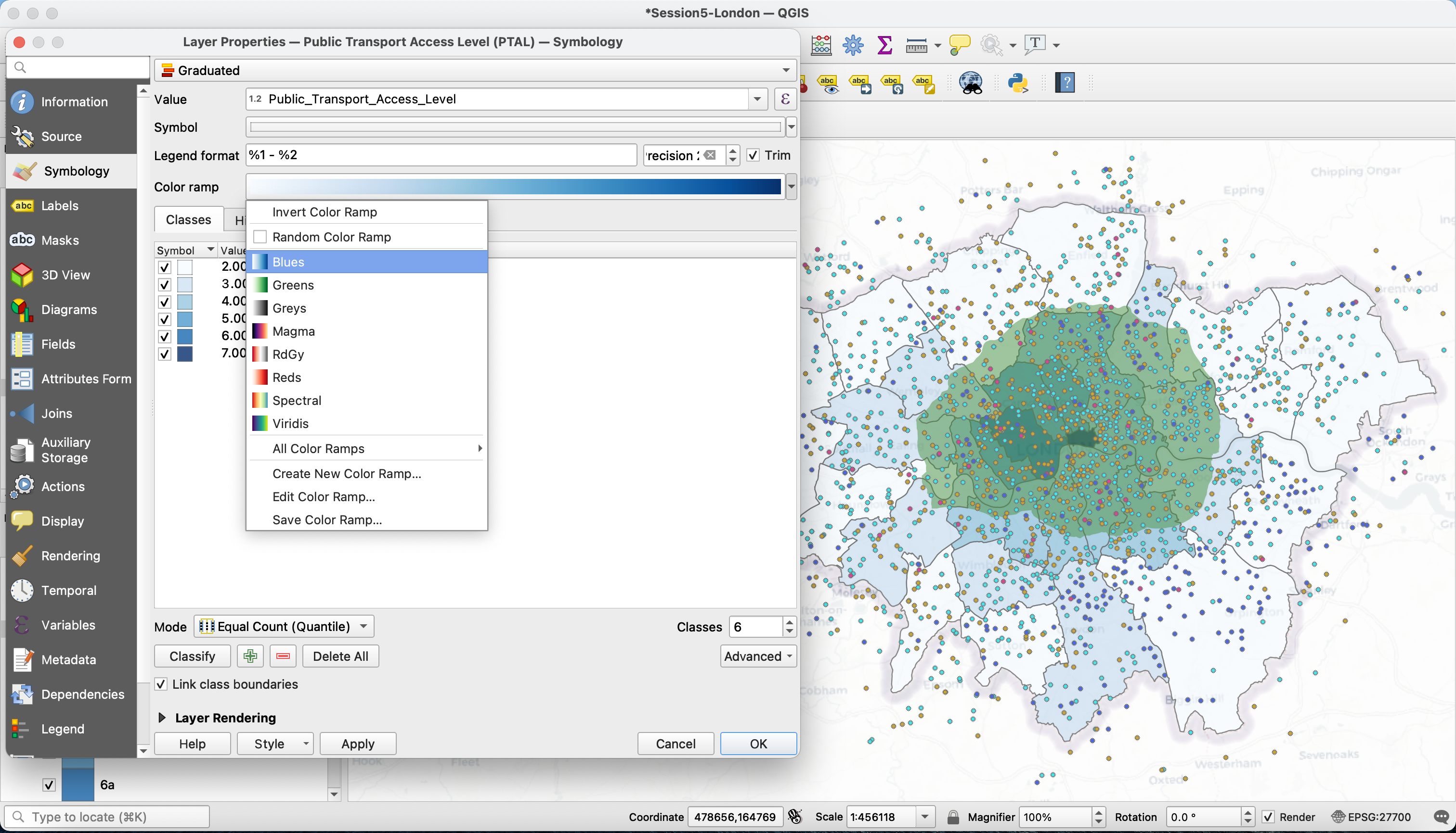
Unsurprisingly, we observe that the hypercentre of London benefits from great public transport access levels, whereas the further boroughs are poorly connected.
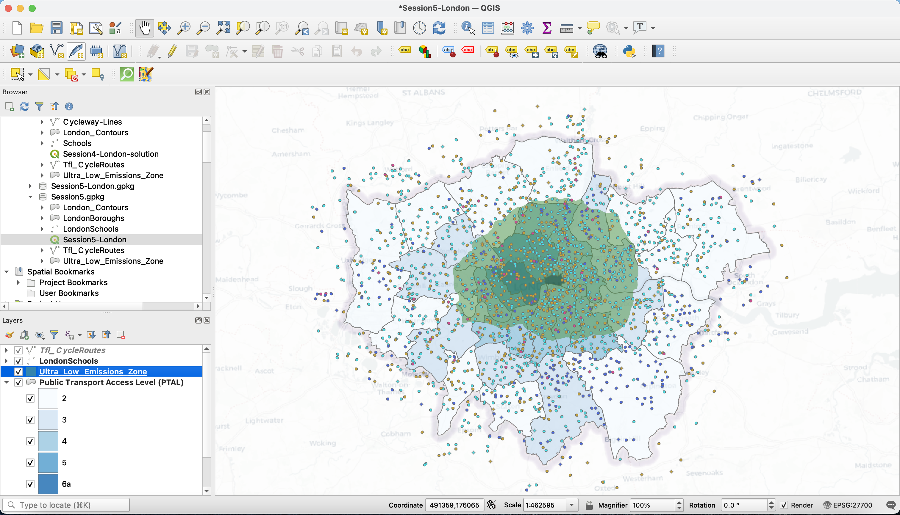
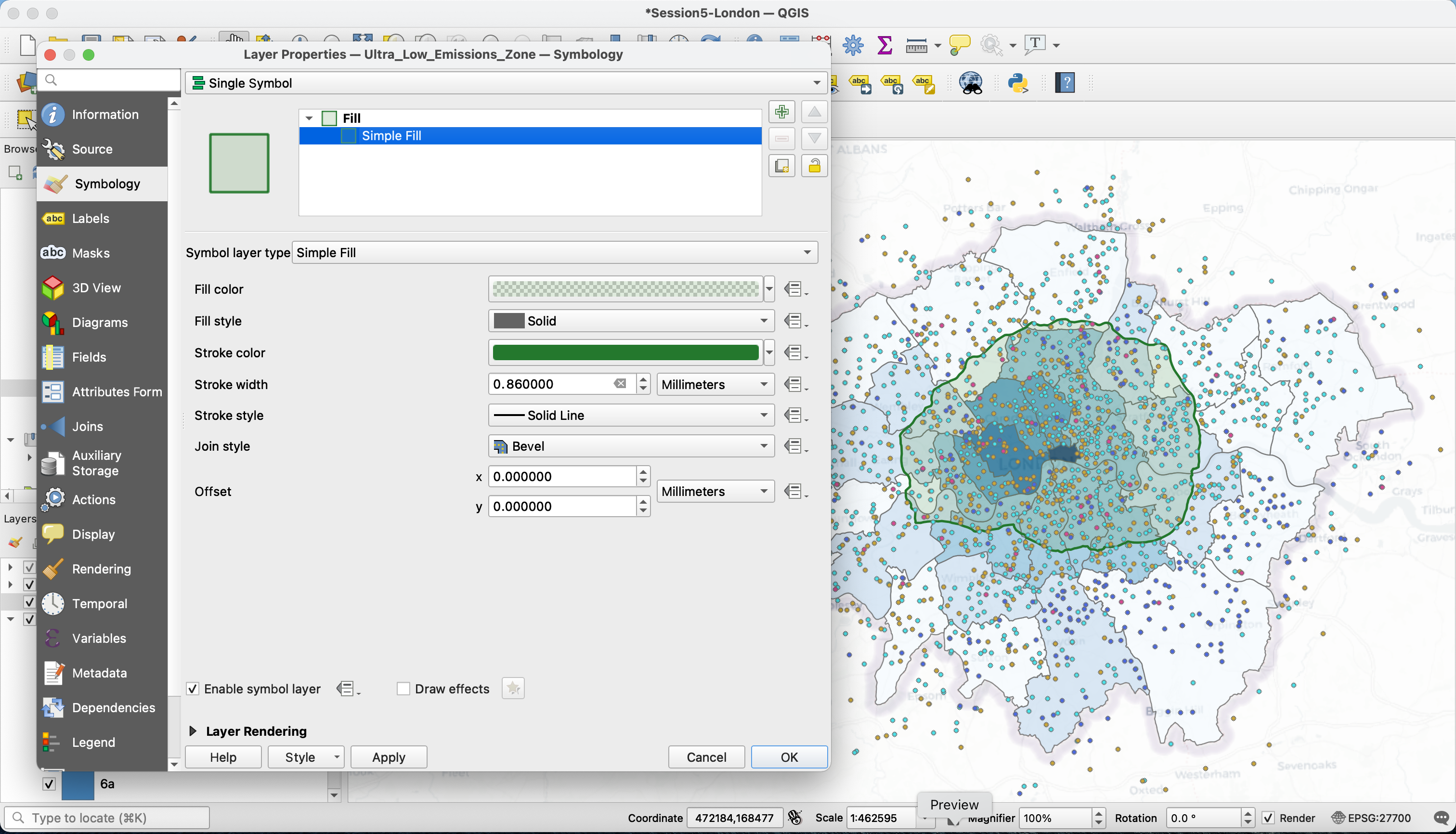
Now the Ultra low Emissions Zone (ULEZ) layer looks a bit busy. Let’s edit the symbology to a strong green line and very low opacity green:
3.4 Try it out!
Now, pick a field of your choice in the London Boroughs layer. You can drag a new copy of this layer on your canvas from your side Browser panel, and untick the PTAL layer in your Layers panel to avoid confusion. In the Fields tab, find a field you are interested in, and try to build a choropleth like we just did (repeat and adapt all the steps from section III). If you want to try several fields, you may want to use the Refactor fields tool instead of the field calculator when you convert the data type to numeric.
IV. Geoprocessing
Next, we decide that we actually want to restrict our analysis to the boundaries of the ULEZ (Ultra low Emissions Zone), to focus on the existing cycling and public transport offer in this zone. To do so, we will clip our 3 layers of interest (Schools, PTAL, cycling routes) to the extent of the ULEZ boundaries.
4.1 The processing toolbox
Your processing toolbox references all the operations and tools available in QGIS. Many of these tools can be accessed from elsewhere in your interface, but you can use your processing toolbox to find them all.
To bring up your processing toolbox if it’s not there already, navigate to your top meny: View > Panels > Processing toolbox.
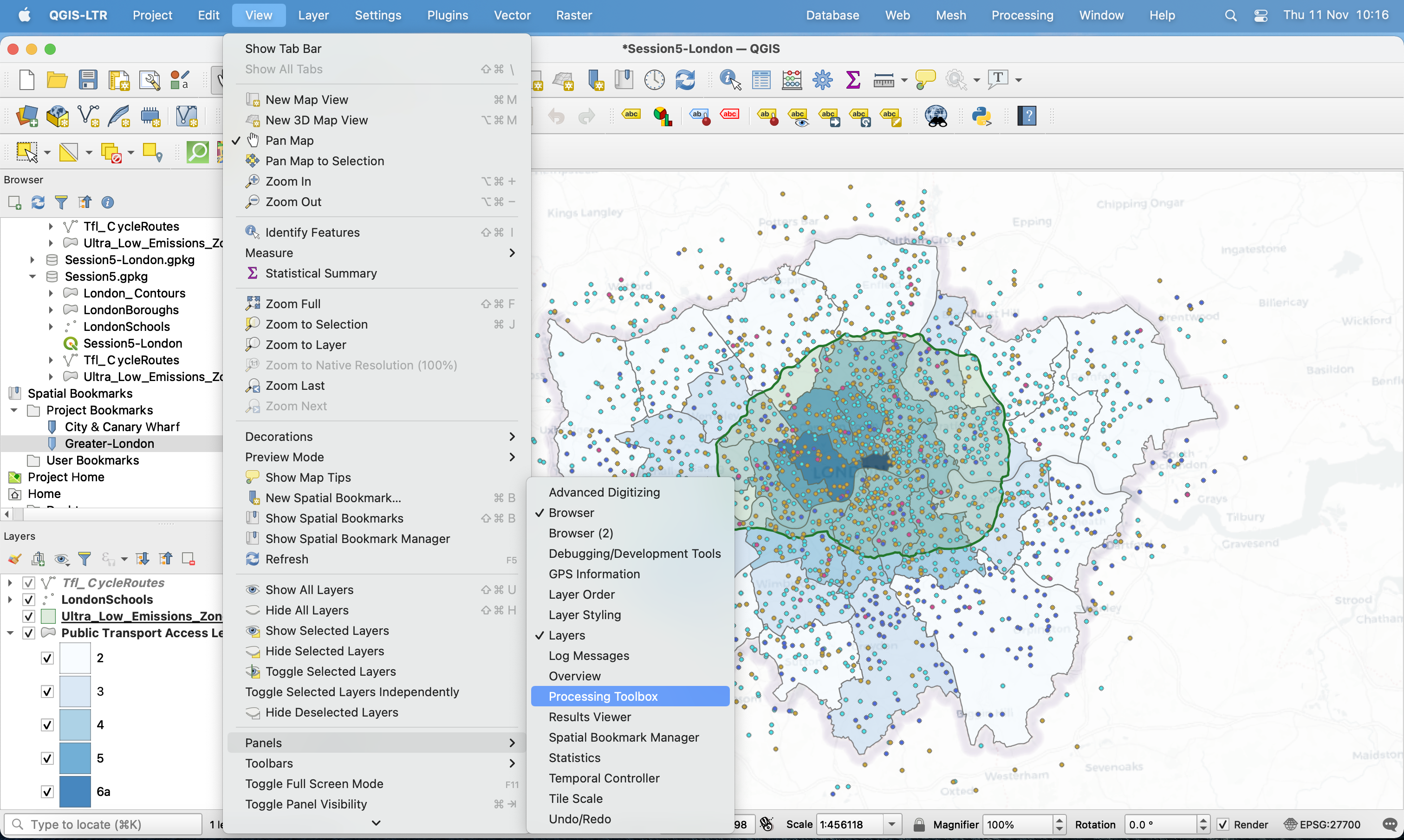
As you can see, functions are tidied in categories. If we look into the Vector overlay category, you’ll notice that it contains the same function as those in your top menu Vector > Geoprocessing Tools, for instamce the Clip and Difference tools.
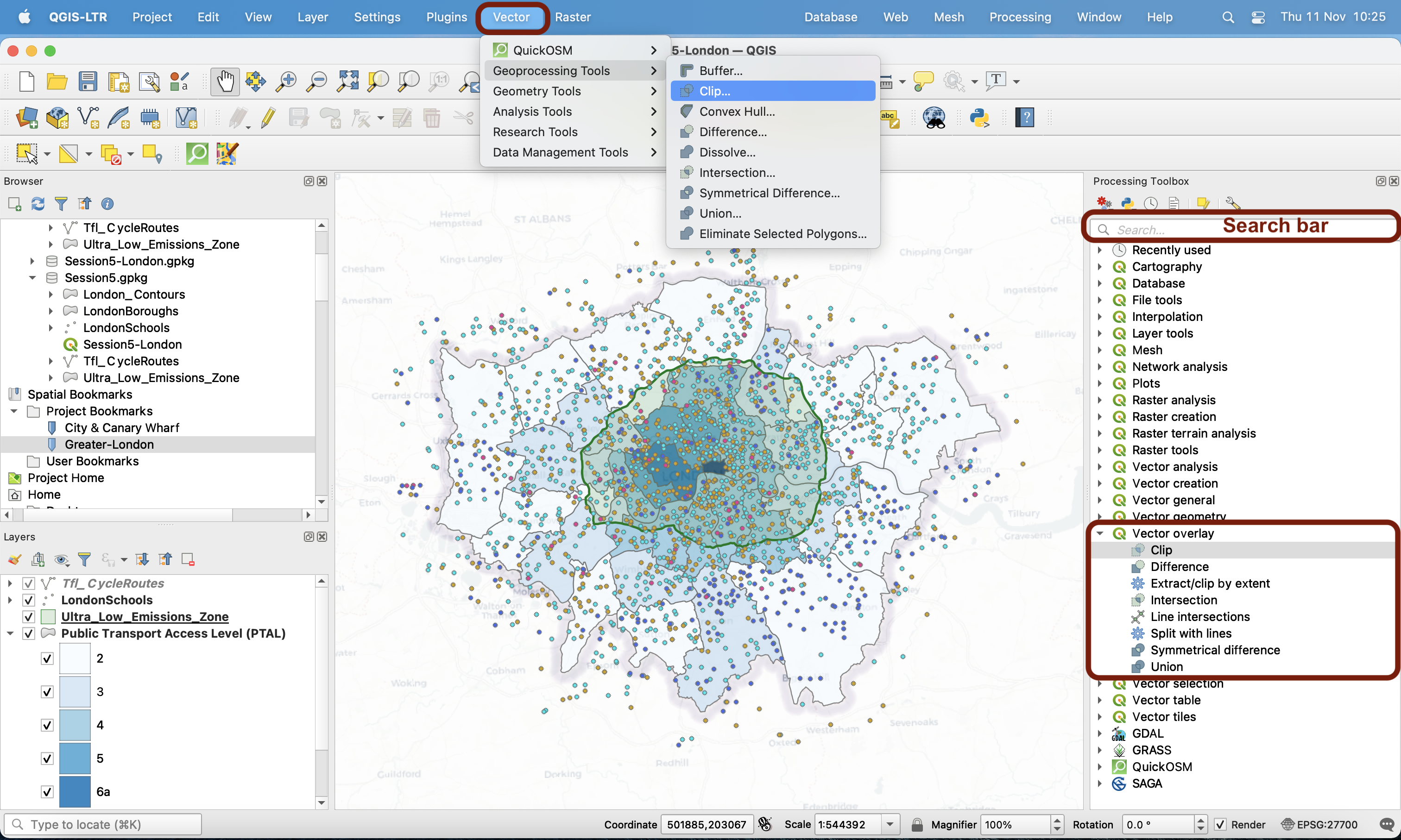
You can also use the search bar to retrieve any tool.
4.2 Clipping
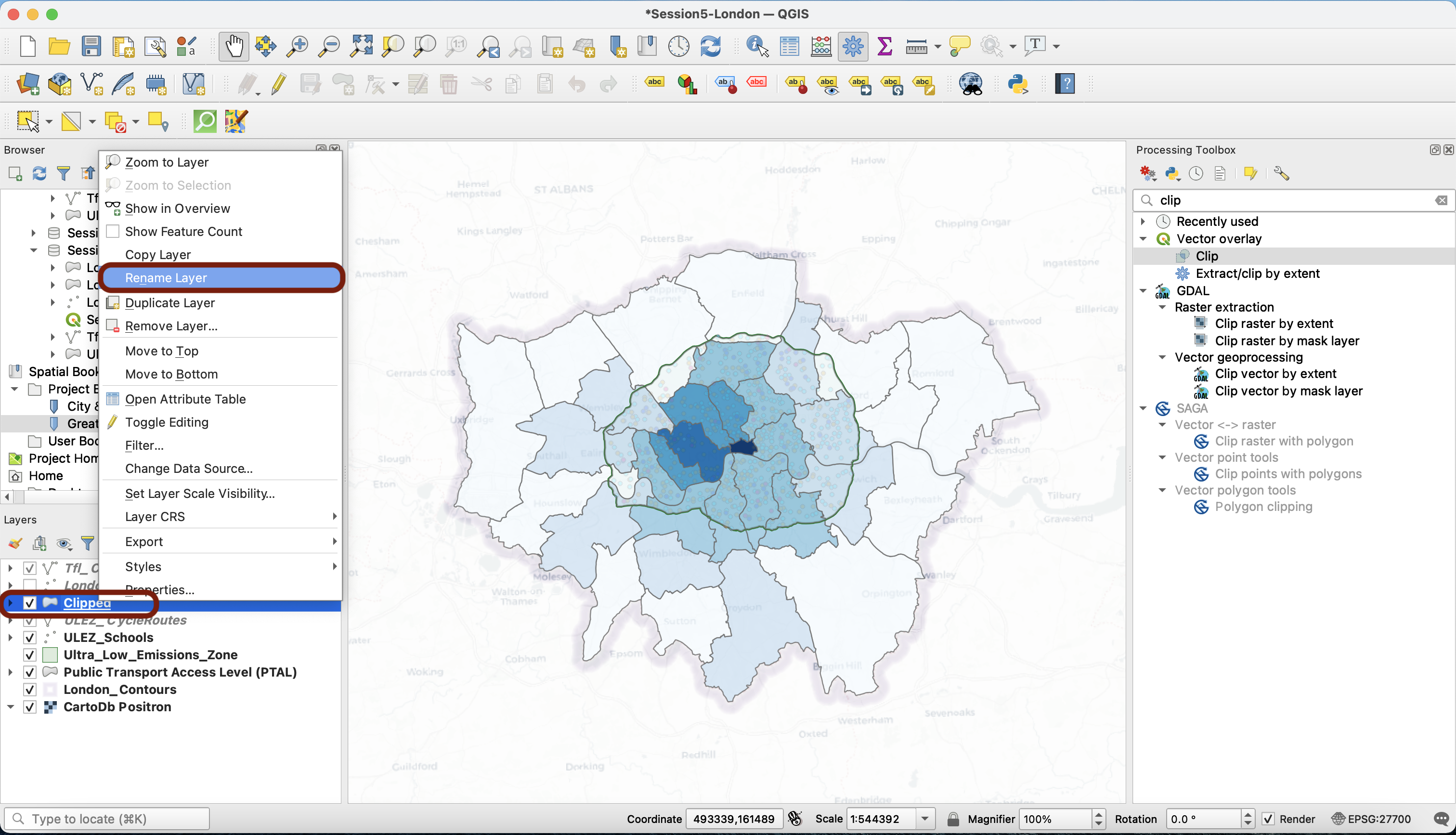
Type Clip in the search bar or access it through your top Vector menu. The clip tool works like a “cookie-cutter”; your “dough” is your input layer, and the shape of the cookie you want to cut is your overlay polygon. Please refer to the lecture slides for more details.
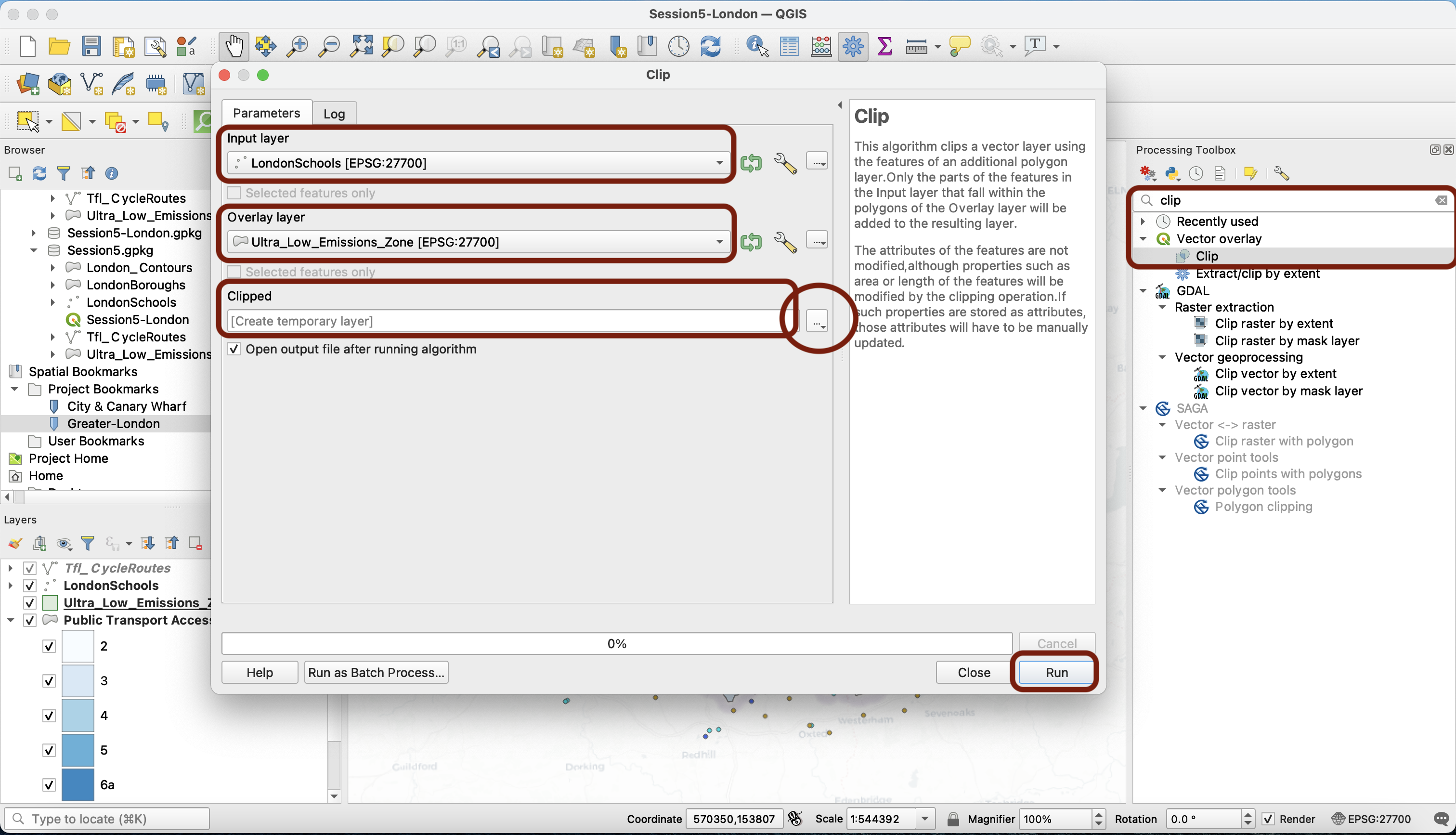
Choose first your schools as input; we’re going to clip this layer to the shape of the ULEZ. Notice that by default QGIS will create a temporary (scratch) layer. This means that the new dataset created is not saved anywhere on your disk, it’s just in memory. You can use the three dots to directly navigate to your session geopackage and save it there. You can also just run it as is for now and save the layer after (we’ll demonstrate this for now). Press Run.
After running the clip algorithm, a message appears in the Log window to confirm that it ran successfully (You can also see a new Clipped layer in your Layers panel). When running geoprocessing tools, make sure you read the messages in there. If a tool fails, you will get an error message that should point you to the reasons the tool failed and help you debug.
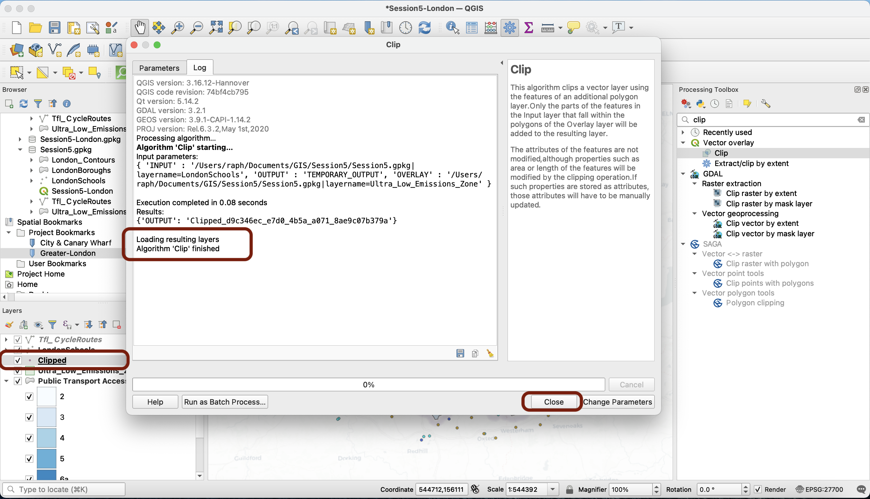
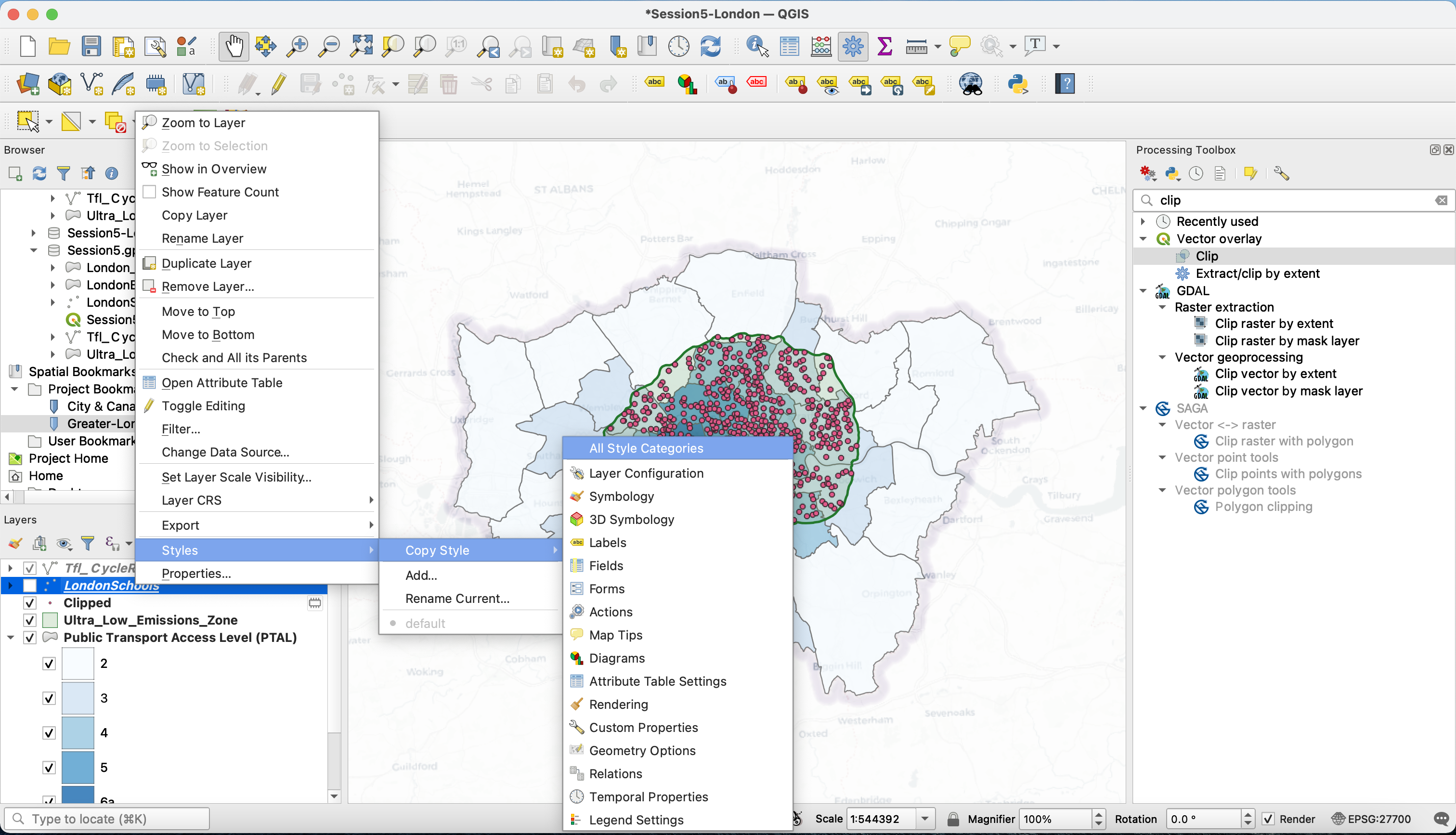
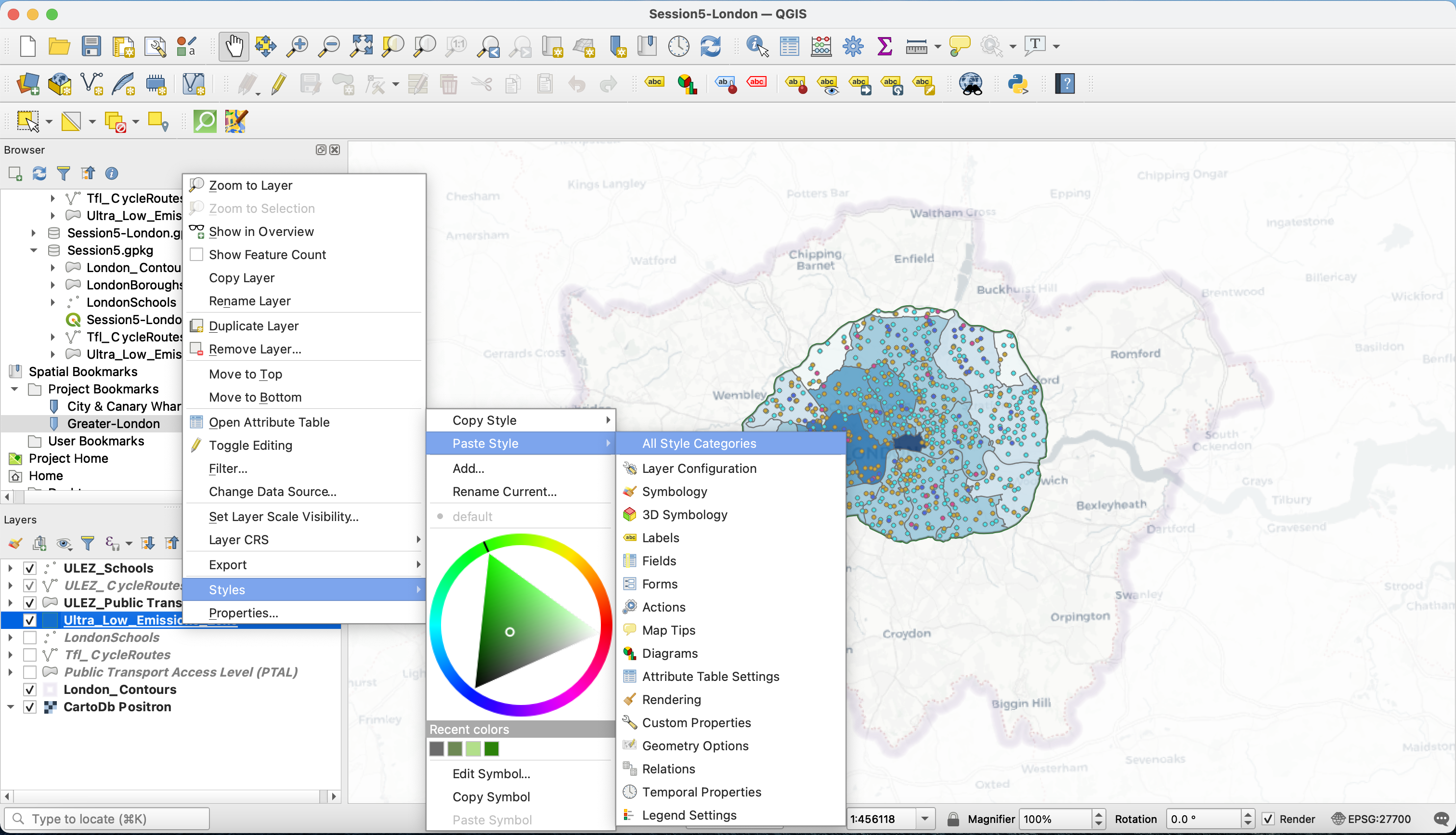
You can now press Close. In your Layers panel, untick the school layer to see your new Clipped layer more clearly. We’re now going to make use of a very handy QGIS function: we’re going to copy the style of the Greater London Schools layer and paste it onto the clipped layer: on your London schools layer, right click then Styles > Copy styles > All Style Categories.
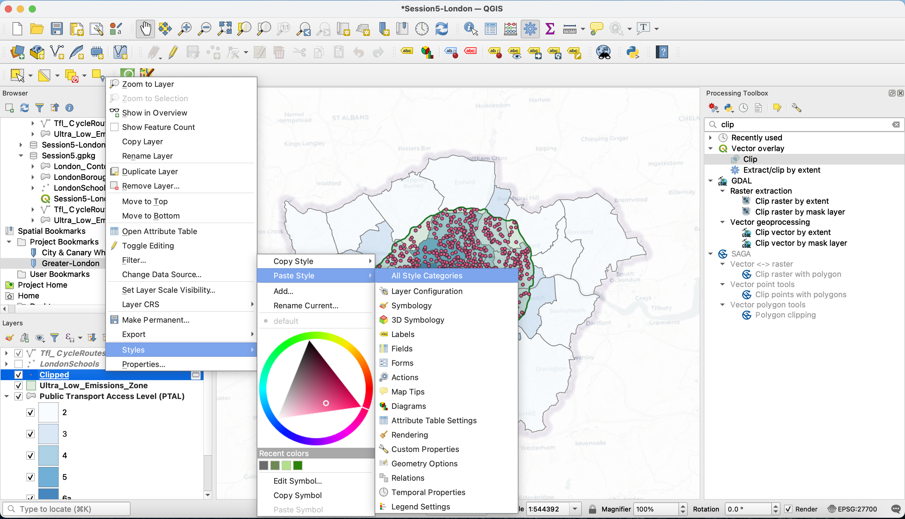
Then on your Clipped layer: right click then Styles > Paste styles > All Style Categories.
In two clicks, you have fine-tuned the style of your clipped layer! Now let’s make sure we don’t lose this new dataset. If you haven’t saved it to a location on your disk when you ran the Clip tool, you will notice that the “hairy box” scratch layer symbol is here.
Then on your Clipped layer: right click then Styles > Paste styles > All Style Categories.
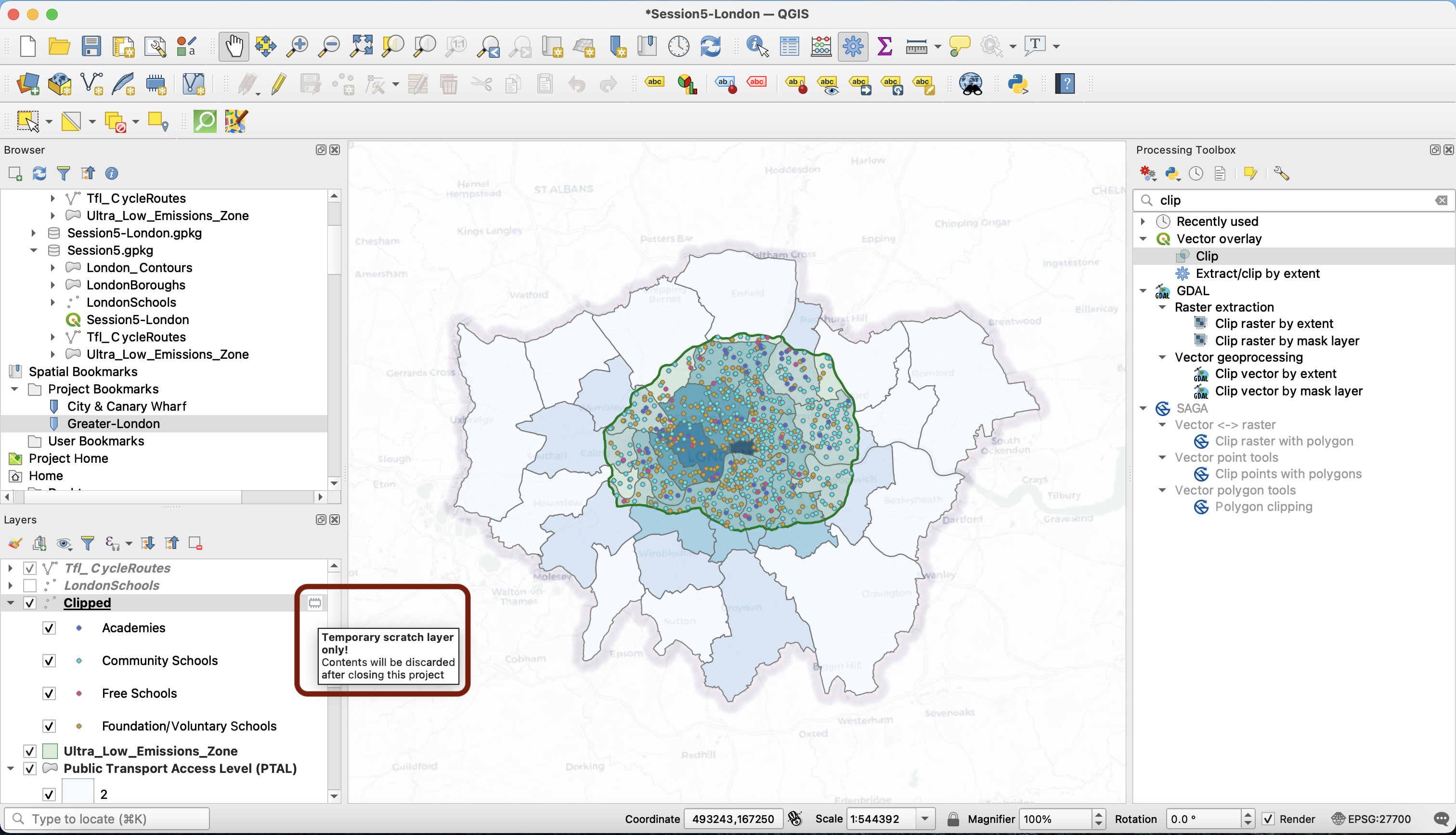
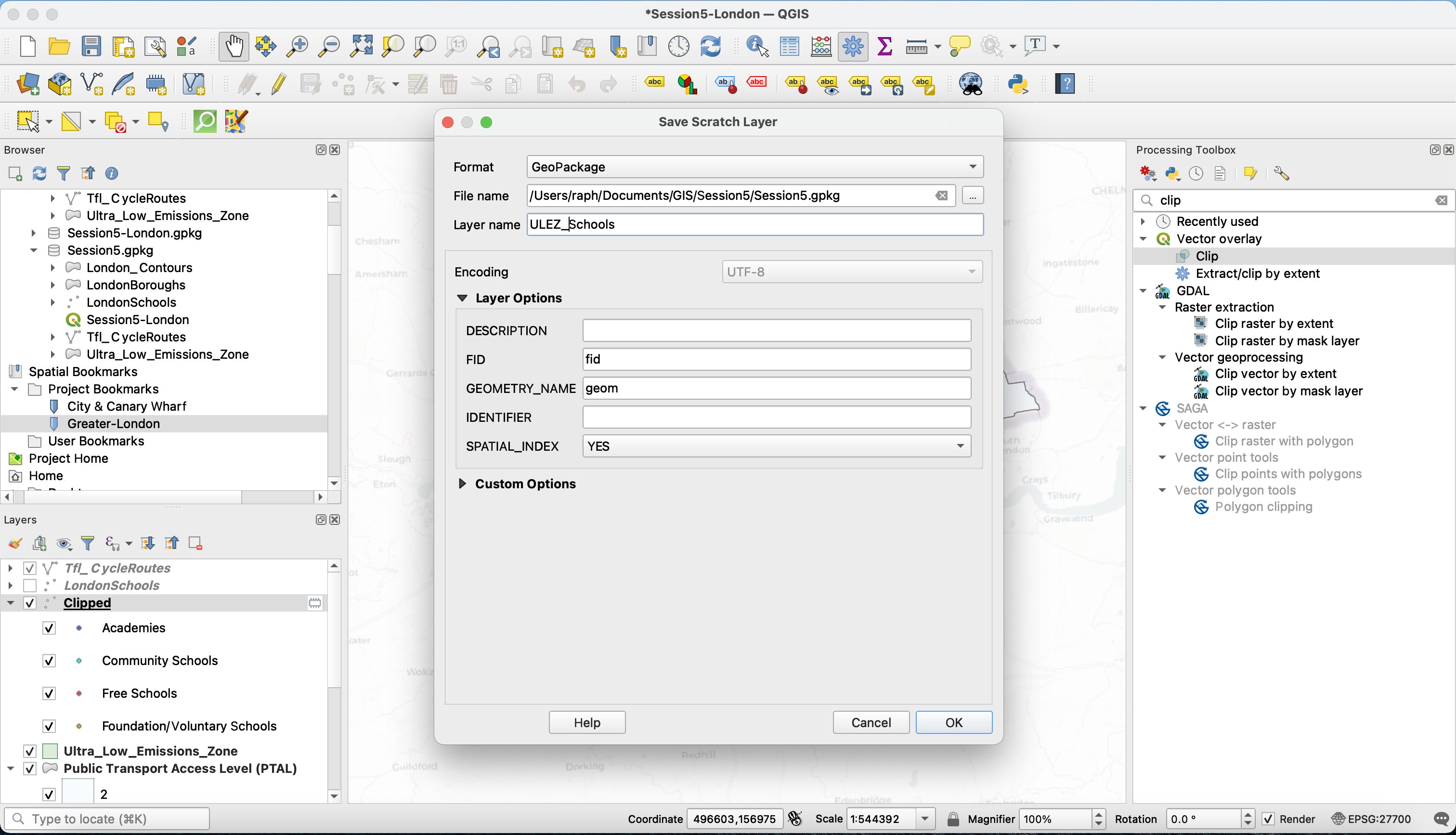
Click on that hairy box (or right click > Make Permanent...) to save the layer to your work session geopackage.
4.3 Your turn to clip!
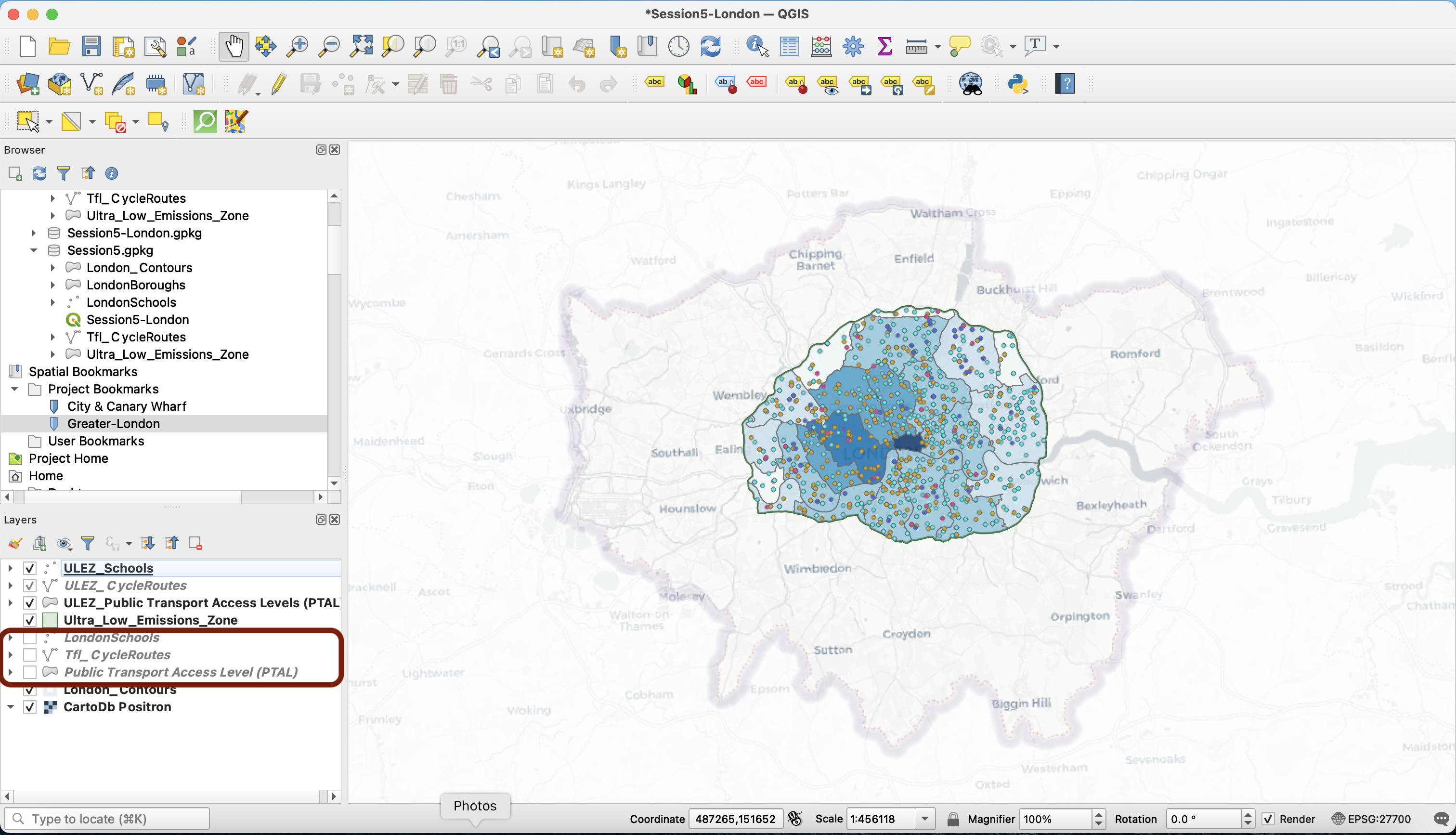
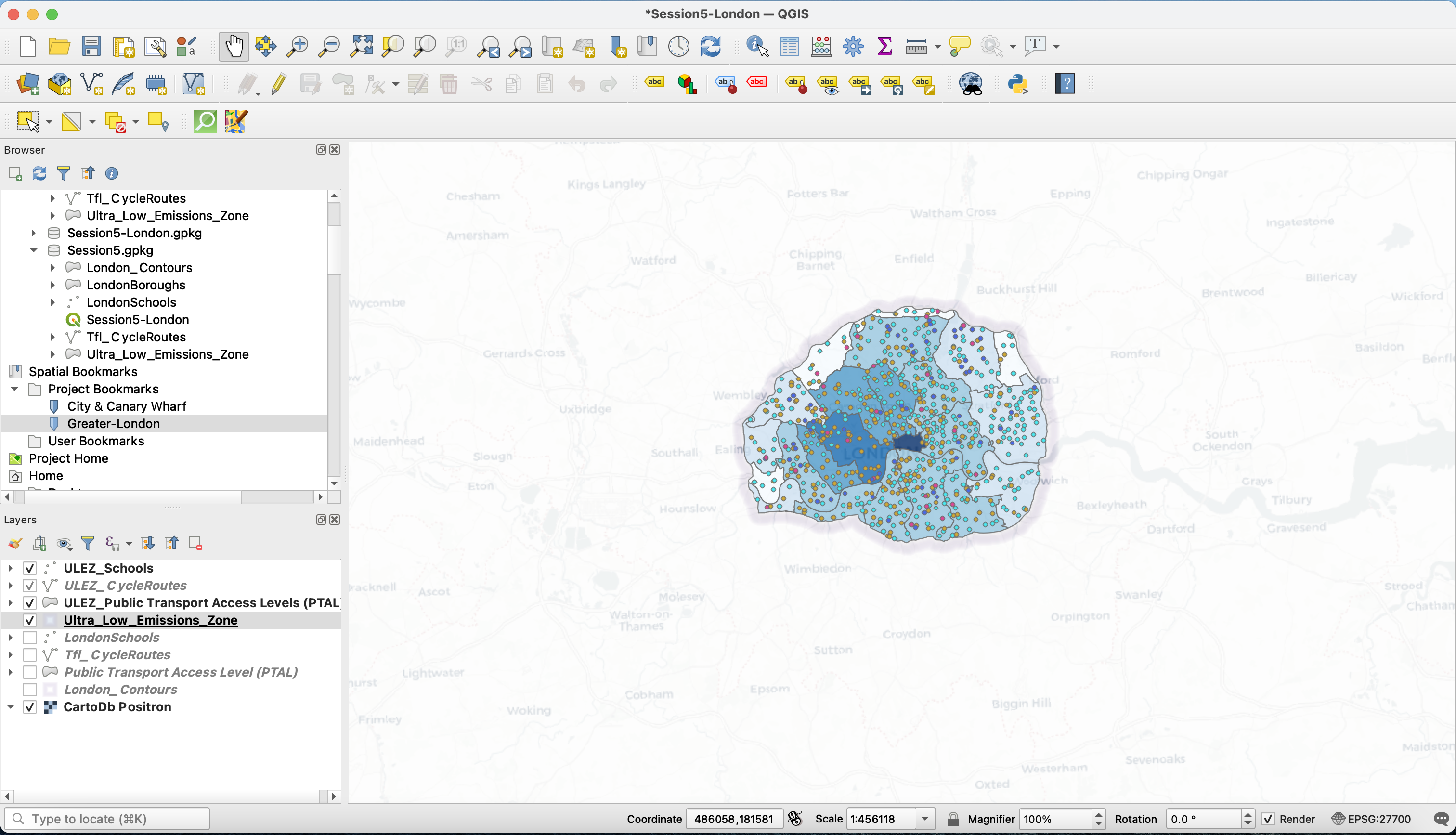
Now it’s your turn! Repeat the operation for the Tfl_Cycleroutes and the Public Transport Access Levels (PTAL) layers.
To avoid confusion in your Layers panel, you can rename the layers to meaningful names
For clarity, you can untick your Greater London wide layers and move them to the bottom of your Layers list.
4.4 Fine-tuning the symbology
Now let’s change one last thing: the symbology of our ULEZ zone. We’ll copy the styles from the London_Contours layer (the shapeburst inverted polygon) and paste it onto the Ultra_Low_Emissions_Zone layer. That way, we are masking slightly everything that’s outside the ULEZ.
Untick your London_Contours layer and right click your Ultra_Low_Emissions_Zone layer > Zoom to layer.
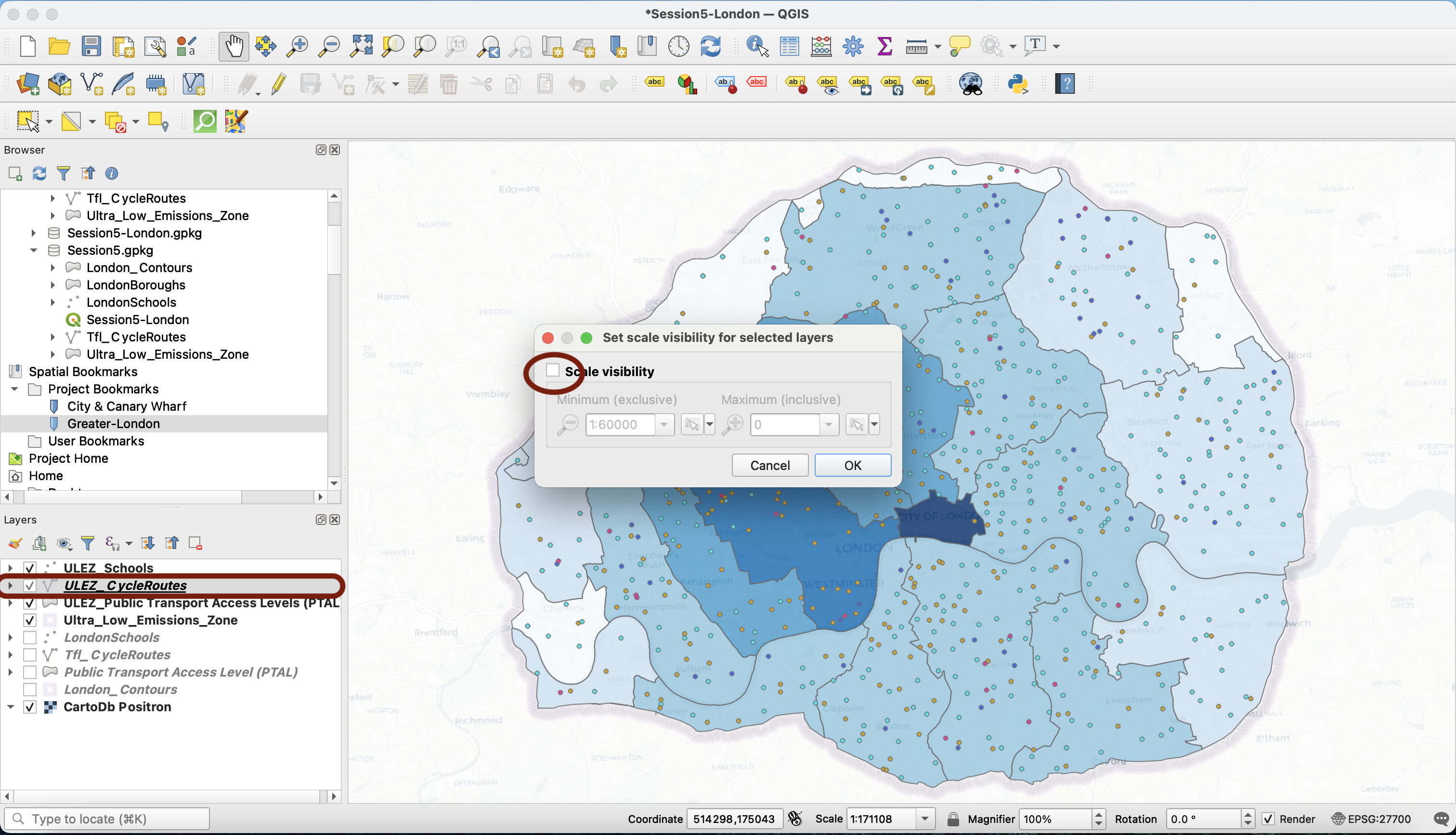
We also remove the scale dependent visibility setting for our ULEZ_CycleRoutes layer by right-clicking > Set Layer Scale Visibility... and unticking the Scale Visibility box.
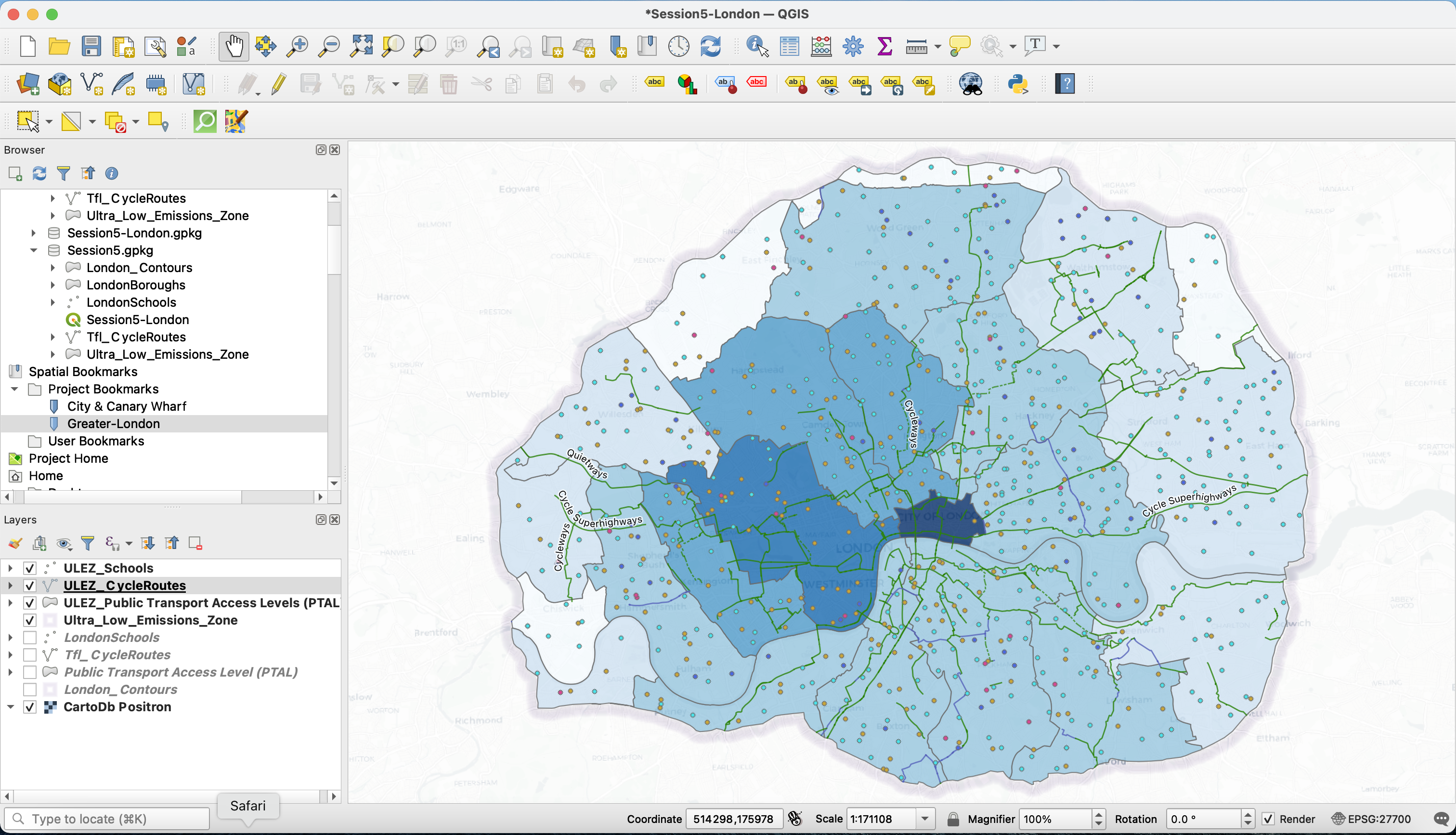
Let’s have a look at this map. Does is tell us much about which schools are actually near a cycling lane vs those that are not?
4.5 Working with distance
We’re interested in finding out which schools are within 200m of a cycling lane, suggesting that the children and family can potentially use the major cycling routes to commute. We could imagine that later on, we want to compare the ratio of public schools vs private schools in the ULEZ, and in the subgroup of ULEZ schools that are within walking distance from a cycling route.
We’re going to use the Join attributes by nearest tool. Use your processing toolbox search bar to open the tool. Your input layer will e the ULEZ_Schools. Your join layer, the ULEZ_CycleRoutes. Now, very important steps: make sure to tick the Discard records which couldn't be joined, and to specify a Maximum distance of 200 meters. Press Run.
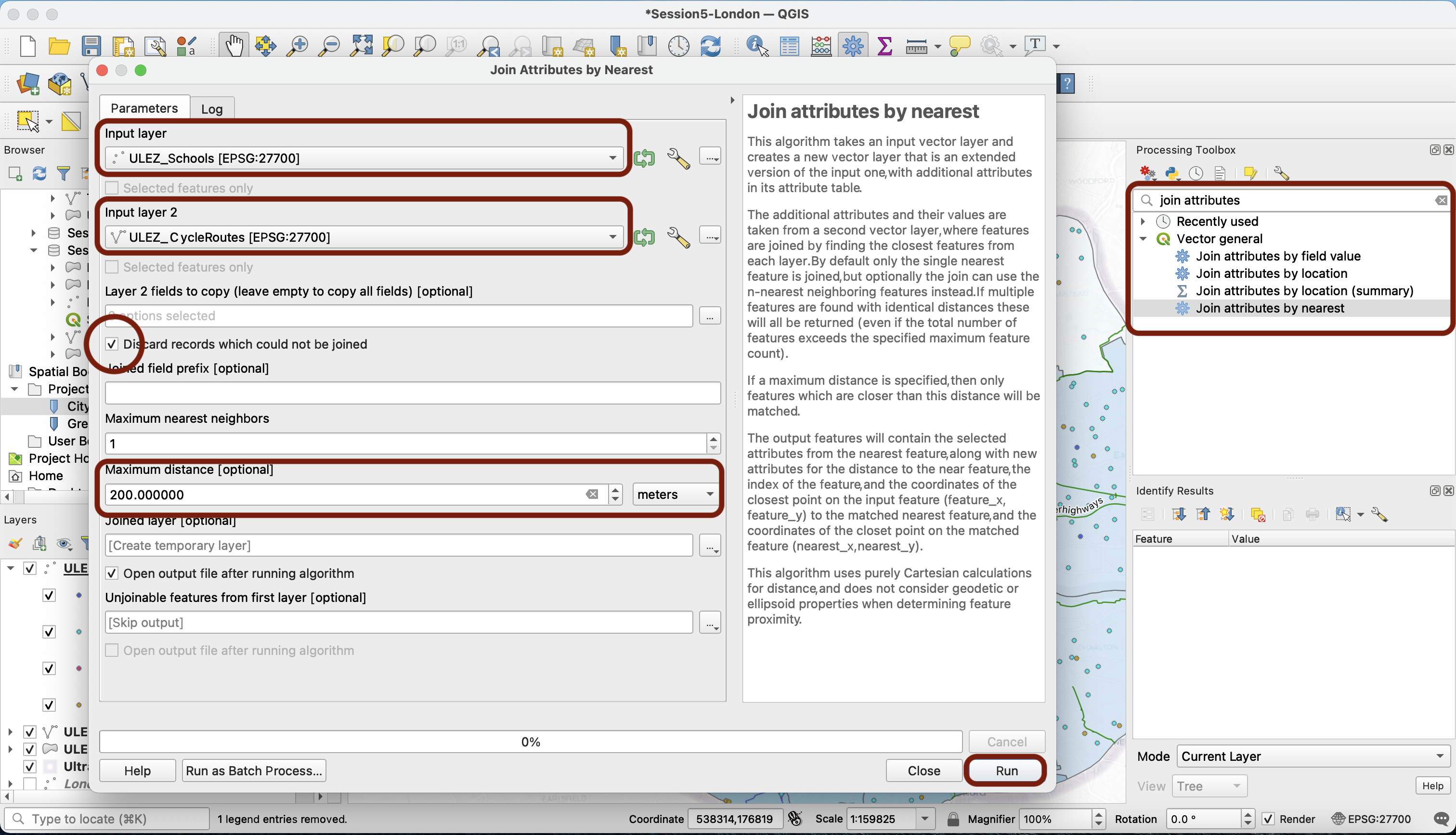
What we are doing here is checking the distance between each school and the nearest ULEZ_CycleRoutes. When the distance is below 200m, we take the row from that school and join attributes (add columns) from the nearest ULEZ_CycleRoutes to this row. If no cycle path is within a 200m radius of a school, no join is performed and the row is dropped from the table. The output is a subset of the ULEZ_Schools layer in which each row is a school that is within 200m of a cycling route (all the other school rows were dropped).
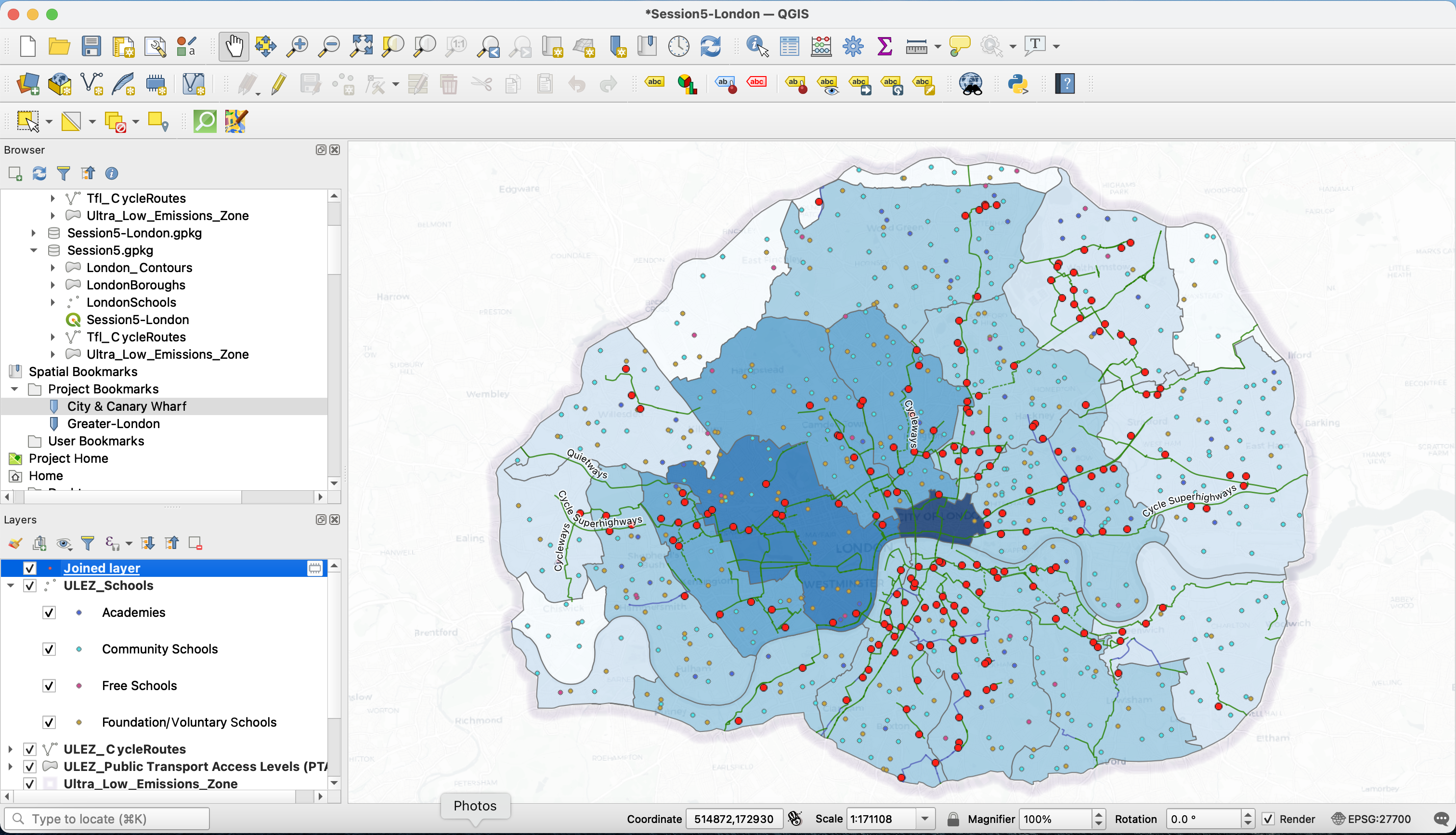
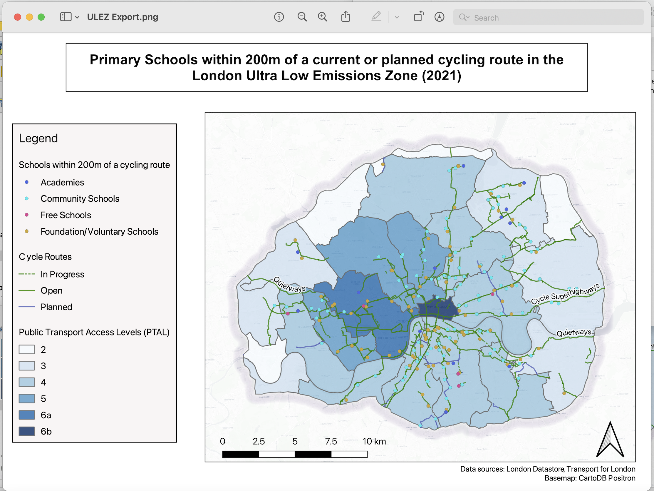
You can now save that layer into your geopackage, rename it, copy the style from the ULEZ_Schools layer and paste it into this new layer, and turn off the original ULEZ_Schools layer. This is your final map:
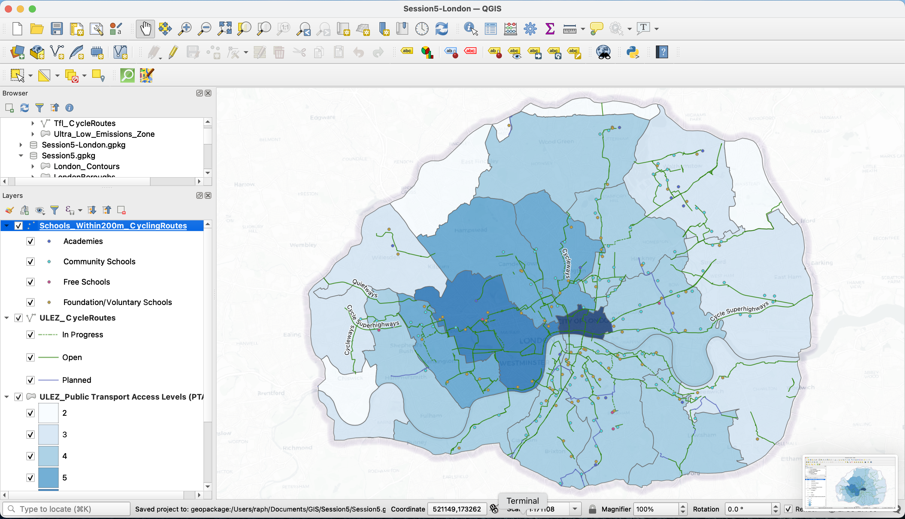
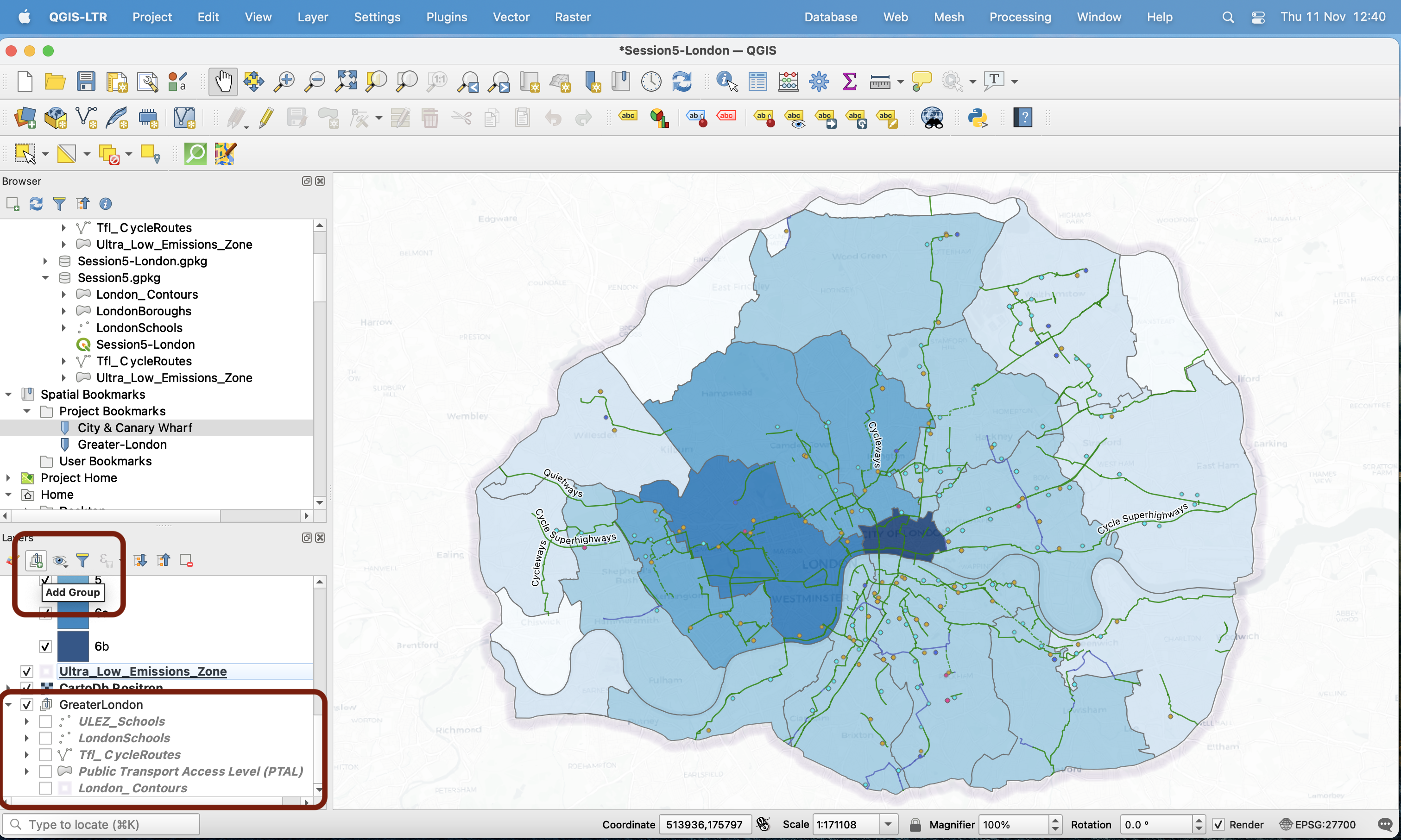
For clarity, in my Layers panel I am now grouping together the layers I am no longer using, in a group called Greater London.
V. Exporting a map: setting up a layout and adding map elements (north arrow, scale bar, legend, title etc.)
5.1 Introducing the Print Layout Composer
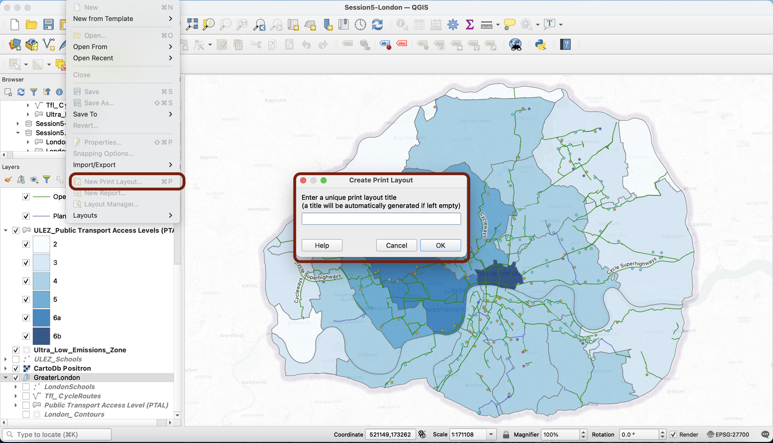
We’ve established that GIS files ( *.gqz or geopackages) are a “recipe” to represent datasets as layers, and to display them in a specific way. Such files are not images; if you want to export an image of your map (as *.png, *.jpeg, *.pdf or even to a printer directly), you must use the QGIS Print Layout Composer, which you can access from your menu Project > New Print Layout.... Give it a name such as Session5-layout and press Enter.
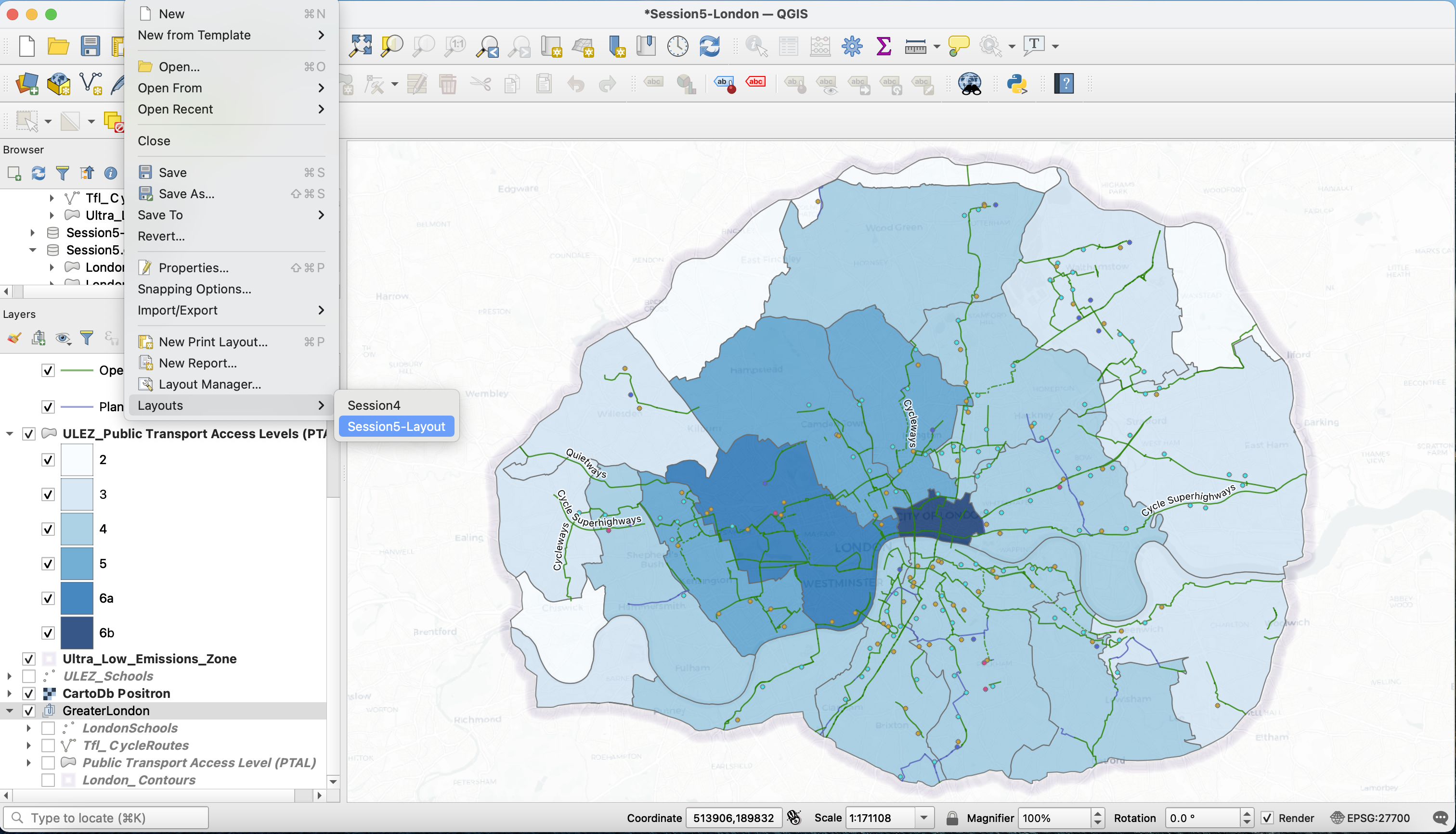
Note that this layout, and the changes you make to it (and save) will now be accessible from your top menu Project > Layouts > …
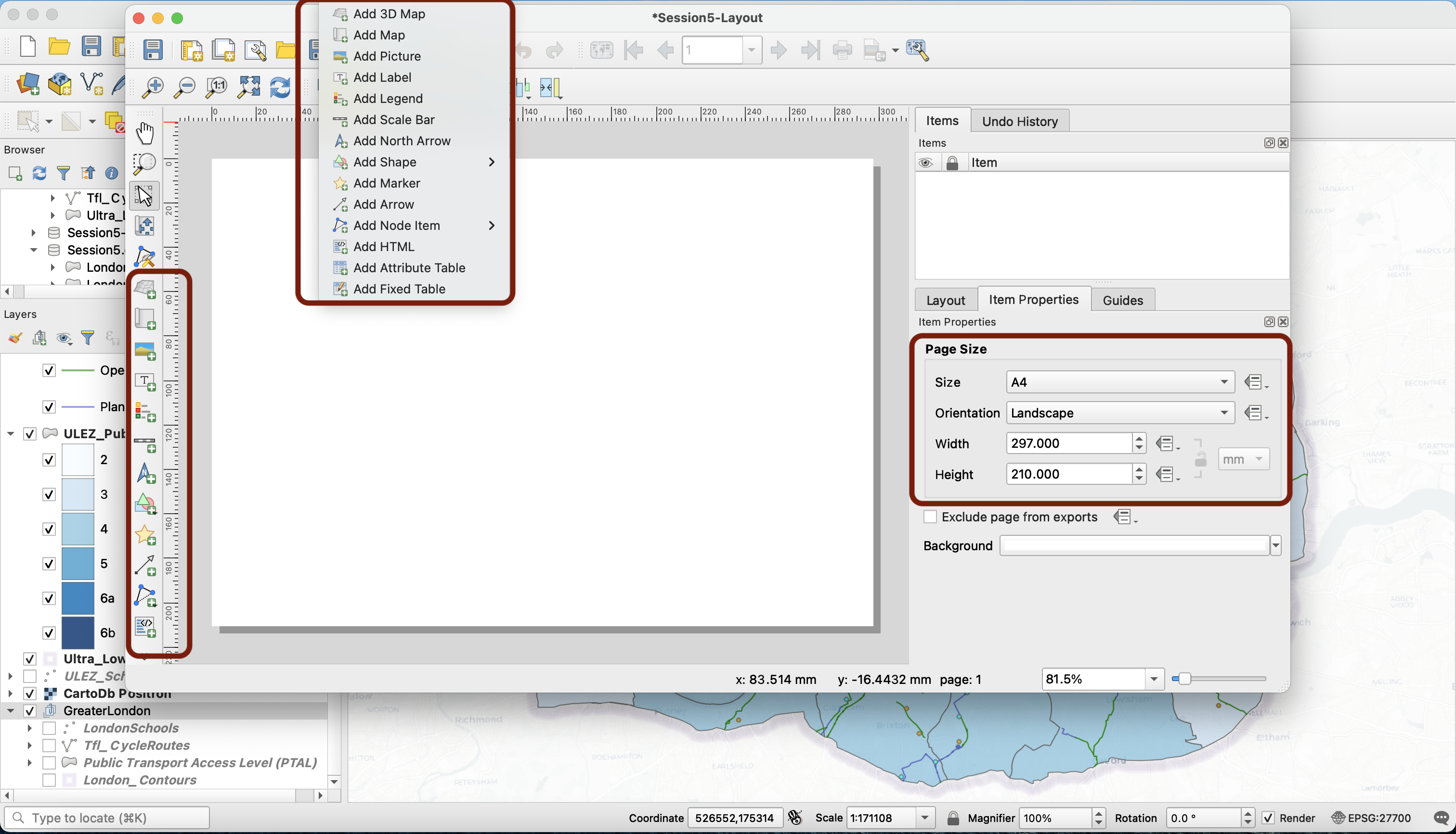
Back to your layout composer! It is for now a simple white space. Right-click on this blank space, select Page properties… and look at the context menu to your right. Make sure that you’re working with an A4 map and the orientation is Landscape. Now we can start thinking about the elements to add to our layout. You can use the top menu Add items to access the various layout elements, or the corresponding icons to the left of the window.
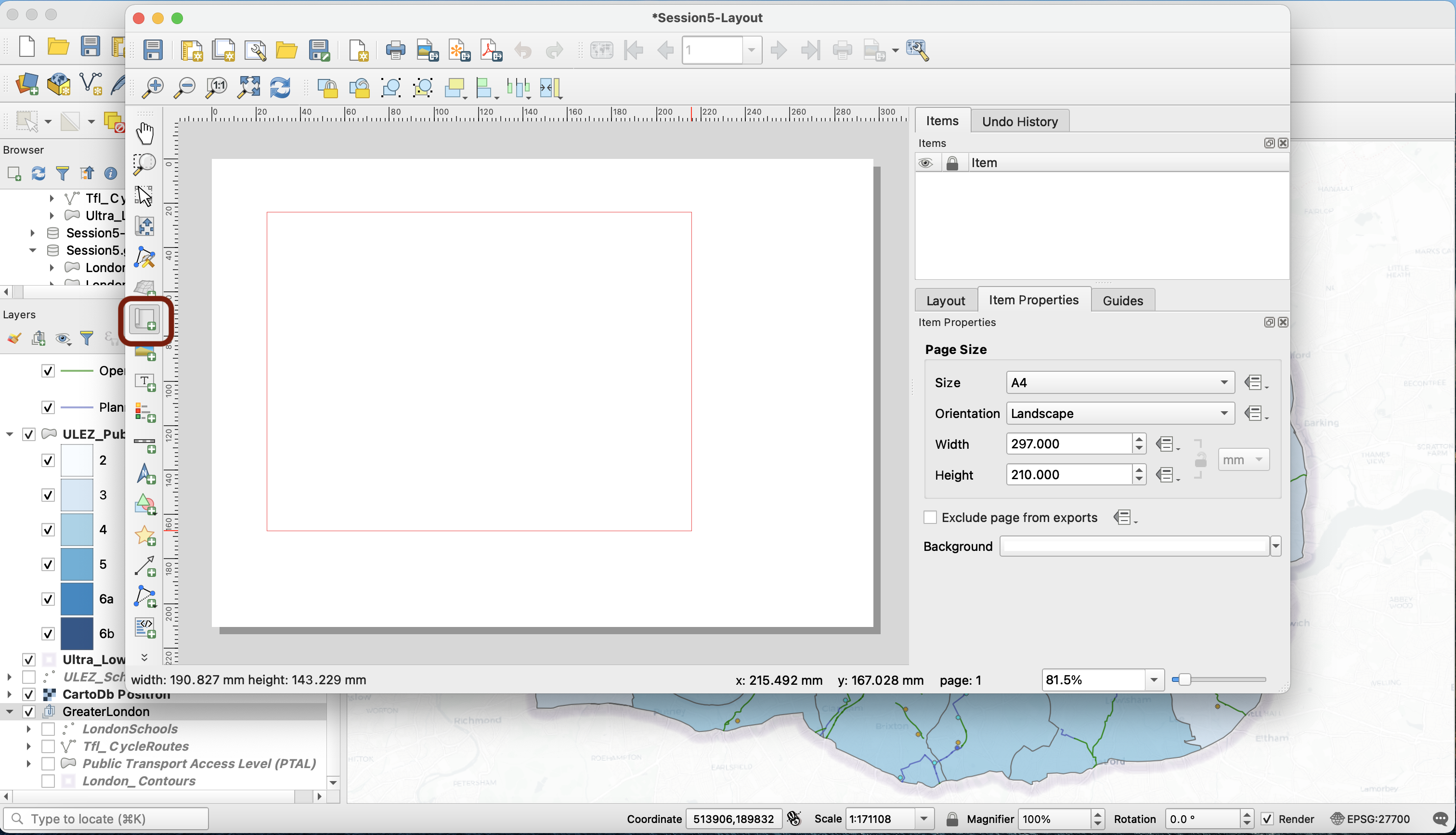
First we’ll want to add a Map. Click the Add Map button. With this tool activated (button looks pressed down), you can place a map on the page. Click and maintain your mouse pressed to draw a box on the blank page:
Once you release, your map appears on the page. You can move the box and edit its dimensions as much as you need. Now, let’s explore how it links to your map canvas. Go back to your map canvas and switch to a different spatial bookmark view (in my case: the City & Canary Wharf zoom). You can use this button to update the map on your layout to match the extent on the map canvas. You can also use the refresh button next to this one to refresh your layout when you’ve changed the layers that are turned on / off on your canvas. Please also note that a Save button is available for you to frequently save your changes to the layout.
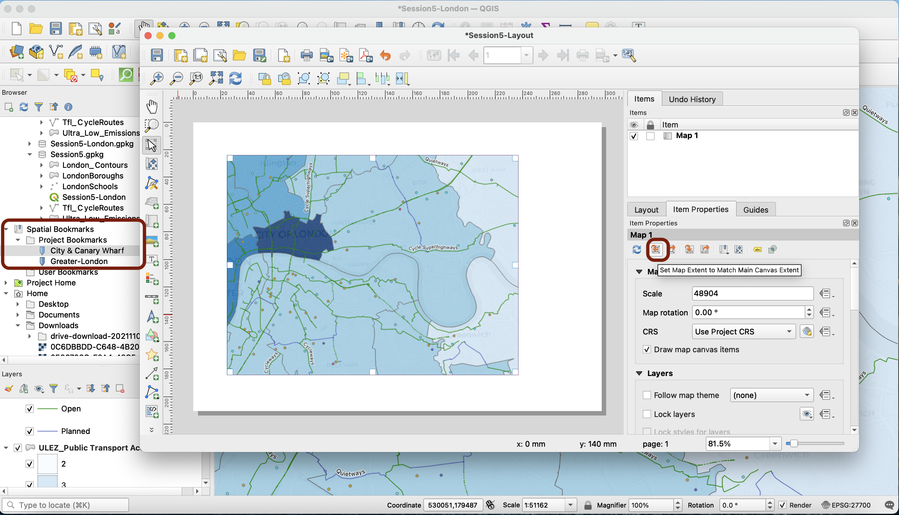
You can go back to the full ULEZ extent.
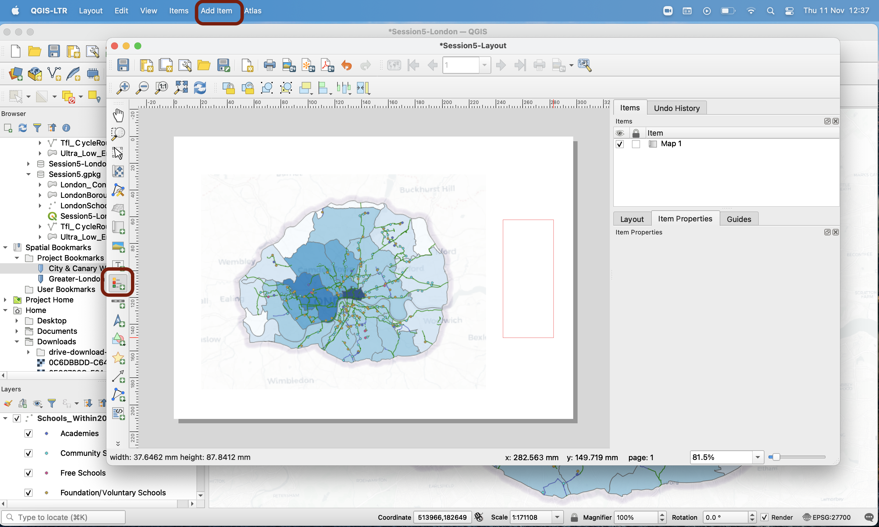
5.2 Adding a legend
Let’s add a legend to our map. Use the top Add Items menu or the side bar to press the Add Legend button. Then, just like you did to add a map, draw a square and release to place your legend.
You can see that this will need a bit of cleaning:
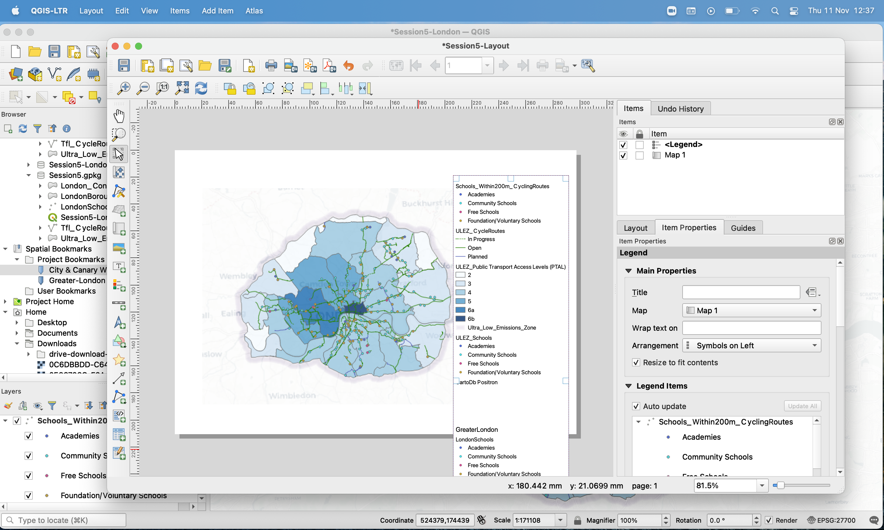
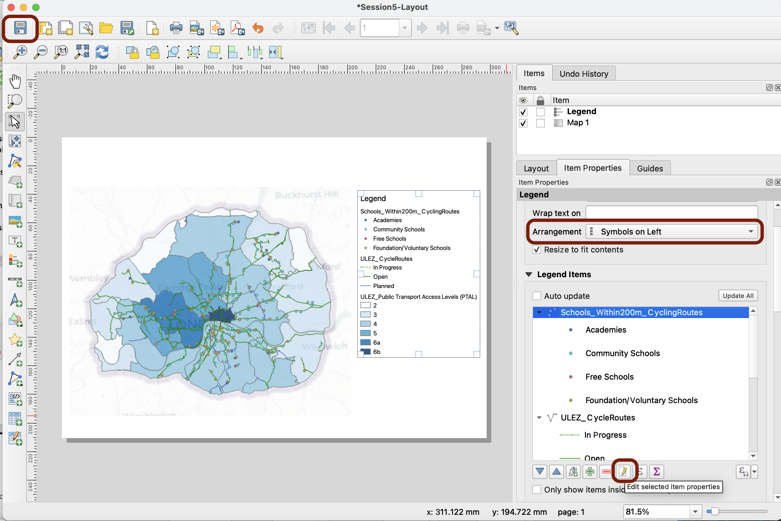
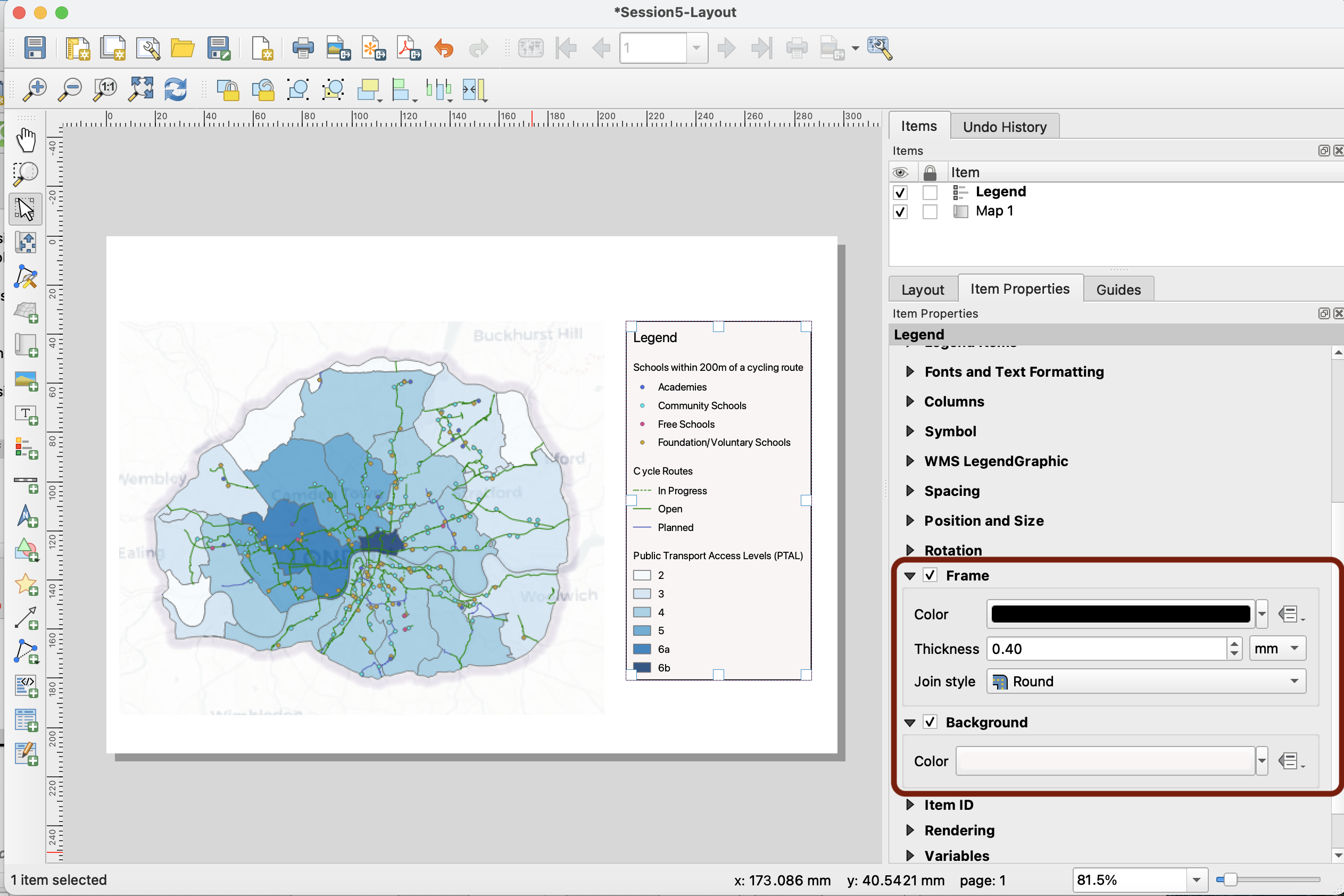
Notice that in your side panel, the Items properties panel content changes depending on which item is clicked. If you click onto your map, you get the map properties. Make sure you are clicked onto your legend as we start editing it. First, give it a title Legend, and untick the Auto update ; this will allow you to manually remove or add items from the legend. To scroll down this menu and see the rest of the options, you may need to use the scroll bar on the right.
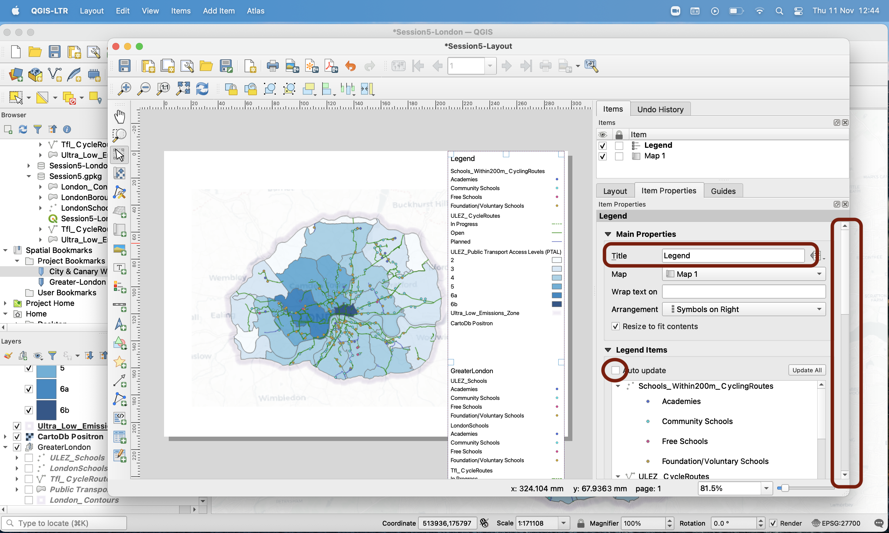
When you scroll down your legent items, you wil see the Greater London group we created earlier. Delete it by pressing the red minus button.
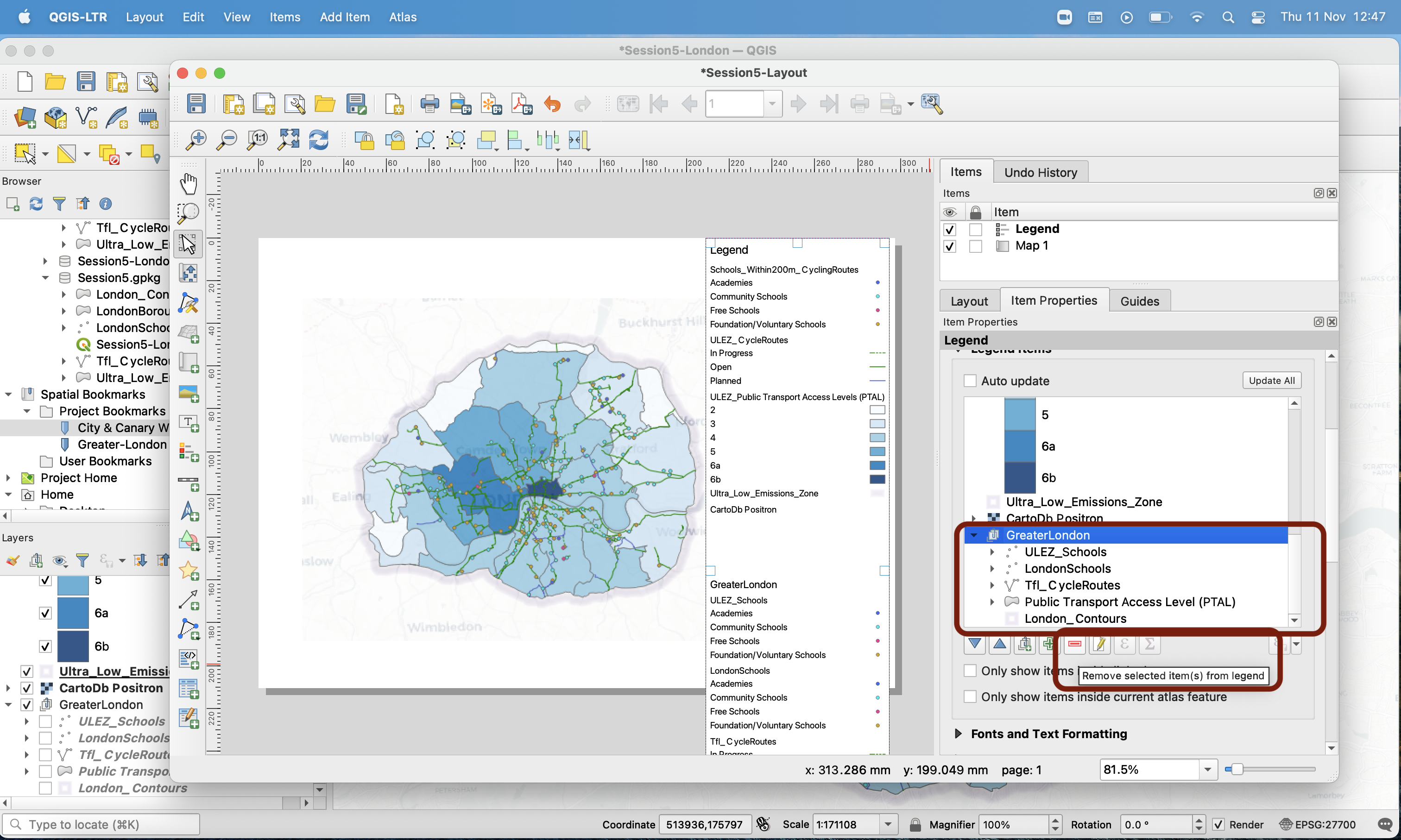
You can also delete the basemap (CartoDB_Positron in my case), and the Ultra_Low_Emissions_Zone. Now your legend is less busy, but still difficult to read:
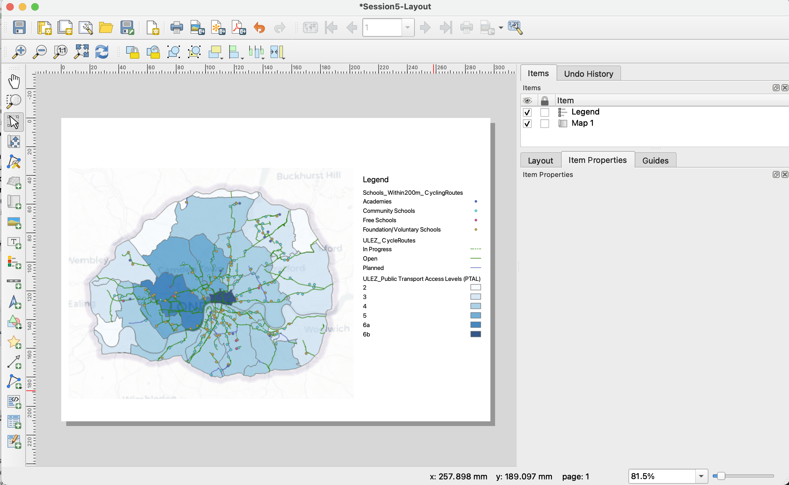
Let’s fix this. First, change the Arrangement to Symbols on the left. Then, you can use the Edit selected item properties to change the names of your legend items and make them more legible (no underscore for instance). Make sure you frequently press the Save project button to save your changes.
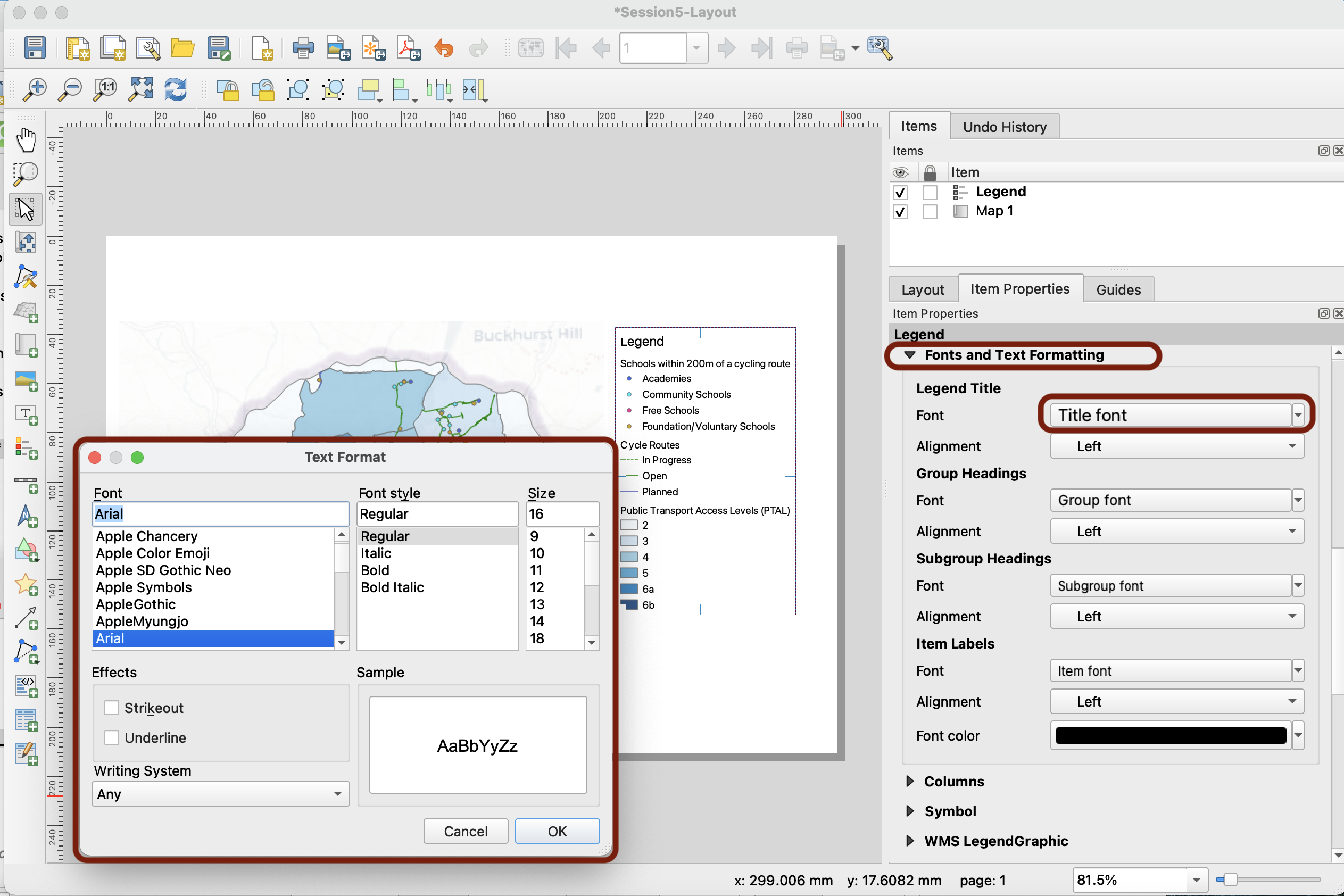
Next, move on to the Fonts and text formatting section (below the legend items). If you want to change the font type and size, you can do so by clicking on each type of font:
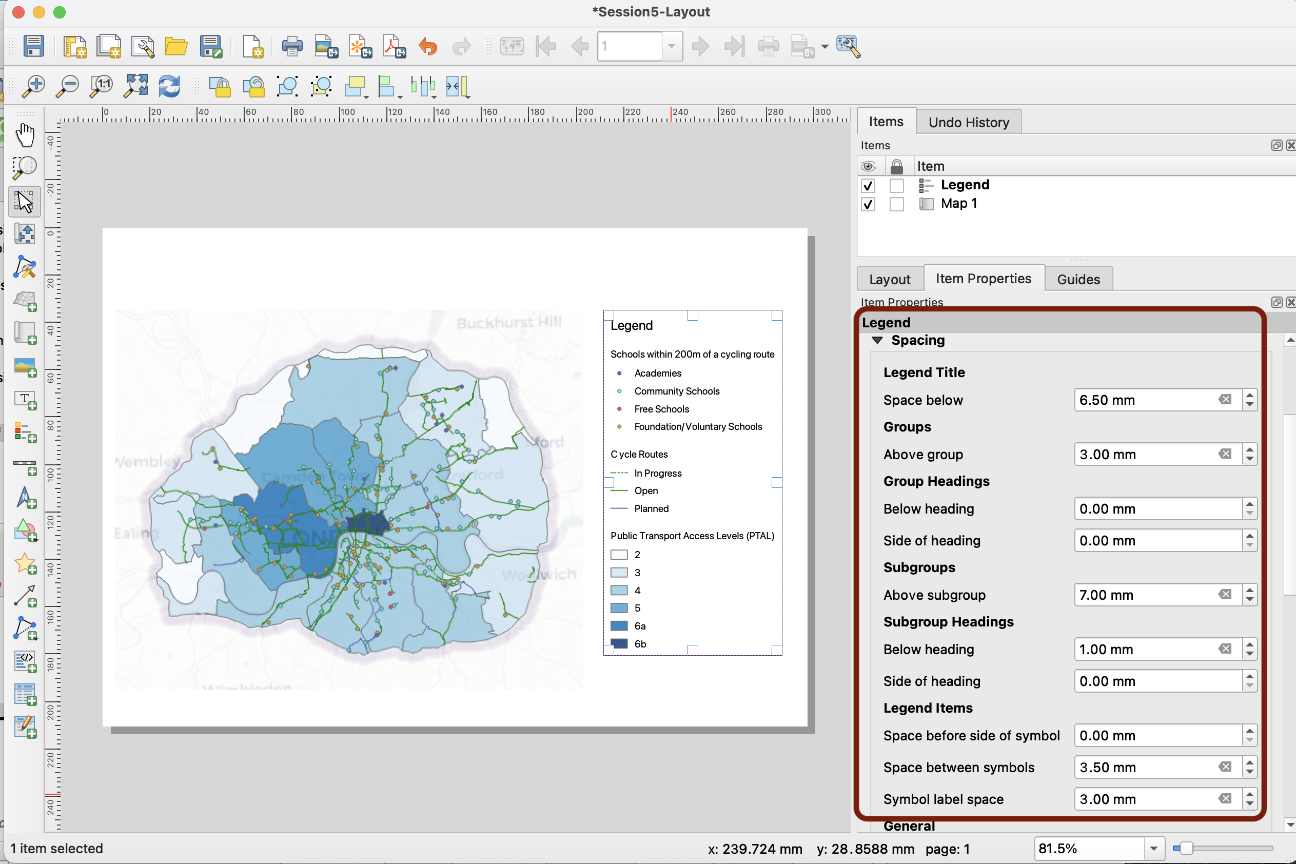
What we want to do here is add spacing between our items. You can access the spacing properties in the Spacing section, and adjust the spacing as you feel fit.
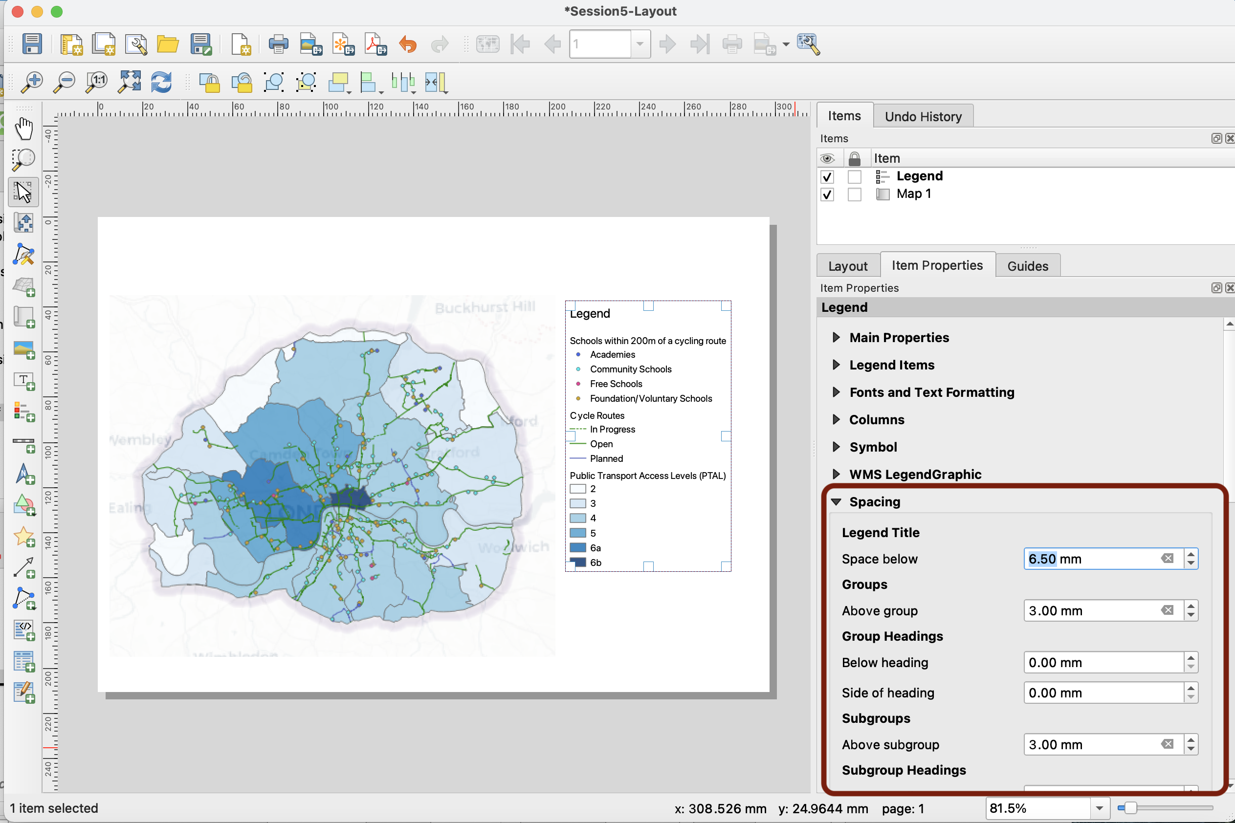
For instance, you may want to increase the space between subgroups, under the legend, around the symbols:
You can also add a frame and a background colour:
5.3 Adding other map layout elements
North Arrow
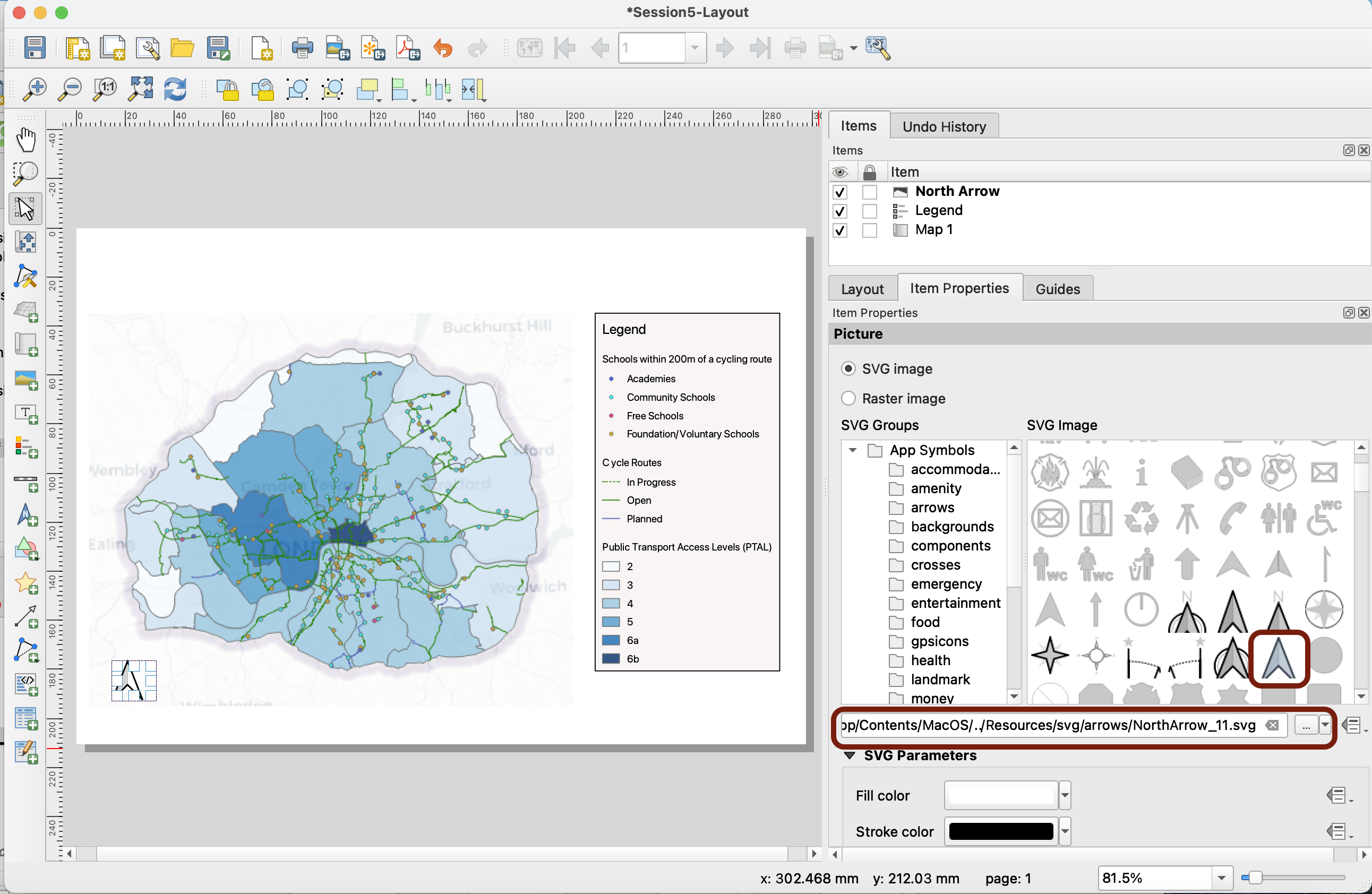
Now let’s add a north arrow. This is the same principle again; press the Add North Arrow icon, and draw a box to add it to your layout.
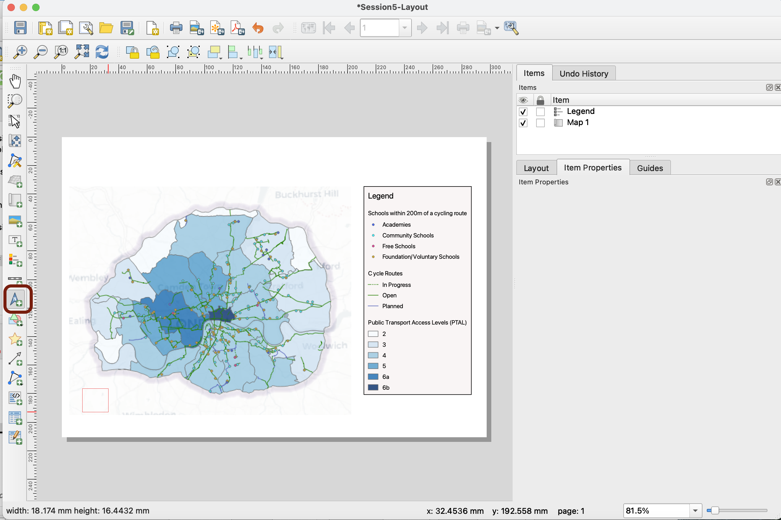
You can pick the symbol you like. If you wanted, you could also use a different symbol from your computer (in vector or raster format) by navigating to its location. For now, we choose a simple symbol.
Feel free to shuffle the various layout elements position around until you find a good balance.
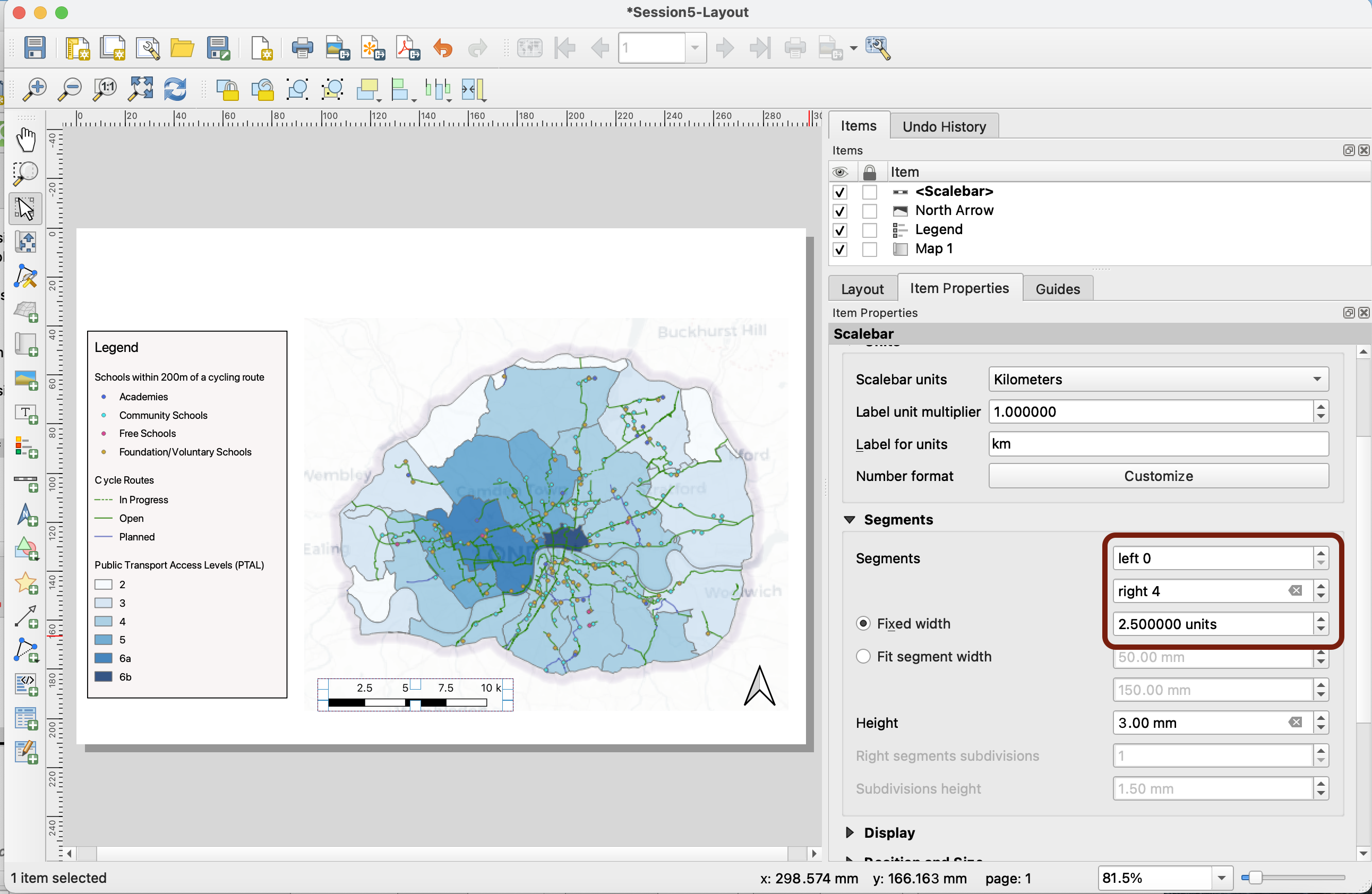
Scale Bar
To add a scale bar, again you can go in your Add items menu or pick the logo on the side, then draw a box. An important parameter is the type of scale bar; do you want boxes, lines, or just the RF number? Here, we’ll use Single Box.
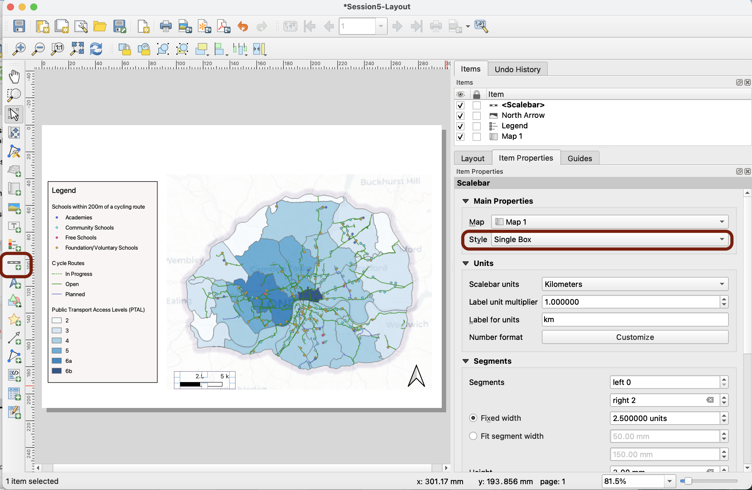
Keep km as your unit, and 2.5 km as a unit for each box. Increase the number of segments to the right to 4 so that you represent 10km:
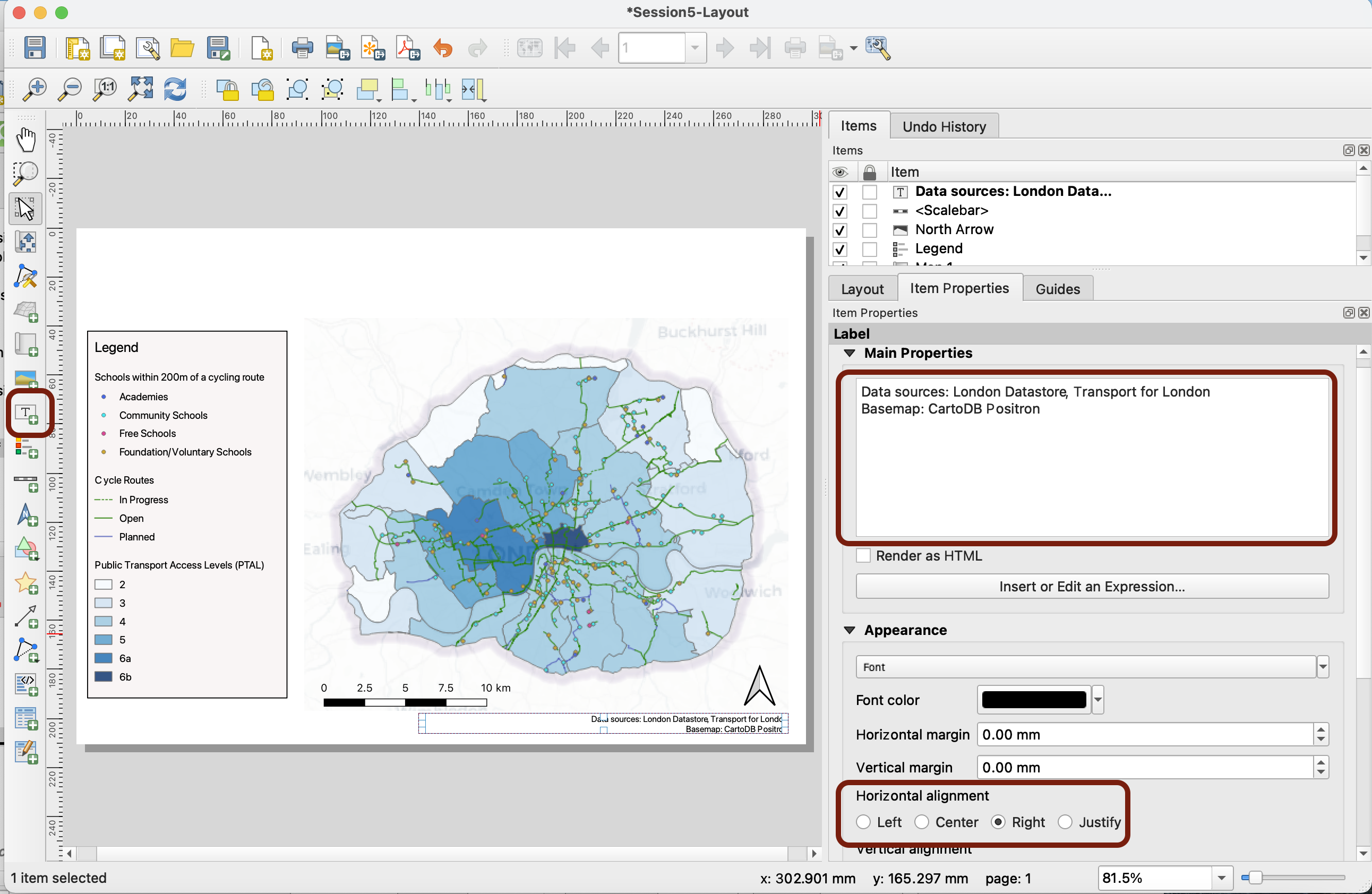
Data Sources
Use the Add label tool to add text. Here we want to add our data sources and credit the basemap.
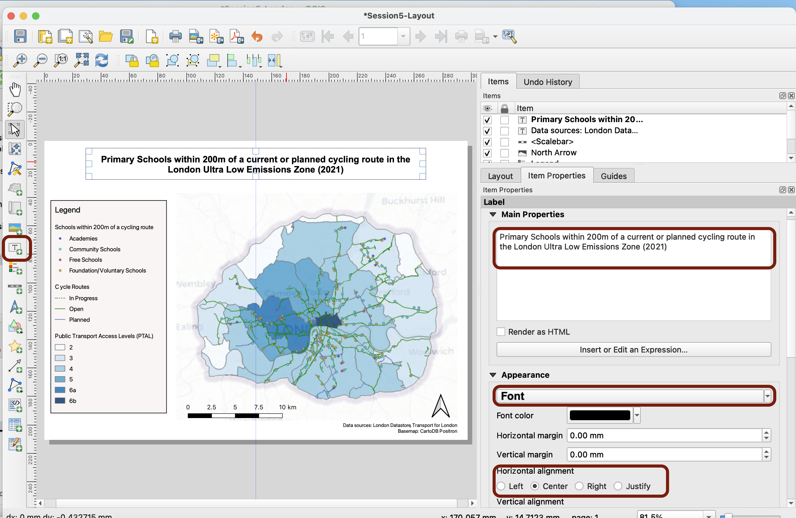
Title
Finally, let’s add a title! Use the Add label tool again. Let’s name this map: “Primary Schools within 200m of a current or planned cycling route in the London Ultra Low Emissions Zone (2021)”. You can click on Appearance > Font to pick a larger, maybe bold font. You can center the text, and you can also add a frame. Notice that if you drag the text box around, blue lines will point you to the centre of your page.
Make sure to save your changes.
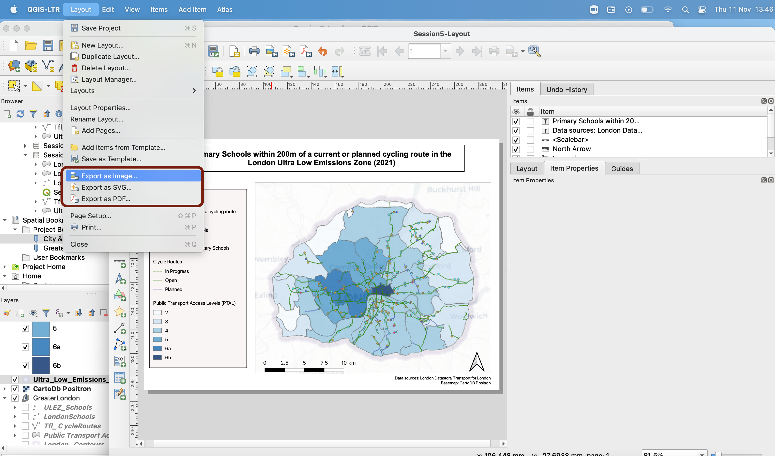
5.4 Exporting your map
Finally, it’s time to export your map! Simply go into your top menu Layout > Export as Image.... You can also export as PDF or as a vectorial format (SVG), but it’s the same process.
You may get an error message saying:
Some WMS servers (e.g. UMN mapserver) have a limit for the WIDTH and HEIGHT parameter. Printing layers from such servers may exceed this limit. If this is the case, the WMS layer will not be printed
This refers to the basemap we’re using. You can ignore it for now, close and continue.
Navigate to your working folder, give it a name and close. In the next Image Export Options window, you can keep the default options.
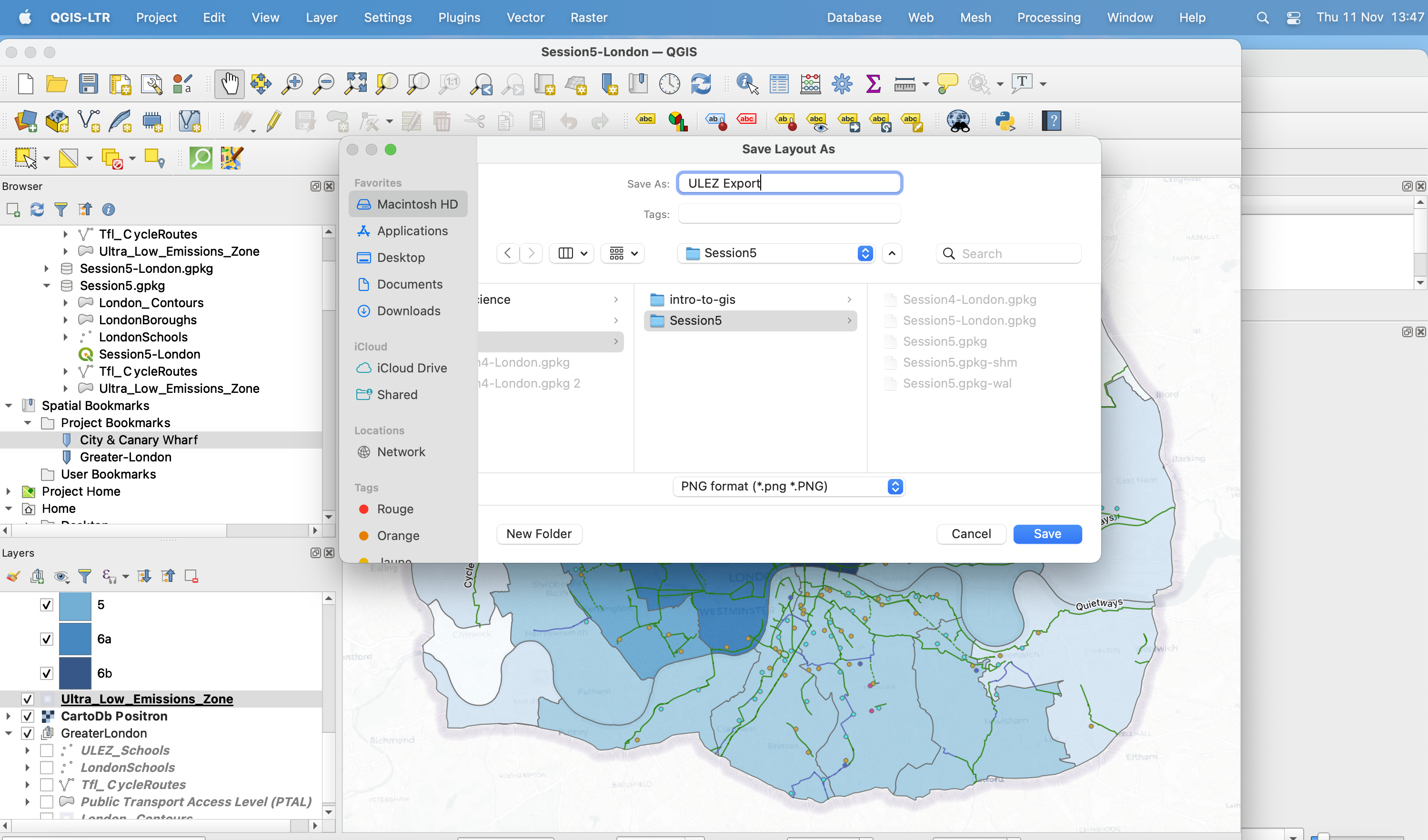
That’s it, you now have successfully exported your map!
Well done! This is it for this tutorial - in the final tutorial of this intro course, you will explore the link between socio-economic status and exposure to flooding in London.