Session 5 - MCDA & Weighted Overlays
23 Jan 2022Advanced GIS · Sciences Po Urban School
Lecturer: Raphaëlle Roffo
I. Session 5 Overview
Download the slides
- Environmental Justice and GIS
- Building a multi criteria analysis using GIS
- Weighting criteria and working with scores
II. Tutorial
2.1 Goals:
- Using the QGIS Graphical Modeler to build a replicable model
- Using the high resolution Population density HDRxFacebook dataset
- Defining Selection Criteria
- Reclassifying data
- Assigning weights to the criteria
- Determining final score
2.2 Context
Suitability analysis (aka Site Selection) is a very common and powerful type of GIS analysis. The goal of a suitability analysis is to identify the most optimal place for something to be located. The most common approach to suitability analysis is raster-based and consists in overlaying multiple layers representing different criteria each, assigning them relative weights, and recombining those criteria into a single suitability score.
Let’s consider this scenario:
London population is set to increase from 9.03 million in 2021 to 10.11 million by 2036 (source: Greater London Authority). How can we ensure decent standards of living for this additional million dwellers ?
Research suggests that proximity to green spaces has a strong positive impact on communities’ physical and mental health. In particular, outdoor playgrounds have been proven to increase children’s capabilities and to significantly improve their behavioural and social skills (Brussoni et al, 2017). As seen with the Covid-19 lockdowns, living within walking distance from such parks seems all the more important to the wellbeing of urban communities and especially young children with no access to a private garden.
We also observe that land allocation in central London is not always optimal, with a considerable amount of brownfield (land that was previously developed but is no longer in use). This is not optimal from an economic, social and environmental perspective.
Literature suggests that conversion of brownfield into green spaces is a very efficient way to lower soil pollution and tap into formerly unutilized land to generate positive social impact on local communities. (Vitiello, 2008; Grenstein & Sungu-Eryilmaz, 2004; Adorjàn et al, 2015).
In this tutorial, our research objective consists in identifying brownfields that are suitable for regeneration into pocket parks with playground facilities, with the purpose of having the greater positive impact on children.
2.3 Set up the project
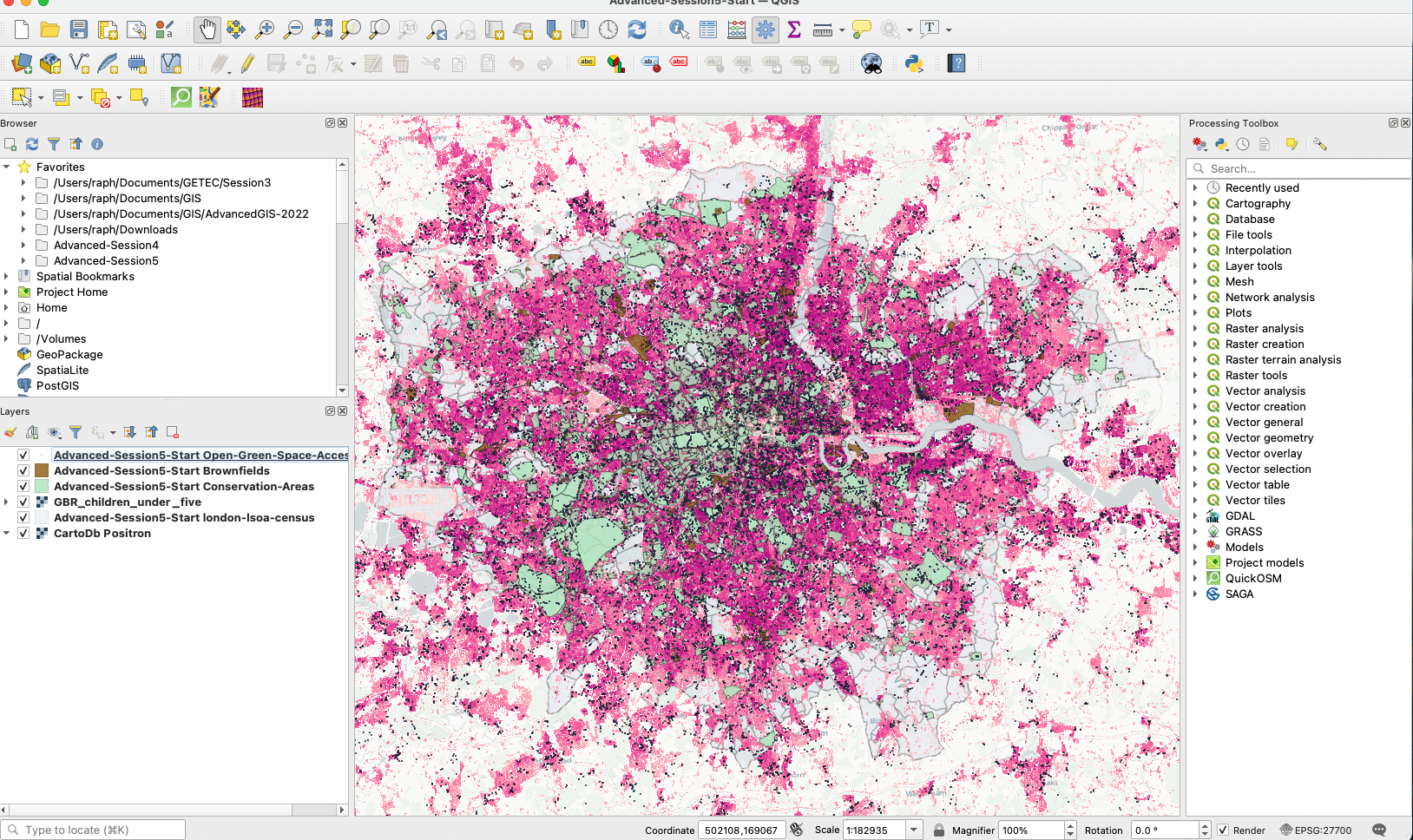
Create an Advanced-Session5 folder and add it to your favourites in your QGIS Browser. Set your CRS to EPSG:27700, because we will be focusing on London. Add a basemap of your choice - for instance CartoDB Positron - to your map canvas. If you do not have basemaps under the XYZ Tiles section of your browser, refer to the Intro to GIS Session 3 tutorial to set it up.
2.4 Data Sources
Download the following datasets in your folder and load them onto your map canvas:
-
Brownfield Register: polygons of identified brownfield sites in London that are potential candidates to being redeveloped as playgrounds. Download the geopackage file.
-
High Resolution Population Density - Children under 5: Download the
Children Under 5geotiff dataset, because we want to maximise the number of children with access to the pocket parks. You can learn more about the methodology here. -
From your Advanced GIS Session 3, your London LSOA layer with Census join: We are interested in the variable
Census_Child Benefit;Total Number of Families Claiming Benefit;2013, because we want to maximise the number of children from low income familities with access to the pocket parks. -
Existing Open Greenspaces: We want to prioritize regeneration of brownfields that are far from existing green spaces. Download the
TQtile, which covers Greater London, as an ESRI Shapefile. Notice that the data folder you download contains a polygon layer (the actual open green spaces) and a point layer for the access points to those open green spaces (gates / entrance). We will actually use those points as our reference as they determine the accessibility of the green area more precisely. -
Conservation Areas: Conservation Areas are subject to planning restrictions and would require additional work to get a redevelopment project approved. We need to exclude those areas from our range of possibilities. Download the geopackage file.
Zoom onto the London area, apply some basic styling (use singleband pseudocolour for the population density geotiff),and save your project as Advanced-Session5.qgz.
In case you are stuck with the setup, you can also launch the project using this geopackage + your downloaded population dataset GeoTIFF.
2.5 Set up the right CRS
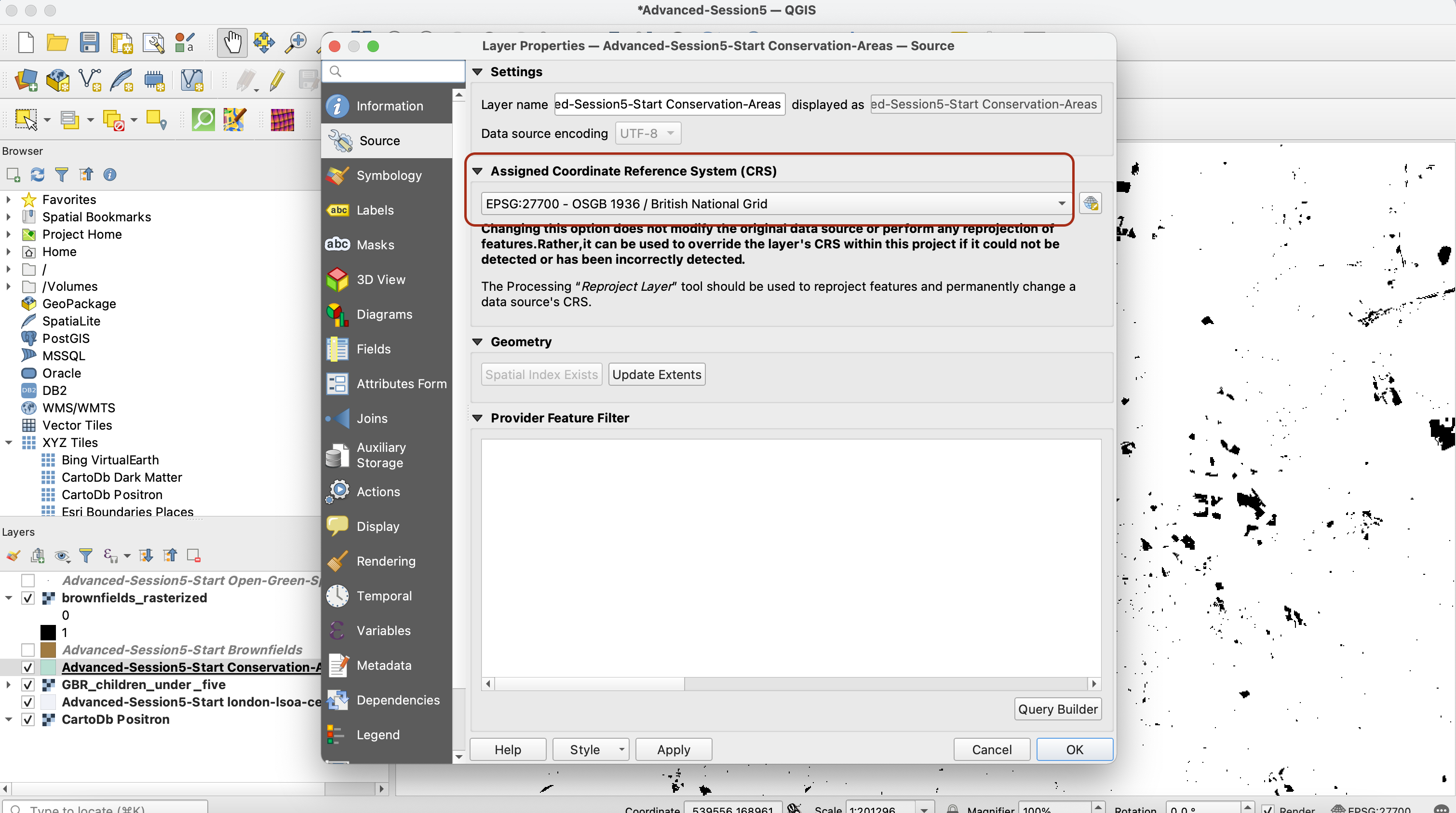
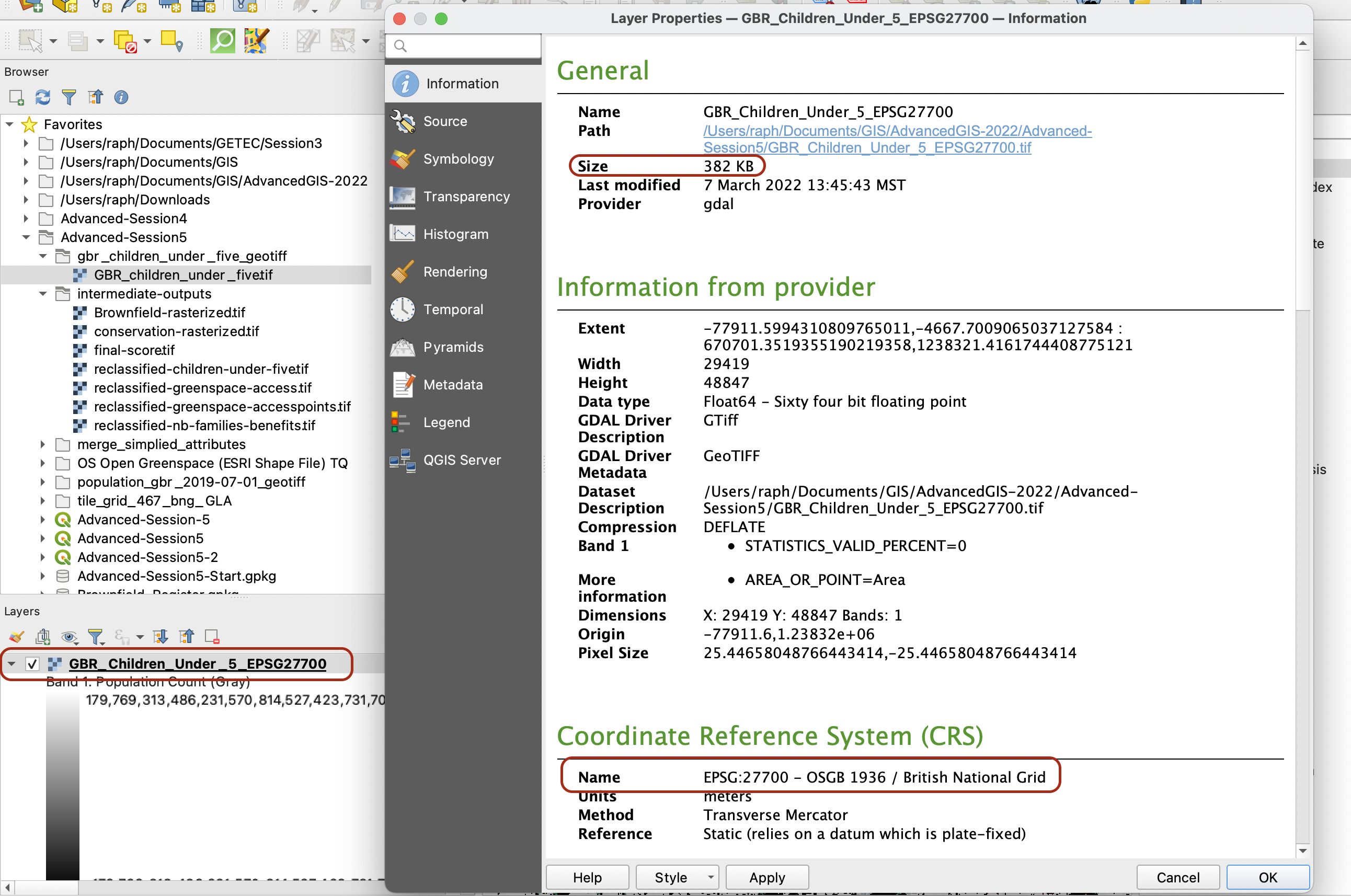
By default the Conservation Areas layer may not have a CRS. Double-click on this layer to access its properties > Source and make sure you set it up to EPSG:27700!
Next, and this is absolutely crucial for the rest of the analysis, you need to reproject the raster dataset so that its CRS is set to British National Grid (EPSG:27700). When you add a layer onto your map canvas that is set to a different CRS, QGIS does this on the fly for you so it appears like the layer is in the correct CRS. However, when we use the modeling tool that we are going to use in the next section, you technically don’t go through the step of adding the layer onto your canvas, so you need to have your layers all set the proper CRS “for good” (not just on the fly). In other words, we are going to save a copy of this dataset, reprojected in the British National Grid CRS.
In your processing toolbox, look for the tool Warp (reproject) in GDAL’s Raster Projections toolbox (if you wanted to reproject a vector layer you’d use the Vector general > Reproject Layer tool).
Set up the tool parameters so that you reproject your population grid raster from WGS84 to British National Grid. Take this opportunity to use the Advanced Parameters to reduce the size of the dataset by using a High Compression profile. This will perform an algorithm that will reduce the size of your raster dataset without compromising on the resolution or level of details.
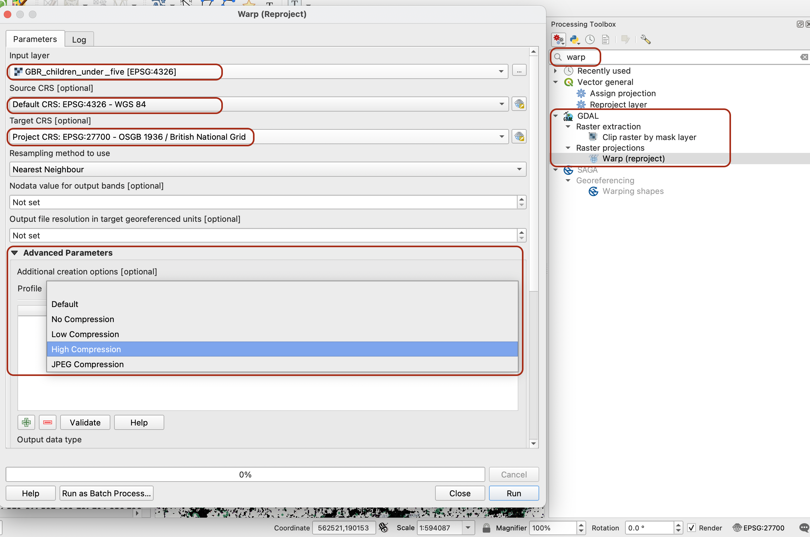
Make sure to set a location to save your file as GeoTIFF. When you run the tool, it may raise some warning messages in red - that’s ok, wait for the tool to run completely.
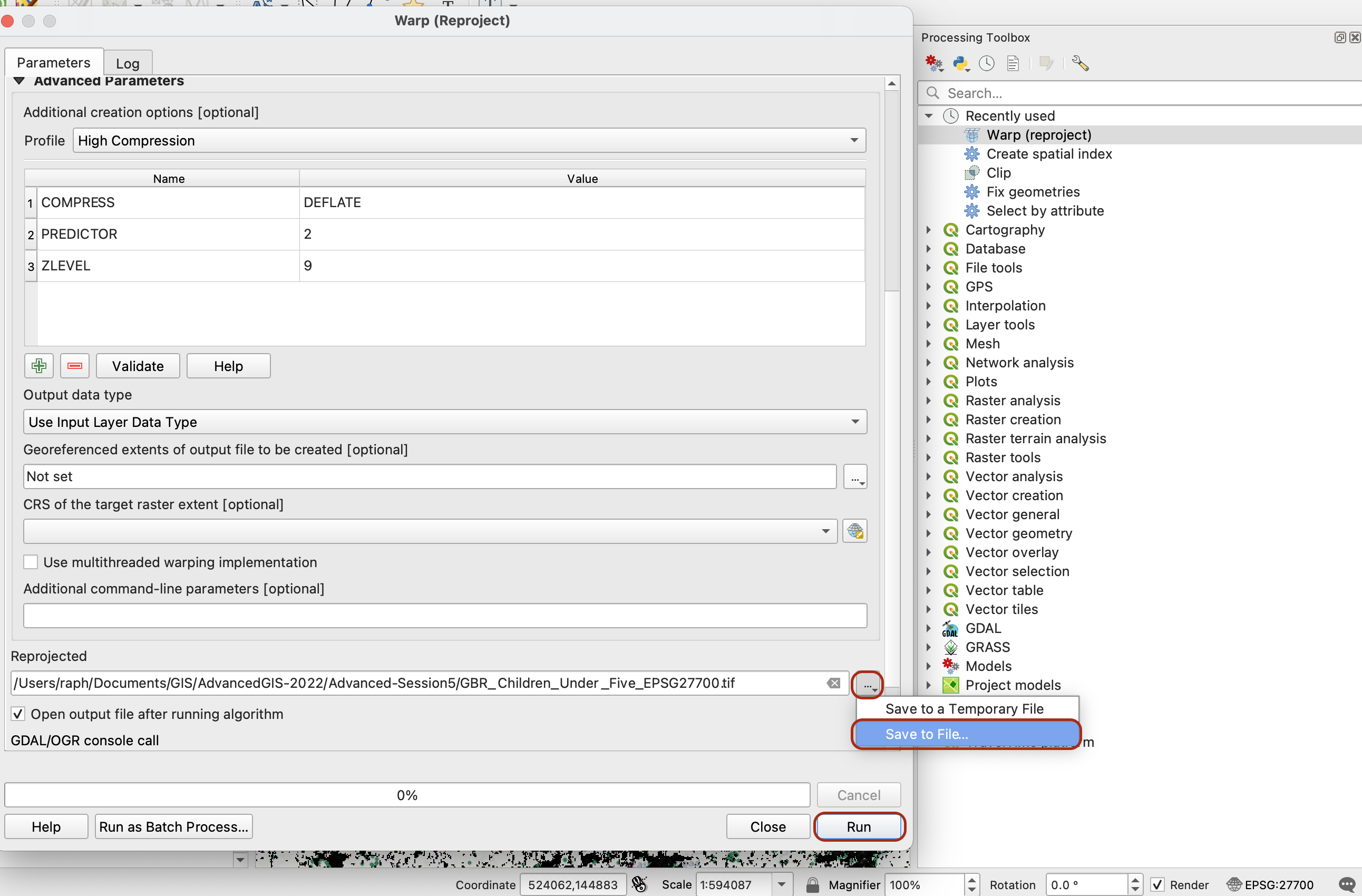
If you explore the layer that was just created, you may notice that the size of your dataset was reduced from 107Mb to 382kb, and that the dataset now comes in British National Grid (EPSG27700).
III. Model setup
3.1 The QGIS Graphical Modeler
The QGIS Graphical Modeler is the equivalent to the ESRI ArcGIS “Model builder”. It allows you to clearly take inputs, run them through algorithms of your choice (= geoprocessing tools, raster analysis tools, basically anything that is available to you through your Processing Toolbox) and produce outputs. One advantage of the Graphical Interface is that it allows you to replicate your workflow and automate the run of your model. This is very useful, for instance, if you realise you want to change input but apply the exact same methodology. Or if you want to edit one parameter of one of your algorithms to re-run your entire analysis. It makes repeating, tweaking, iterating through a workflow much easier.
It can be accessed through your top menu Processing > Graphical Modeler... or in your Processing Toolbox by clicking on the cogs icon > Create new model.... Either way, a new window opens:
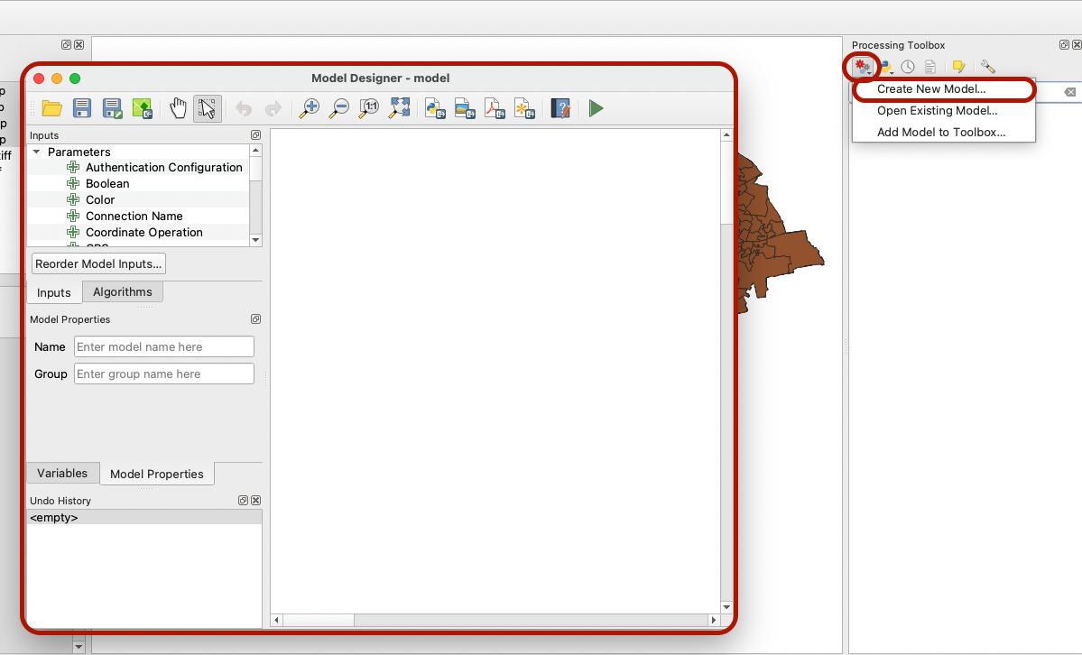
In the top toolbar of that window, hover over the different icons. The first set of icons help you open an existing model, save your model, save your model to your project. The second allows you to pan across / select / undo or redo actions / zoom in and out of your model overview. The next set of icons enables you to export your model as a Python script or as an image/PDF/SVG. Finally, the book icon lets you write some help documentation for your model, and the green triangle can be clicked to run your model.
Give a name to your model and a group (For instance, Pocket_Park_Selection in a Suitability_Analysis Group).
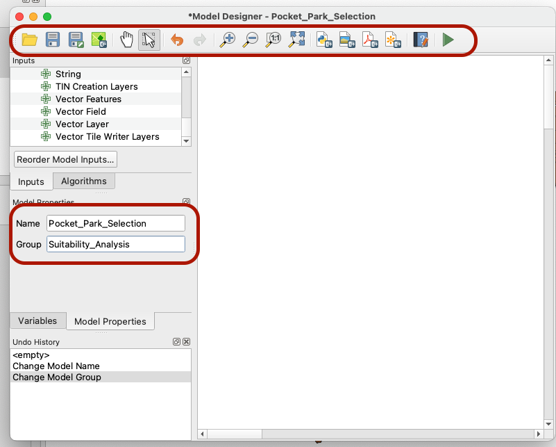
Then, click Save as... to save your model, then click the icon to save it to your project too.
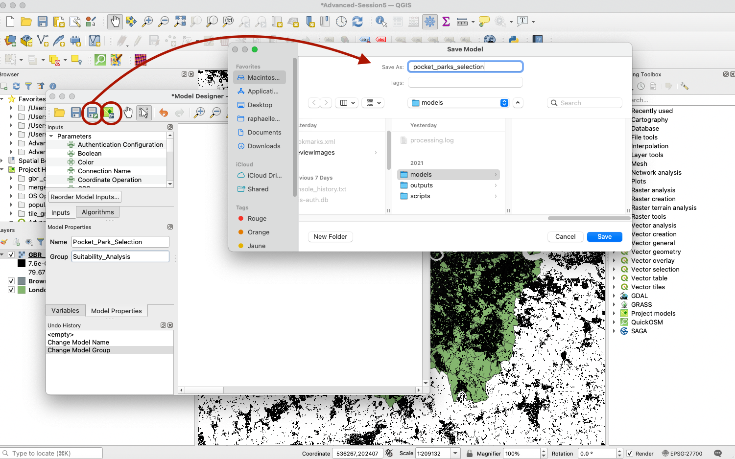
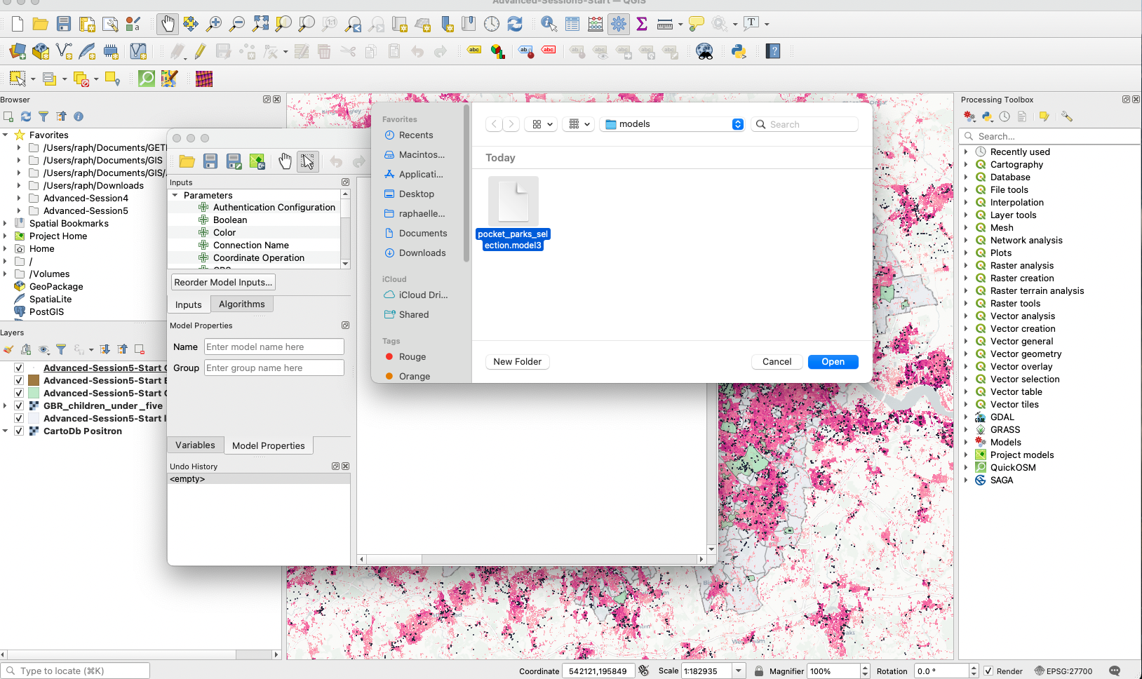
Note that if you close this window and don’t find your model when you reopen that window, you can use the Open Model... icon to retrieve it. Remember to save your changes frequently.
3.2. Clipping workflow for your population density raster
3.2.1 Add a raster input for your population density grid layer
As a first step we want to clip our population density grid for children under 5 to the extent of our London LSOA layer.
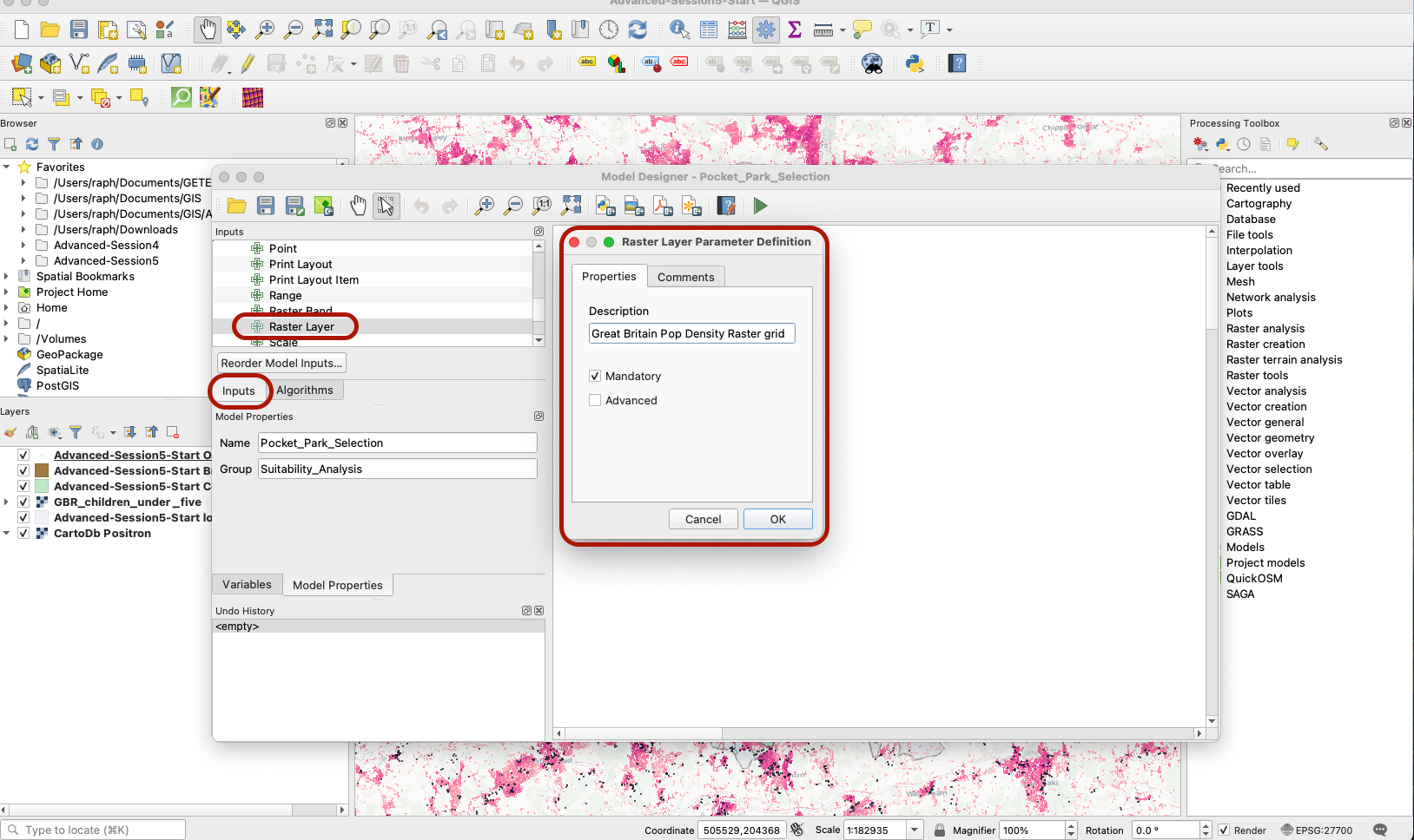
In your Graphical Modeler interface, click the tab Inputs and have a look at the available parameters. Drag a Raster layer onto your modeling area. Give it a descriptive name and make sure it’s a mandatory input into your model.
3.2.2 Add a vector input for your LSOA layer
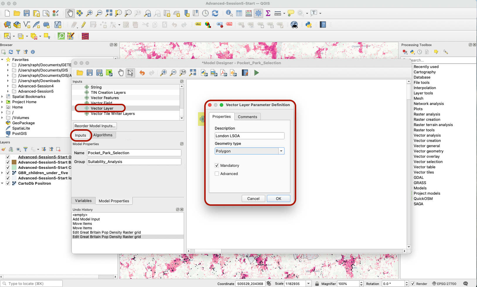
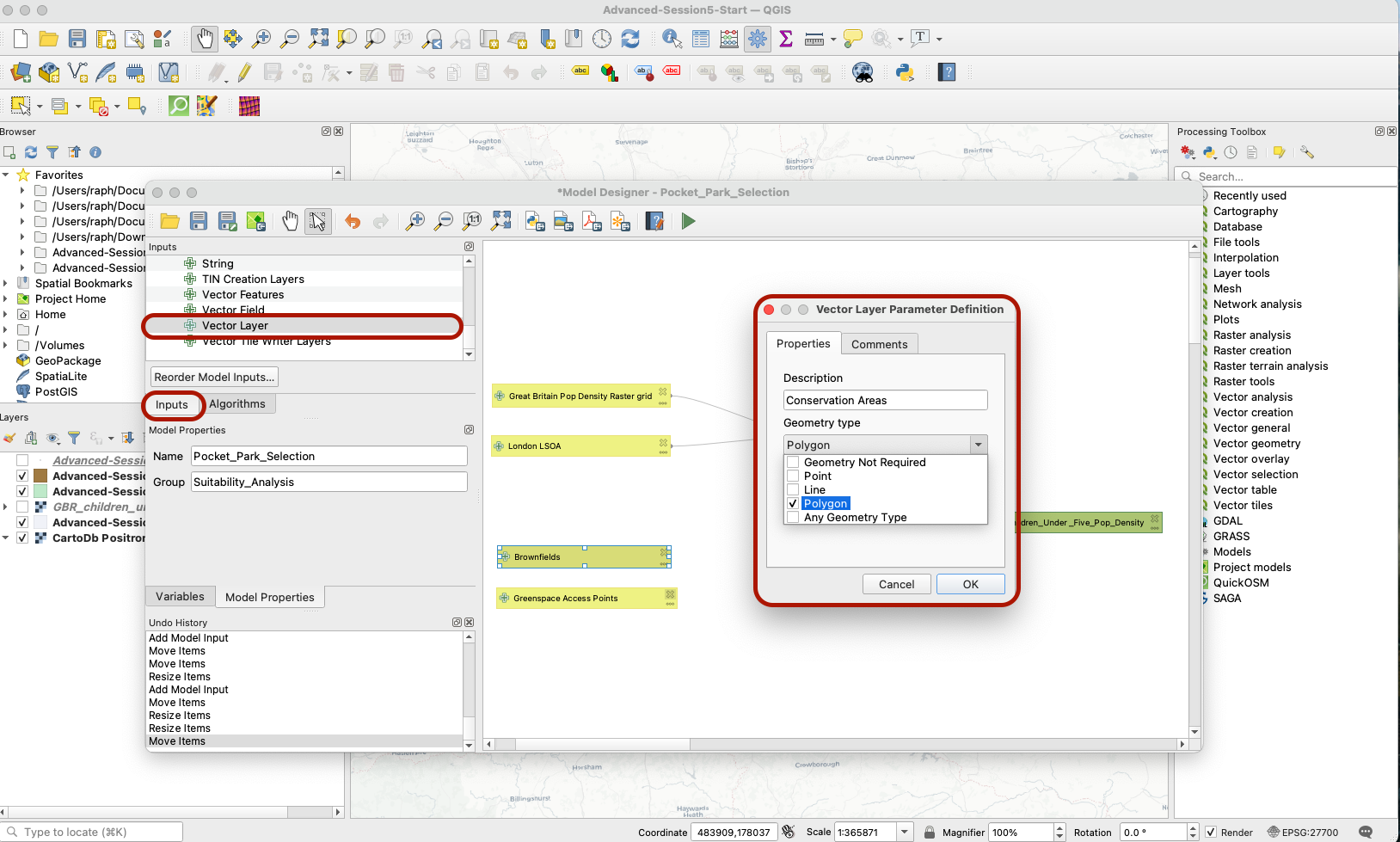
In order to clip this layer to the London extent, we also need to feed the London LSOA layer into our model. In the parameters, click Vector Layer. Add a layer called London LSOA of type Polygon, and make sure it’s a mandatory input.
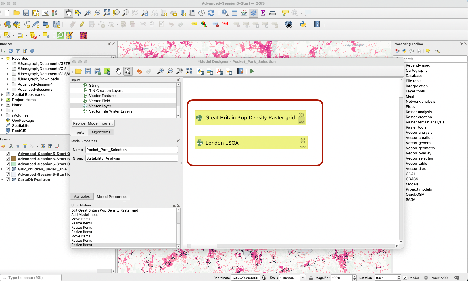
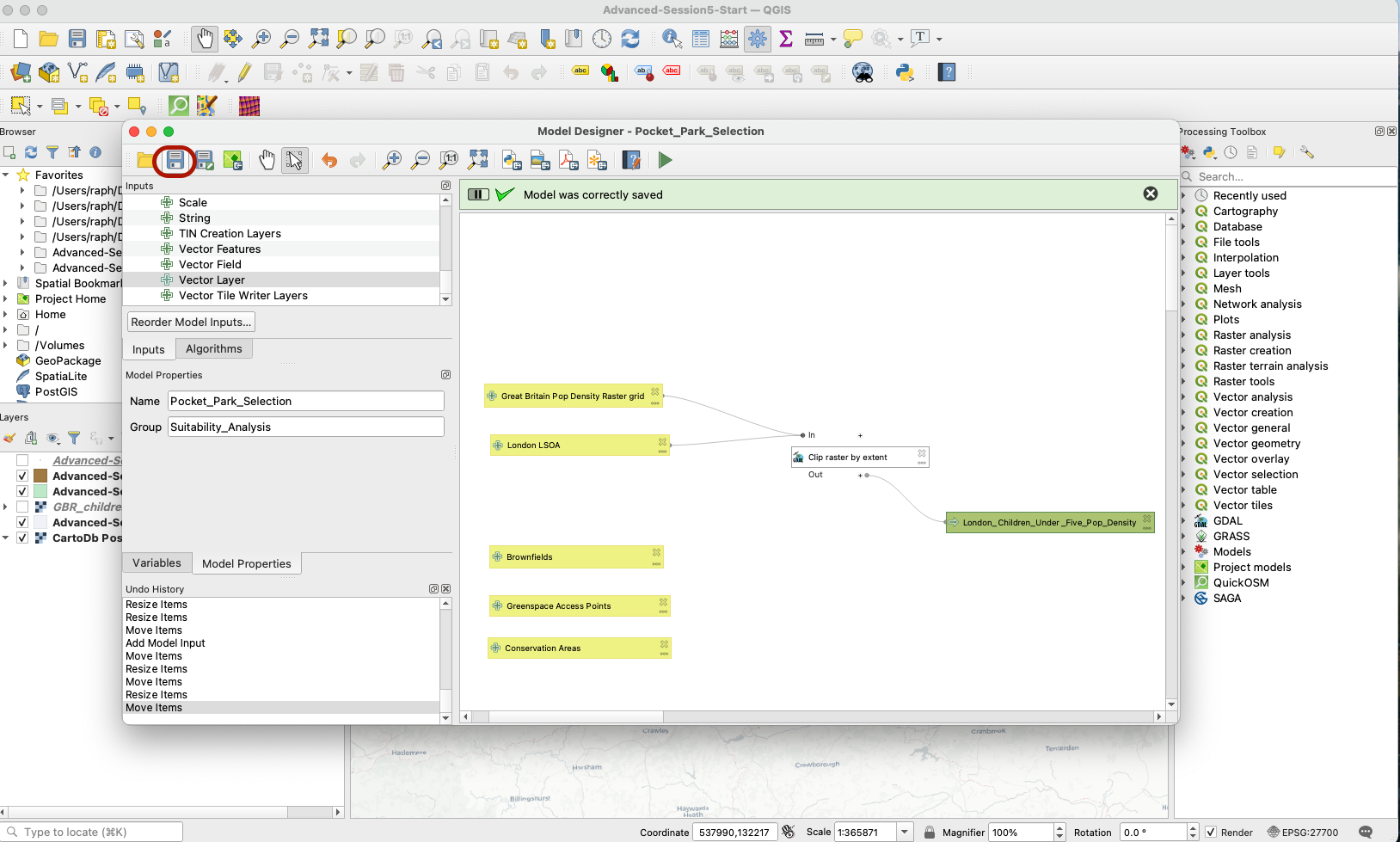
Your two layers are now ready to be processed. Press the Save button (you might need to “overwrite” your existing model in its saved location - go ahead). Note that so far QGIS does not know which layers you are actually referring to, you are just creating the pipelines for your analysis.
3.2.3 Clip the raster to London extent
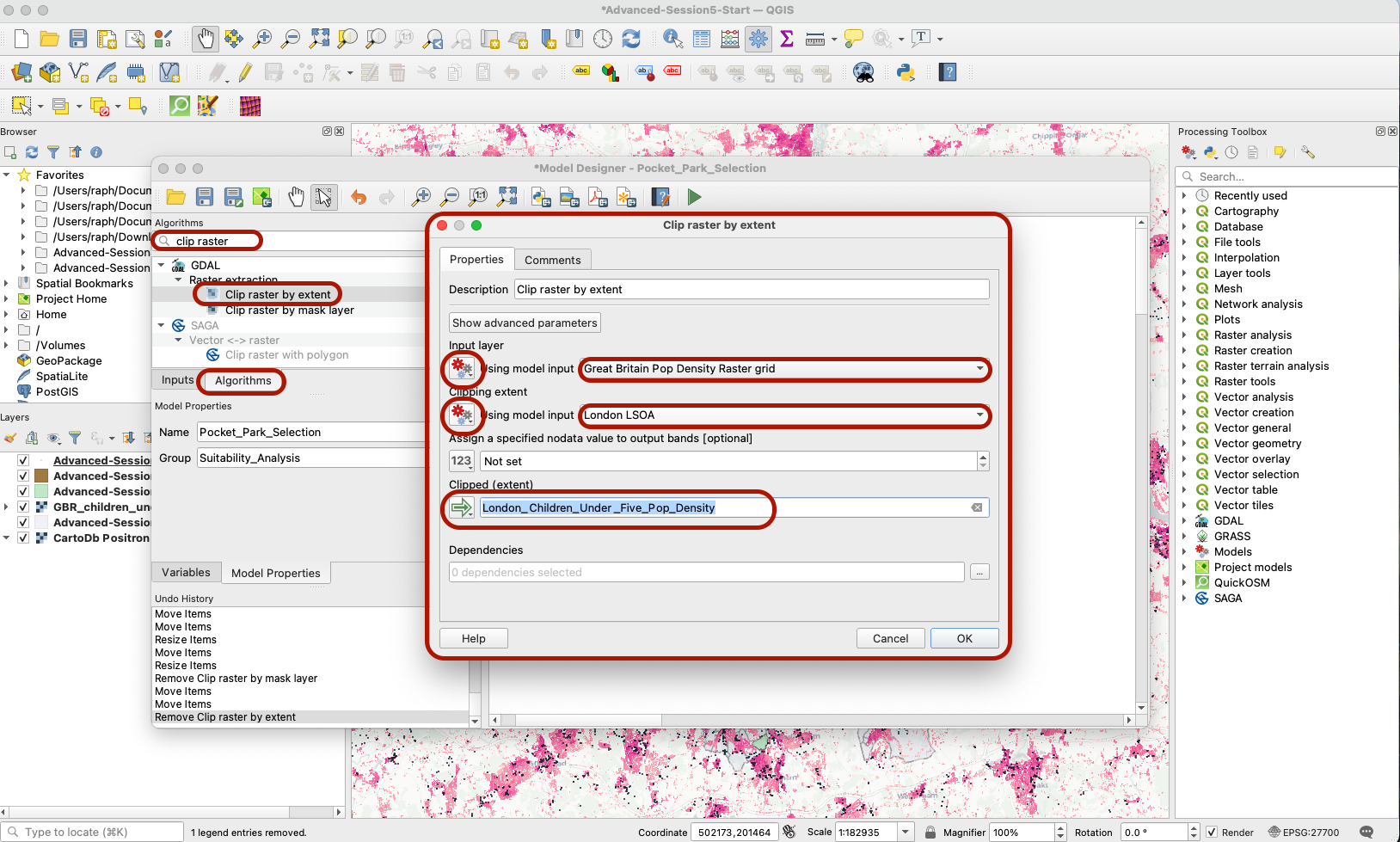
Next, click on the Algorithms section and search for “Clip raster by extent”. Drag that on your modeling area, to the right of your two input layers. A pop-up window opens (make it bigger by pinching the corners of that pop up window).
- Set your Input layer to a Model Input (click on the
123icon to change the type of input), and pick yourGreat Britain Pop Denisty Raster Grid. - Do the same with your Mask layer: set it as Model input
London LSOA. - Give your output a name:
London_Children_Under_Five_Pop_Density - You can ignore the dependencies section for this one (more on this in the next sections).
Once you’ve pressed OK, a new box for your algorithm appears, along with a green Output box (your clipped raster layer).
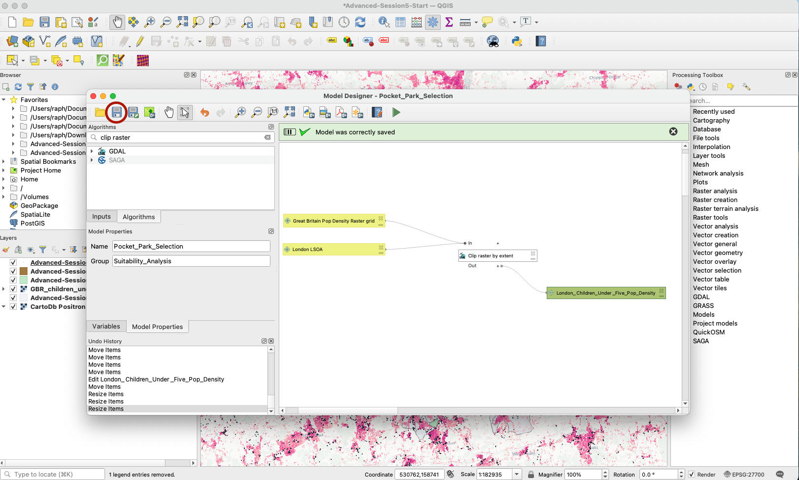
3.2.4 Try running your clipping workflow
You now have a simple workflow that takes two inputs and returns one output. Let’s try to run that: press the green arrow (or F5 on your keyboard). A new pop up windows appears, with three parameters for you to fill: what layer should you use as your Great Britain Pop Density Raster Grid, and which one as your London LSOA, and do you want to save your output on your computer? (for now it’s ok to just save as temporary file / scratch layer, because we are testing the outputs of that step in our model)
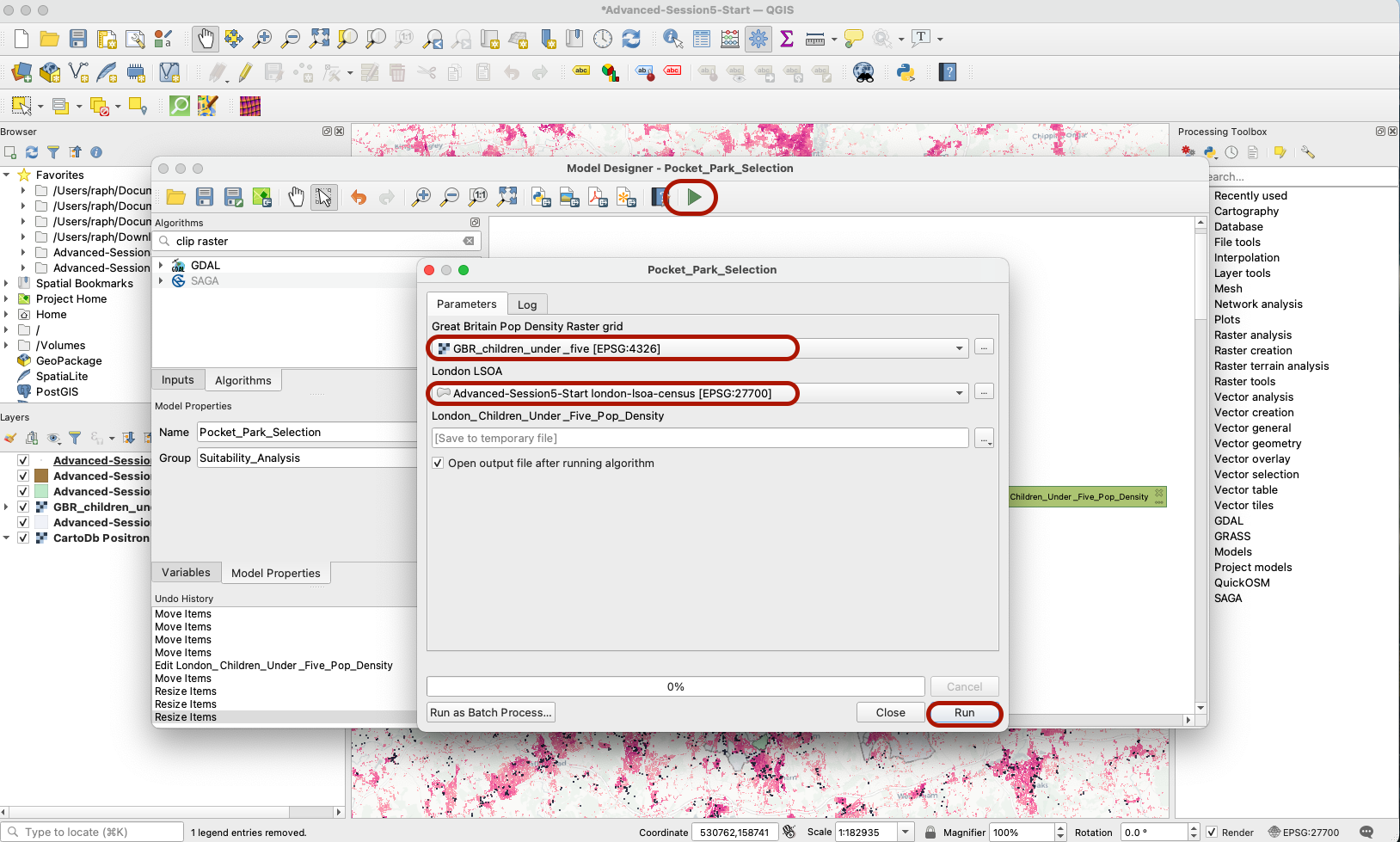
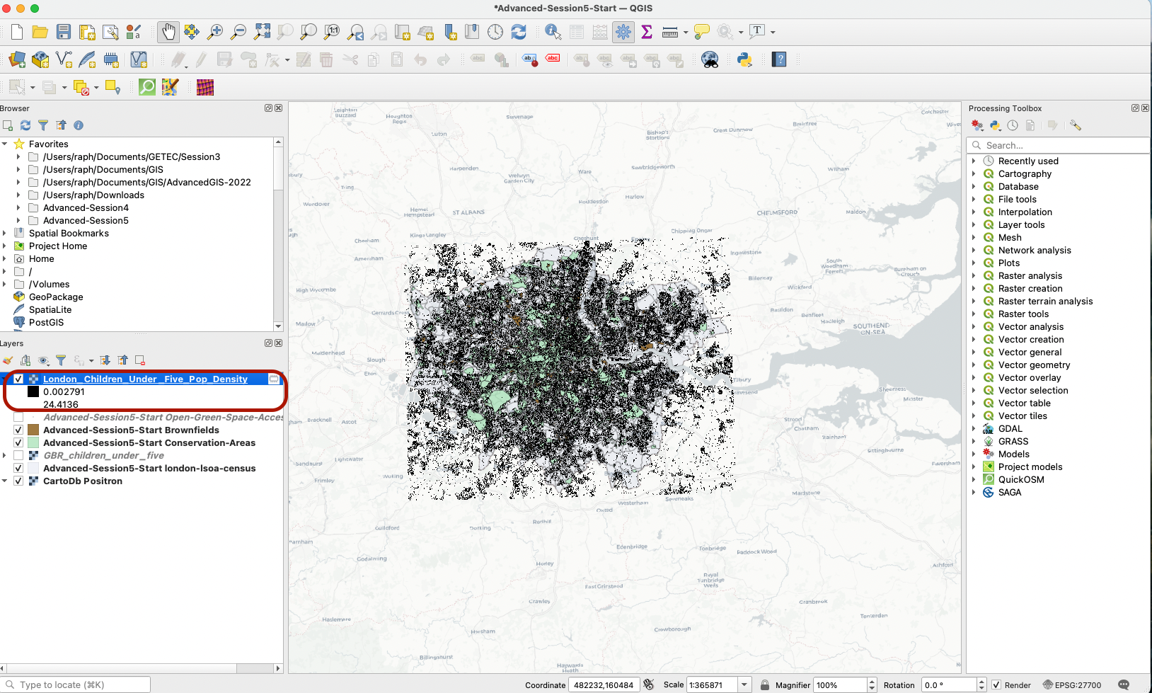
You can see that your model ran successfully and produced the outpur layer you wanted, clipped to a bounding box that represents the extent of London boundaries (a raster grid that ranges from the minimum to the maximum x and y values in the London LSOA layer). You can remove that layer and go back to your Graphical Modeler.
3.3 Create Input layers for the remaining parameters in your pocket parks suitability analysis
We need to make sure the remaining parameters in our pocket parks suitability analysis are loaded into our model. Click the Inputs tab and add three new Vector layer inputs for:
- Brownfields (polygons - mandatory)
- Greenspace Access Points (points - mandatory)
- Conservation Areas (polygons - mandatory)
Save your changes. Your inputs are now ready to be pre-processed to become usable as selection criteria.
IV. Data pre-processing & reclassification
We are using a raster approach in this analysis so we first need to turn all of our layers into raster scores.
4.1 Brownfields
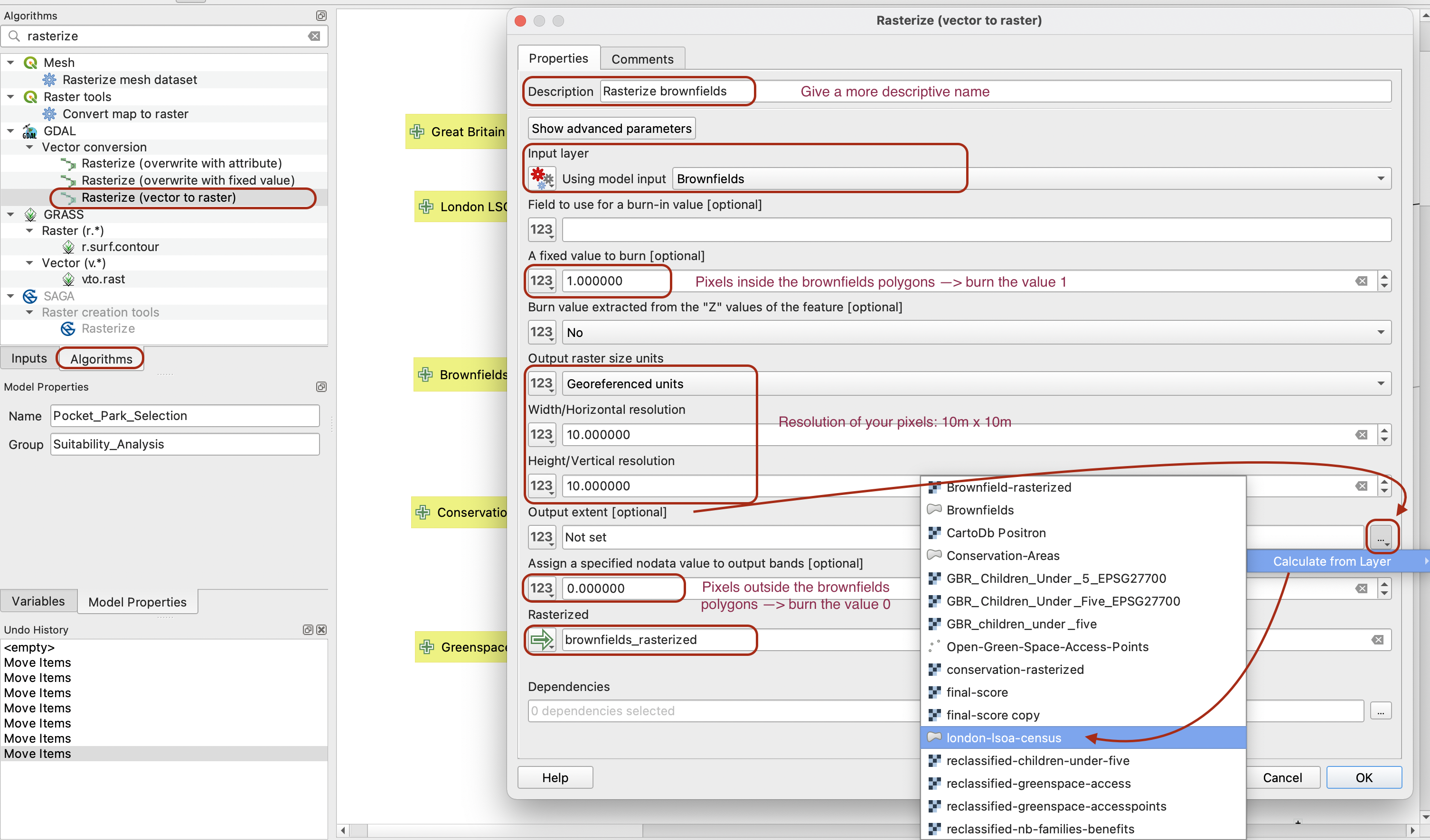
The first layer we want to reclassify is the brownfields. Our criteria here is simple: is a pixel in or out of a brownfield. If the site is not a brownfield we will not consider it as a possible option so we will assign those areas a value of 0. Brownfield areas will be assigned a value of 1. Because our layer is a vector polygon layer, we first need to rasterize it. We will “burn” the value 1 on pixels that overlap the brownfields, and the value 0 elsewhere.
The help page gives you more information about each parameters.
In your algorithm tab, search for the tool Rasterize (vector to raster). Use the following parameters to burn 1 where the brownfields are and 0 elsewhere. Note that the resolution parameters will determine the size of your pixels: here 10 meters (meters are the georeferenced unit in projected coordinate reference systems like British National Grid). Make sure to pick your London LSOA layer for your output extent using Calculate from Layer.
Let’s check that your tool is running properly. To do so, save your model and run it. You can also right click the Clip tool and temporarily deactivate it, that way you are only running your rasterize tool and not the entire model.
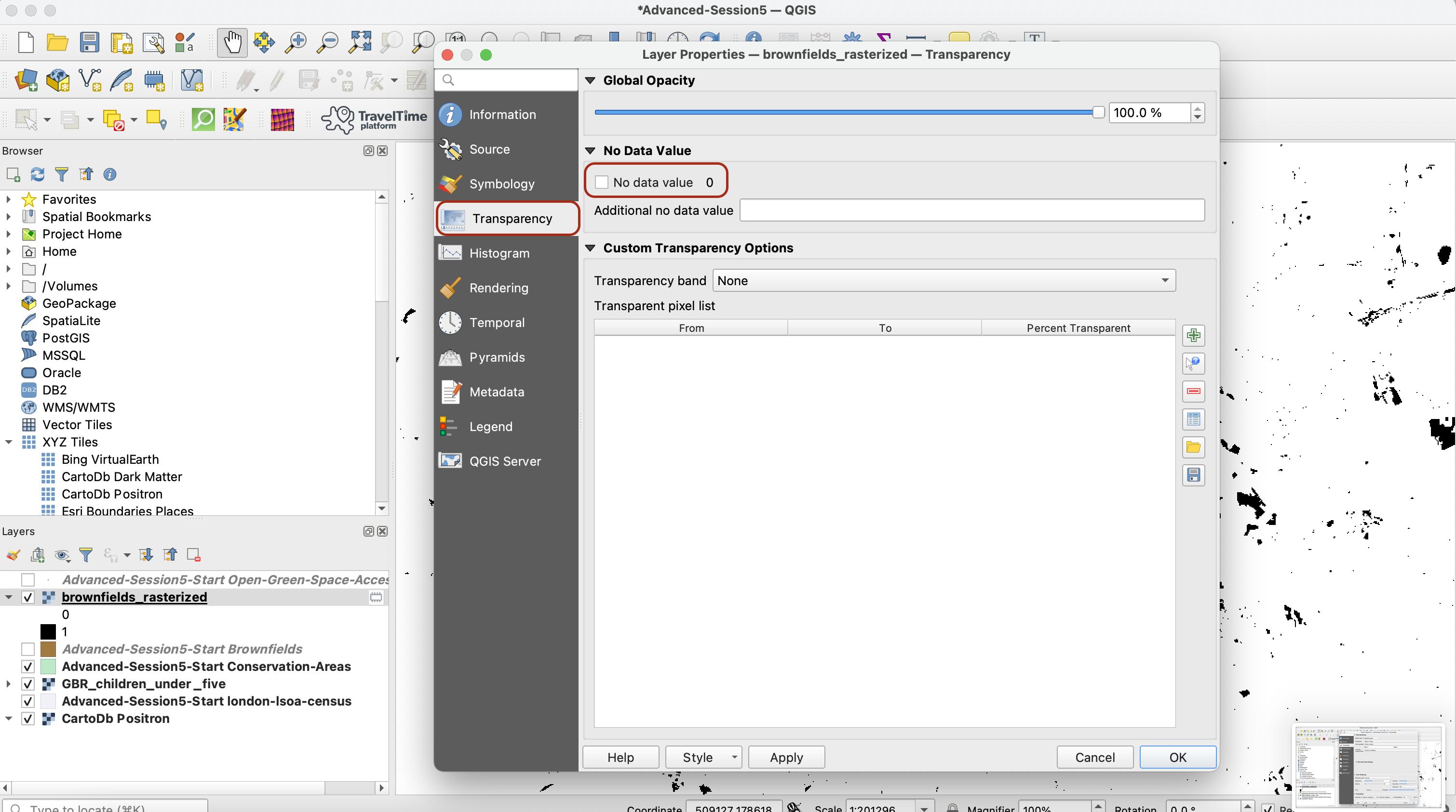
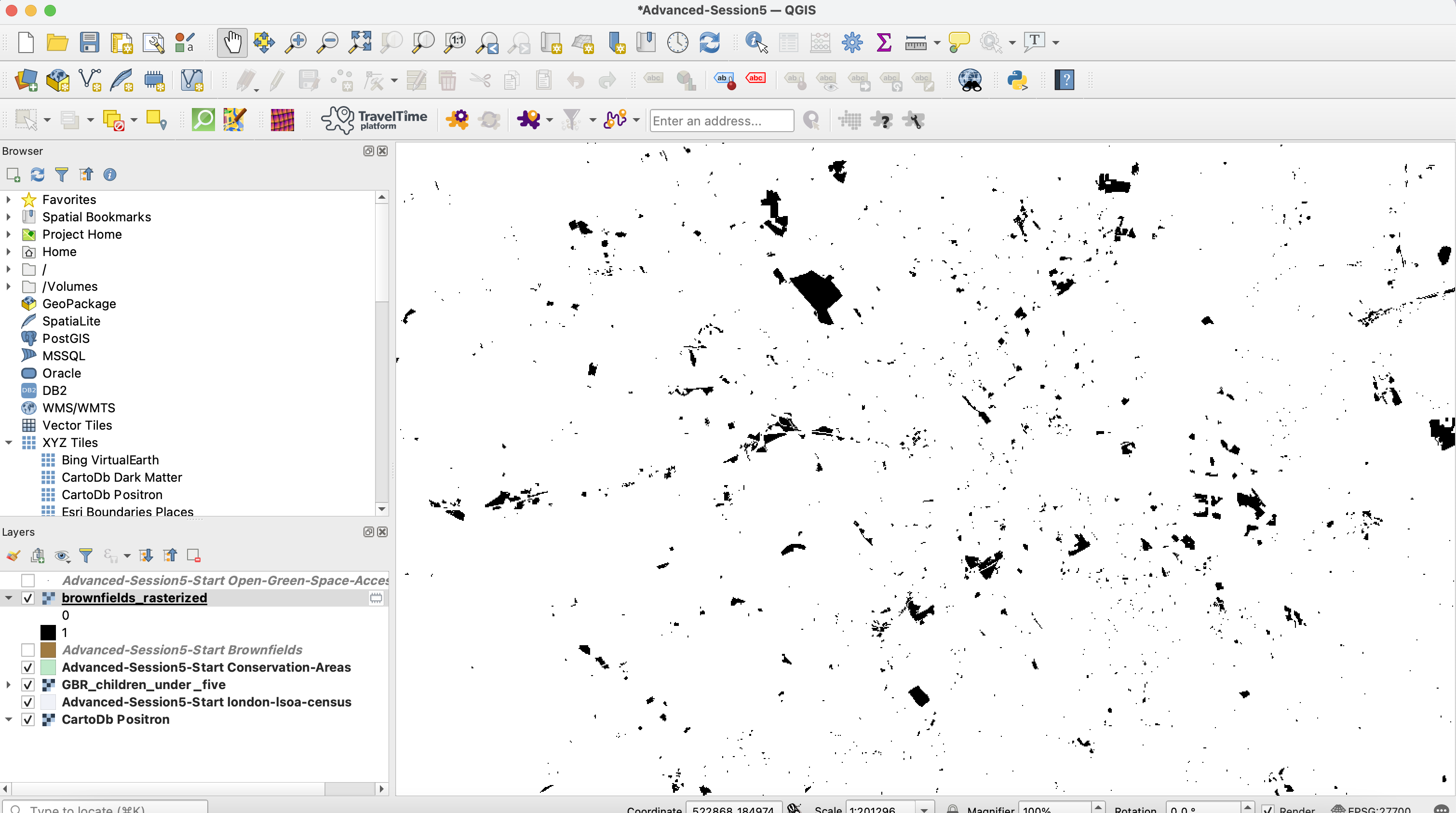
If you try to run the model, you will get a new brownfields_rasterized layer on your map canvas, but the symbology is probably off. Double-click it and in the symbology, set the min value to 0, max value to 1 and the colour ramp to be white to black. This ensures your brownfield areas (pixels of value 1) are represented in black and the rest in white).
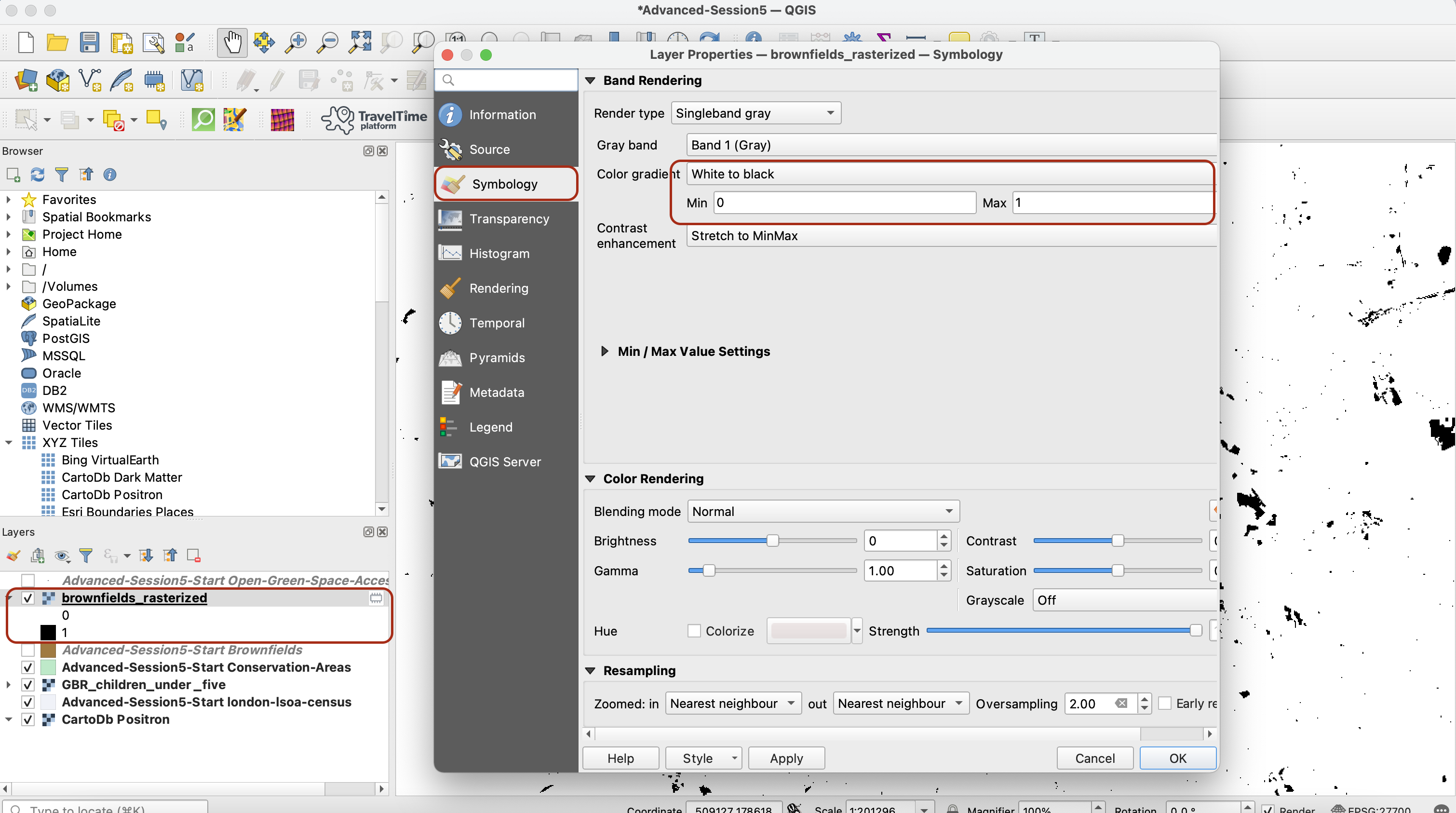
You can also choose, in the Transparency tab, to untick the box No data value 0. When this box is ticked, it makes the raster cells are equal to 0 transparent. If you untick it, it makes them white.
You can now check on your canvas that the rasterized output does match your original vector layer by toggling it on and off. This is good, so we can go back to our model.
Troubleshooting:
/!\ When you run this tool you may (or may not) run into a memory error in red that signals you’ve hit a memory limit on your computer. This is generated when you have exceeded the amount of data held in memory. You can try saving your changes, closing QGIS and reopening it and you should now be able to run the tool smoothly.
4.2 Conservation Areas
We want to run a similar process with the conservation areas, except this time our criteria is that we want to exclude from our analysis the areas that are conservation areas. This means that this time we will burn the value 0 if a raster cell overlaps a conservation area, and the value 1 otherwise.
Drag the Rasterize (vector to raster) tool onto your modeling area and fill it using the parameters below. Note that you can also give it a more descriptive name such as “Rasterize Conservation Areas”:
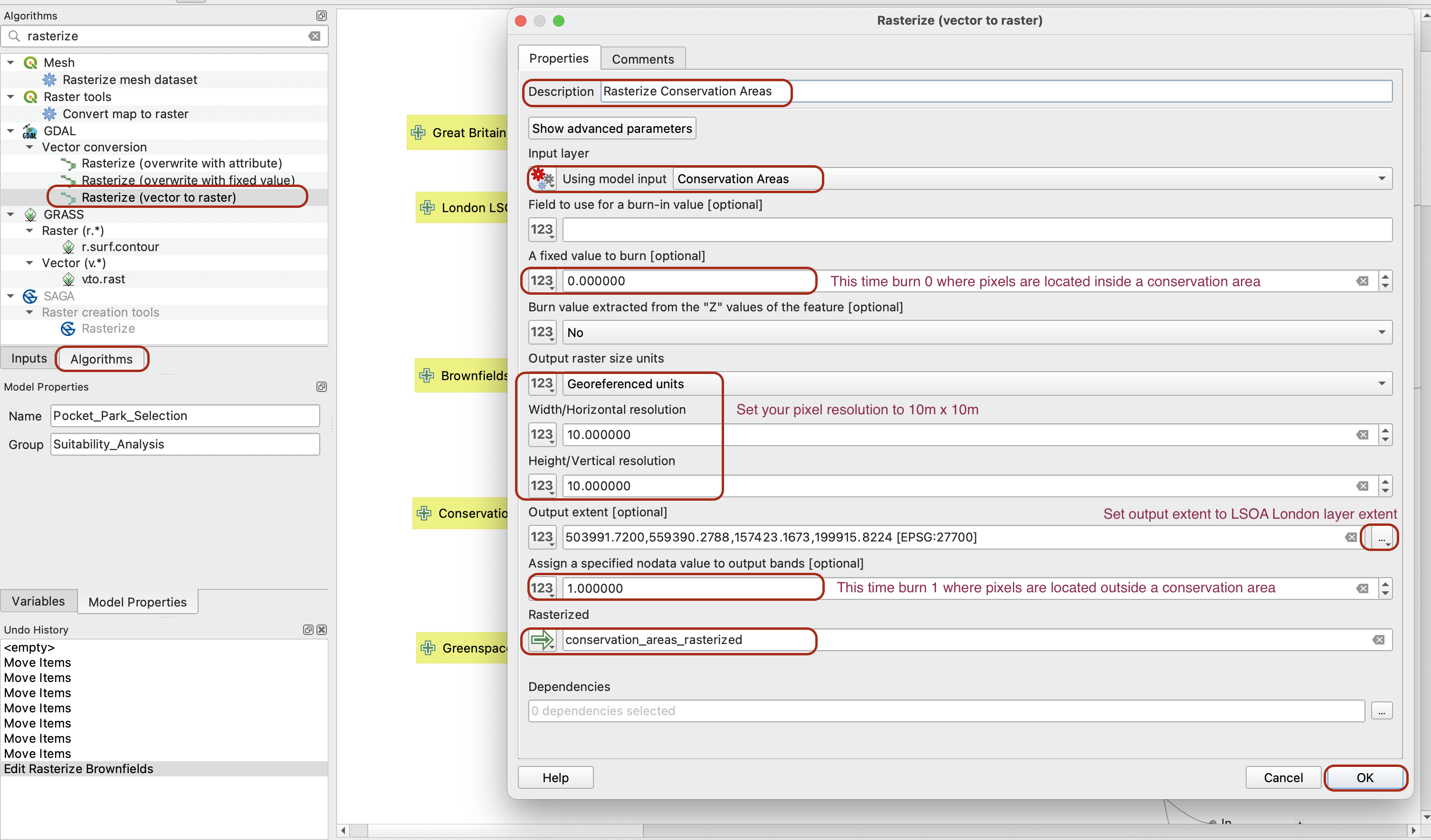
Again if you want to get a sense check of whether your tool runs as intended you can run your model (maybe deactivating the other algorithms for now) and explore the layer produced. Set the min value to 0, the max to 1, and maybe the colour scale to be from Black to White:
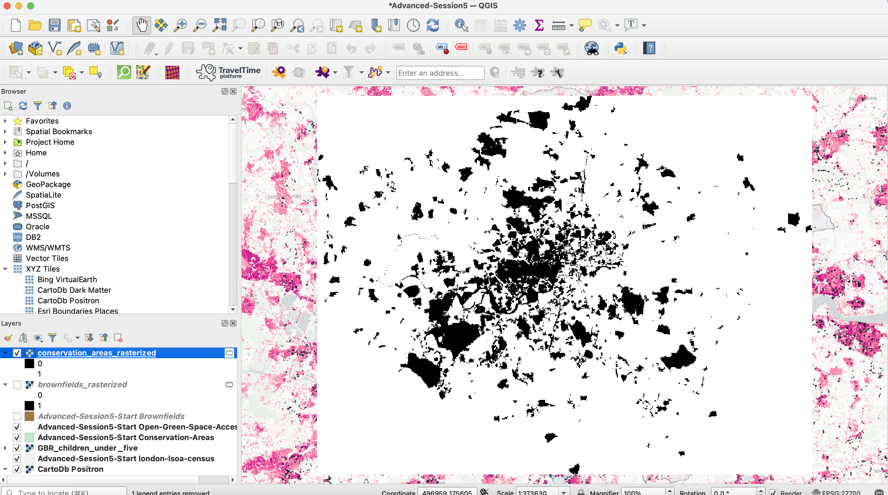
It all seems good, let’s move on to the next layer.
4.3 Greenspace Access Points
Our greenspace access points criteria is a bit more elaborate: In the London Plan (Greater London Authority, 2016), small open spaces (less than 2 ha) have a catchment area of less than 400m. This means that if residents already have access to a greenspace within 400m, they might not be our priority target for providing an additional pocket park. Besides, using an average 4km per hour average walking speed for children (Muller, 2008), we can consider that residents living between 400m and 700m of a greenspace access point are still within 10minutes walk of a greenspace, but beyond 700m the distance becomes difficult to manage, especially with children. This is why our final criteria is;
- We exclude entirely (score of 0) areas located within 200m of an existing greenspace access point,
- We assign a score of 1 to areas between 200 and 400m,
- We assign a score of 2 for 400-700m
- We assign a score of 3 for areas beyond 700m of an existing greenspace access point
4.3.1 Rasterize the layer
Repeat the process of rasterization for your greenspace access points. Here we burn the value 1 on each of the access points, and 0 everywhere else. Pick the LSOA layer extent as your output extent, so that we reduce the extent of the layer to Greater London. We also use a pixel size of 1, to prevent a major slowdown in running the next algorithm. You can also change the Description, for instance to “Rasterize greenspaces”.
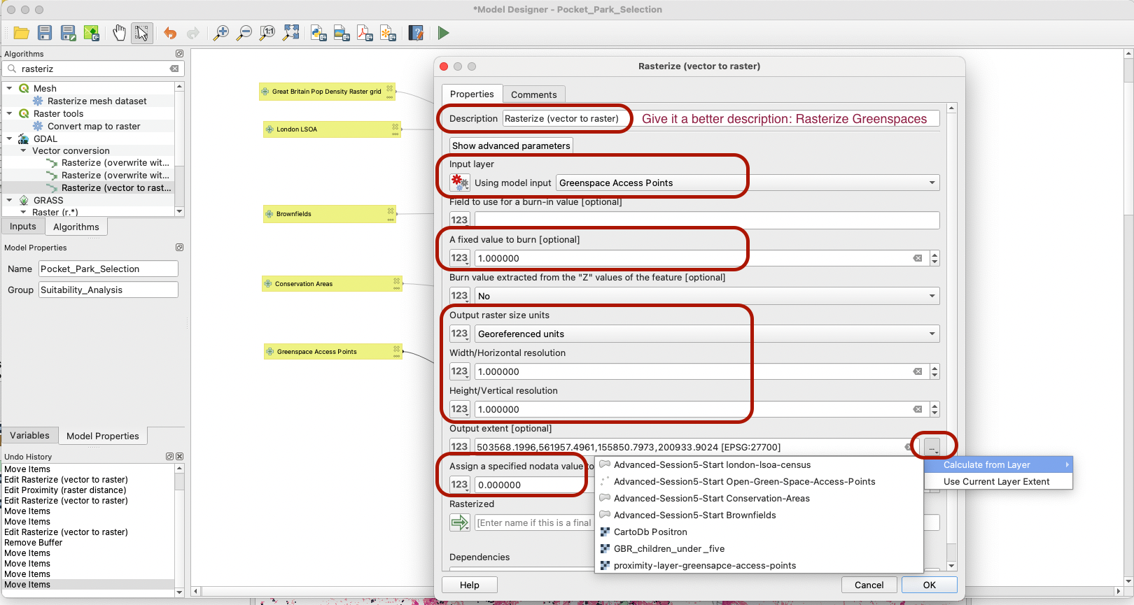
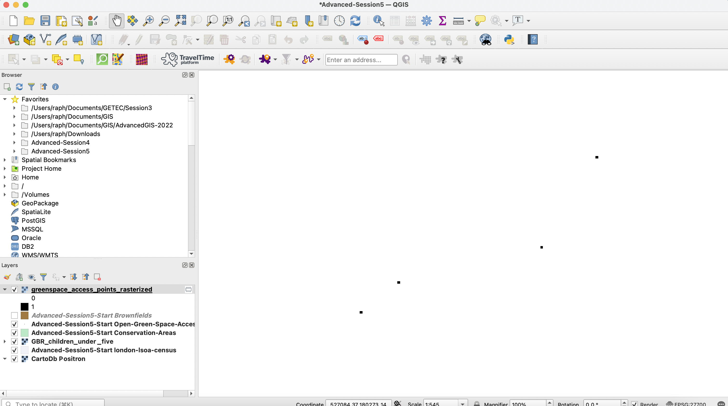
You can again do a sense check of whether your tool is working properly by running that algorithm (if you do so, make sure to specify a name for your output layer in the bottom parameters of your rasterize tool). The layer produced will be almost exclusively filled with 0 values, but you have to be very very zoomed in onto your greenspace access points to find the cells with a value of 1.
4.3.2 Proximity Analysis
Our selection criteria here is not just about the access gates though, but rather the distance to a greenspace access point. So one additional pre-processing step we need to take here is to use the Proximity tool to derive the distance from each access point (the raster equivalent of a buffer). This tool will look at each pixel of value 1 (access point) in the input layer, derive the distance to each of the other pixels, and then for each pixel of value 0, assign it the distance to the nearest access point (nearest pixel of value 1).
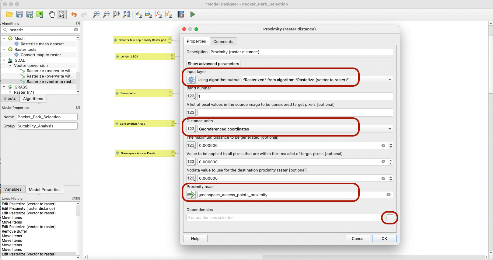
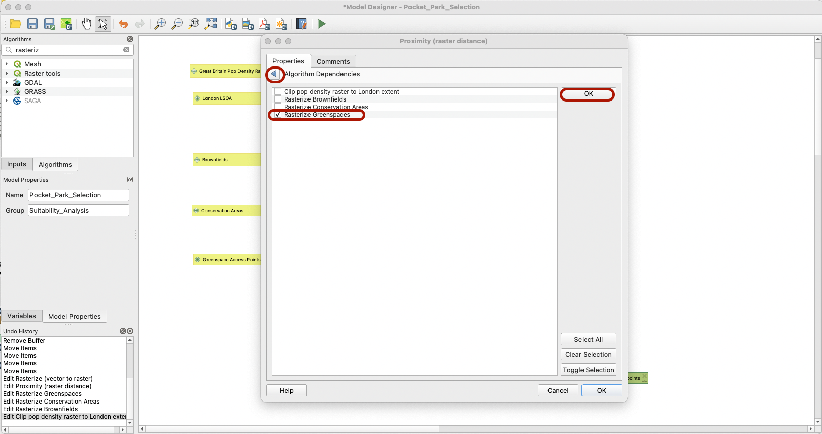
Note that you can also at this stage add a dependency; if the previous step of rasterizing greenspace access points did not run properly, then this step should not be run.
4.3.3 Reclassification
The next step is to reclassify the distance layer into the categories we have defined previously:
- 0-200: 0
- 200-400: 1
- 400-700: 2
- > 700m: 3
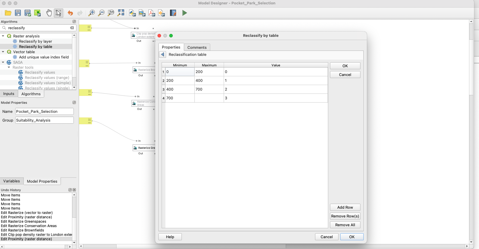
Look for the Reclassify by table algorithm and fill it using the below parameters: we want to use the output of the Proximity map as input to this step, and we will define the reclassification table the same way that we did for the NDVI tutorial. Make sure to note the Proximity step as a dependency.
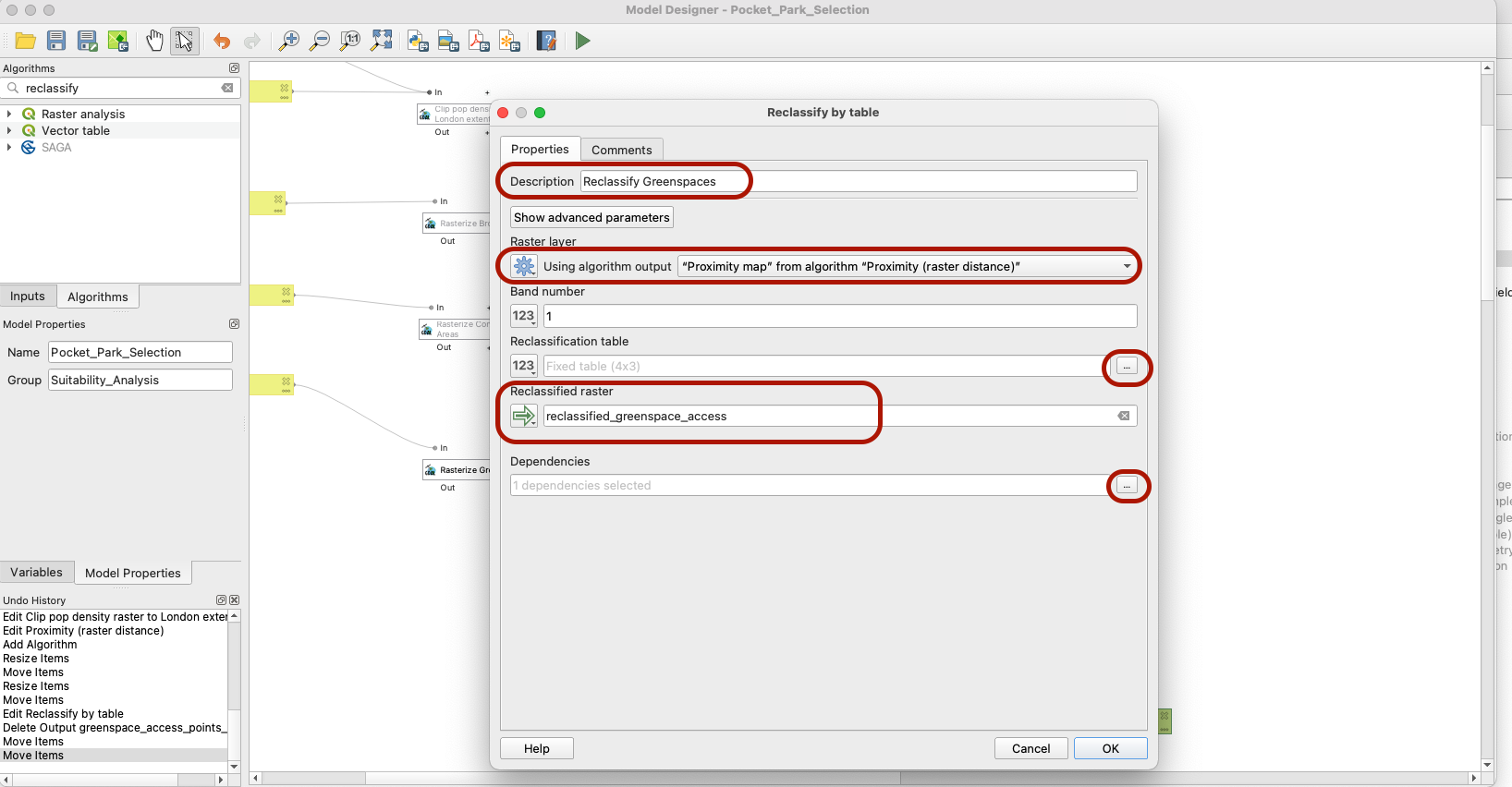
Your table should look like this:
4.4 LSOA
For your LSOA layer, our criteria is derived from the number of familities claiming benefits in each given LSOA. We want to identify the LSOAs with most families in this situation and attribute those areas a higher score, in order to prioritize the creation of a new pocket park in more deprived areas. Areas with the lowest number of families needing social benefit will get a lower score, as we consider them to be less of a priority.
To do so, we first need to:
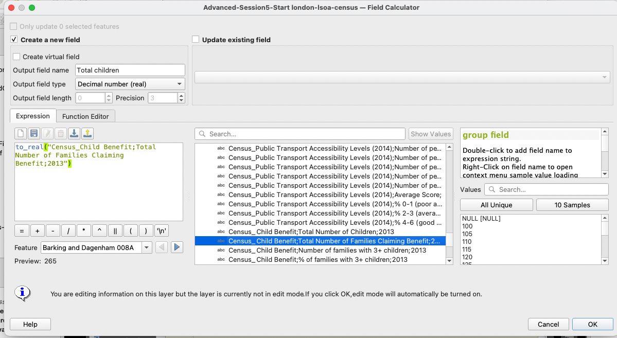
1) Use the Refactor tool to make sure our Census_Child Benefit;Total Number of Families Claiming Benefit;2013 variable is of the right data type (real number) instead of string.
2) Rasterize your layer and assign the value of our census variable value in any given LSOA to the cells in that LSOA
3) Reclassify our data in the appropriate number of categories (but first we need to have a think about which class breaks we want to use)
4.4.1 Refactoring
Because we want to explore the distribution of the variable on our map canvas, we will do this step directly on our dataset. Use the method of your choice (field calculator or refactoring tool) to transform your Census_Child Benefit;Total Number of Families Claiming Benefit;2013 variable into a field of type Real.
4.4.2 Distribution and class breaks identification
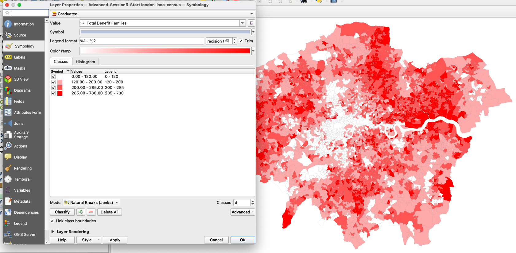
Make sure you save your edits and exit the edit session by clicking on the yellow pencil button. Then, navigate to your symbology and load your variable in the Graduated symbology. Look at the Histogram and load the values. The data is more or less normally distributed, and you clearly identify blocks around the mean and +/-1 standard deviation around the mean.
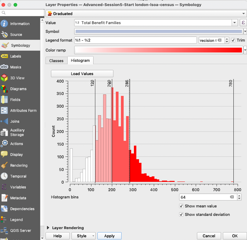
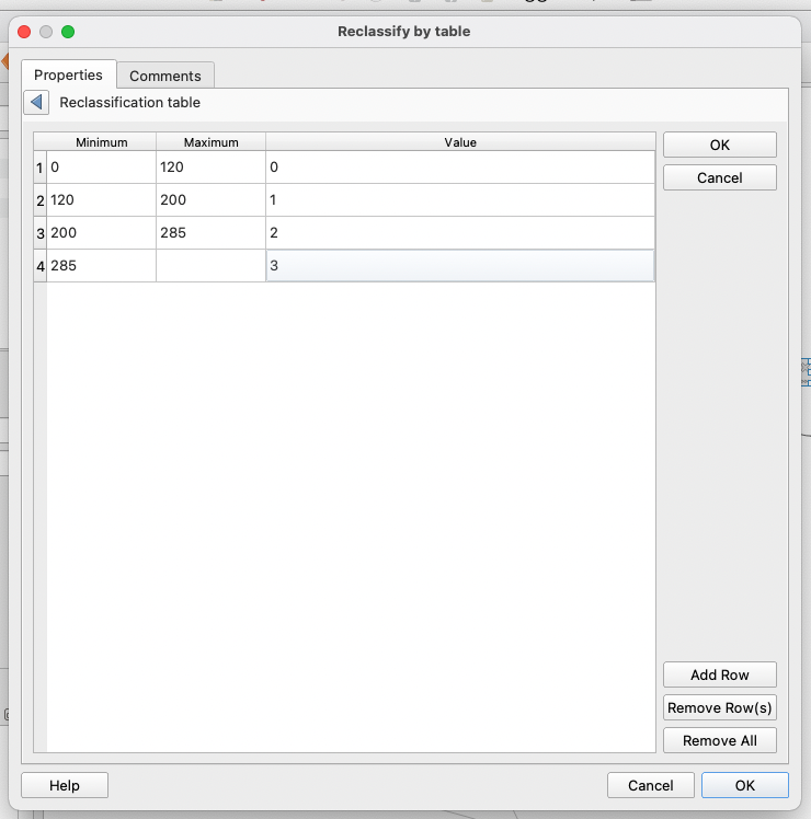
We will use the Jenks method that precisely takes those values as class breaks. Note down the values of the breaks: 0; 120 ; 200 ; 285 ; 780.
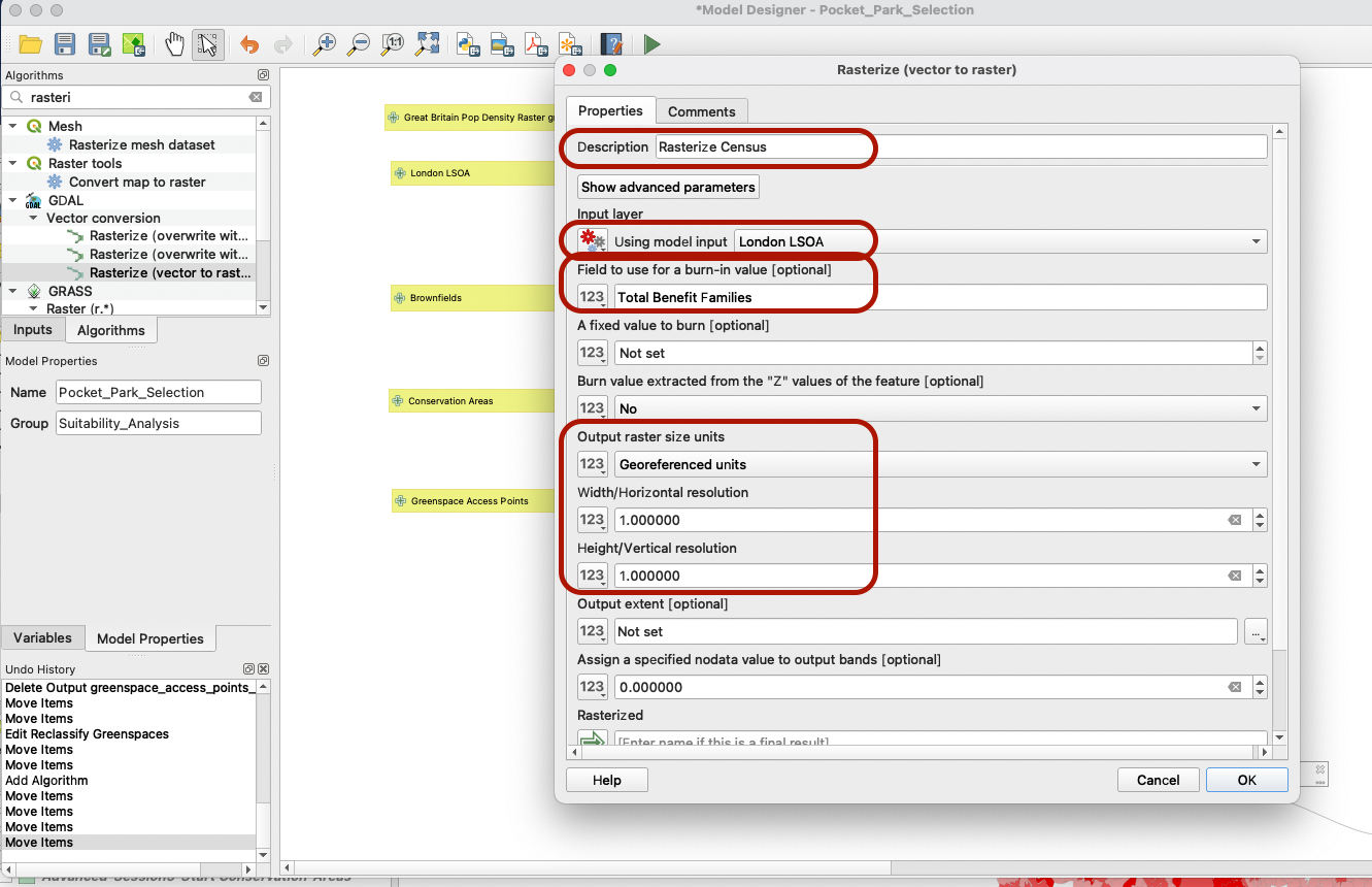
4.4.3 Rasterize data
Now, go back to your Graphical modeler. We need to rasterize the census dataset, and use our modified Total Number of Families Claiming Benefit;2013 field (in my case, it’s called Total benefit families for short) to burn the pixel values. Make sure to remove the 0 from the parameter below (a fixed value to burn):
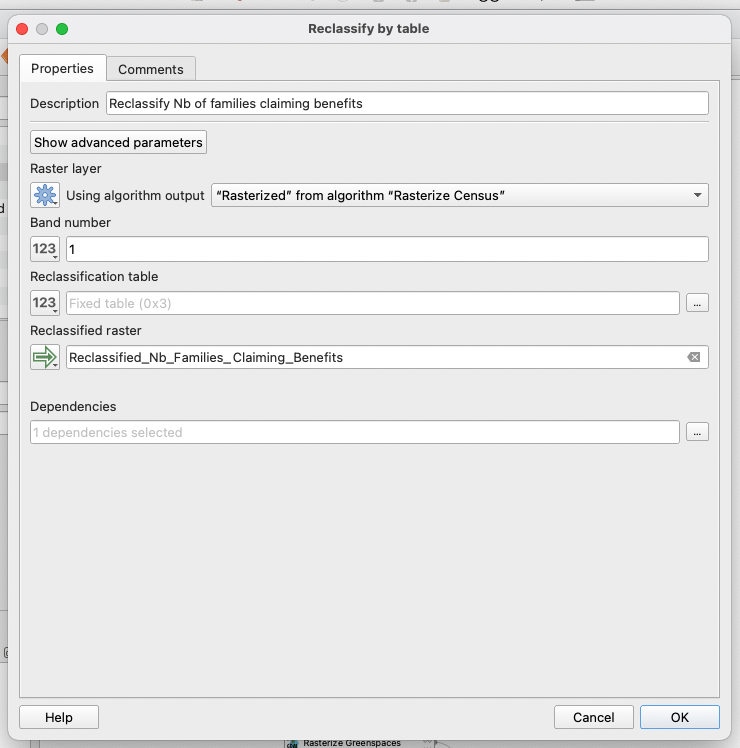
4.4.4 Reclassification
Finally, we will take the output of this previous step and reclassify the values into 4 categories, the ones we identified earlier in step 4.4.2 when looking at the distribution of our variable. Open the Reclassify by table tool:
Make sure you set up your table like this:
We are done with the census layer!
4.5 Children under 5
This dataset is already a raster data - in the right format. Our criteria for this variable is that we want to prioritize areas with a high density of children under 5. Areas with the highest number of children will be attributed a high score, and areas with few hildren a low score. To come up with this reclassificaiton, we first need to figure out the best class breaks. This can be done by exploring the population density layer that was clipped to London extent (you may not have kept it, it’s ok you can simply read this step to understand the approach).
When looking at the histogram, it is difficult to come up with clear values for our class breaks.
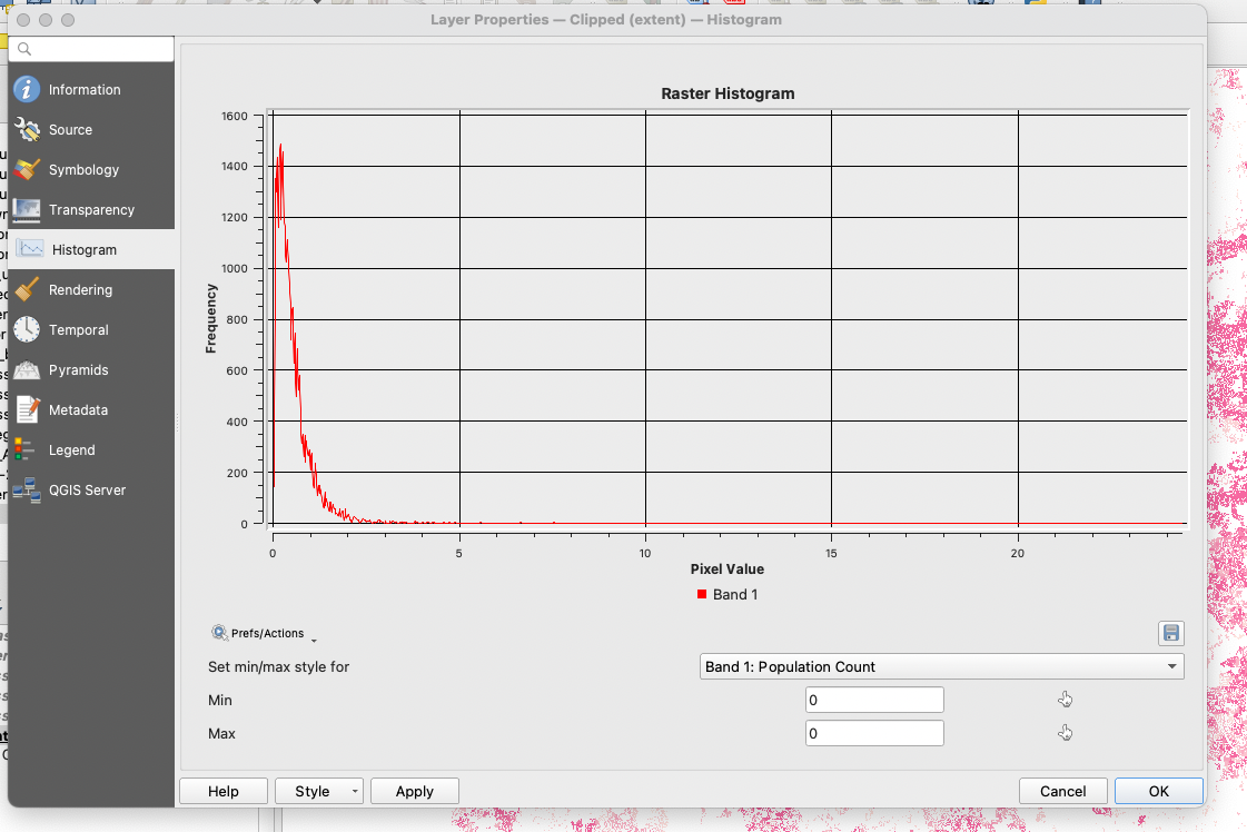
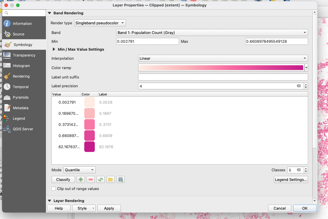
Instead, we can use the singleband pseudocolour symbology to split our distribution into quantiles. We will use the values 0-0.2, 0.2-0.4, 0.4-0.6 and 0.6-62 as our class breaks for the reclassification. This way, we have a score of 0 for 25% of all areas that have the least number of children under 5, a score of 1 for the next 25%, a score of 2 for the next 25% and a score of 3 for the top 25% areas with the most children under 5.
In your graphical modeler, open a new Reclassify by table tool and fill the parameters so that it takes the output of the clipped population grid as input:
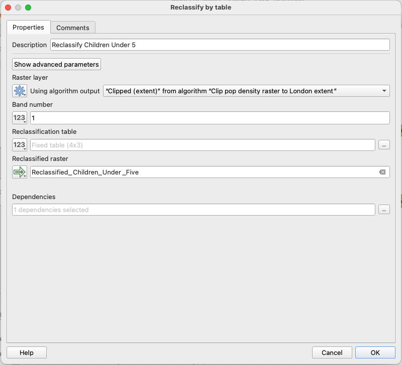
Make sure your table uses the values determined above:

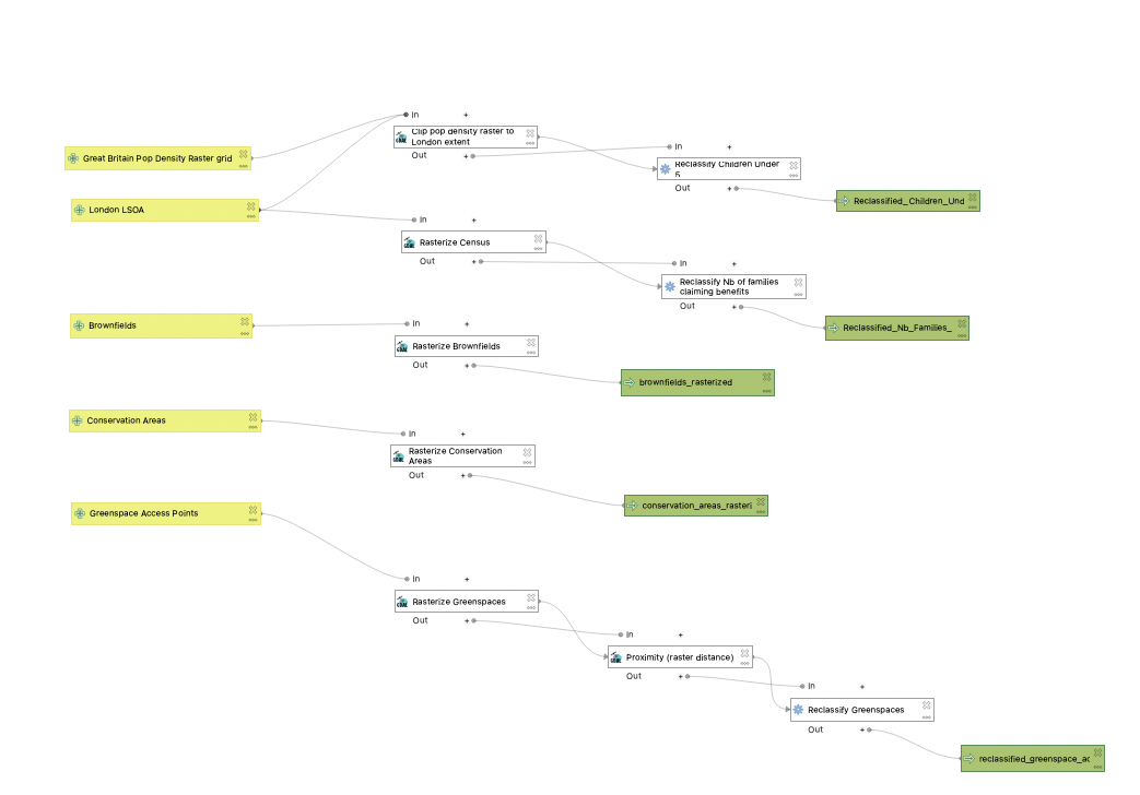
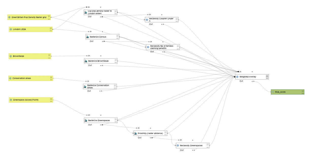
We are now done with the data pre-processing and reclassification steps! Your model should look like this (don’t ehsitate to mode the functions around for clarity):
V. Weighted overlay
Finally, we can now build our weighted overlay by combining our 5 criteria into a single score.
5.1. Assign weights
We can now assign a weight to each of out criteria. Brownfield is not assigned a weight because it’s the condition for a site to even be considered as a potential site.
We decide to lower the weight of the conservation areas score and existing distance to greenspace access points (20% each), and to give a higher weight of 30% each to our two social variables:
| Criteria | Weight |
|---|---|
| Brownfields | Necessary |
| Conservation Areas | 0.2 |
| Distance to Greenspace Access Points | 0.2 |
| Number of Families Claiming Benefit | 0.3 |
| Population Density of Children under 5 | 0.3 |
5.2. Weighted overlay
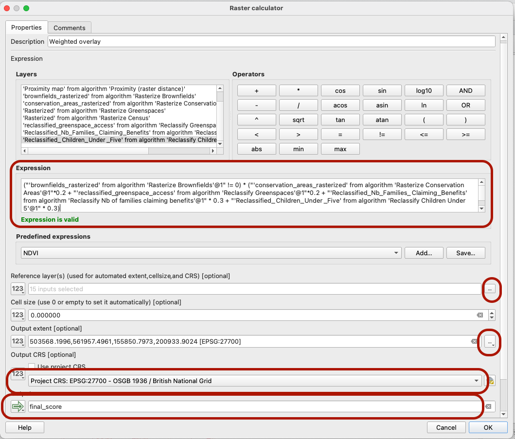
To get our final score, open the QGIS Raster Calculator algorithm (/!\ not the gdal or saga ones!) in the graphical modeler. The raster operation we write translates the weights above: We want to first check whether the Brownfields pixels do not have a value of 0 (aka: that we are not outside of the brownfield polygons); if it is the case then we sum up all the other variables, multiplying them by their weight.
Make sure to select all layers as references (the smallest cell resolution will be used as default output), to set the CRS to British National Grid, and yoru output extent to the LSOA layer extent. Name the final output that will be produced, and you can also set up where it will be saved n your computer.
5.3. Run Model
Make sure you’ve saved all your edits! Before you run your model, it may be a good idea to save a different copy of this model (Save As...) that still contains all the intermediate layer outputs. Then in your second copy you can delete all the extra layers that are being produced at intermediate stages of your model, which would take up more memory. Run that!
You have successfully completed your weighted overlay! In the final session (session 6), we will explore the outputs of the model together

Notes
- This workflow is unfortunately extremely greedy in terms of memory, due to the raster processing. If you are experiencing issues, you can try reducing the resolution (set a larger pixel size). It’s ok if you are not able to run the model ultimately - in the final tutorial we summarize the main findings from the model outputs, and go through the actual selecxtion process based on the final score.
- The snapshot of the entire workflow can be exported as an image or a pdf; if you build up a complex analysis it’s a good idea to include this in the methodology section of your report.
- You can also export your model as a Python script
- One of the big advantages of using the Graphical Modeler is that you can change input layers easily, as long as they’re of the same data type. This means you can replicate an analysis from one city to the next very easily (as long as you’re careful with the CRS).