Session 4 - Cartographic design
16 Nov 2021Introduction to GIS · Sciences Po Urban School
Lecturer: Raphaëlle Roffo
I. Session 4 Overview
Download the slides
- Cartographic design principles
- Accessibility
- Elements of a Map Layout
- Choropleths
- Choosing the right class breaks (number, method) and colour palette
II. Tutorial
Goals:
- Loading data from Open Street Map
- Accessing vector symbology settings
- Creating rule-based symbology
- Adding and styling labels
- Setting scale-dependent visibility
- Saving spatial bookmarks
Context:
In this tutorial, we will be exploring the theme of cycling to school. In the context of the Covid pandemic, the question of safely getting kids to attend school has become a key element in many countries’ economic recovery strategies. Taking into considerations the pressing challenges of reducing carbon emissions, walking and cycling to school represent sustainable and safe ways for children and their parents to get to school, as long as proper cycling infrastructure exists.
We will be focusing on primary schools in Greater London, and will look at existing and planned major cycling routes, in the context of the GLA (Greater London Authority) plan for reducing carbon emissions, in particular with an expansion on the Ultra Low Emission Zone since 25 October 2021.
In the tutorial 5, we will add another layer to this analysis and use the accessibility to public transport score in the census dataset to add some more context.
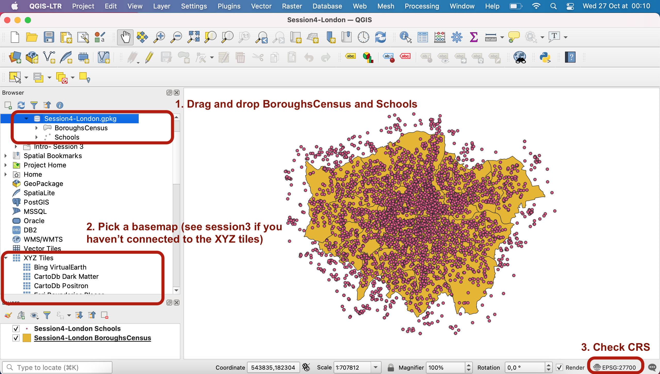
Data:
Download the geopackage for this session here. It contains the same London data as in Tutorial 3 and some additional layers. Drag and drop the BoroughsCensus layer and the Schools layer onto your canvas. Make sure the CRS is set to EPSG:27700.
Pick a basemap of your choice from the XYZ Tiles section of your Browser panel. I’ll be using CartoDb Positron.
III. Loading OSM layer
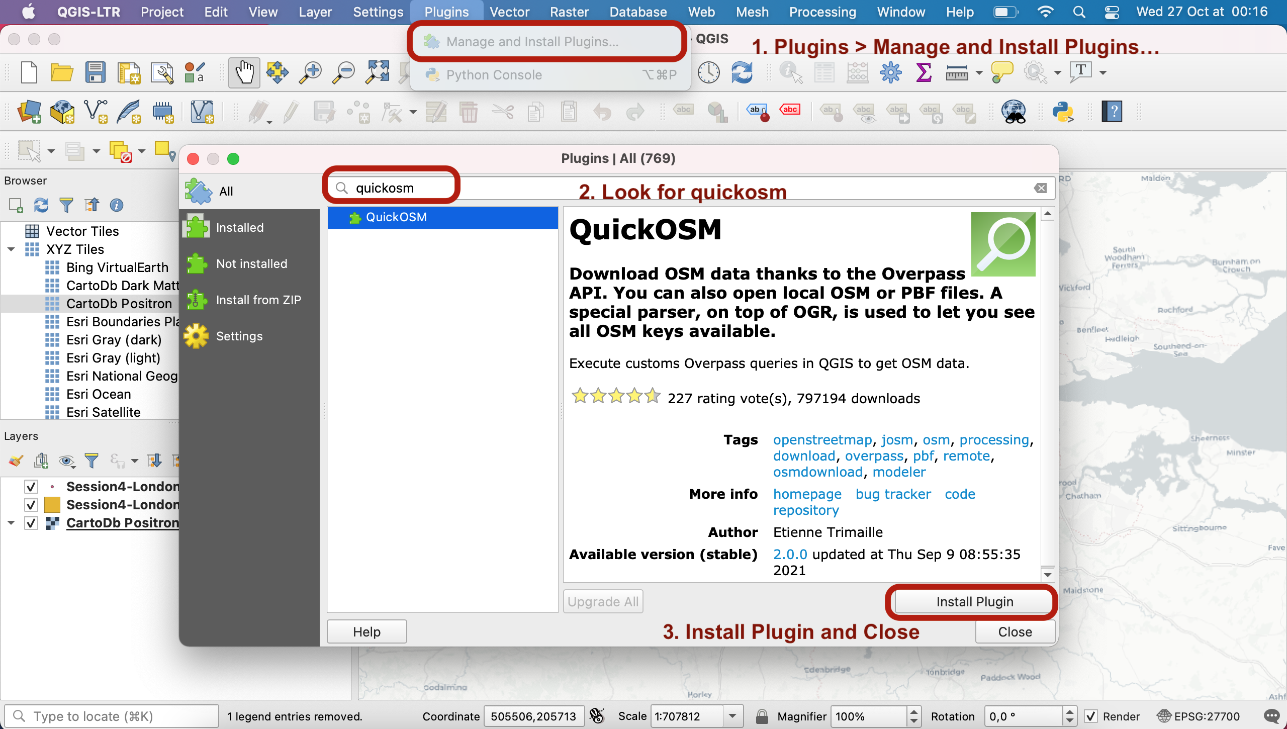
Now, we have decided we want to look at cycling lanes in the Greater London Metropolitan Area. We will be using crowdsourced data from OpenStreetMap. In order to access this data, we will use the QGIS QuickOSM plugin. You can access it through your top menu: Plugins > Manage and Install Plugins.... Search “quickosm” in your searchbar, install the plugin and close this window.
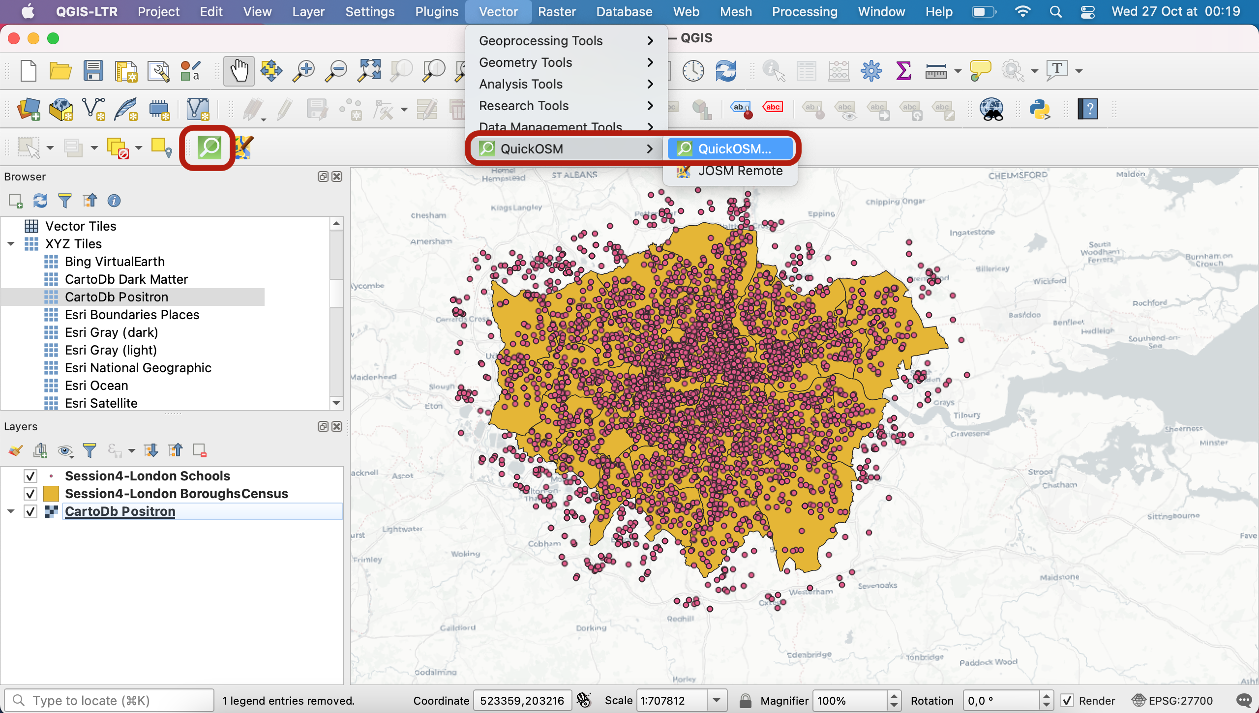
Now, to access the plugin, you can either click the icon that appeared in your toolbar, or access it via your top menu: Vector > QuickOSM.
This plugin basically enables you to query the (very large!) OpenStreetMap SQL database and load layers of your choice onto your map canvas. You can learn more about what you’re querying at this address. Today, we will load all the cycleway features and we will see later what kind of filtering we might want to do using the values (are they one-way, shared lanes, etc), so leave the Value box blank for now.
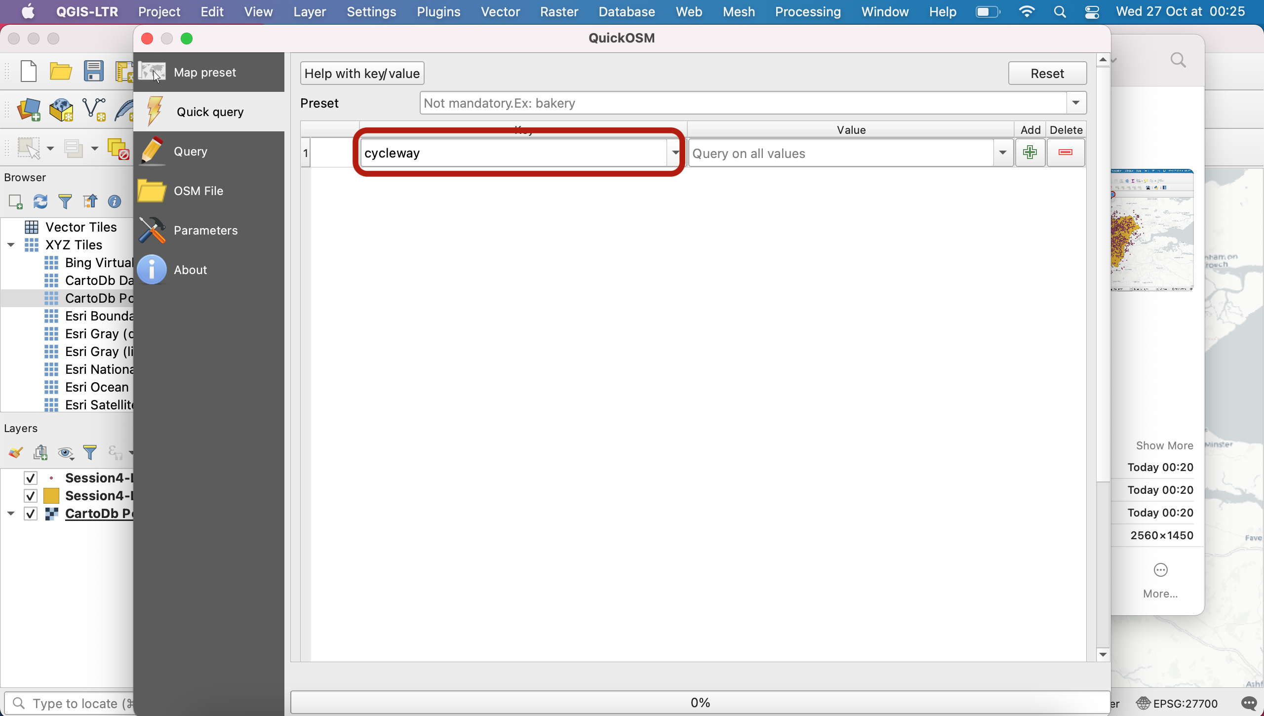
Scroll down in the menu (maybe use the vertical scroll bar) and select the spatial extent of your Boroughs layer as the query extent. It means you only want to download cycleways that are within the Greater London boundaries. Press Run query.
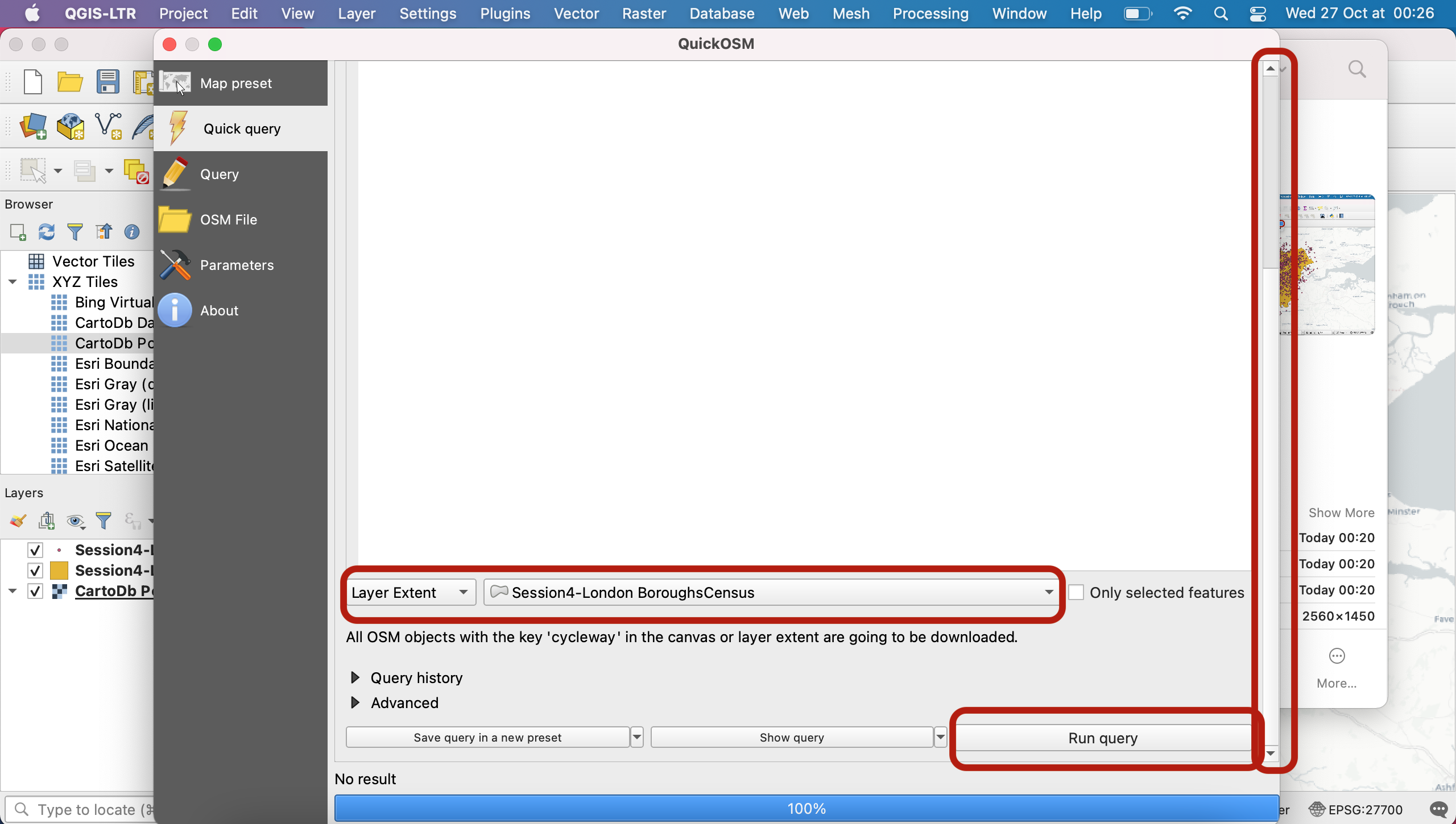
After a few seconds to a few minutes, you shold get a success message, a 100% blue prorgess bar, and notice that 4 new layers were loaded onto your canvas. Great! You can now close the query window.
Note that QuickOSM is a very powerful way for you to get access to feature geometries! However attributes can sometimes be a bit messy or lack consistency (same feature types might be given different names), which may make them tedious to navigate.
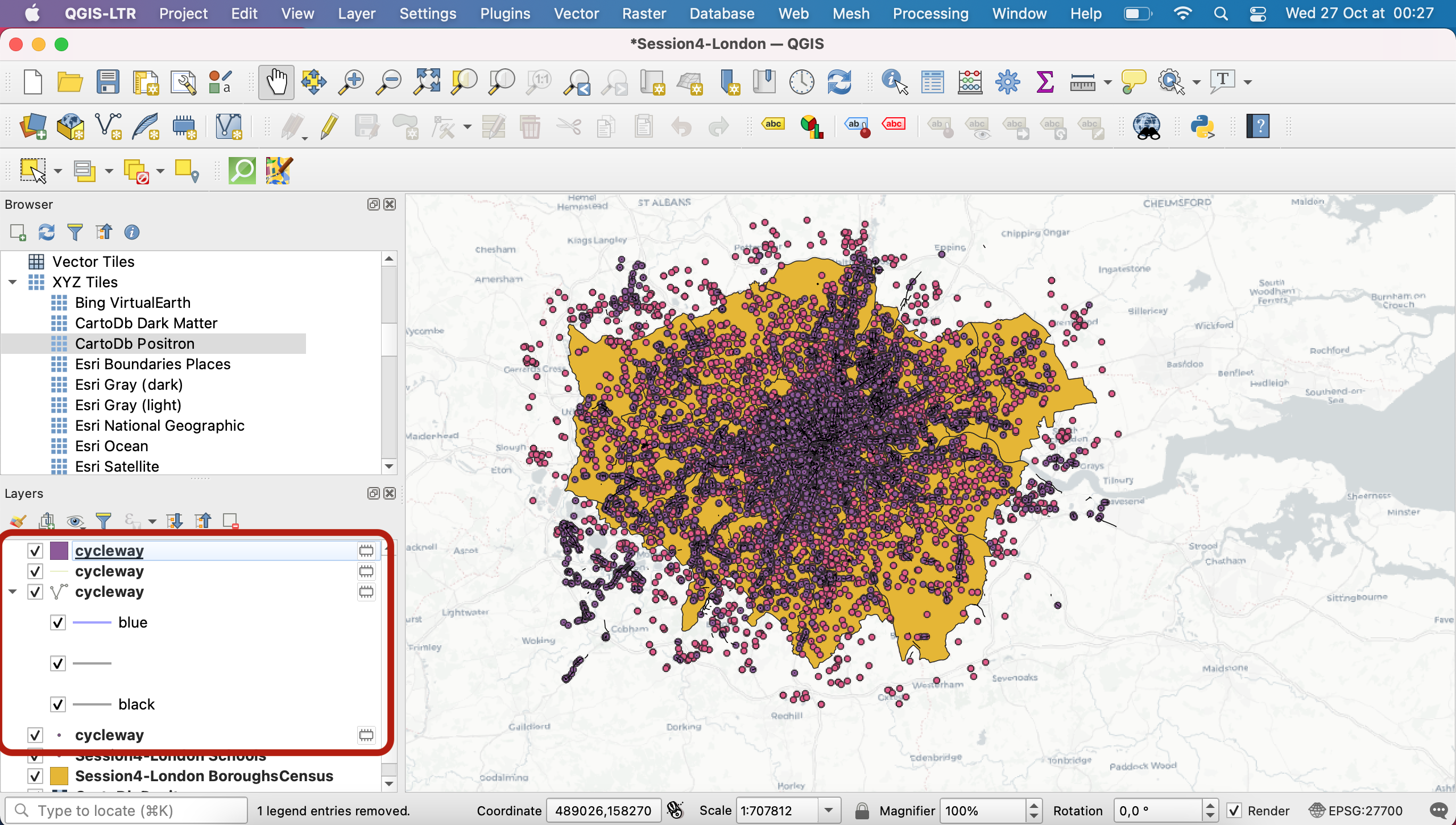
Let’s have a look at those layers. For cycling lane you would expect to work with lines, however QuickOSM also loaded a point layer. If you double-click the attribute table, you will notice that those points are actually nodes and don’t contain especially useful attributes. We can’t really use this layer to do anything so we will just remove it from our project.
The polygon layer also doesn’t make much sense and only contains a single record.
The layer with a single line in it will also not be useful to us.
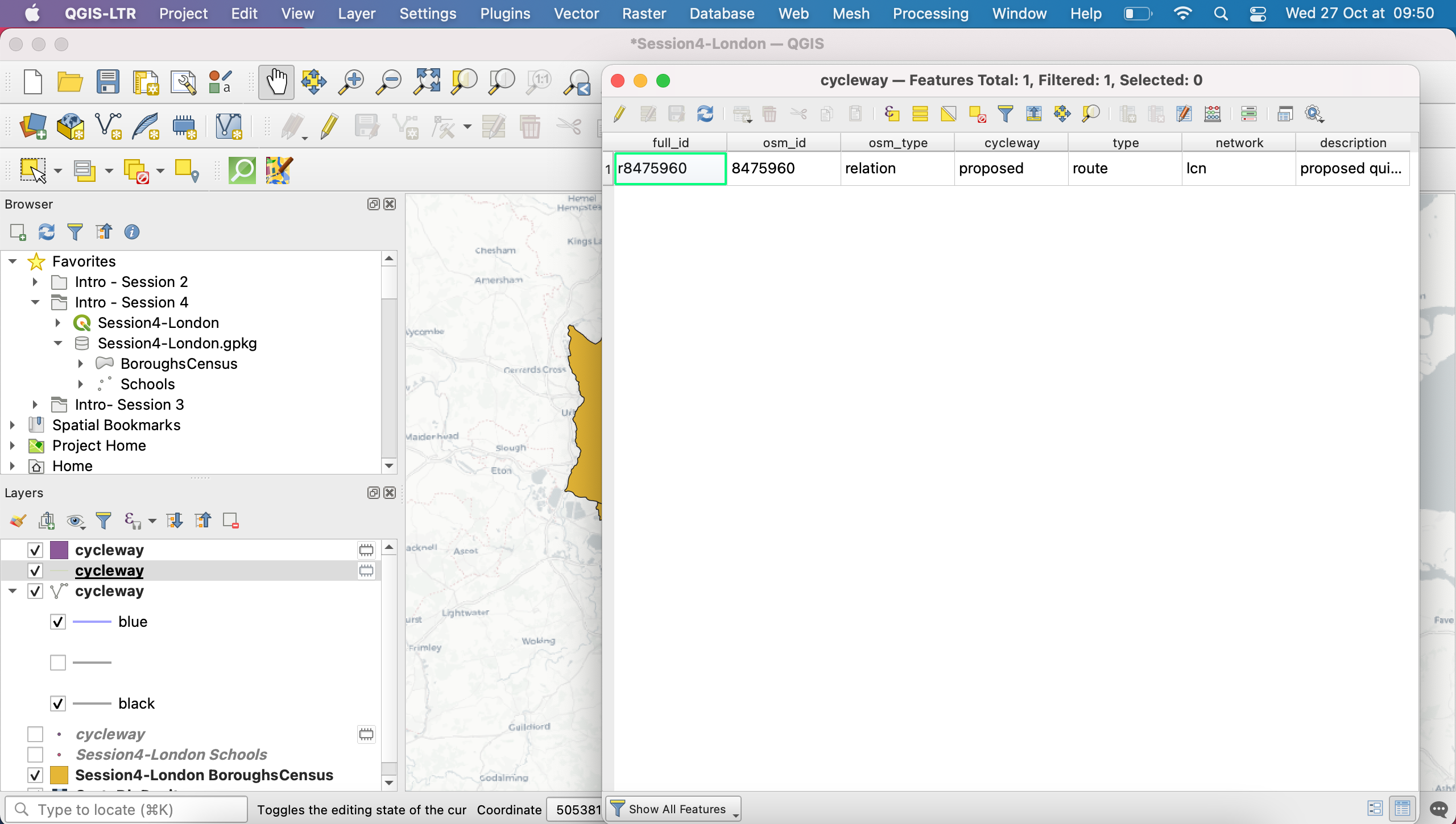
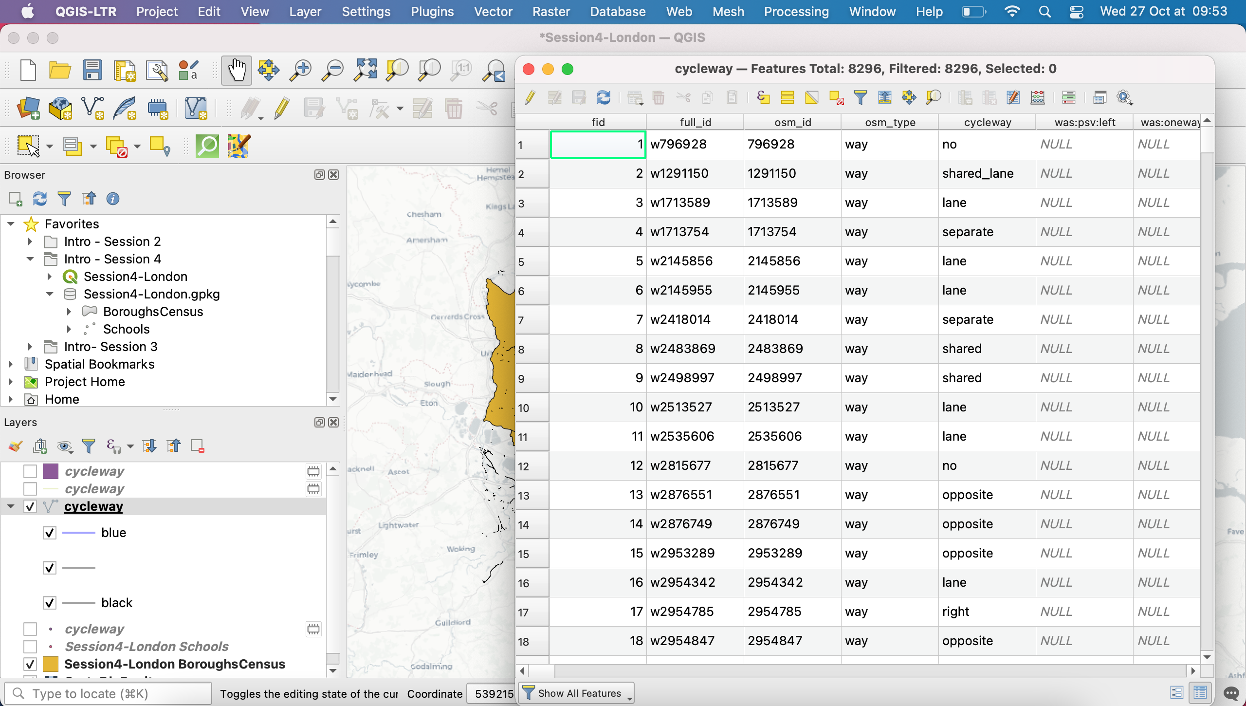
We will also remove those two layers from our project, and only keep the polyline layer that contains 8296 features.
Scratch layer Warning!
When you create a new layer using a geoprocessing tool (or in this case the QuickOSM plugin), QGIS will produce a temporary layer, aka “scratch layer”. This layer only exists for you in this open session of QGIS and is not saved anywhere on your computer. This means unless you do something about it, the layer will be gone next time you reopen this project. Make sure you avoid this rookie mistake by checking that none of your layers display the little hairy box sign. If they do (like in this case, the layers you just queries from OSM) double click and save the layers you want to keep into your project geopackage (give each layer a meaningful name) or as a new shapefile in your project folder. The little hairy box icon will disappear after you save the layer somewhere on your computer.
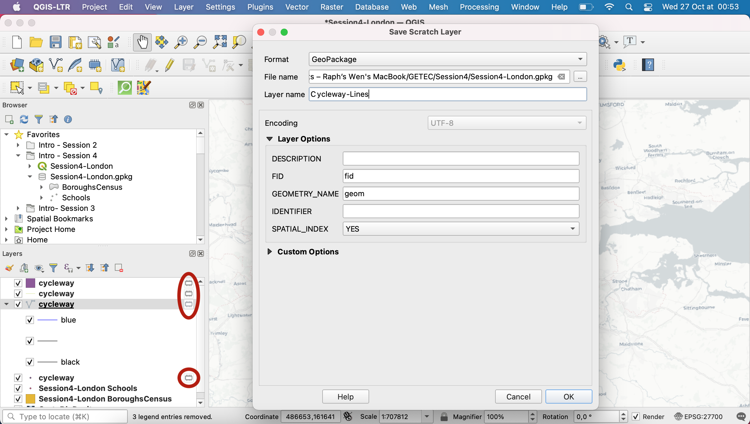
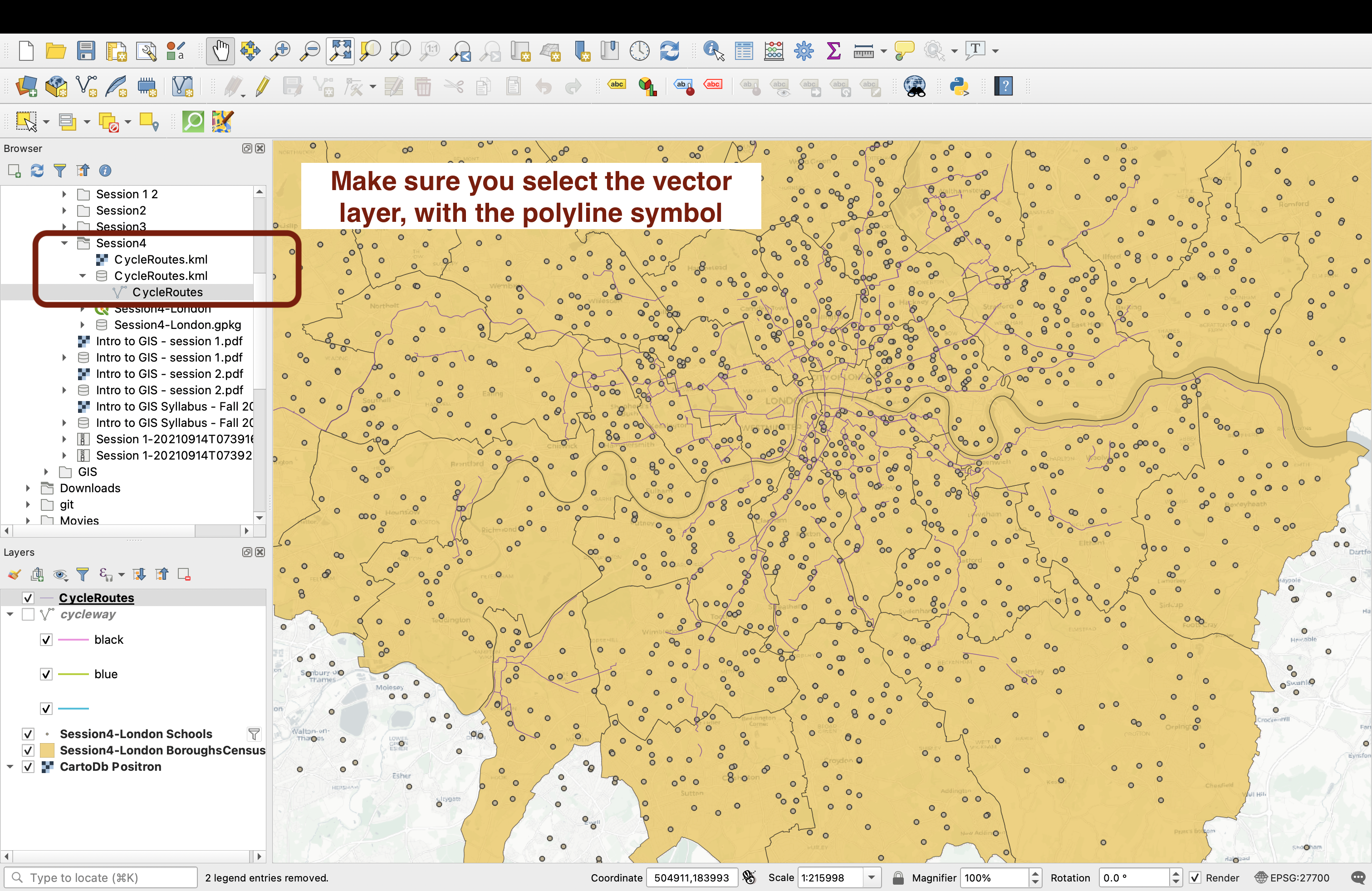
In this case, simply save the polyline cycleway layer, and remove the three others from your Layers section if you haven’t already.
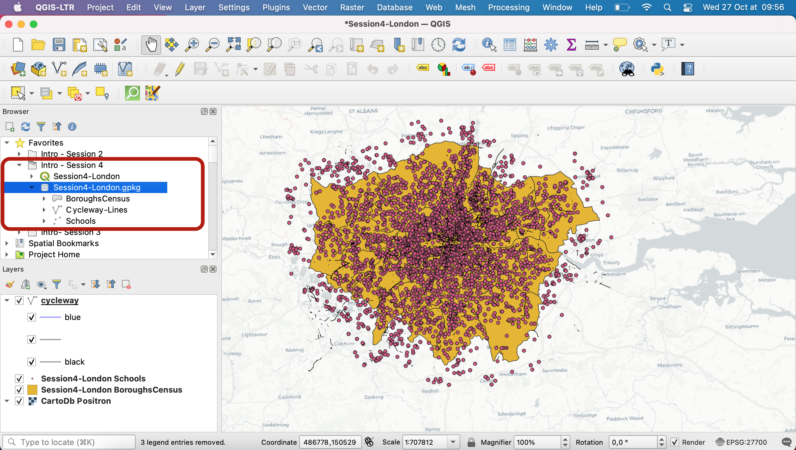
Now that you’ve saved your cycleway layer (if you refresh your browser, it should appear in your geopackage), let’s move on to the symbology step.
IV. Vector symbology
4.1. Accessing symbology settings
For any layer, you can double click to open its Layer properties menu and navigate to the Symbology tab to access all the settings. Start with your Schools point layer. In the top dropdown menu you’re given a few options.
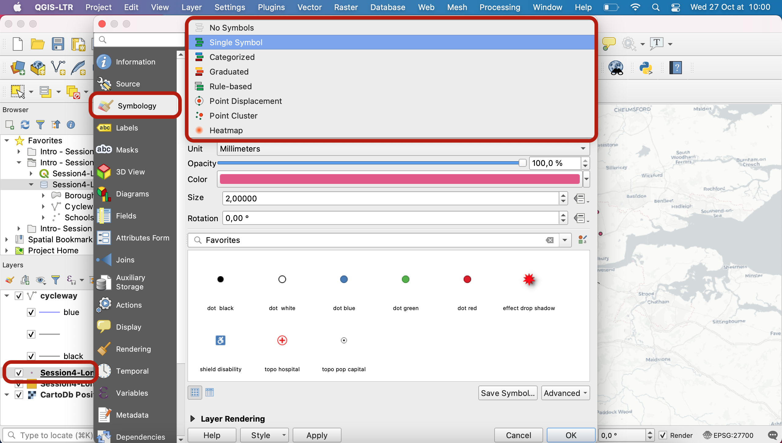
These 5 options are common to points, lines and polygons alike (points and polygons have a few additional symbology options of their own):
- No symbols = nothing is displayed on the map
- Single symbol = all features are displayed the same way
- Categorized = features symbols depend on the value of one of their categorical attributes (e.g. which type of school, which type of cycling lane)
- Graduated = features symbols depend on the value of one of their numerical attributes (e.g.length of the cycling lane, population count in a borough, etc)
- Rule-based = you can define more advanced nuances using filters and expressions. For instance you could create 3 rules: 1)if a cycling lane is longer than 2km and in a separated lane then apply a certain symbology to it, otherwise 2) if it is between 500m and 2km and on a one-way road applly another symbology, and 3) don’t display the rest.
4.2 Exploring single and categorized point symbology
Using the single symbol, try to change the opacity, size and colour of your points. Note you can also use presets in the section below.
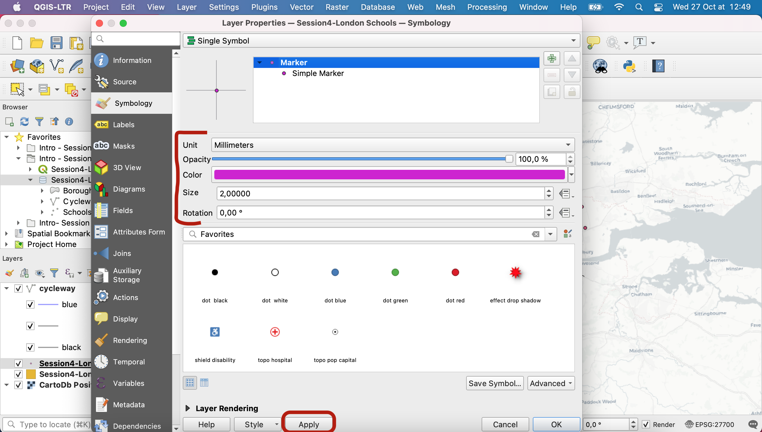
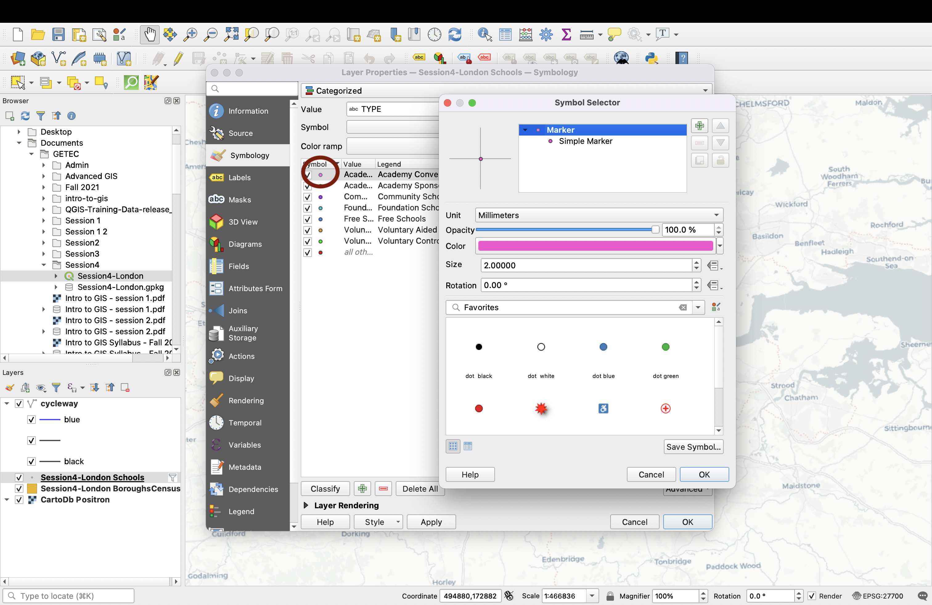
Now click on the Simple Marker to access further customization options. A few useful ones include the size and colour of stroke, and the shape of your marker.
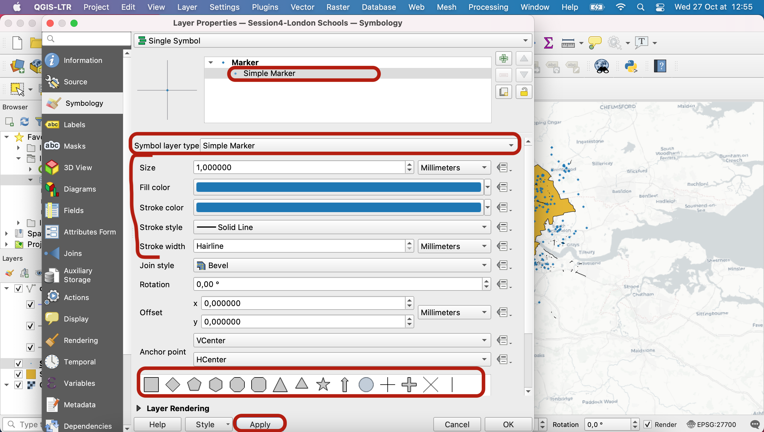
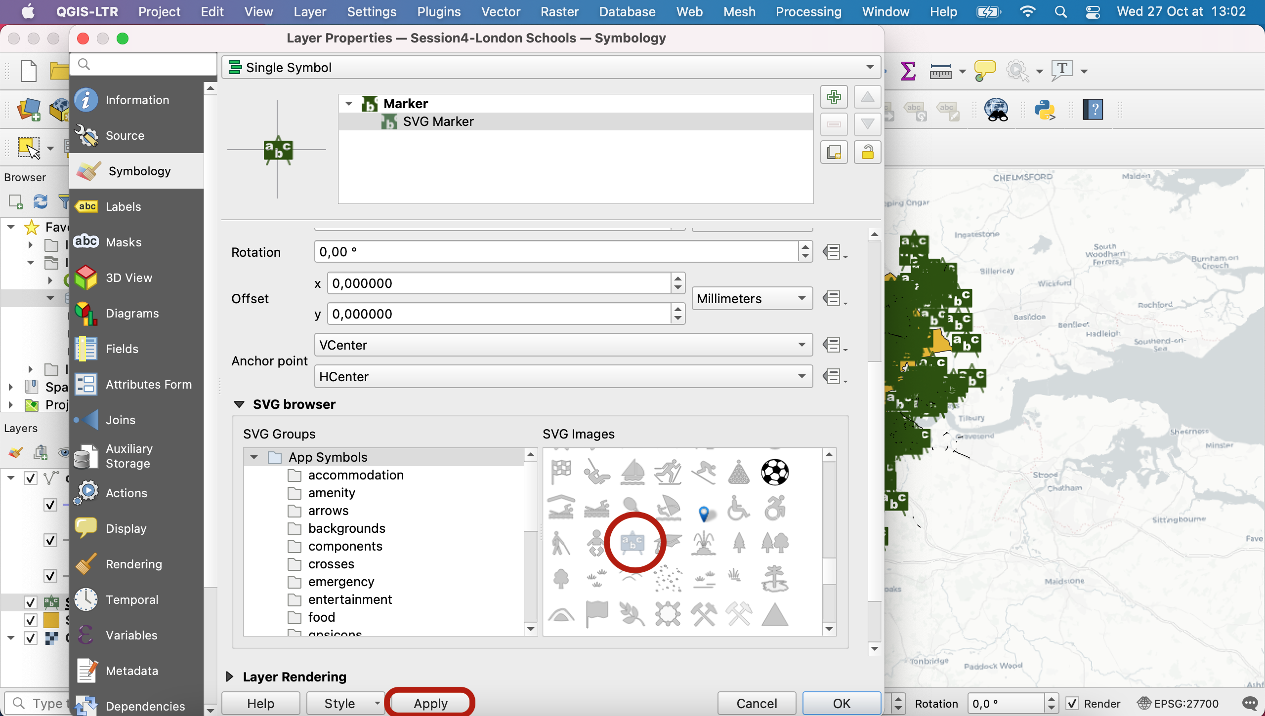
Note that you can even use common logos or import your own SVG or raster symbols to use as markers - for instance here under Symbol layer type select SVG marker , scroll down and you have access to a large array of logos, including this school logo. You can try it out, notice that it is not the right choice in this case and then please reverse back to a simple marker symbology of size 2mm and grey colour.
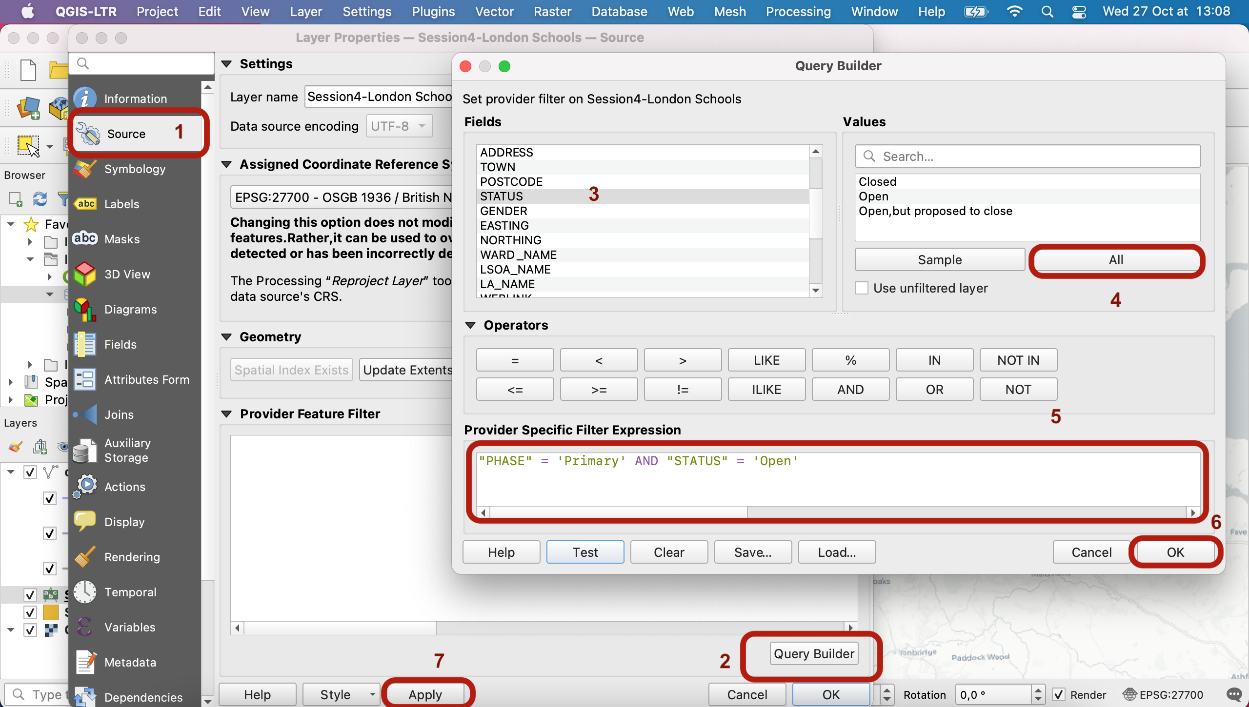
Now that you know more about the symbology customization, let’s move on to something more useful for understanding our data. We decide we actually only want to work on primary schools that are currently operational (not closed, not opening in the future). To do so, we want to edit the definition query of our layer so that we only display the open primary school features. Navigate to your Source tab, and click Query builder. Find out what values are available for different fields. For instance select STATUS and click on Sample All values. You can double click a field, an operator and a value to directly add them into your expression. Use Test to see if your expression has any syntax error.
Write the query that keeps primary schools that are still open, click OK to close this window, click Apply in the Source tab and go back to your Symbology tab.
We are now interested in displaying the different types of schools in different colours, to see if there is any geographical pattern as to where certain types of schools can be found. To do so, we will use a Categorized symbology and pick TYPE as our value.
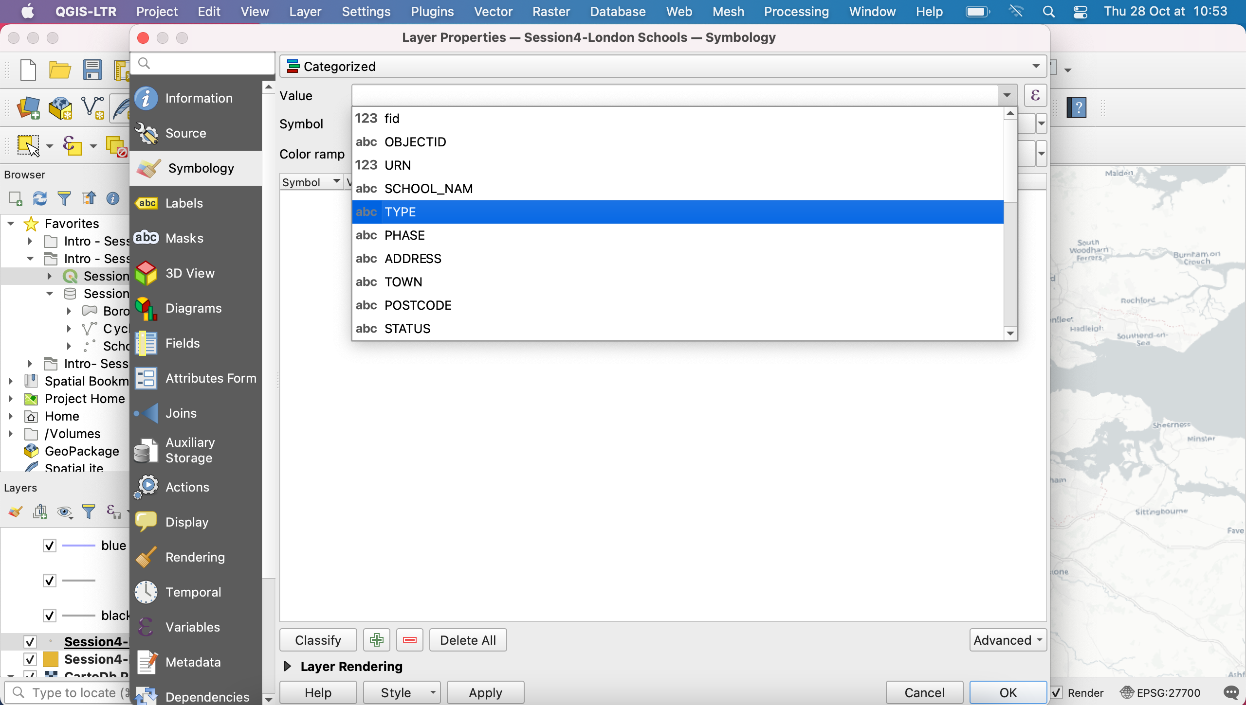
Click Classify to load the Types values into your legend. Note that you can update your base symbol (click on the Symbol dropdown arrow then Configure symbol):
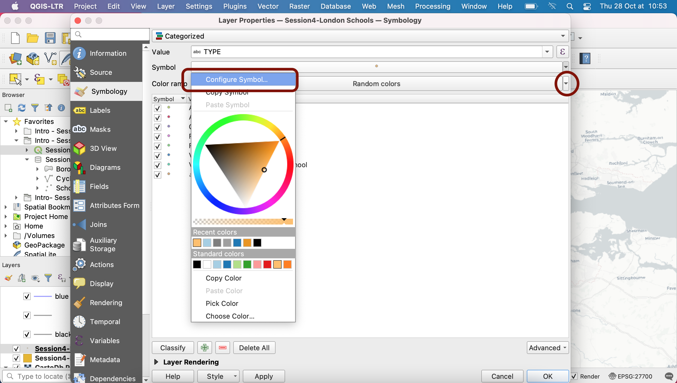
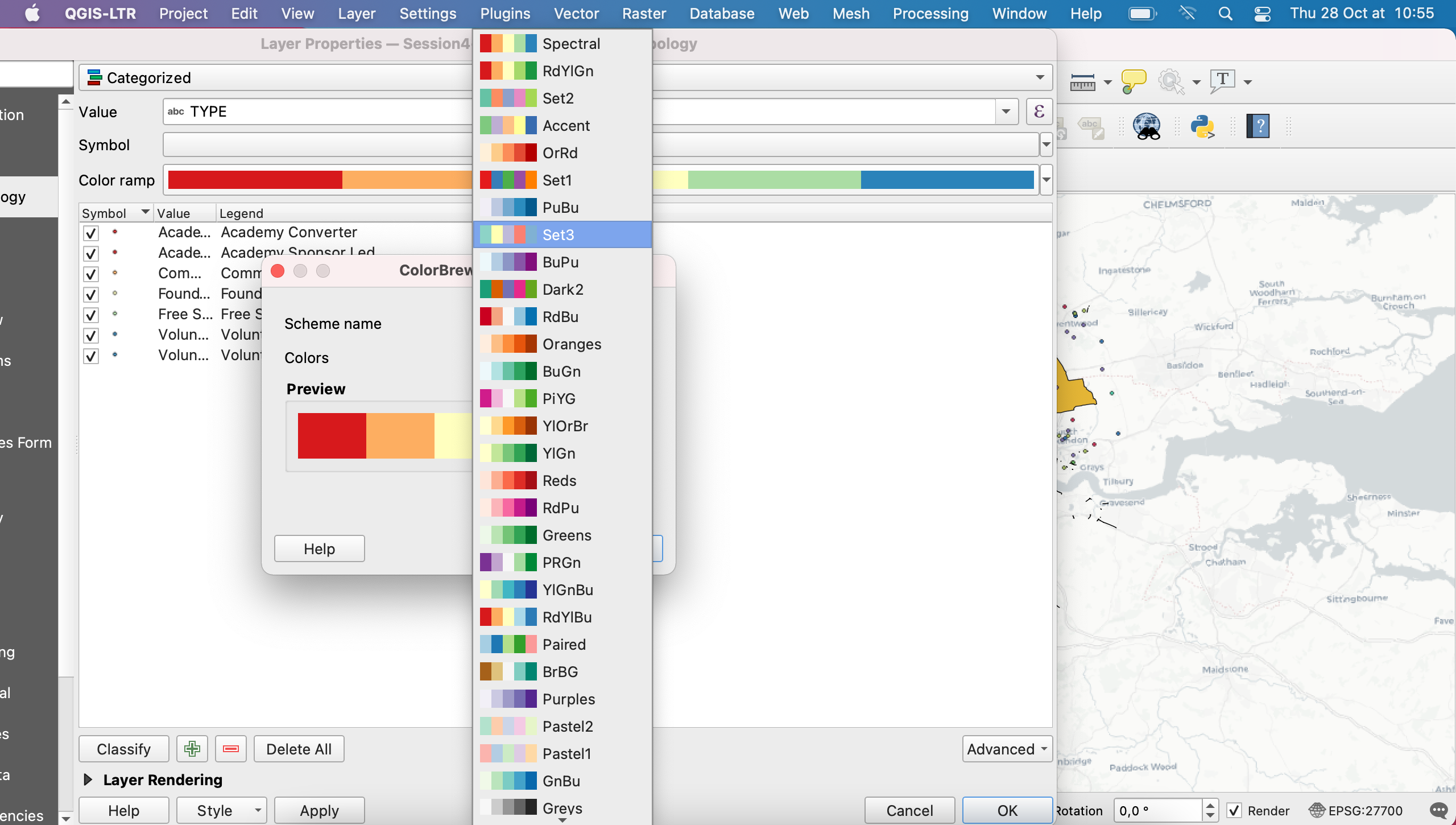
By default, QGIS has assigned random colours to each point. You can also choose a specific colour ramp from the many available by clicking on the Color Ramp dropdown arrow. Because we are using categorical variables here, we prefer to avoid using a sequential palette which would imply some form of order among the values (there is no order here, they’re just three different values).
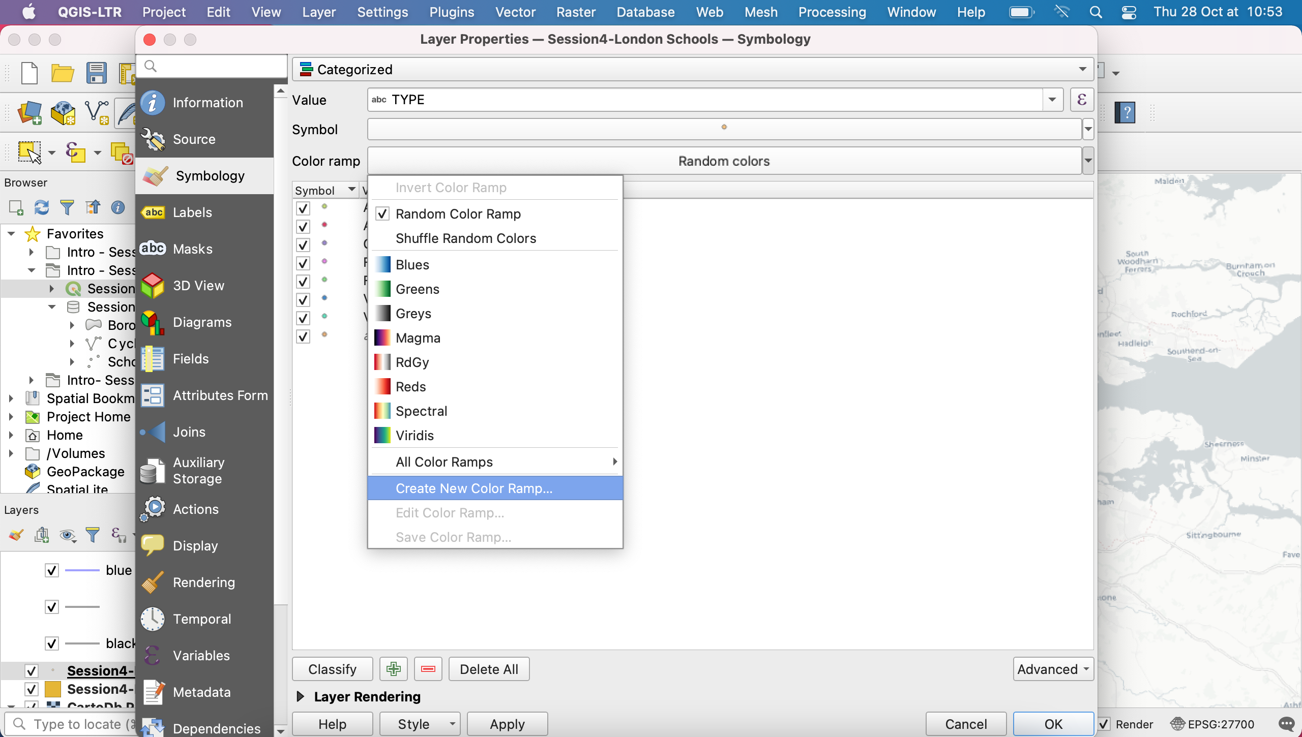
You can explore the many options available to you in the colour ramp including shuffling the colours currently assigned to your values, creating your own random colour palette or editing existing ones.
You can also edit each symbol individually, one by one, by clicking on them directly. You then get access to the same customisation options as you had under Single symbol earlier.
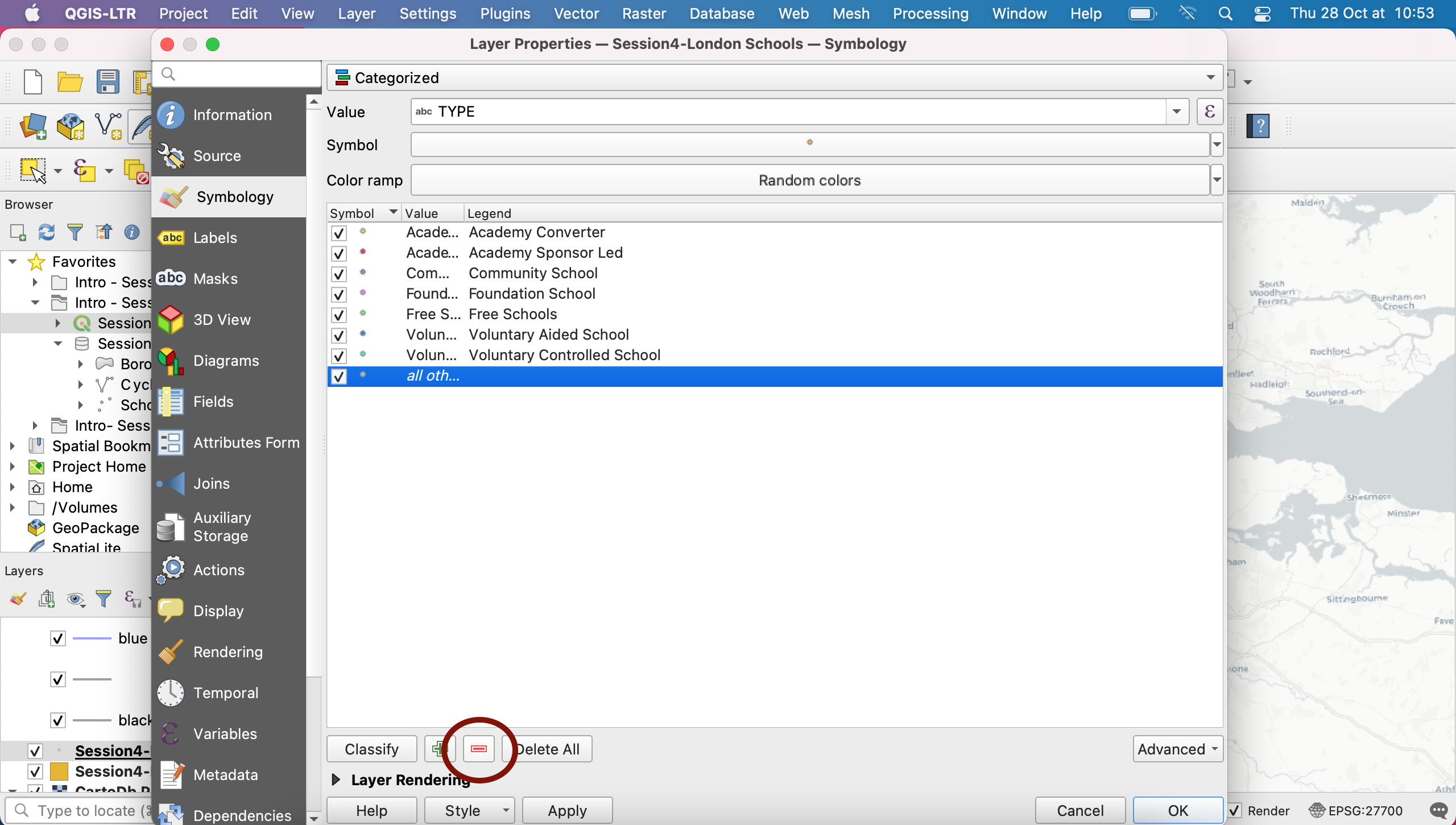
Note that in the Values list, the last value listed is “all other values”. You can decide which values you want to keep or remove, and we will just get rid of this one using the red “minus” button.
4.3 Creating a rule-based symbology for the schools
There are still quite a few values (you could use official information to understand the nuances between each type of school). Here we’d like to improve the legibility of our map by reducing the number of categories. To do so we’ll do some “data generalization”, meaning we will lump together categories that are quite close thanks to Rule-based Symbology.
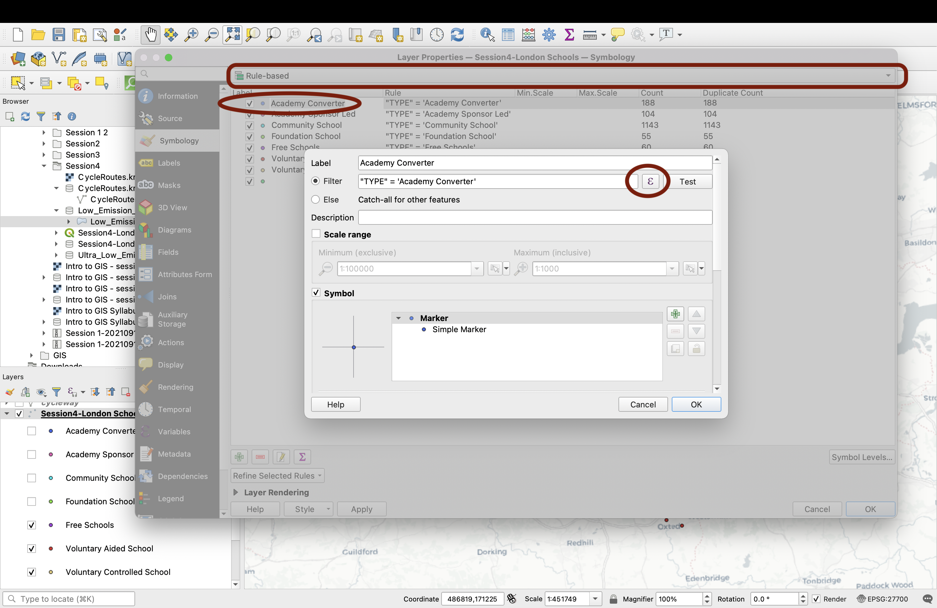
The values that were loaded from your Categorical symbology are still here. You can either delete them all and start from scratch, or edit the existing ones. We’ll start with Academies. Double-click the first value; the epsilon symbol is where you can go to define your expression. Here, we want to create a single category for Academy converter and Academy Sponsor Led:
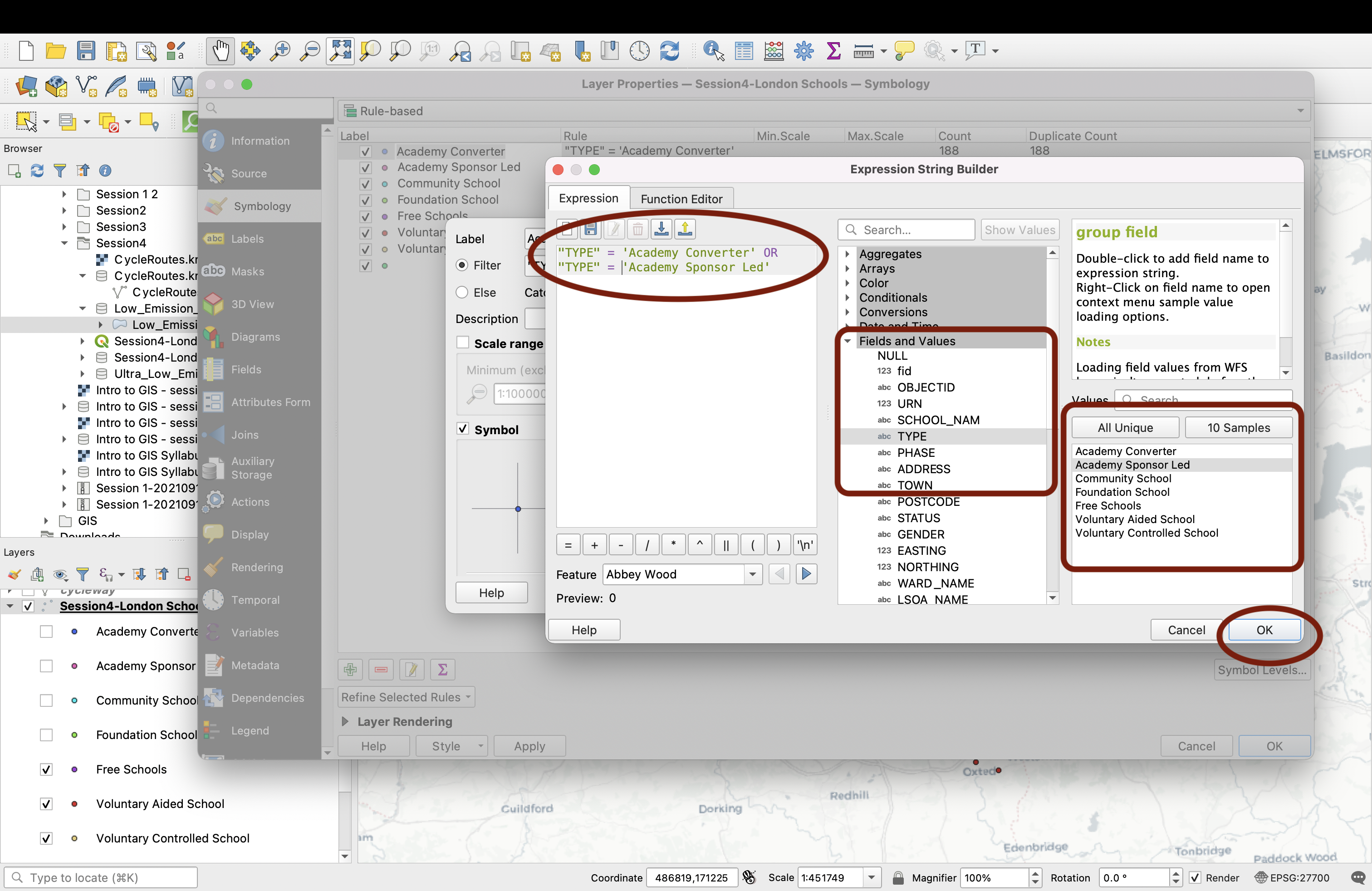
Press OK, then make sure to give a new name to this category (here: Academies).
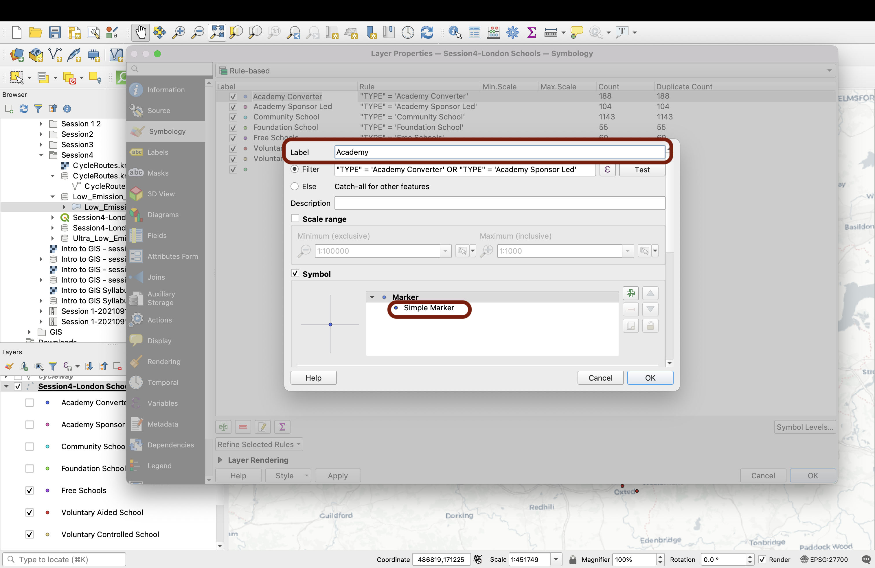
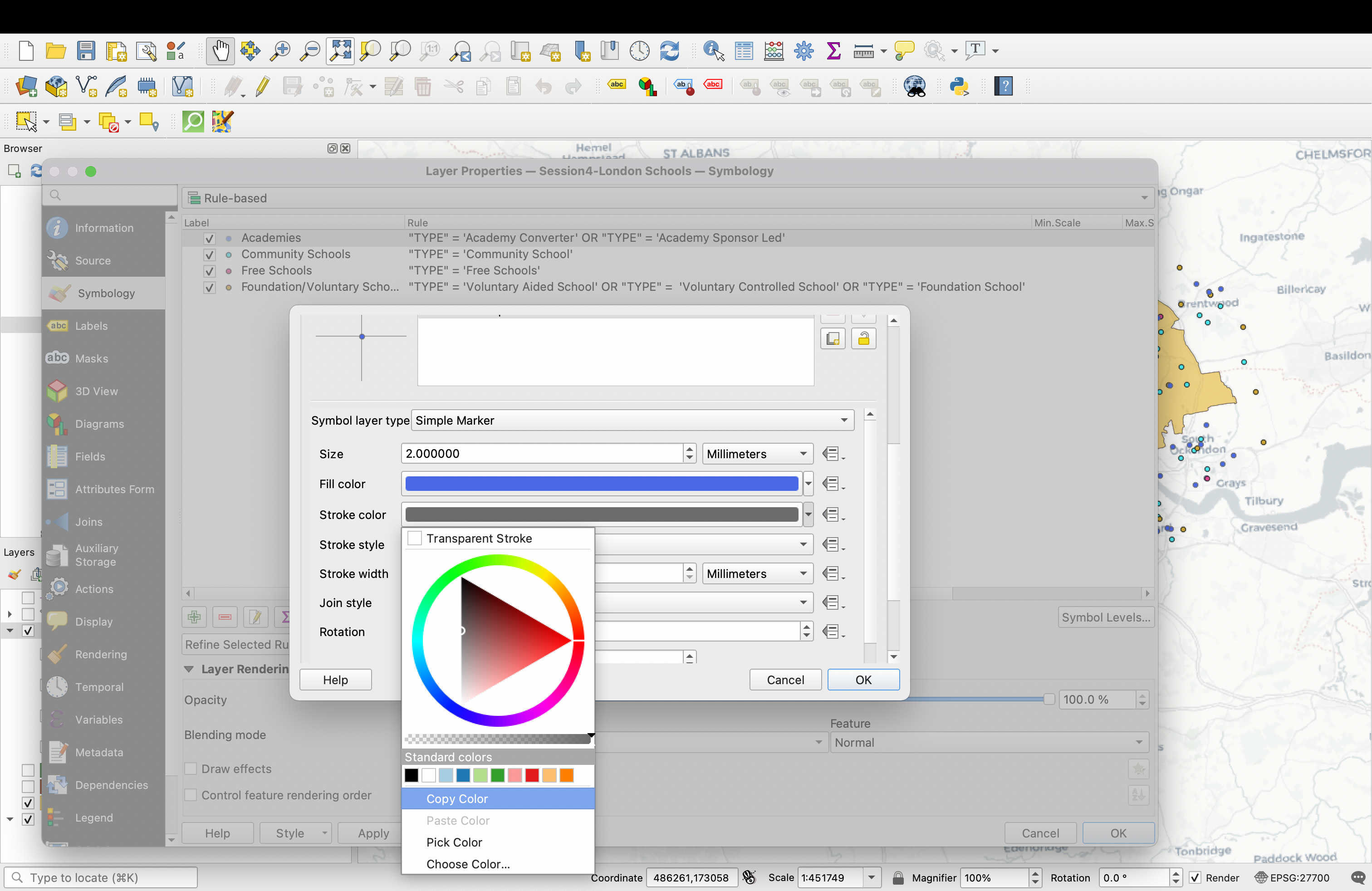
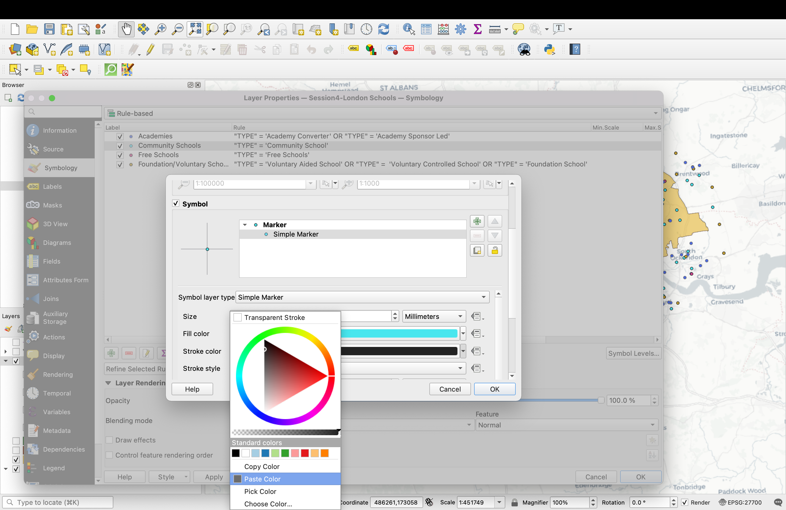
We also want to touch up the symbology by making the outline gray rather than black. Below, in the symbology section, click the Simple marker then scroll down to find the outline colour. Click to select a gray (you can also make it a bit transparent by reducing the opacity). Once you’ve found the gray you like, click Copy color; we’ll be re-using it.
Finally, change the Size of the marker to 1.6 instead of 2.0, then press OK.
Now let’s repeat this process to lump together the Foundation schools and the two types of Voluntary schools. Click on Foundation School, then find the Epsilon sign and write an OR statement to combine these three categories. Press OK, then don’t forget to rename it to Foundation/Voluntary Schools:
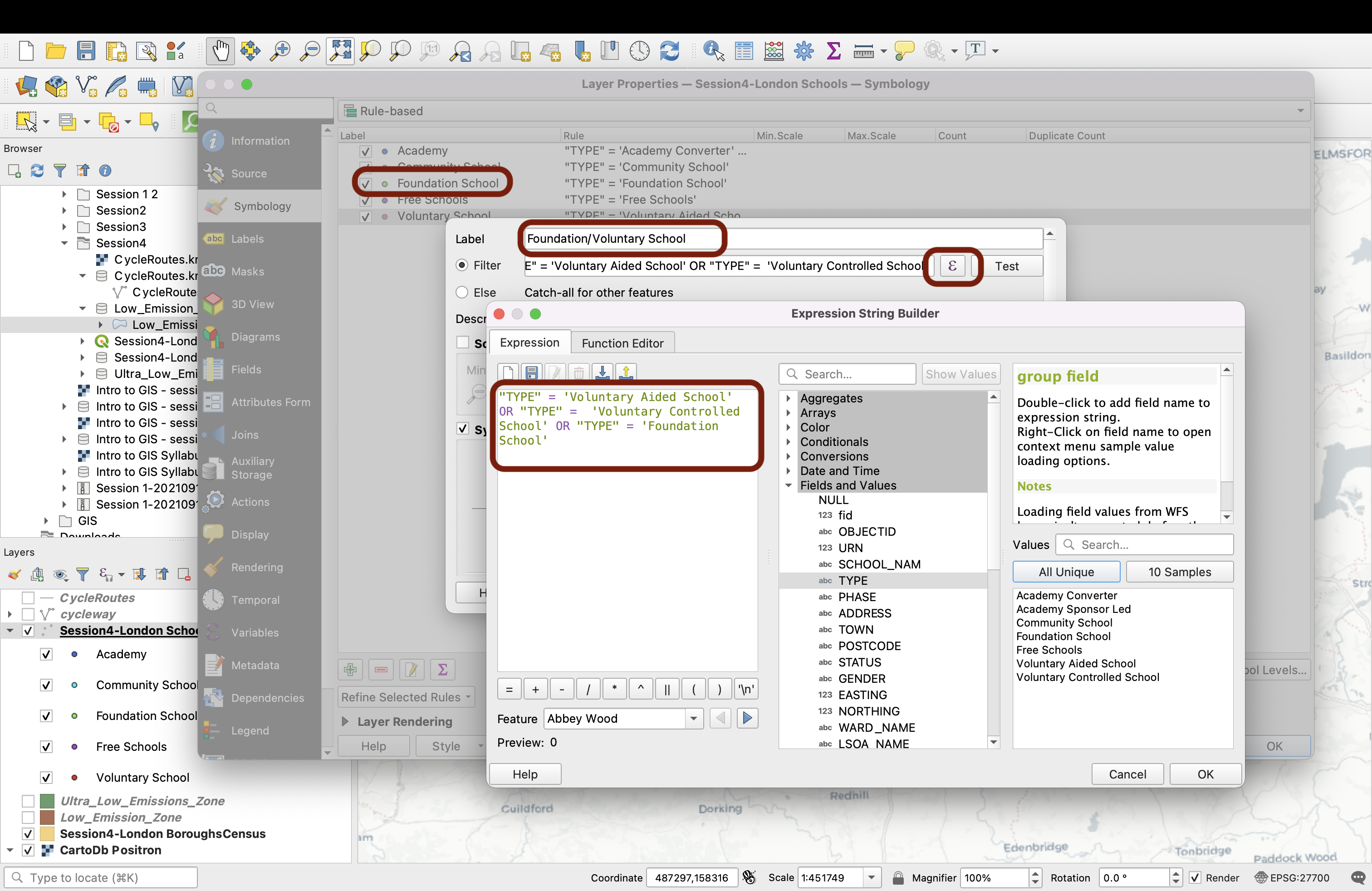
Now on the symbology: again, scroll down to edit the Simple marker. Change the size to 1.6, then in the outline colour you can simply paste the colour you used previously!
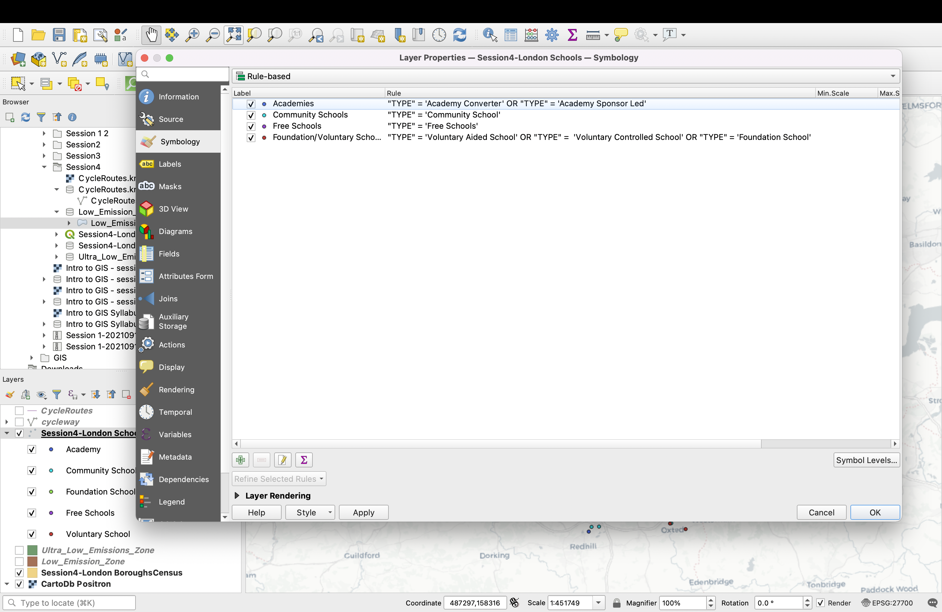
You can delete the extra categories (the two types of Voluntary school and the Academy Sponsor led) since we don’t need it anymore. You should be left with only 4 categories:
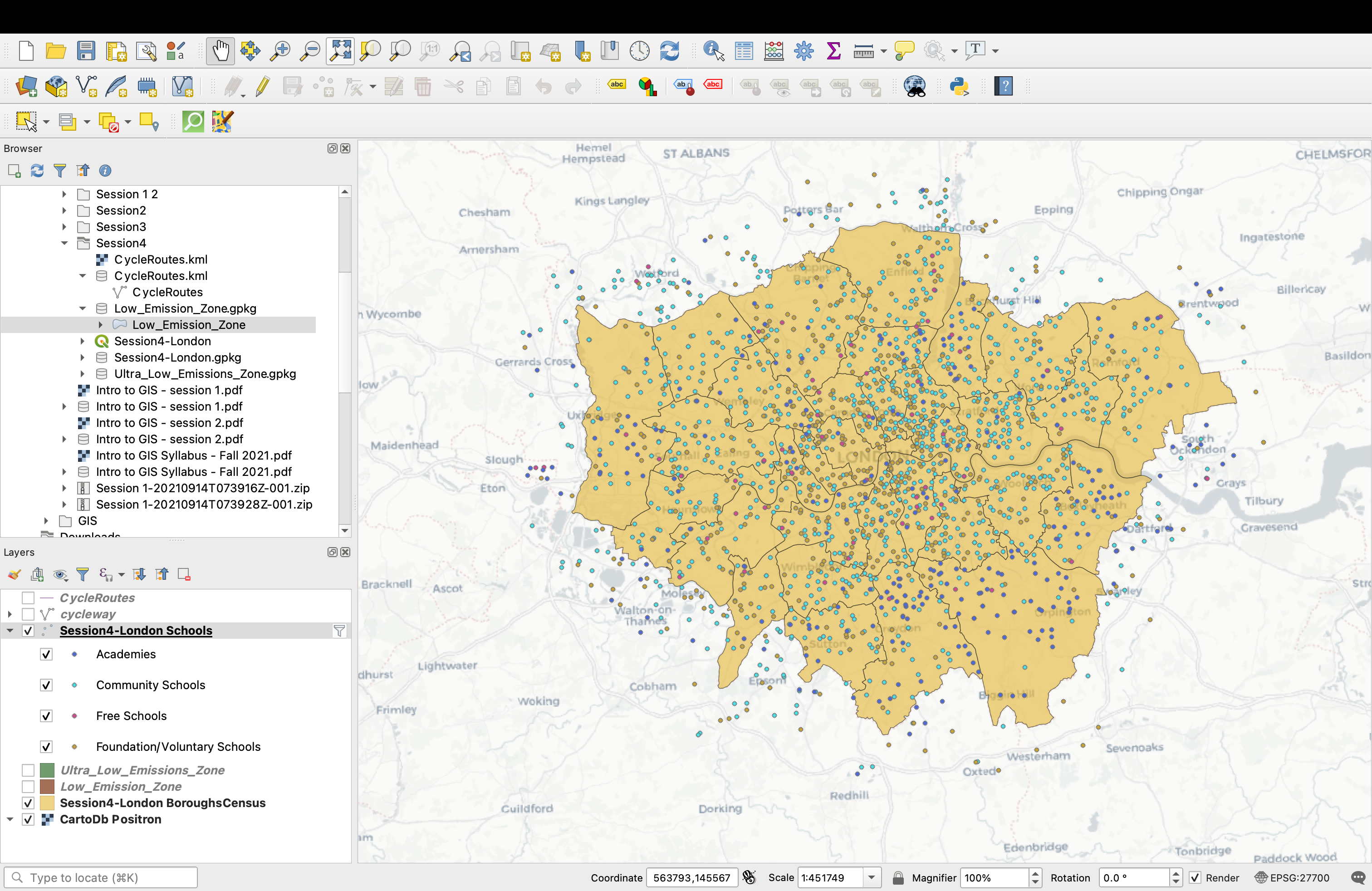
Edit the symbols for Free schools and Community Schools to paste the same gray onto their outline colour, and to change the marker size to 1.6. If the 4 colours are too similar, you can also change them manually to make sure they can be easily distinguished. You can now press OK, we are done with the point layer!
4.4 Styling the cycling lanes
Let’s now explore the styling of lines. In this case, we have one polyline layer: the OSM cycling lanes layer.
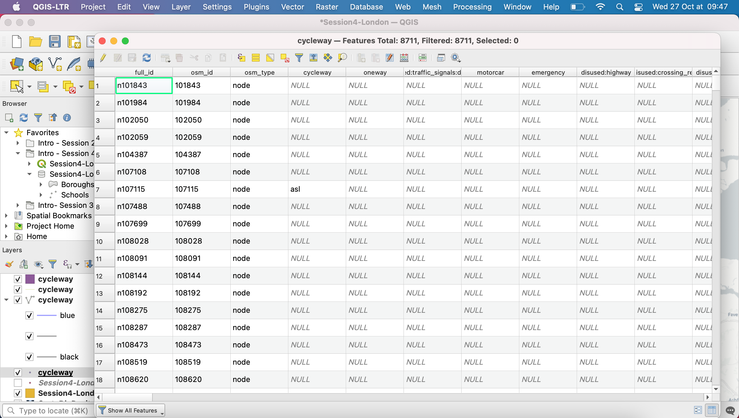
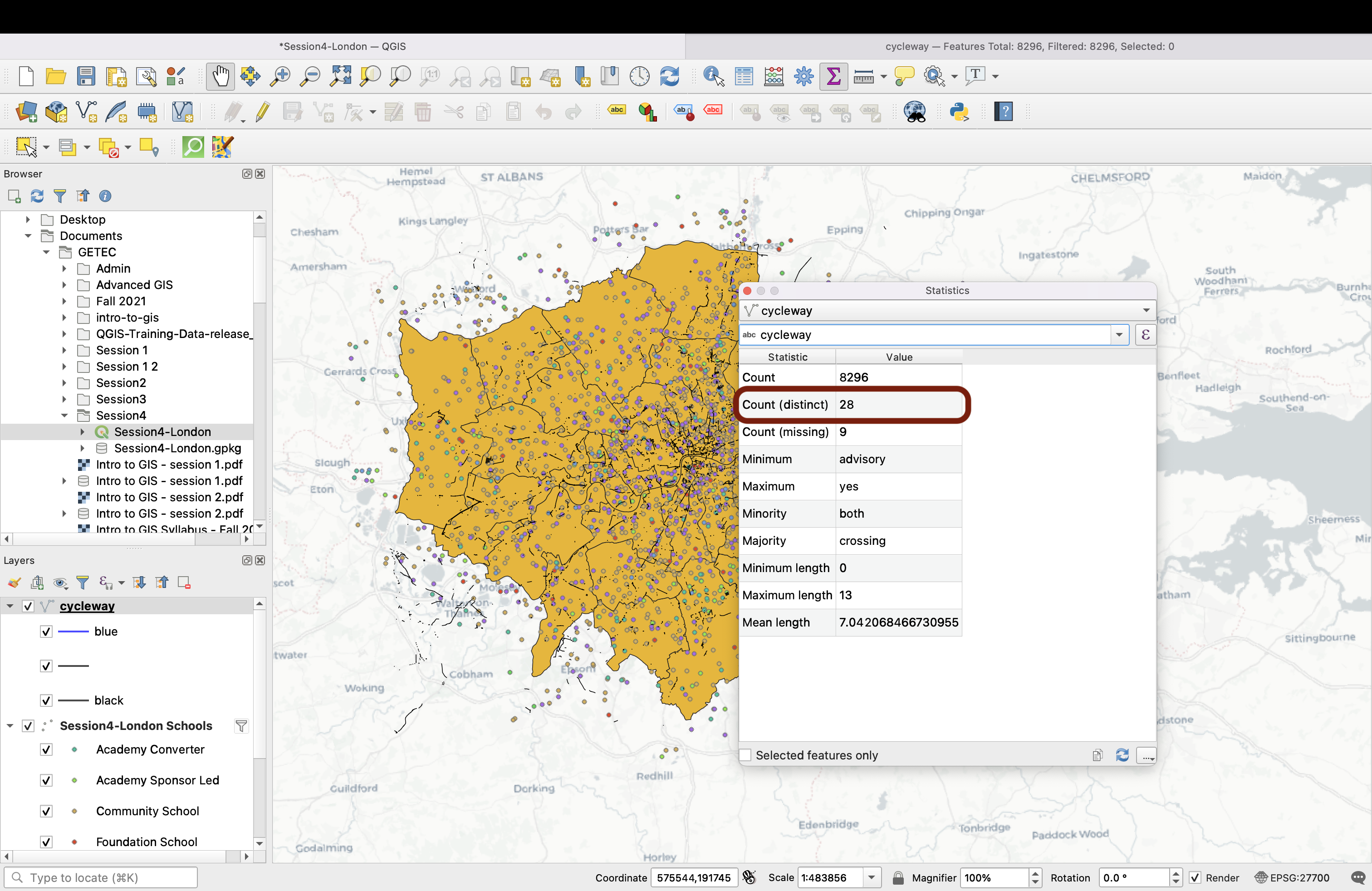
If you open the Cycleway attribute table, you will notice that a lot of fields are actually empty and that it’s difficult to identify a single field that would make it easy to base our symbology on.
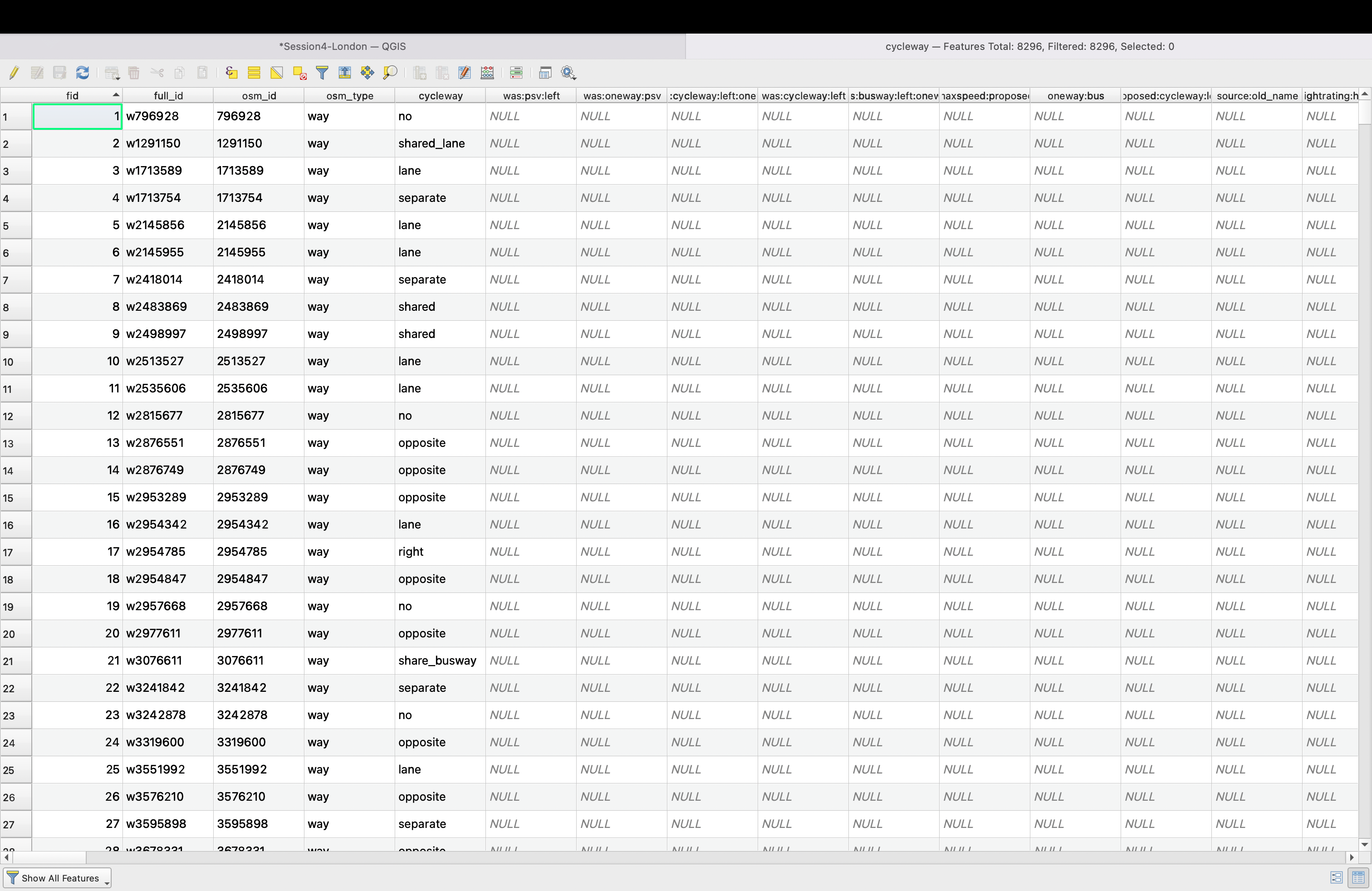
The cycleway field seemed promising, but using the Summary statistics tool (Press Ctrl + 6 or ⌘ + 6, or go into your menu View > Panels > Statistics) you can see that there are 28 different distinct values in this field.
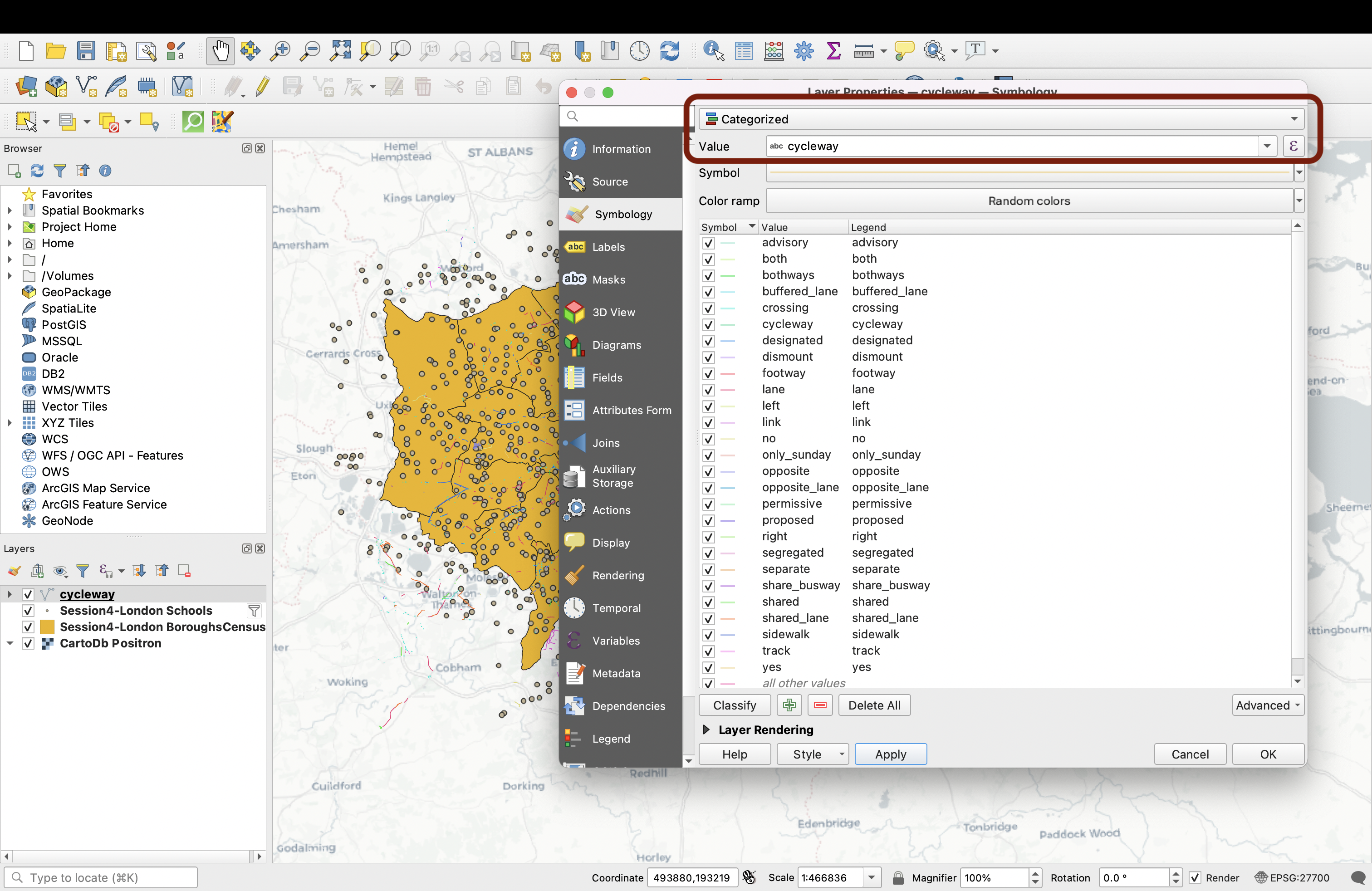
Double-click your Cycleway layer to open your Layer properties and the Symbology tab. If we pick a Categorized symbology and choose cycleway as the Value, we end up with way too many different colours and our map becomes illegible. Would you, as a map reader, be able to understand the values of each line if the Cycleway legend contained 28 items?
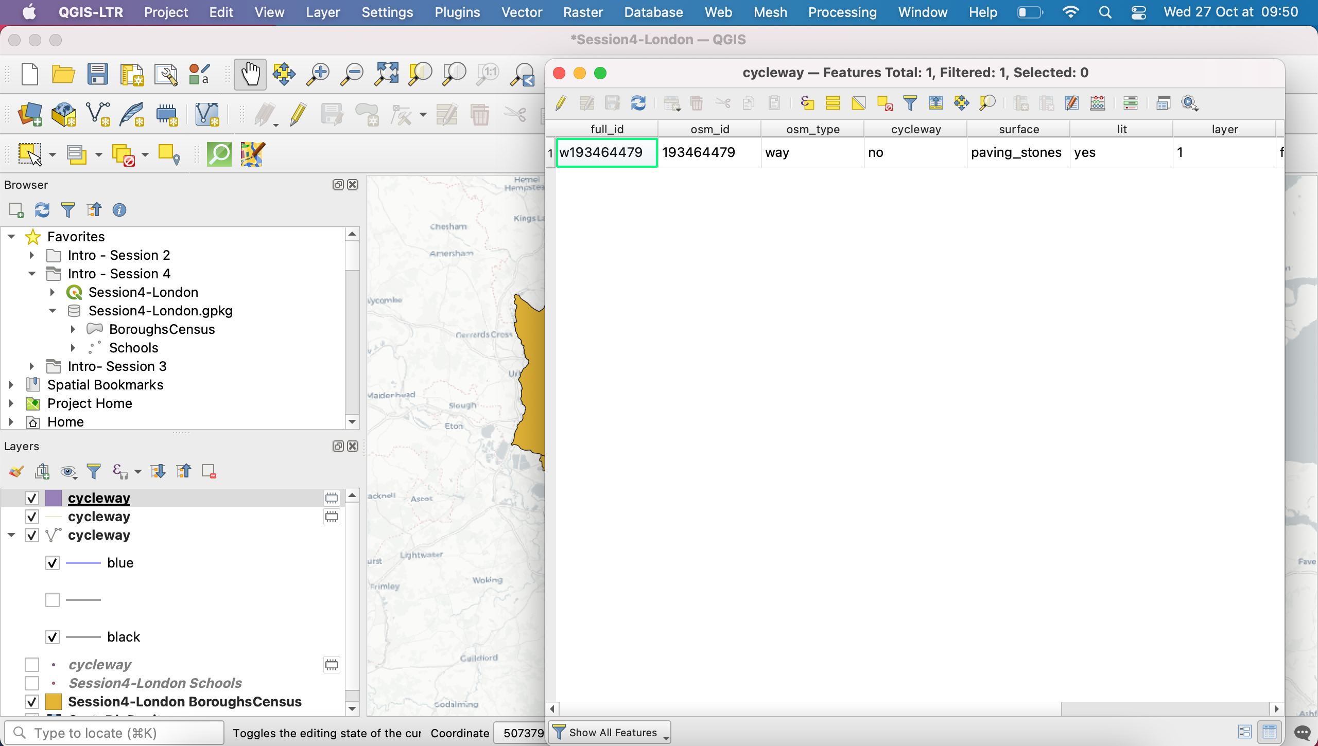
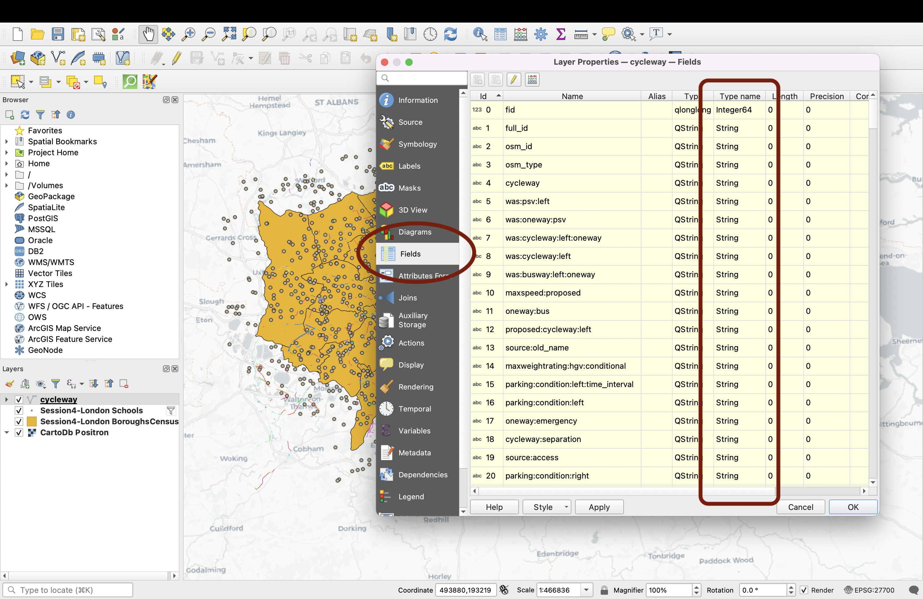
We also can’t use Graduated symbology (In fact, QGIS wouldn’t let us) because our fields contain string values (text), as you can see by clicking in the Fields tab :
In fact, we are now seeing that this layer is going to be very difficult to use, and that the geometries also look very scattered around. It’s time to change gears and look for another dataset.
Let’s see if we can find a dataset that’s better suited to working with the attribute table. The reference provider for these questions in the Geeater London Metropolitan Area is Transport for London; we’ll use their cycling data. On this page, download the CycleRoutes.kml file (the page is very packed, just use Ctrl + F or ⌘ + F to jump to the file). Save it into your Session4 working folder (if you’re having issues, a copy of it is also available in the geopackage on the GitHub as Tfl_CycleRoutes).
KML files are vector files, you can easily drag and drop the layer onto your map canvas.
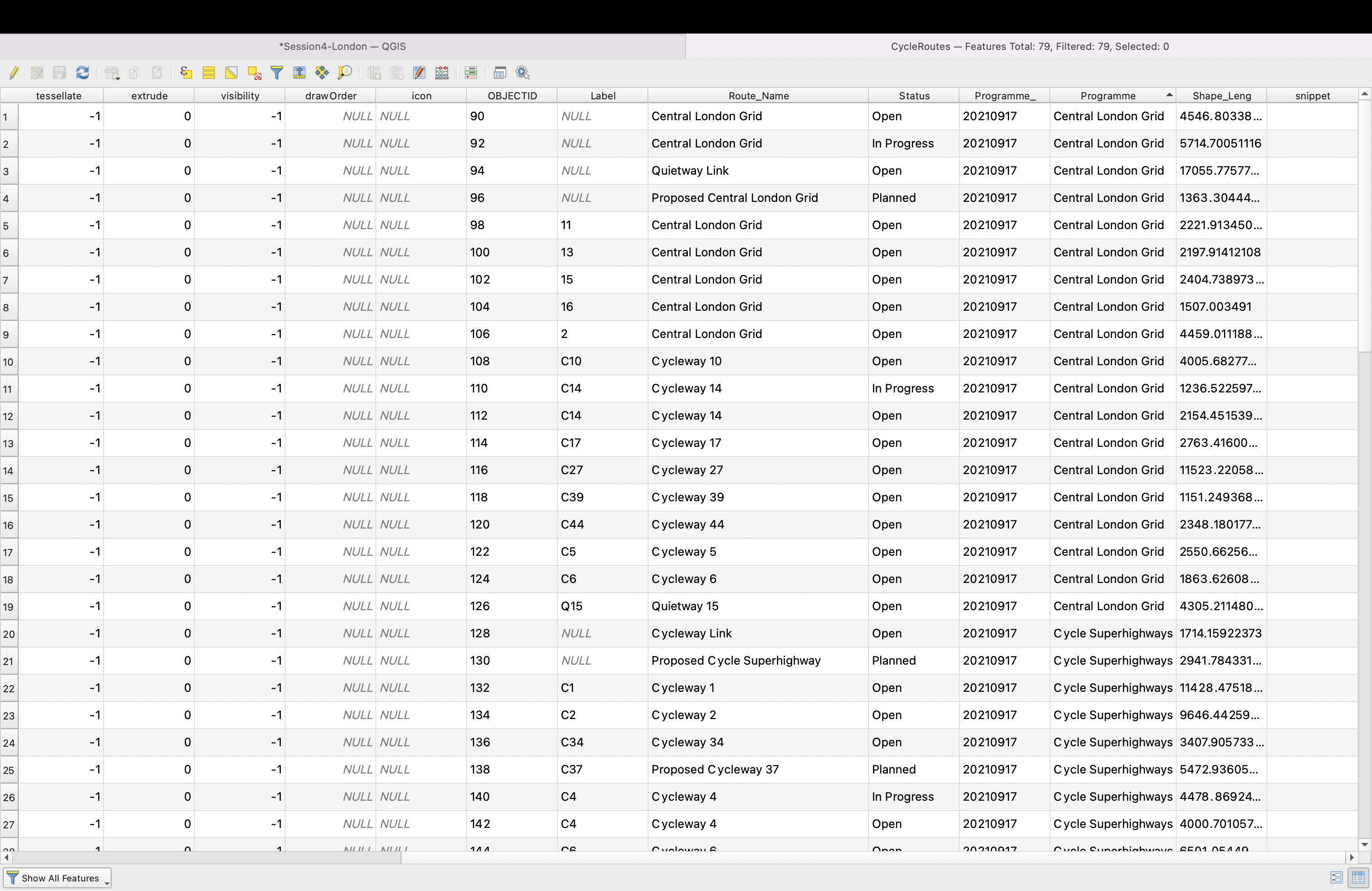
If you look into the layer’s attribute table, you’ll find that two fields are actually quite interesting: the Status and Programme tell us about the completion status of the cycle routes, and which initiative they fall under.
Double-click your layer and navigate to the Symbology tab. We will use the Status as our value. You can delete the all other values....
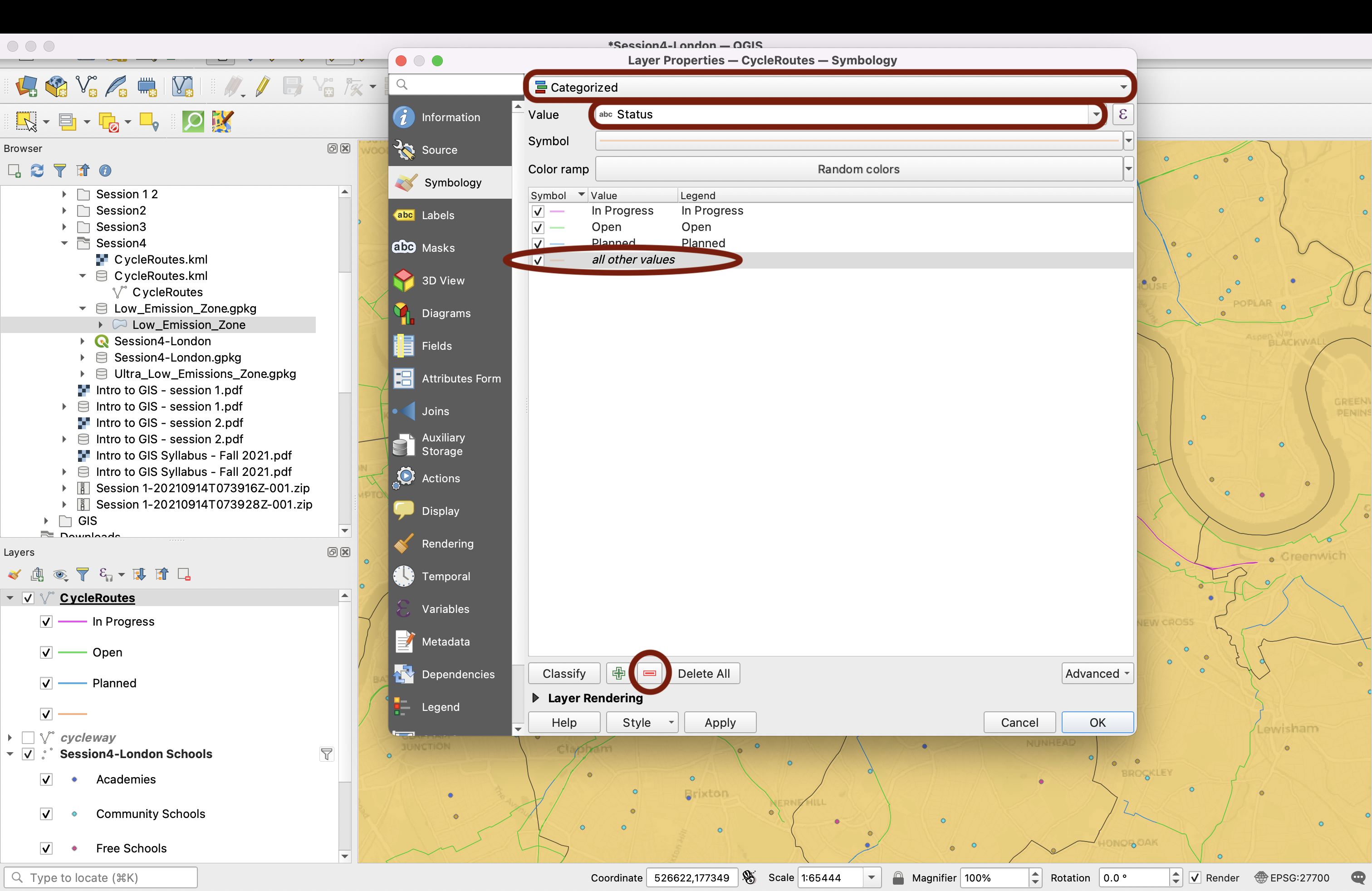
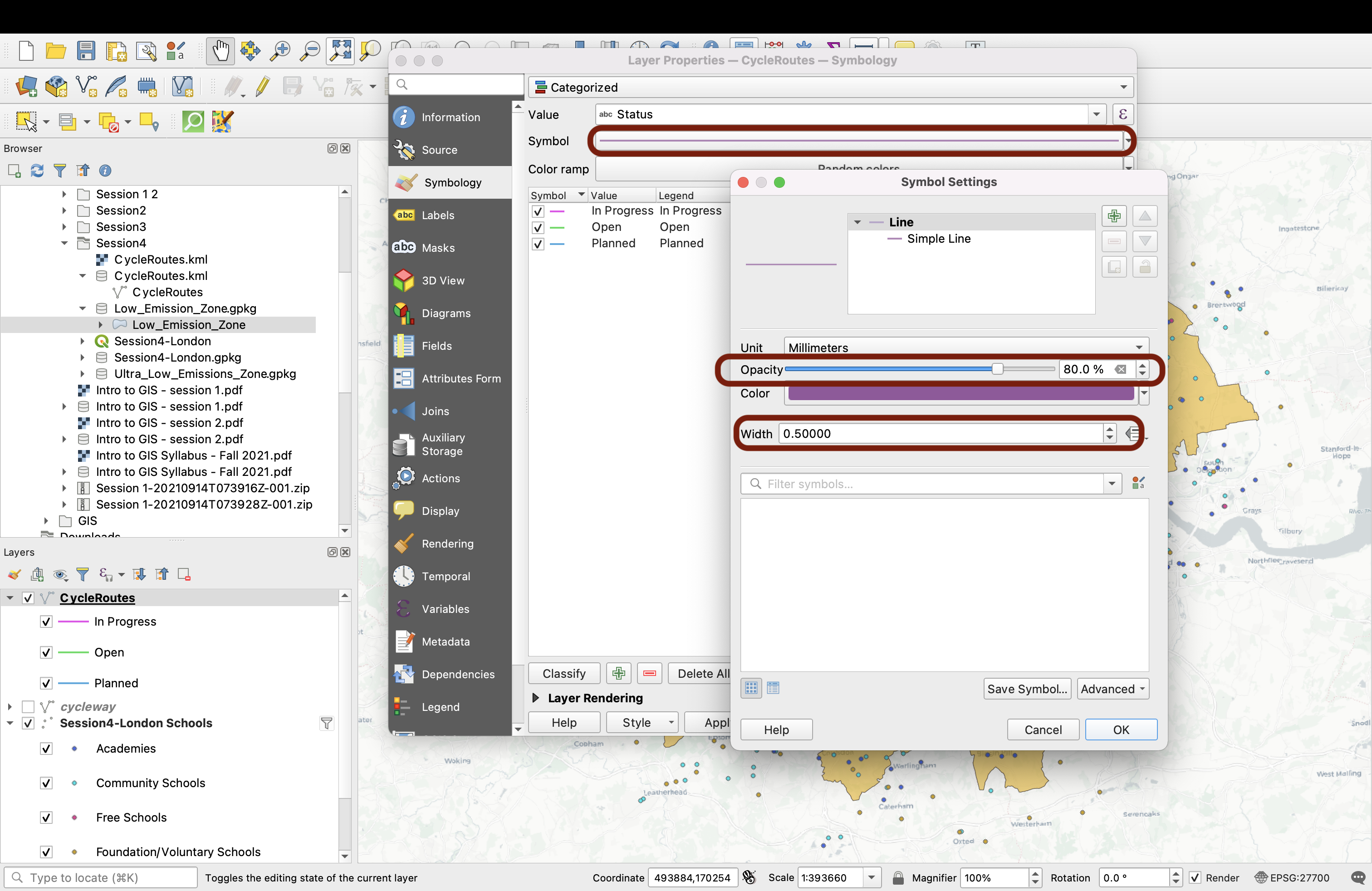
Click on the Symbol (not the arrow, but the Symbol button itself) to access all the customization options. Increase the line size to 0.5 and decrease teh opacity to 80%:
We’ll now edit each symbol individually, starting with the Open lanes. We’ll use a dark green and copy the colour.
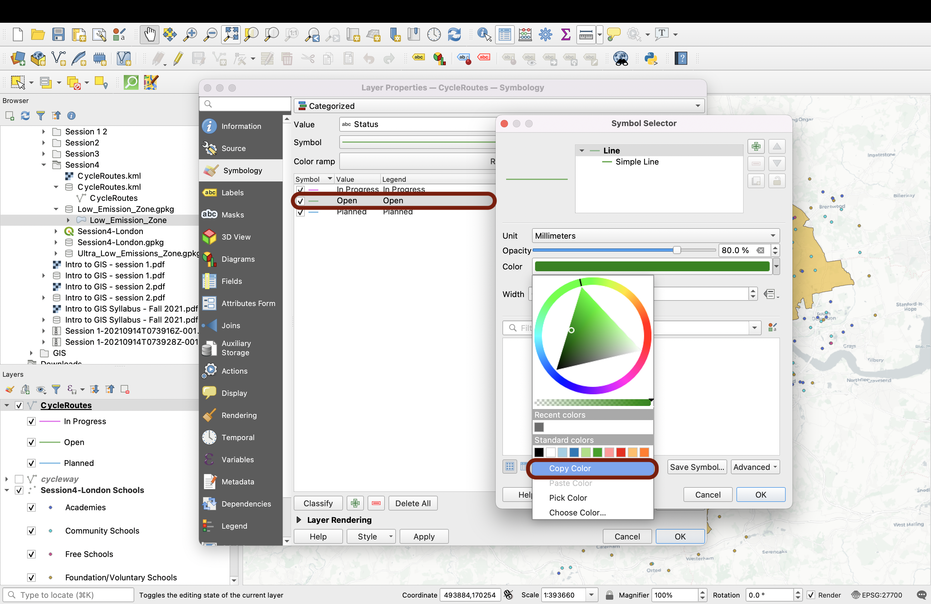
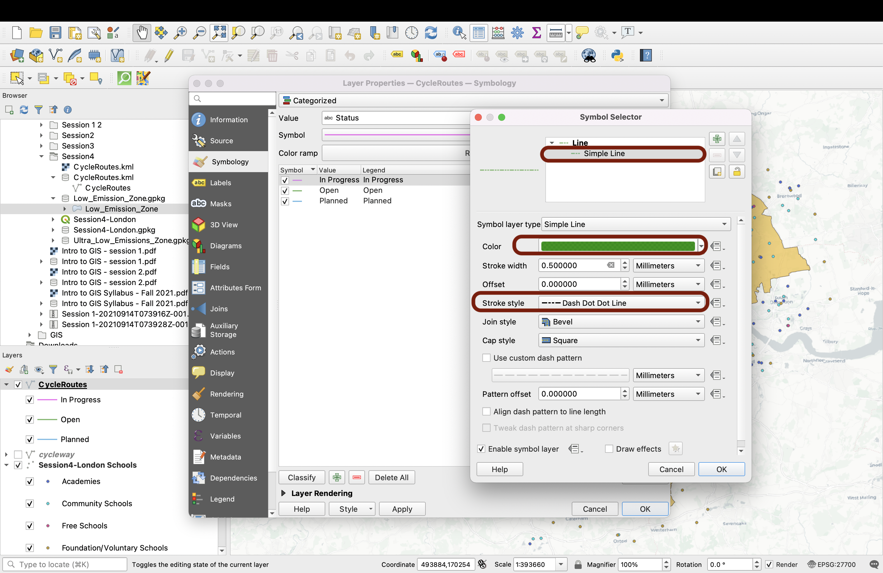
Next: cycle routes In Progress. Paste the green you just copied from the open lanes and make it slightly more transparent. Now, click on the line symbol to edit the type of line; we will use a dashed line to symbolize the progression.
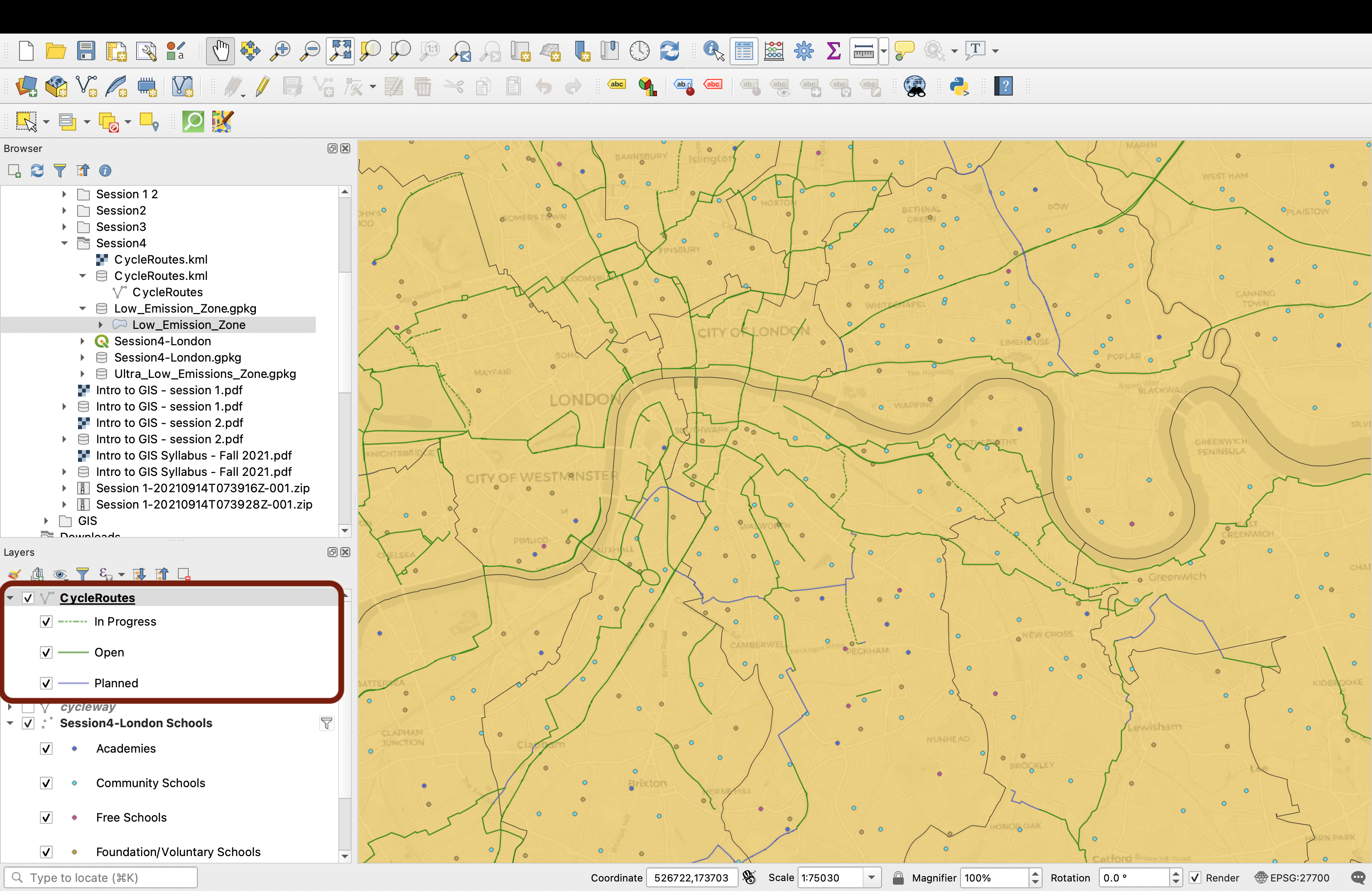
Finally, pick a medium dark blue for the Planned lanes. Press OK, then look at your map canvas; you can zoom onto specific areas to get a clearer view. This symbology for the cycling lanes works pretty well because the nuance is subtle at the London scale and just gives us a general sense of where the main cycling routes are, but once you zoom onto a specific area you get a better sense of what routes are yet to be completed.
4.5 Adding and customizing labels
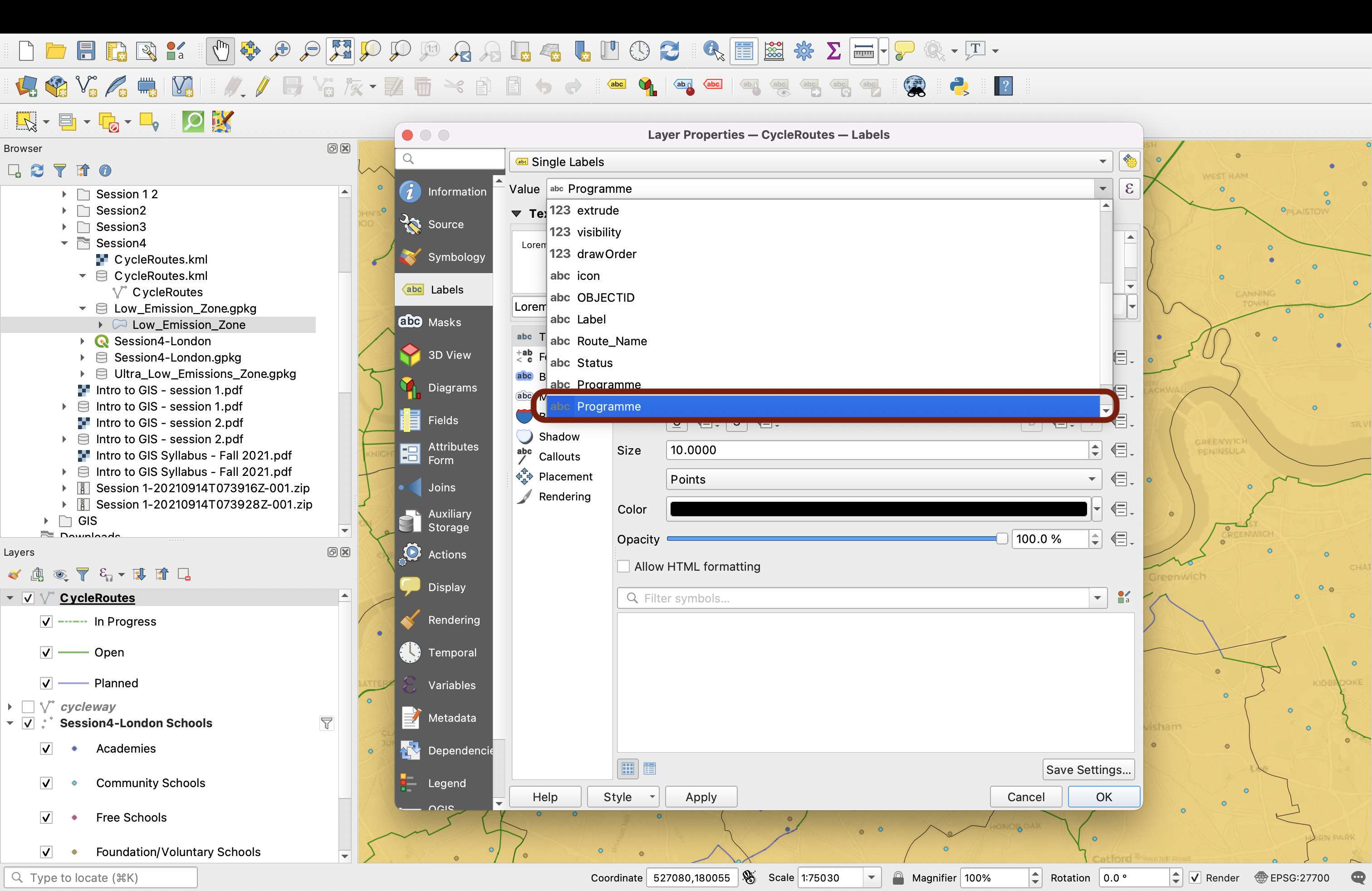
Now, we’d like to use labels! Double-click your layer to open the Layer properties window and go to the Labels tab. Use Single Labels.
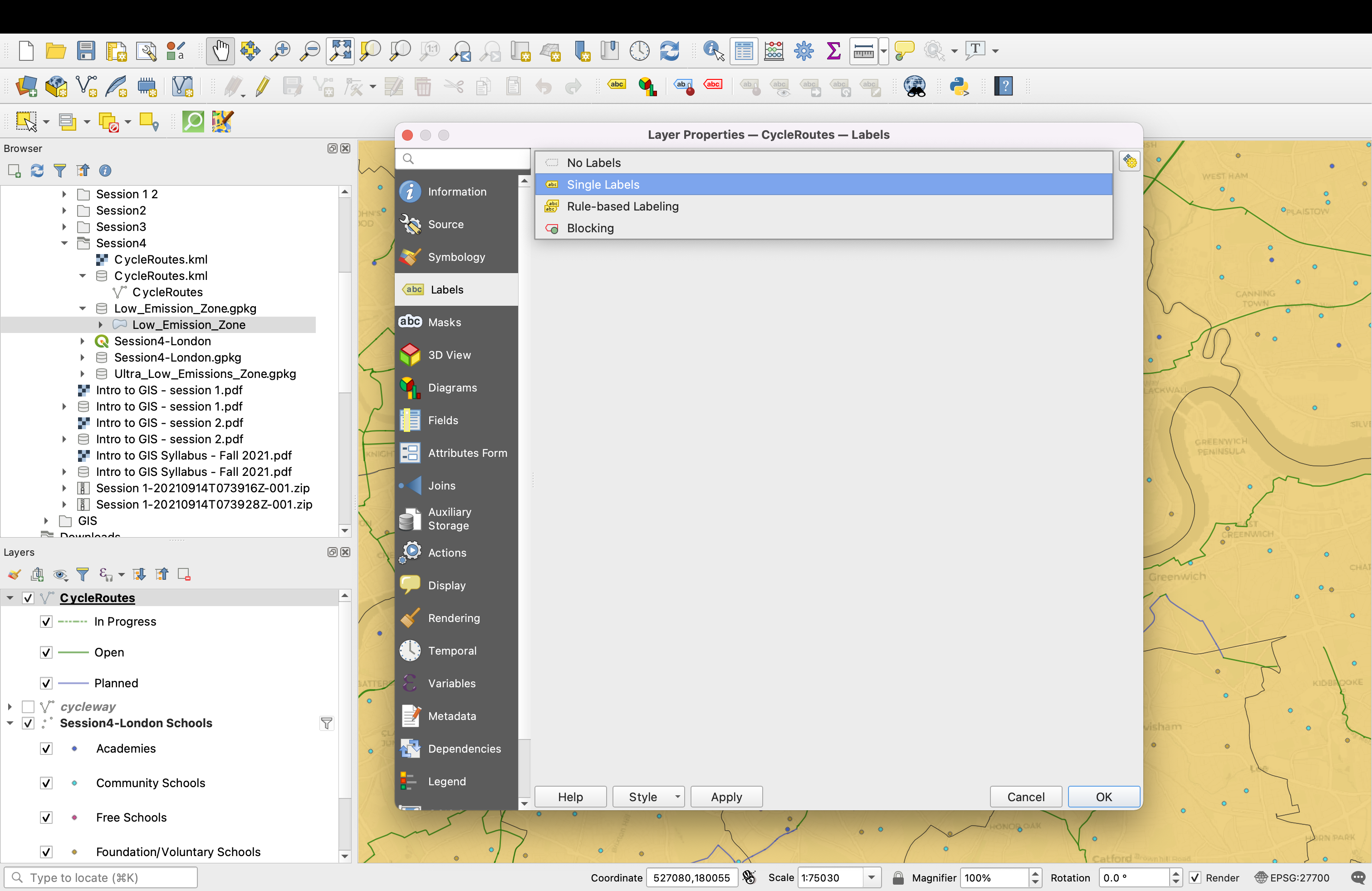
Now, select Programme as your value.
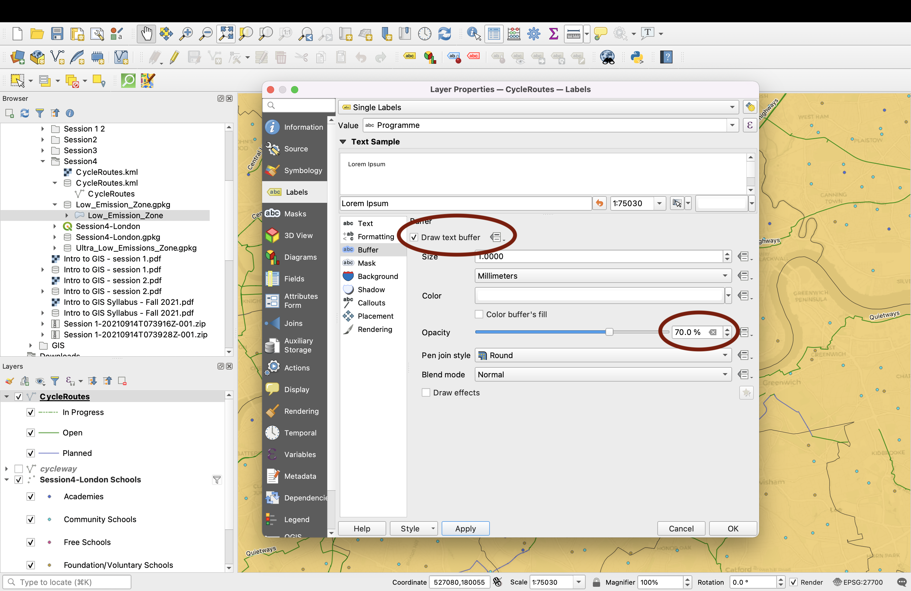
The font works pretty well, we’ll just edit a couple settings. First, let’s add a buffer around the text so that it “pops” better from the background.
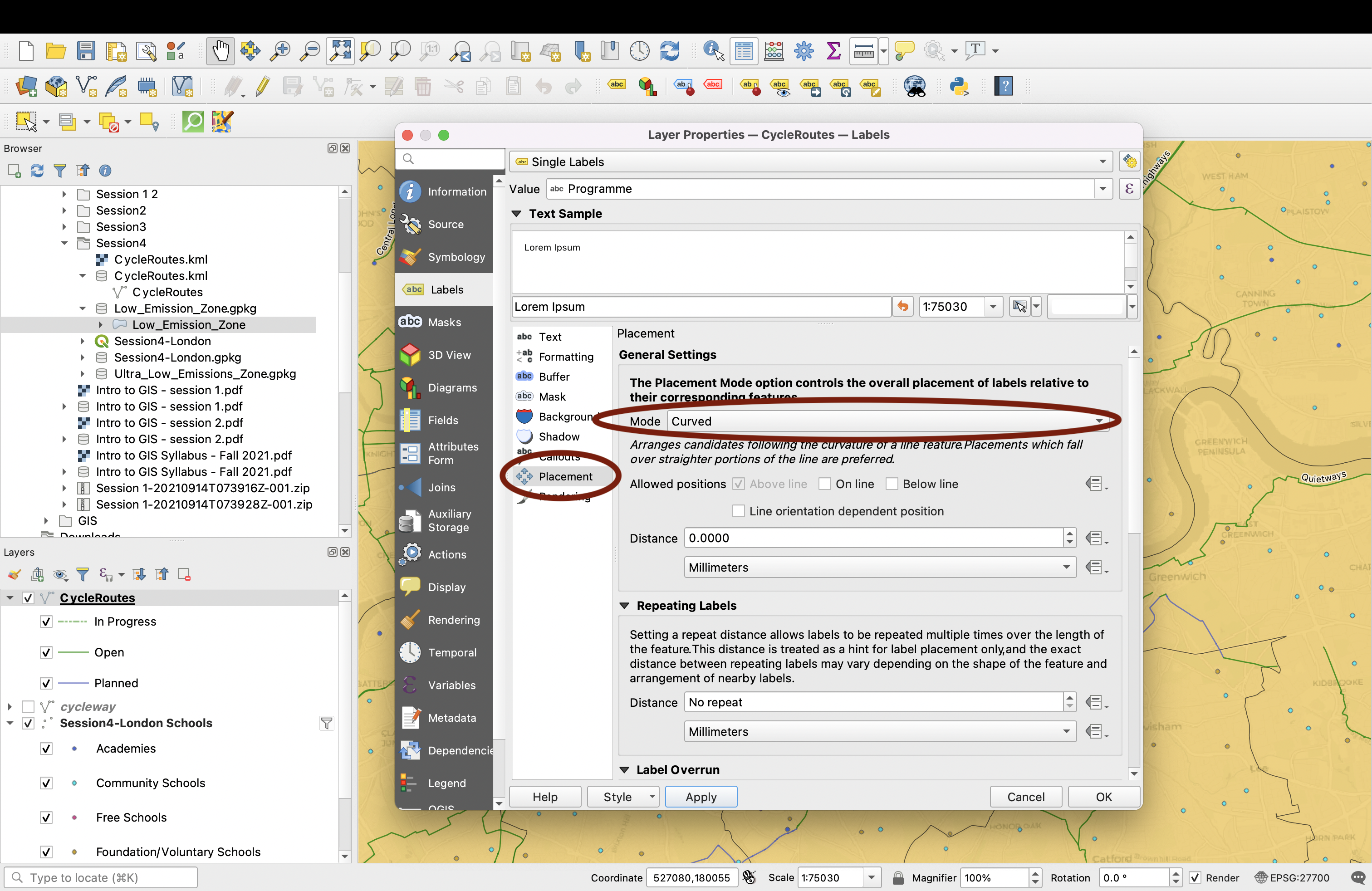
Next, in the placement settings change the placement mode to Curved so that the text actually follows along the lines nicely.
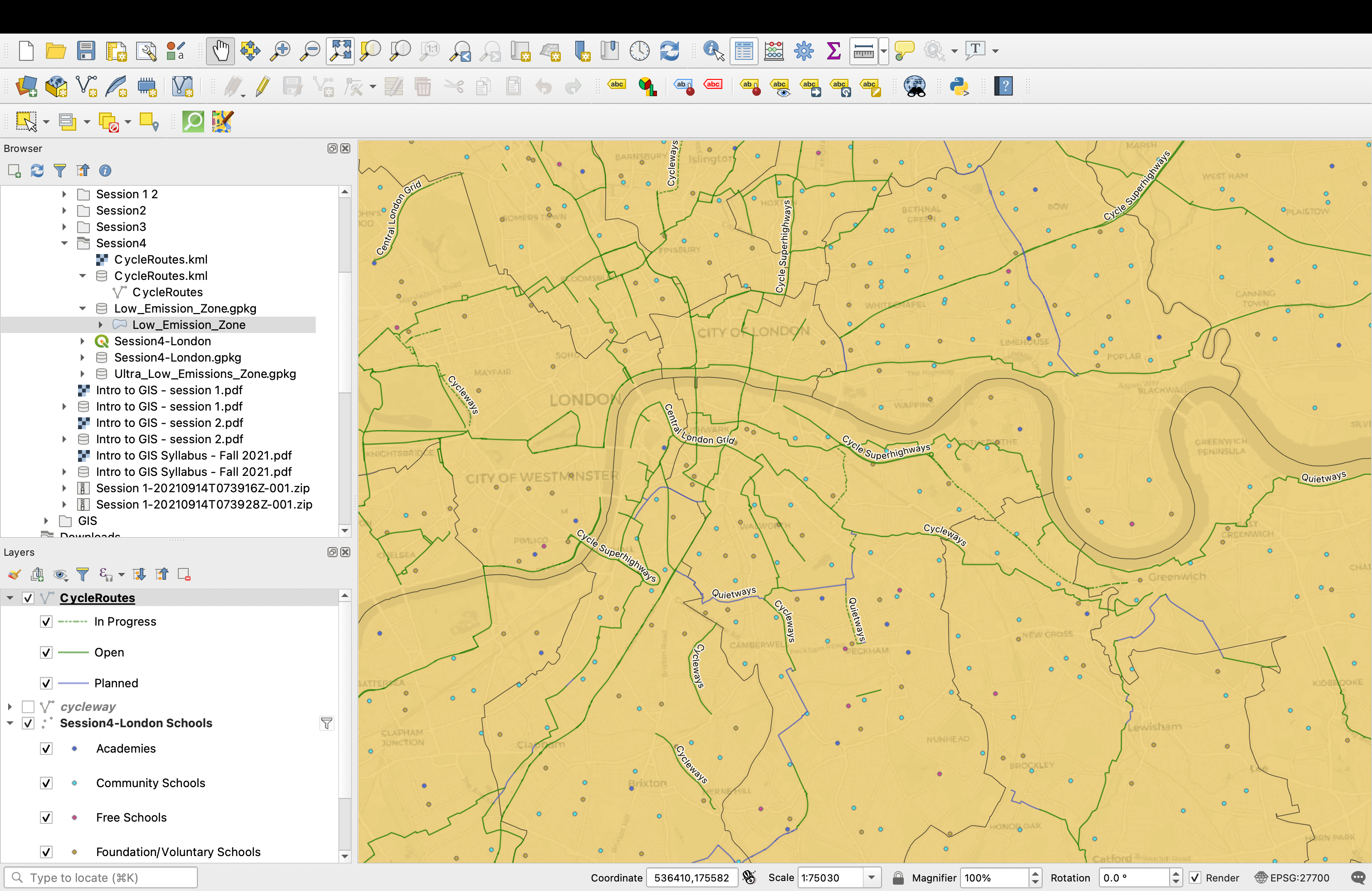
We’re done with the line layer! Zoom in and out across London and notice that the rendering of the lines depends on the current map scale (the more you zoom in, the more line labels you can read).
4.6 Scale Dependent Visibility
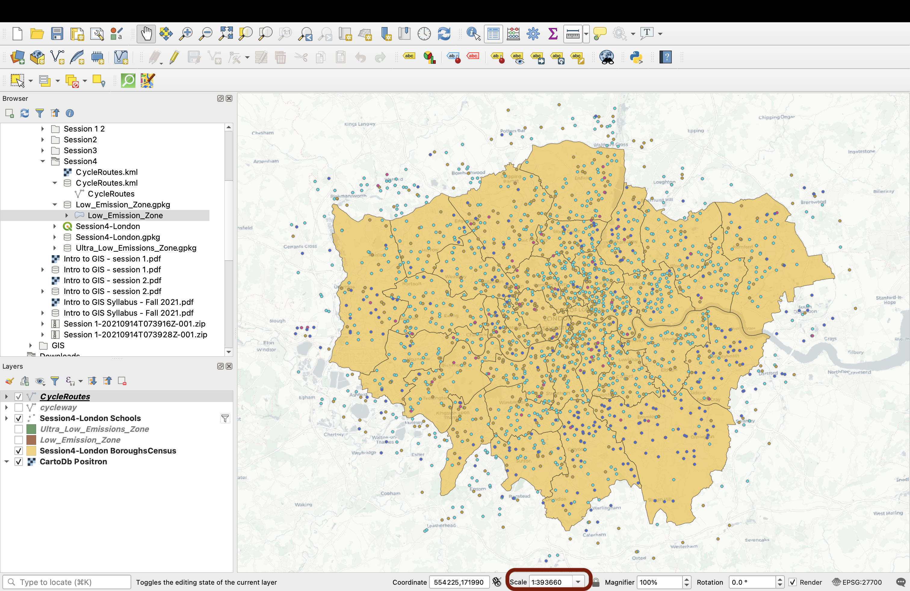
This type of rendering behaviour is called “Scale-dependent rendering. You can for instance decide to only display certain features once you’re zoomed in beyond a certain level. This allows you to avoid clutter. You could for instance decide that your CycleRoutes layer should only be visible once you’re zoomed in at Borough level. You can try it by double-clicking your layer, and in the Rendering tab checking the Scale Dependent Visibility checkbox. Use 1:60000 as the minimum scale.
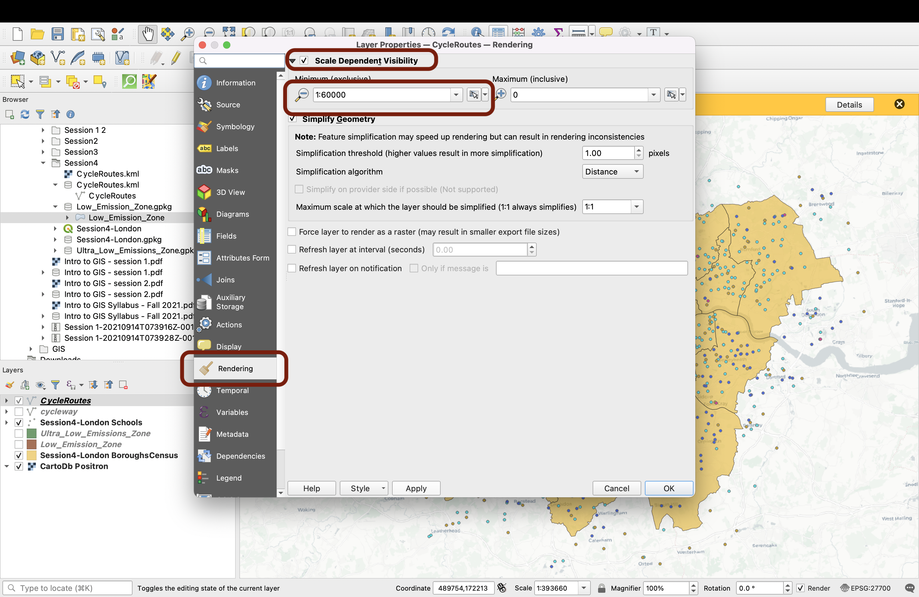
Now if you’re zoomed out to see all of London (scale 1:3), the layer is not rendered on your map.
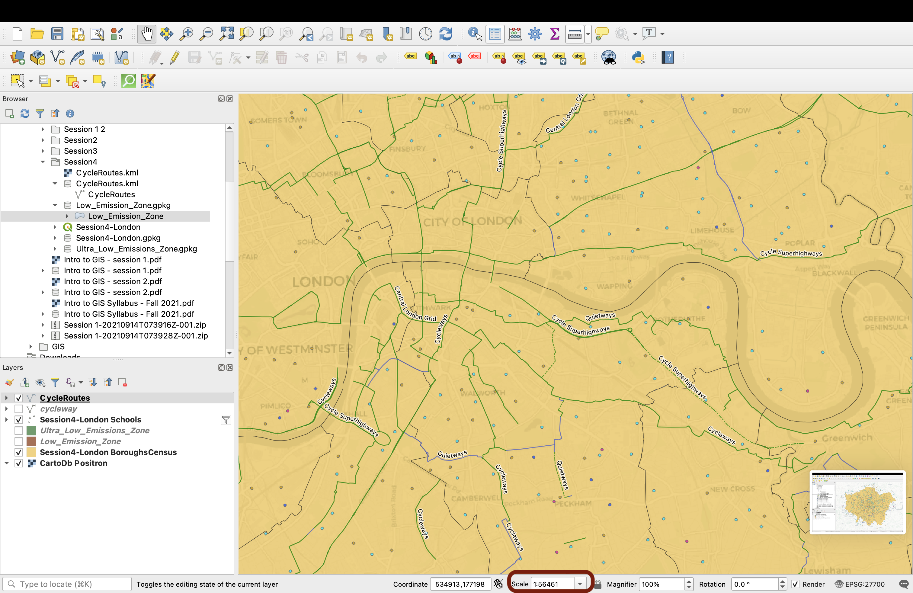
But if you zoom in, for instance to 1:56461, then your layer re-appears:
This is all for your line layer, now let’s move on to your polygon layer.
4.7 Styling polygons
There are 3 polygon layers in your geopackage. Bring them onto your map canvas.
4.7.1. Masking with the London boundaries
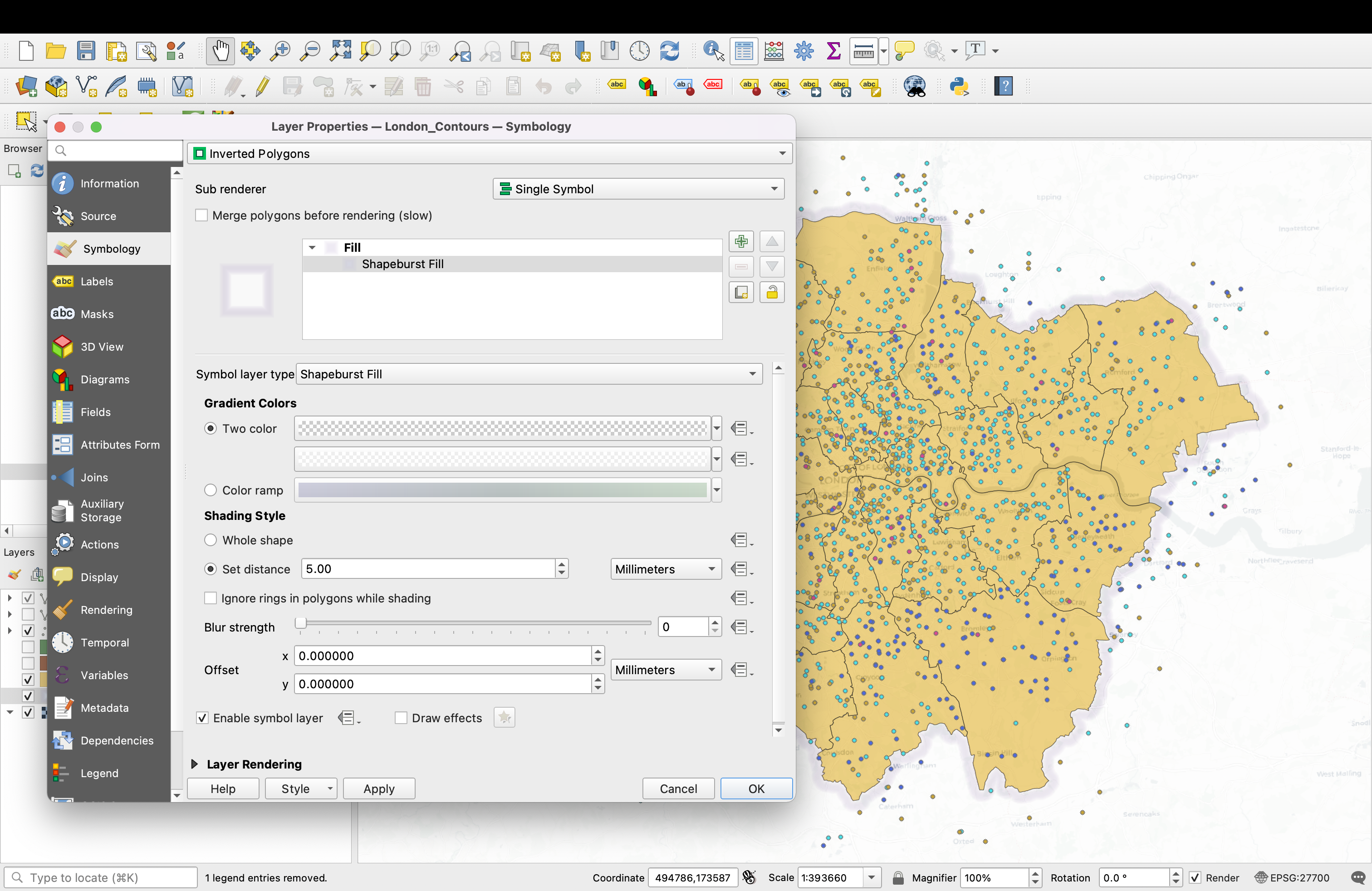
First, let’s create a mask to hide what’s beyond London boundaries. Double click the London_Contours layer and go to your Symbology tab. Select Inverted Polygons, then select Shapeburst Fills as your Symbol Layer Type.
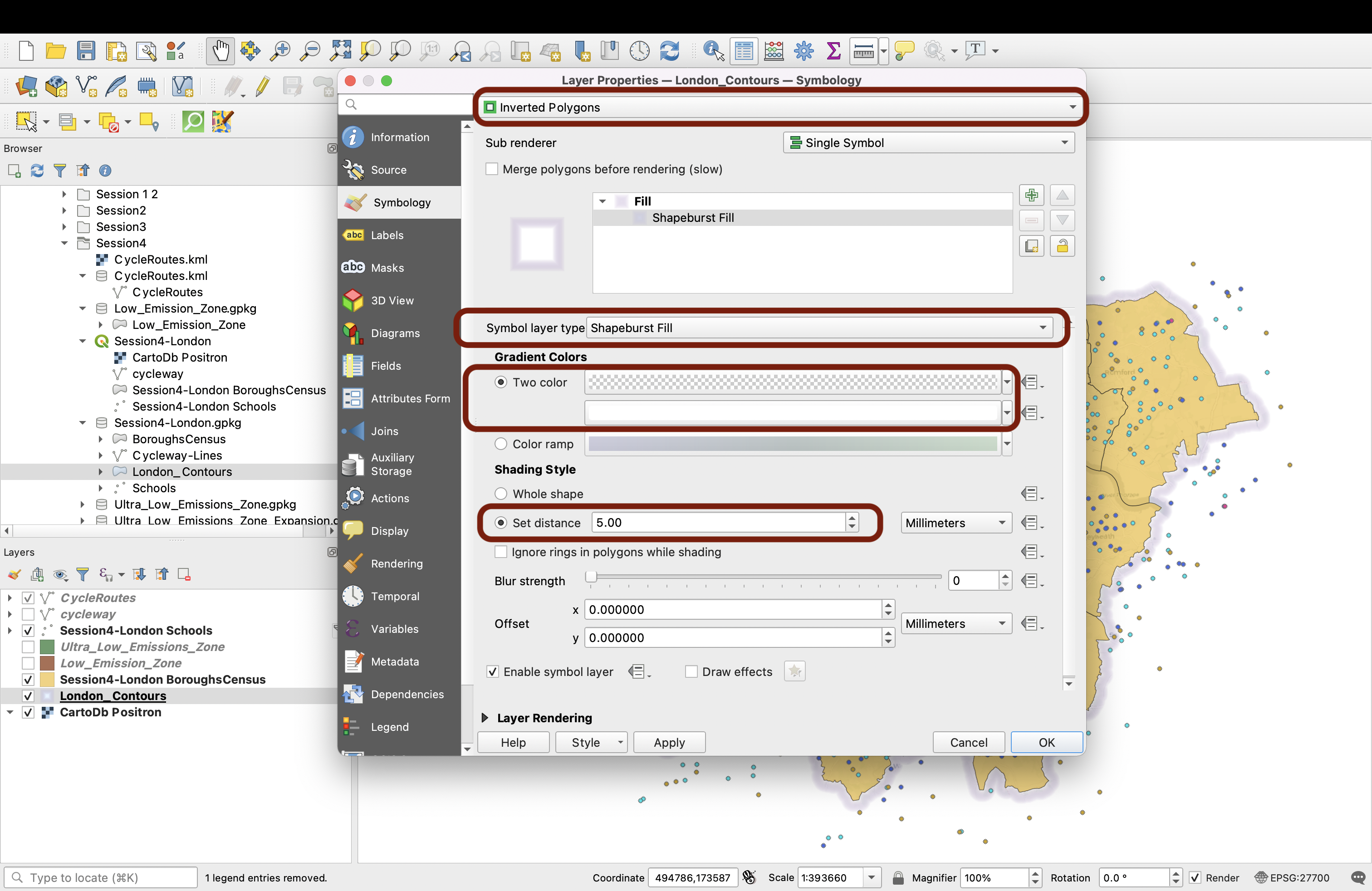
Use Two color so that QGIS creates a light feathering effect, the first colour being Transparent and the second a 60% opaque white.
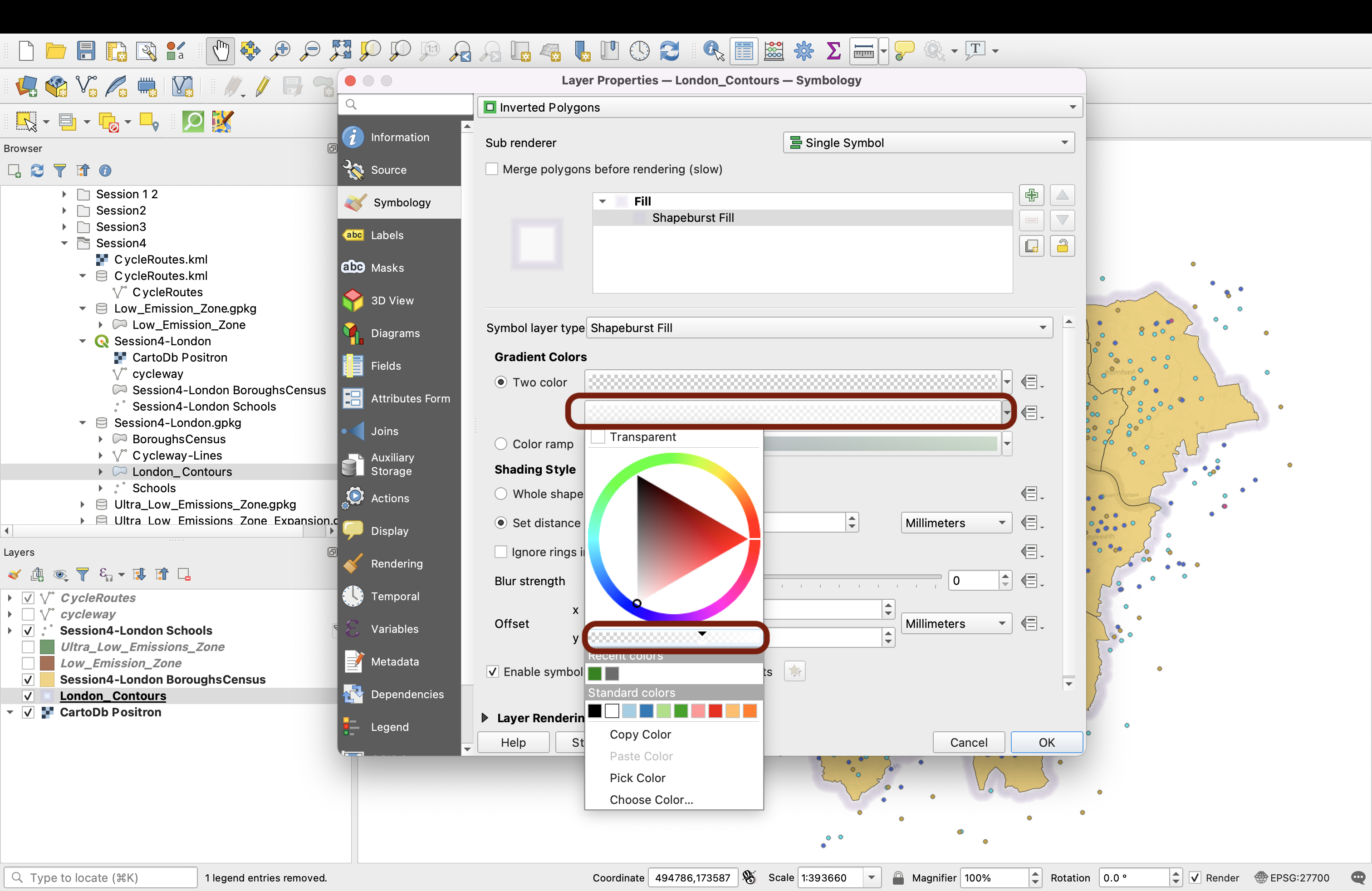
Set distance to 5.00, then press OK and admire your new mask!
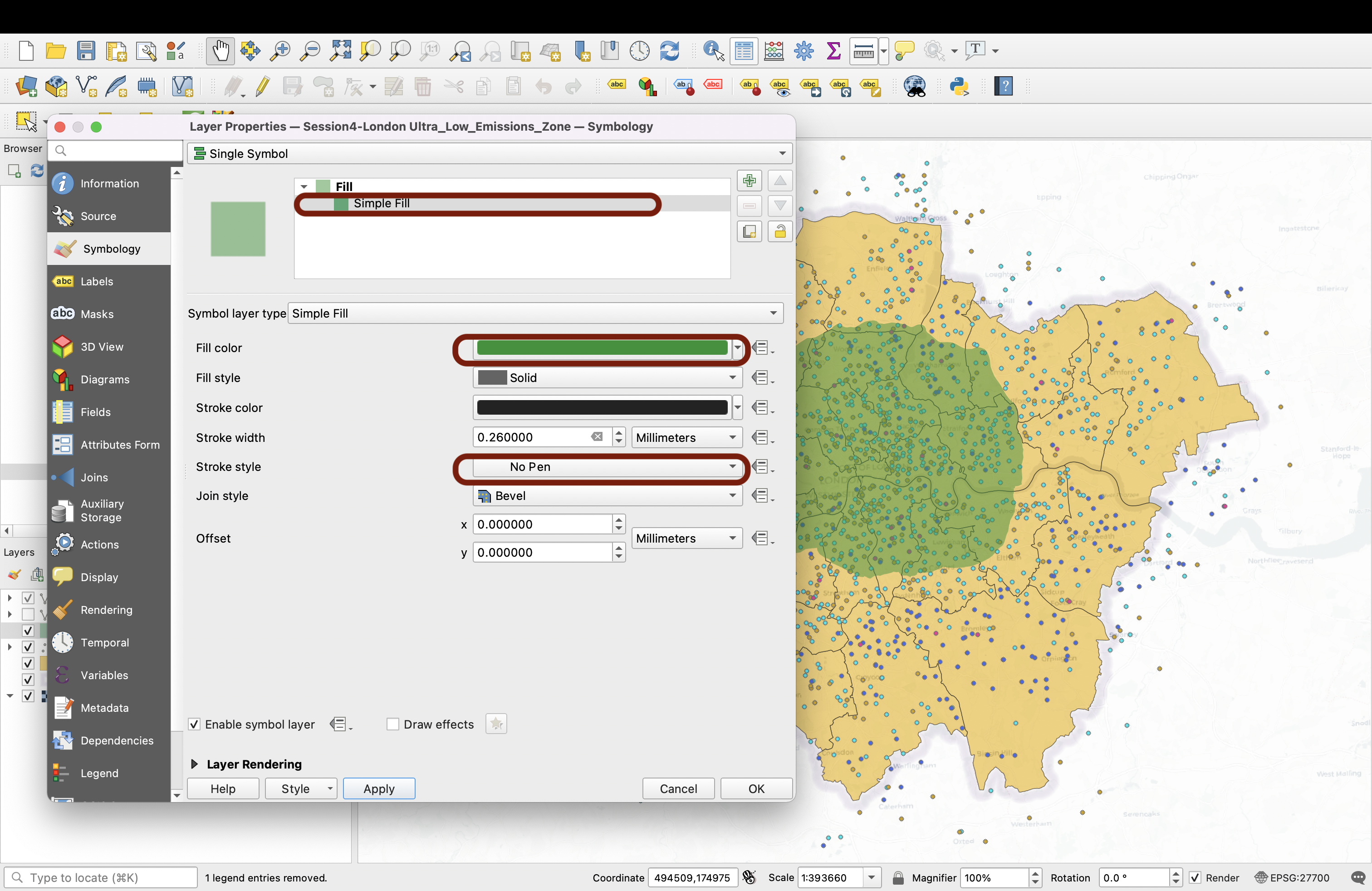
4.7.2. Ultra Low Emissions Zones
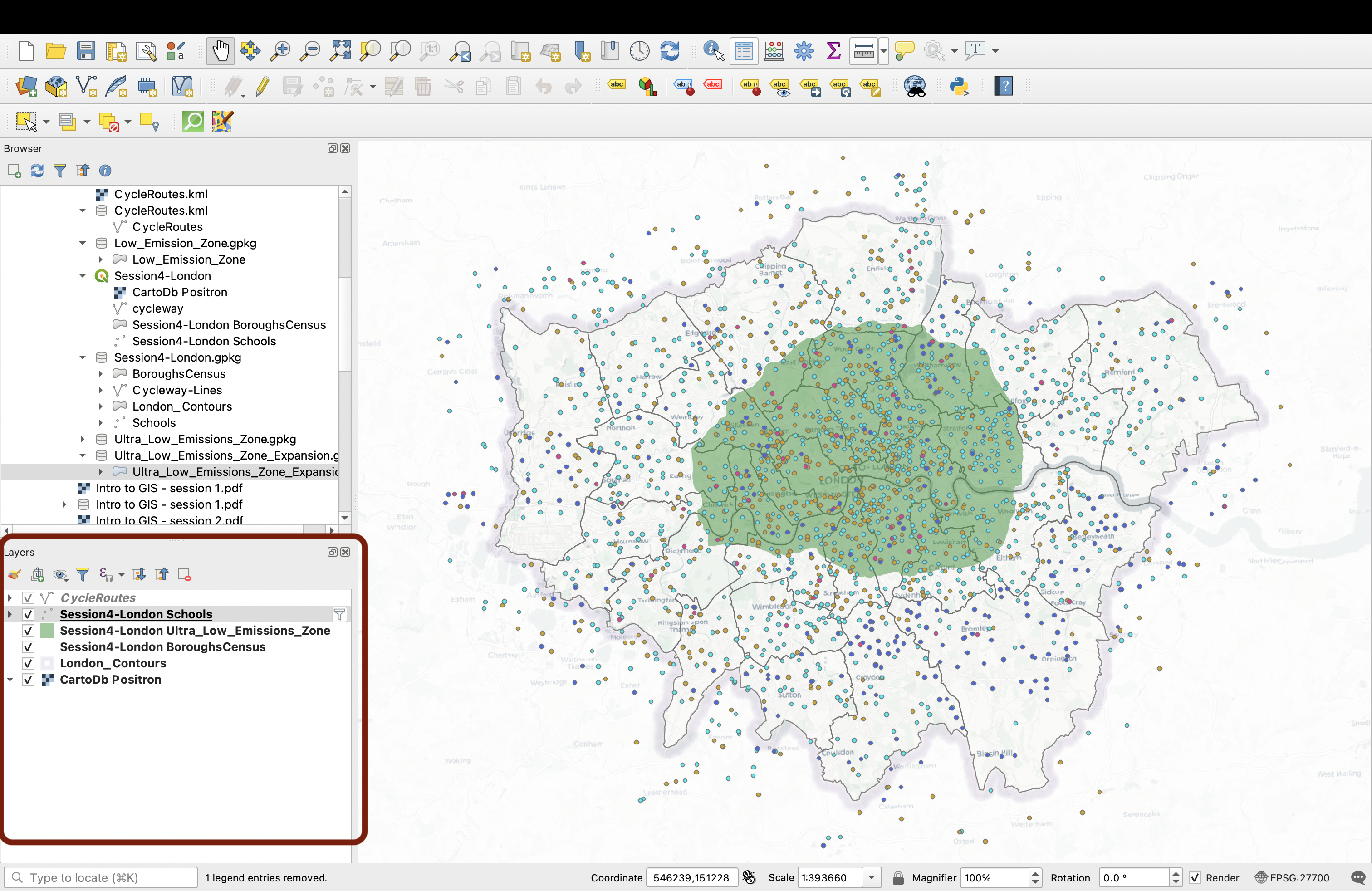
Next we’ll look at the Ultra_Low_Emission_Zones layer. We use a simple symbology and pick a bright green colour. We choose to not draw the boundary of this layer.
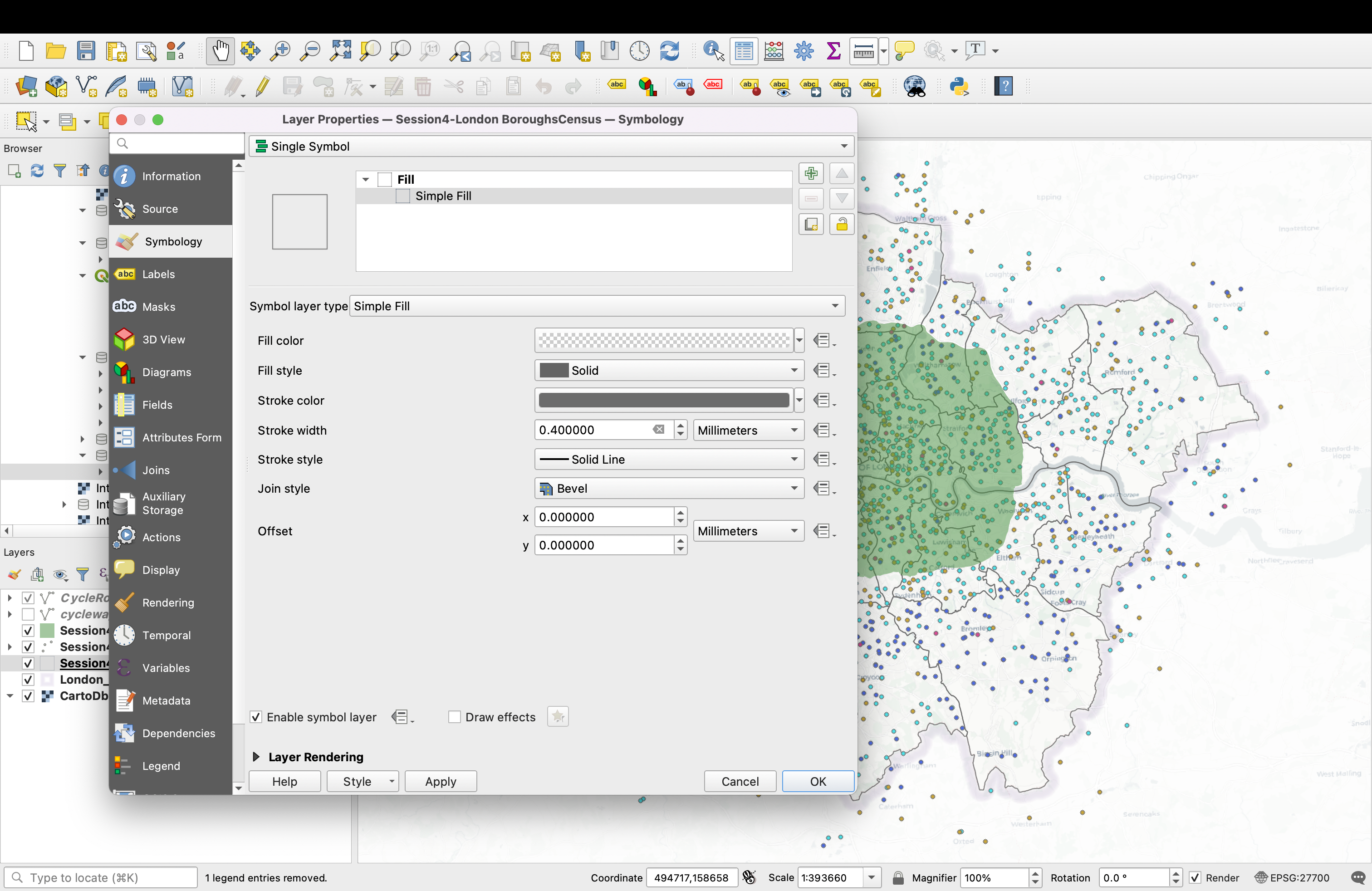
4.7.3. Context: Borough boundaries
Finally, let’s handle the LondonBoroughs layer. Because our point and line layers are already quite busy, we want to keep it quite minimal. We’ll keep it transparent and just use display the boundaries between boroughs. Double-click your layer, and in the Symbology tab select Single Symbol. Click Simple fill to access the below customisation options. Choose a transparent fill and a dark gray outline of 0.4mm width.
You’re almost there! Make sure your layers are in the right order.
V. Spatial bookmarks
A useful feature of QGIS is the Spatial bookmarks, which allow you to “bookmark” certain zoom areas. Right click your London Schools layer and select Zoom to layer. We’ll bookmark this view first.
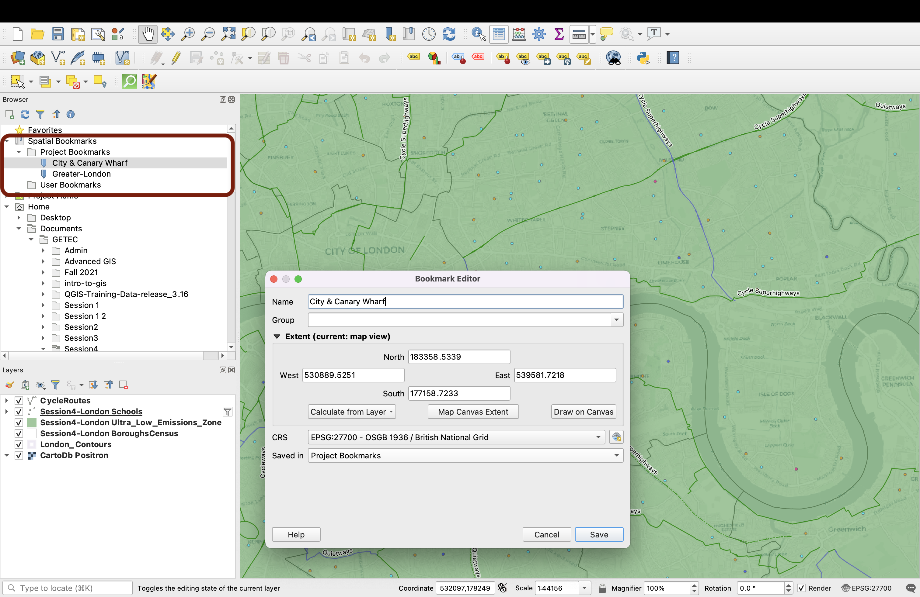
Select the menu View > New Spatial Bookmark…, (or press Ctrl+B / ⌘ + B ) to open the Bookmark Editor dialog. Give it the name Greater-London and save it in the Project bookmarks. By saving it here instead of in the User bookmarks, you save it in the project file itself and it will be available to otehr users if you share this file.
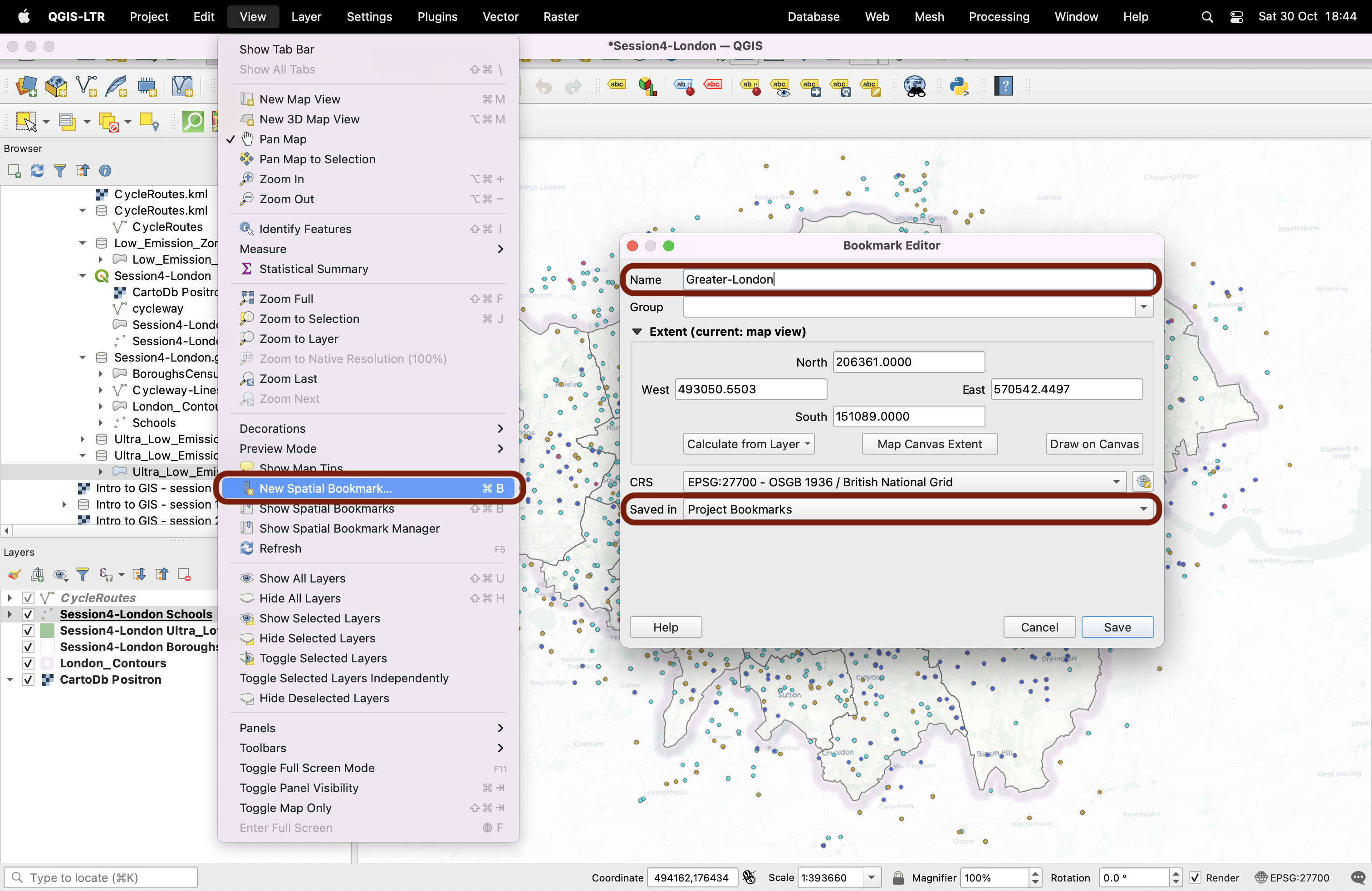
The Spatial Bookmarks can be found in your browser window. If you click on it, your map canvas will automatically “jump” back into this specific map extent and scale.
Now repeat the operation! Zoom onto a borough of your choice, to a scale at which your cycle routes are displayed, and save a new spatial bookmark in your Project bookmarks.
You can find more information on Spatial bookmarks in the Documentation
Well done! This is it for this tutorial - in tutorial 5 you will build a choropleth and ue the print layout composer to export your maps.