Session 1 - Introduction and Raster Analysis
23 Jan 2022Advanced GIS · Sciences Po Urban School
Lecturer: Raphaëlle Roffo
I. Session 1 Overview
Download the slides
- Course overview and objectives
- Raster data in GIS
II. Tutorial
Goals:
- Sourcing public satellite data
- Importing satellite imagery in QGIS
- Using Raster calculations to compute a vegetation index (the NDVI).
III. The NDVI
The Normalized Difference Vegetation Index (NDVI) is a widely used index that can be computed from remote sensing data, allowing researchers to monitor vegetation health and land use remotely. Put simply, every surface on the planet absorbs and reflects certain ranges from the electromagnetic spectrum. Plants appear green to the human eye because the wavelengths that correspond to the colour green are bouncing off the chlorophyll pigments while the colour red is absorbed. So we know that a healthy plant will absorb red light. When the satellites capture less colour red, it means a lot of greenery was present on the surface being observed.
We also know that during photosynthesis, plants develop more cell structures that happen to reflect near-infrared (NIR) waves. So when a plant is growing and healthy, it will also reflect more NIR.
The NDVI is simply a way of observing the relationship between the amount of red light and NIR waves captured by remote sensors such as satellites. It is calculated using this formula:
NDVI = (NIR-Red) / (NIR+Red)
Now, using QGIS, we are able to calculate this ratio at the level of each pixel, using the two bands that map to the colour Red and the near-infrared wavelengths.
IV. Sourcing the data
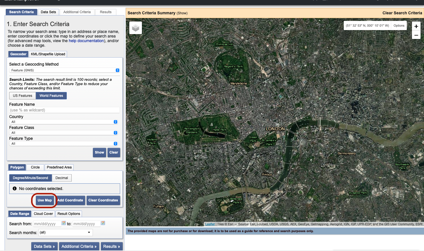
Visit https://ers.cr.usgs.gov/login and create a new account. Once you’ve successfully created an account and are logged in, go to the Earth Explorer page. This is one of many platforms from which you can download public satellite data, for free.
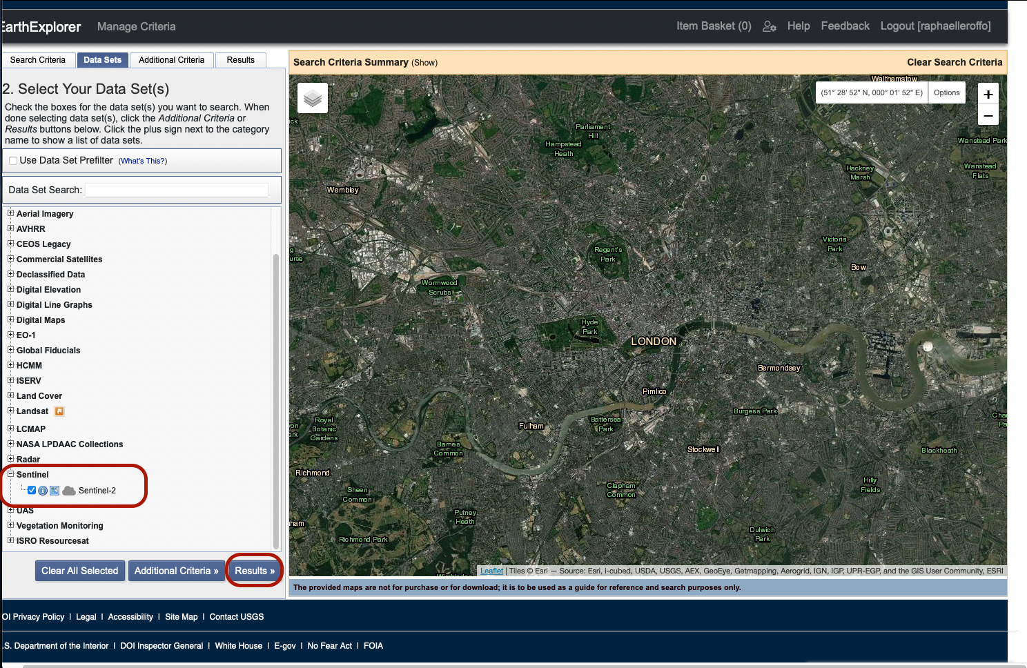
We are interested in London. By default, the map is centered on Siouxville in the US, but scroll out and navigate to the UK, then zoom onto London, roughly to this extent:
Click on Use map; when you zoom out, you’ll notice it has set four pins to determine a bounding box around your previous zoom level. This determines the zone in which you will be looking for data. Click Results
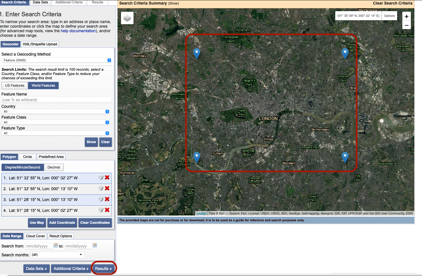
In the bottom set of parameters, select dates 01-01-2022 to 23-01-2022. You can actually retrieve Sentinel data all the way back to November 2015 when it was first launched.
In the next tab Cloud Cover, set the slider to only keep images with a 0-30% cloud cover range, and exclude images with range unknown.
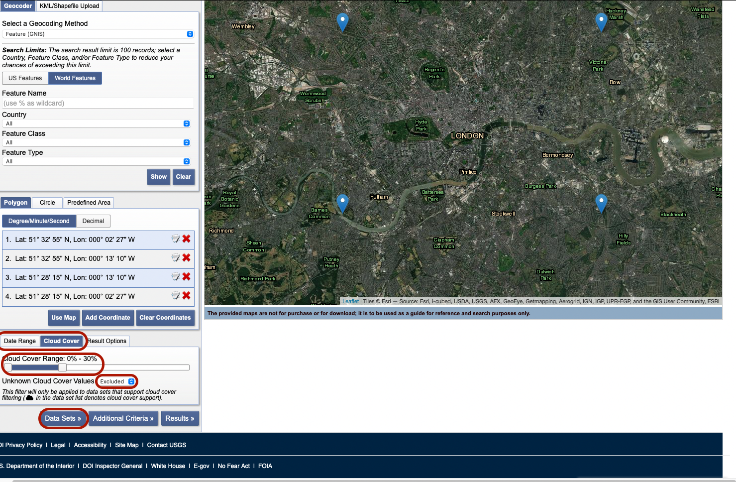
Next, press Data Sets. On the new panel, select Sentinel > Sentinel-2 data then press Results.
You can now see a series of tiles that partly or entirely cover our area of interest. By pressing the foot icon, you get an overview of the layer’s footprint. By pressing the second icon (the small image), you get a preview of the actual image, directly on your canvas. You can preview several images or footprints together. Sentinel-2 breaks down the surface of the Earth into square tiles that it revisits every 2 to 10 days depending on the latitude (closer to 2-3 days in Europe). Those tiles slightly overlap to avoid gaps in the image. Notice that the London area we selected actually falls on two tiles: tile L1C_T30UXC to the West and tile L1C_T30UYC to the East. Technically, tile L1C_T30UXC contains the entire study area, so we will stick to this single tile for this tutorial.
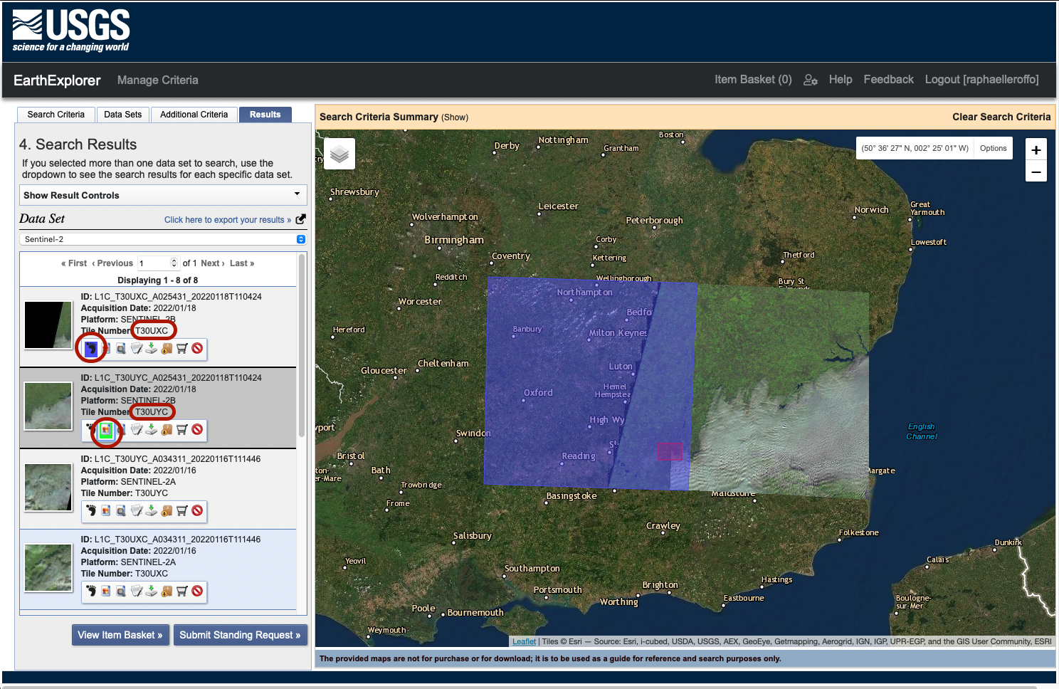
The pictures taken on 18/01/2022 are cloudy and hide the area we’re interested in. Instead, it seems that the pictures taken on 13/01/2022 are clear and cloud-free. These are the ones we are intereested in. Click the fifth icon to download those two pictures. Select JPEG format:
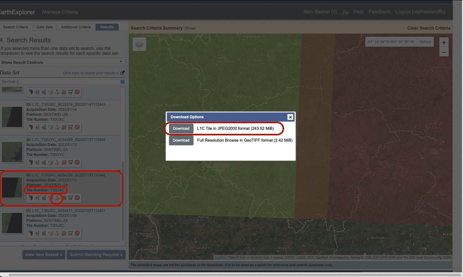
Note that the download is launched from a pop-up window. If nothing happens after you click Download, your browser might be blocking the pop-up and you should be able to allow the pop-up from your browser’s address bar. Save the downloaded folder to a Advanced-Session1 folder.
V. Processing the data in QGIS
1. Loading the data
Open QGIS and create a Favourites shortcut to your Advanced-Session 1 folder. Navigate in the folder you just downloaded: GRANULE > L1C_T30UXC_A034268_20220113T110448 > IMG_DATA. Select all the files preceded by a checker symbol (it represents raster bands) and drag them onto your canvas.
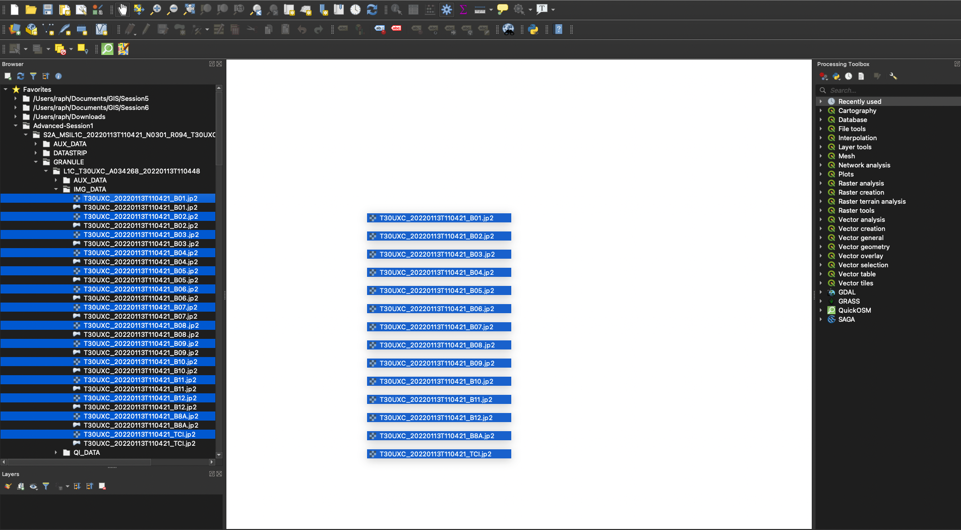
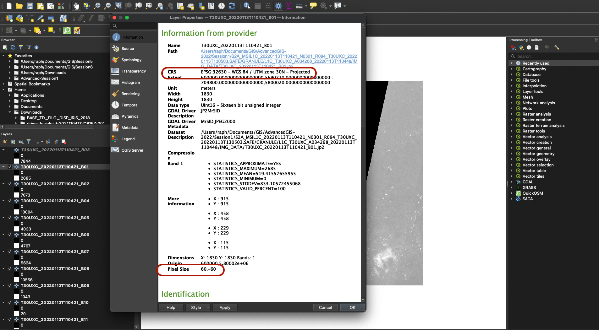
If you double-click (or right click > Properties) one of these bands from your Layers panel, and have a look at the layer information, you can see that the laeyrs have already been assigned a CRS (UTM zone 30 North) and that each band may have a different resolution. Band 1 has a 60x60m resolution, Band 3 and Band 2 have a 10x10m resolution, etc.
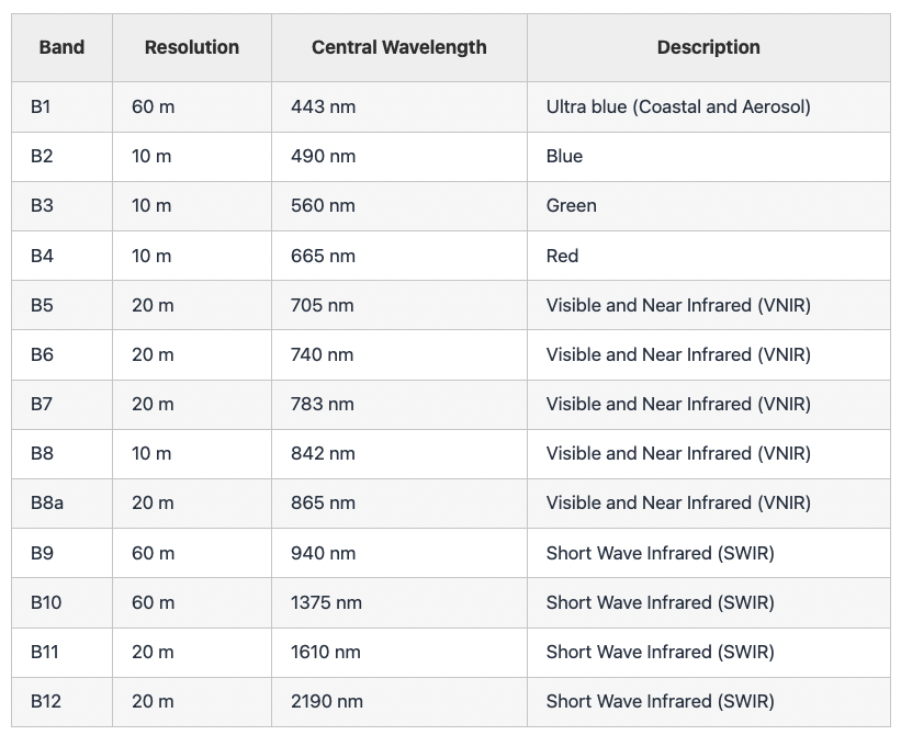
Each band represent one section of the electromagnetic spectrum (You can find more information on the ESA website)
2. Building a multi-band raster using a virtual layer
We are now going to combine each of these bands. In your Processing Toolbox panel, look for “Virtual raster”. Select Build virtual raster from the GDAL > Raster Miscelleanous toolbox.
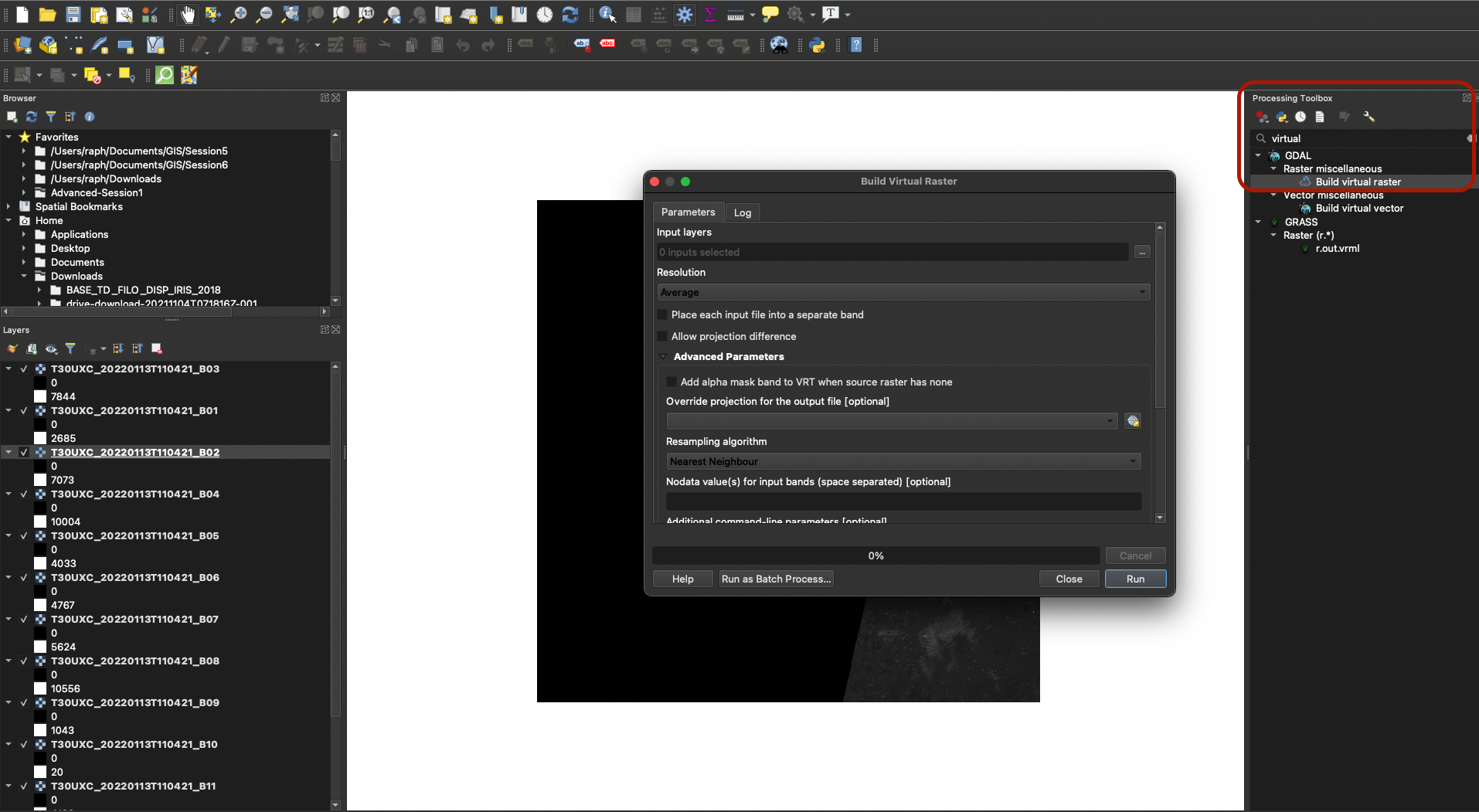
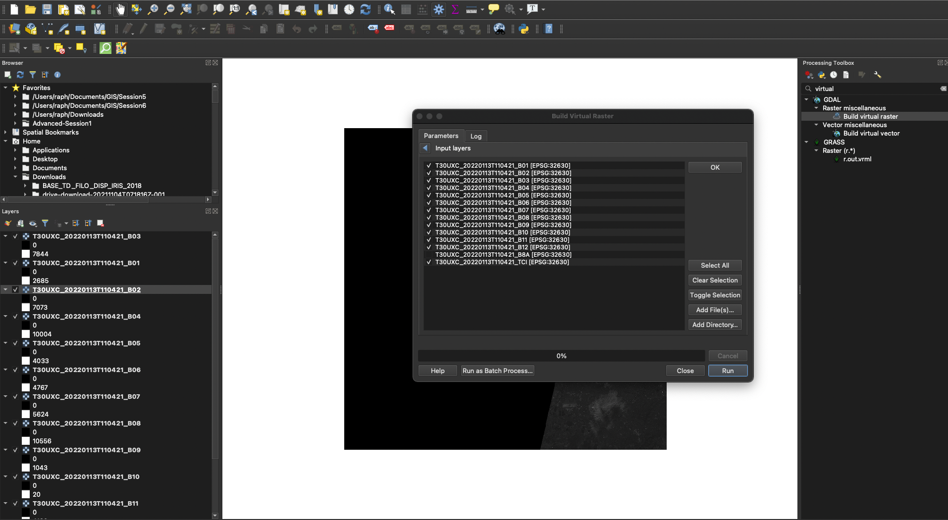
In the Input Layers, choose all the layers except B8A. Click OK.
In the Resolution parameter, choose Highest, and make sure to check the box Place each input file into a separate band. This is very important as it will allow us to perform the calculations needed to compute the NDVI.
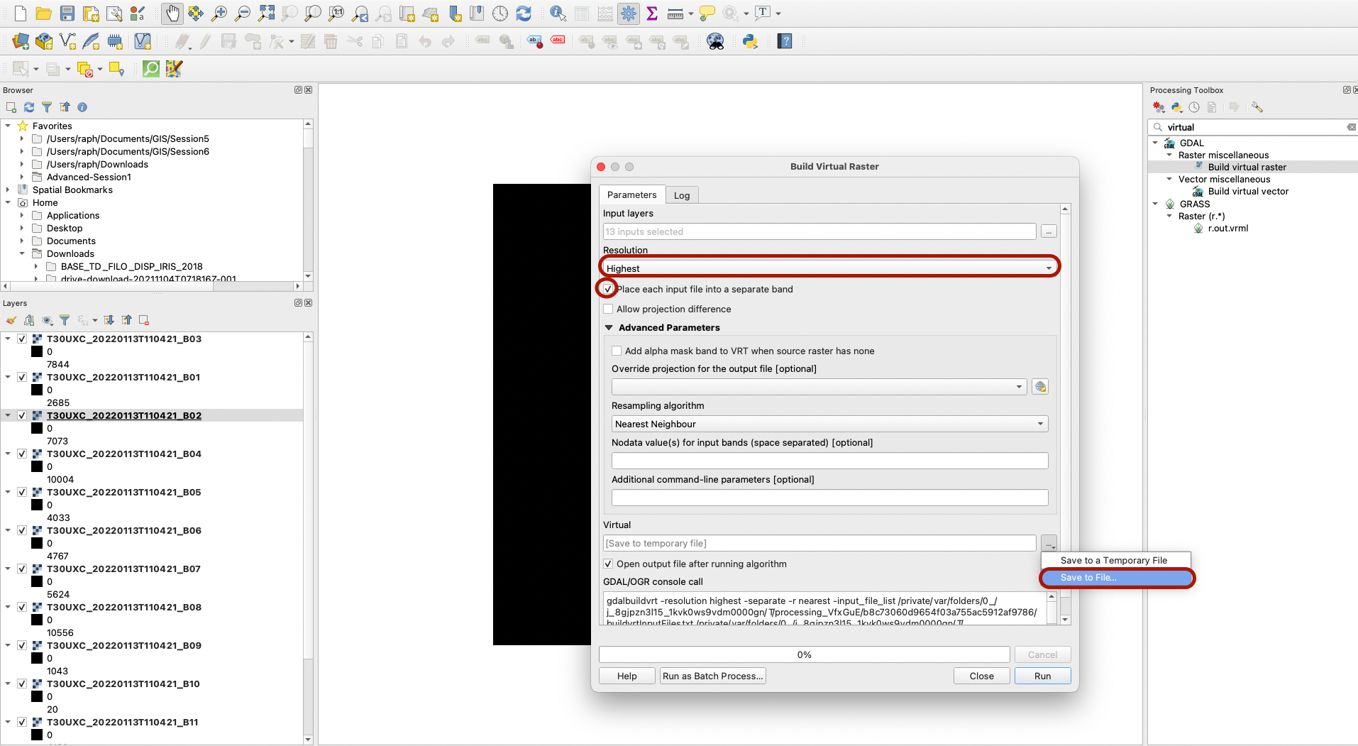
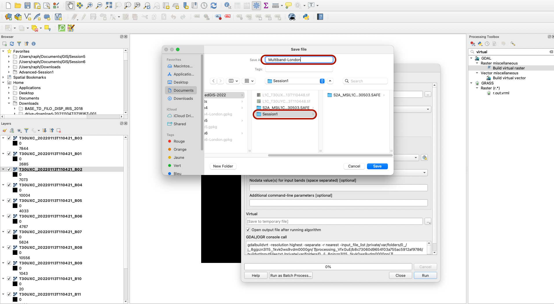
The rest of the parameters can be left to their default values, then make sure to save the output to a file in your Advanced-Session1 folder(don’t specify the extension, it will be done automatically).
Press Run. Once it’s run, close the window. You can remove all the other layers and only keep your multiband raster.

3. Exploring the raster bands
You can notice that a large chunk of the tile does not contain data (visualised in black). We do however have a combination of multiple raster bands, that match various different sections of the electromagnetic spectrum, avaialble in this single file. You can zoom in so that the West London area fills your canvas.
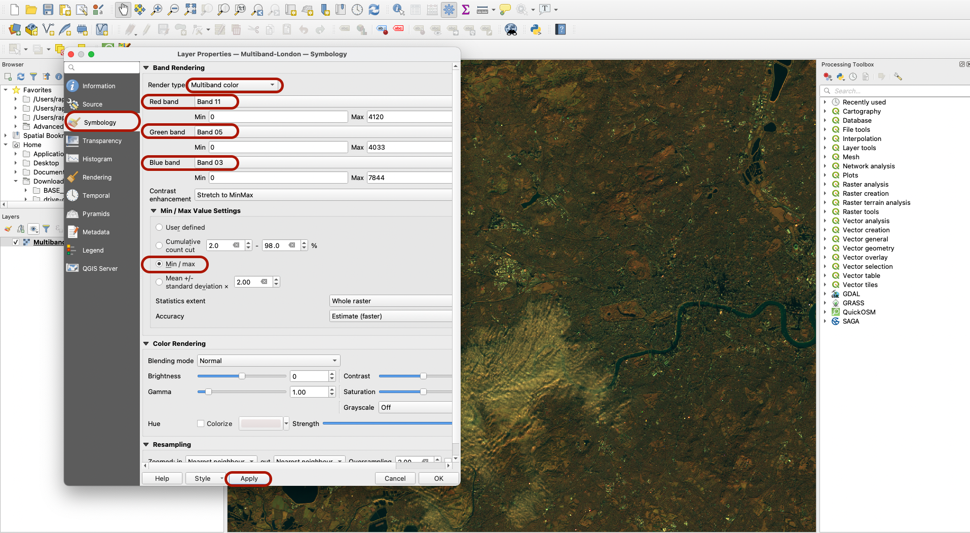
Double-click the layer and go to the Symbology tab. Choose the Rendering type Multiband color. Using this mode, you can represent the “intensity” of each section of the electromagnetic spectrum using a colour (Red, Green or Blue). You can combine three bands to see features emerge from the picture.
For instance, using Red = Band 11, Green = Band 5 and Blue = Band 3 and the Min/Max value settings you get this image:
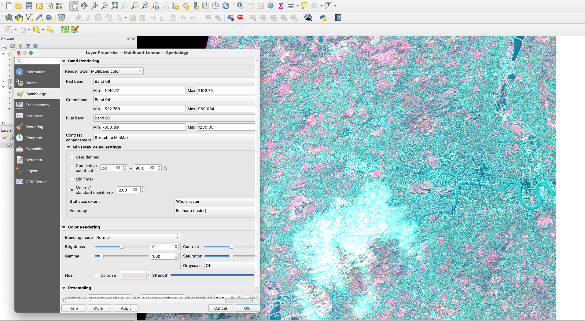
Using Red = Band 8, Green = Band 4 and Blue = Band 3 and mean +/- standard deviation as min/max values settings, the picture that emerges is quite different:
4. Calculating NDVI
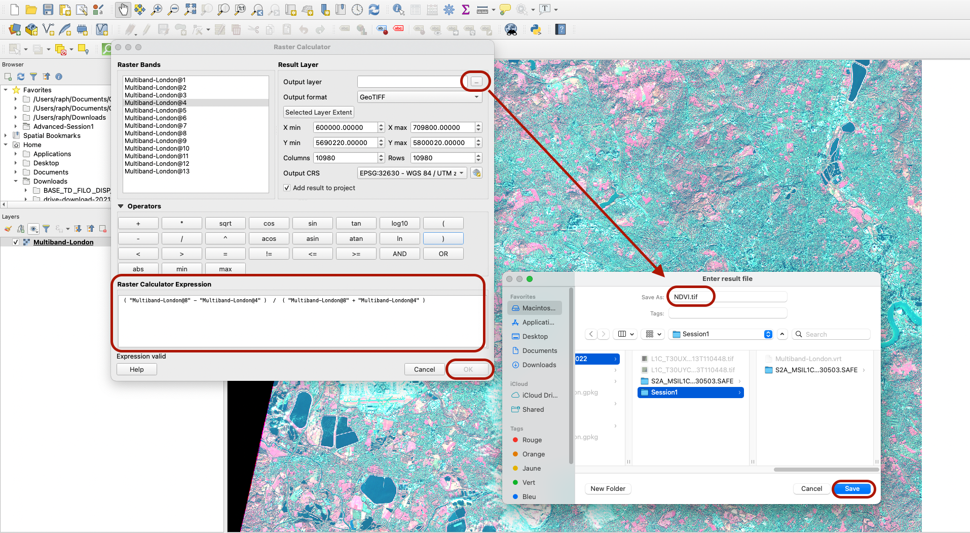
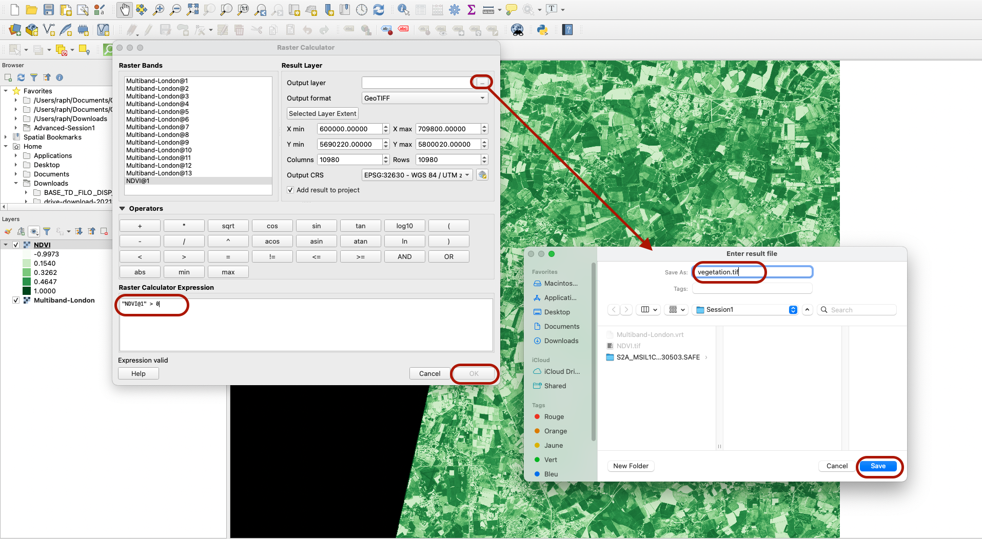
Now let’s actually build our NDVI index. In order to do so, we are going to perform operations between the different bands values, at the pixel level. On any given pixel, we will take the value of Band 8 which represent near-infrared (NIR), and the value of band 4 which represents the visible colour Red, and run the calculation NDVI = (NIR-Red) / (NIR+Red). To do so, we open the raster calculator (from your Processing toolbar or top menu Raster > Raster Calculator). You can double-click on raster bands and operators to build the expression: ` ( “Multiband-London@8” - “Multiband-London@4” ) / ( “Multiband-London@8” + “Multiband-London@4” ) . Specify where to save your layer (in your Advanced-Session1 folder), and name it NDVI.tif`. Press OK and let it run - it may take a few minutes depending on your computer.
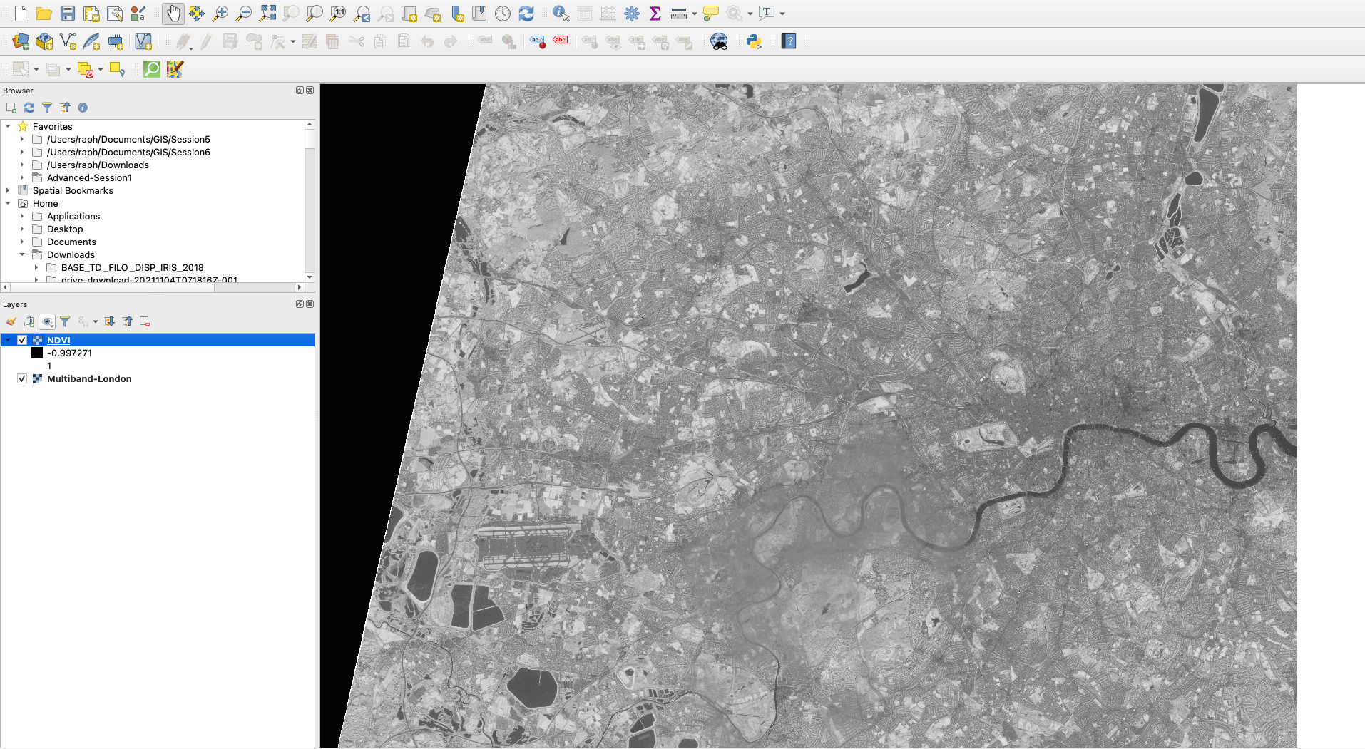
Your layer is now ready!
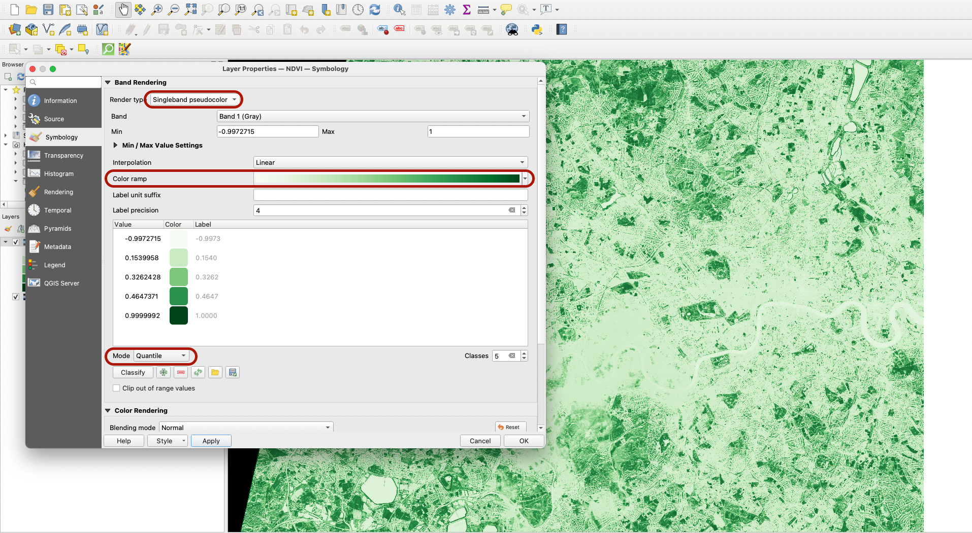
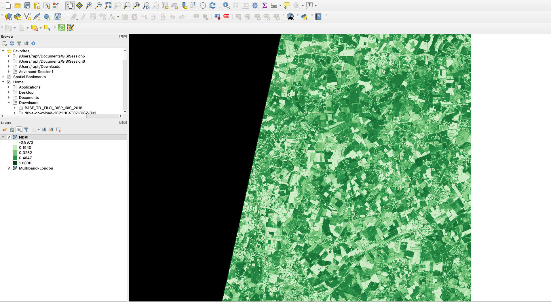
We can play with symbology, using single band pseudocolour and for example the Greens colour ramp. You can also use Quantiles as the classification mode to emphasize contrast in your picture.
If you move further north on your canvas towards more rural areas, you will see very clearly the green intensify.
5. Reclassifying the data
You may have noticed that the values range from -0.99 to 1. This makes sense given that the index is measuring the ratio of red light against near-infrared waves. Put simply, whenever the amount of red colour reflected decreases, we interpret it as a lot of red light being absorbed by chlorophyll. Whenever NDVI > 0 , we can classify the surface as vegetation.
To reclassify the data we have into two categories (landuse = maybe some or a lot of vegetation VS landuse = zero vegetation), we can use again the Raster Calculator. The formula we can use is simply: "NDVI@1" > 0. We can save that layer as vegetation.tif in our work folder.
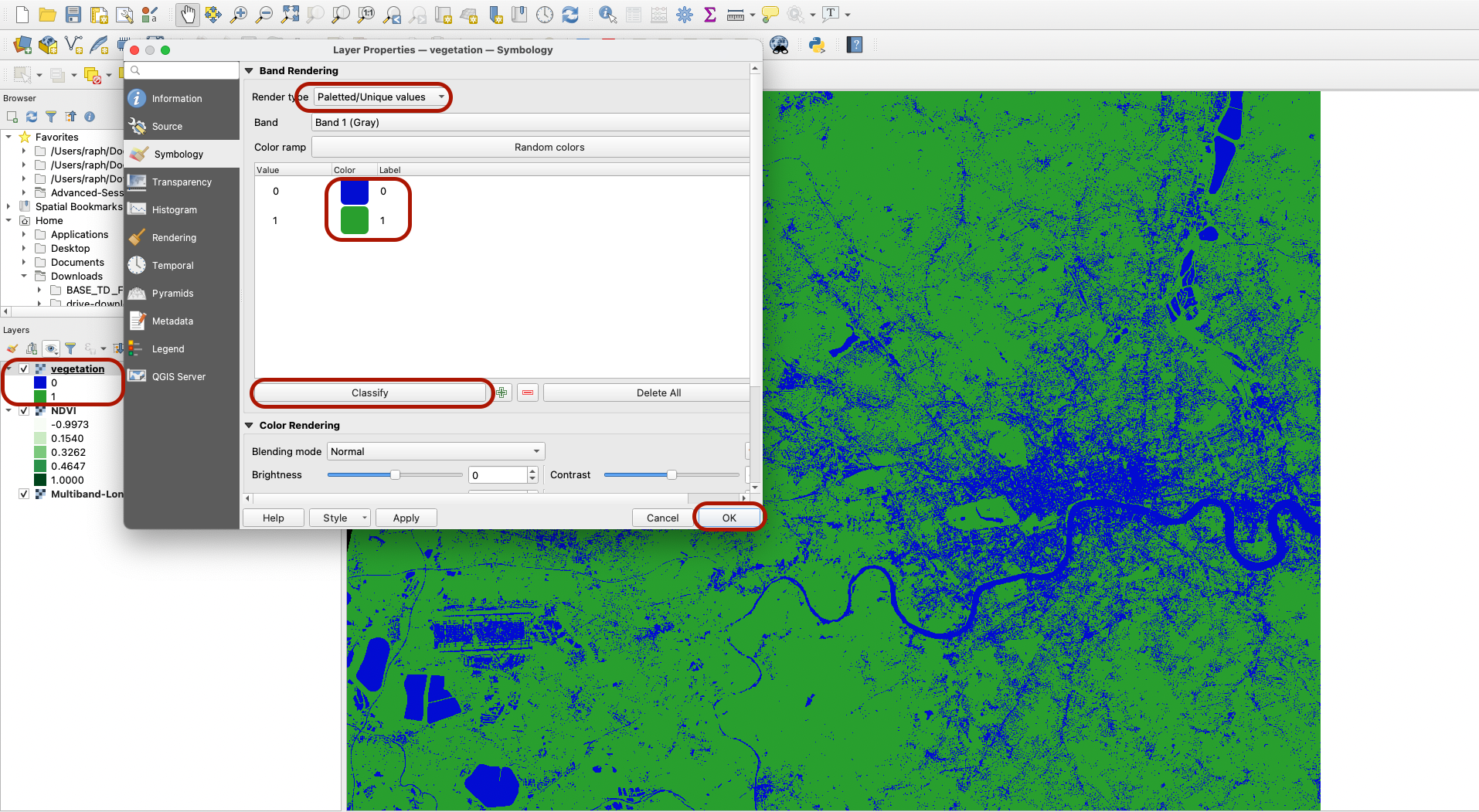
Next, have a look at the symbology of this Vegetation layer. Using the Paletted/Unique Values rendering style, you can hit classify and apply a dark blue colour to the value 0, and a green colour to the value 1. Press OK. While this is not as nuanced as the previous quantile classification, is allows us to clearly identify all the water bodies and heavily urbanized areas, that are definitely not vegetation.
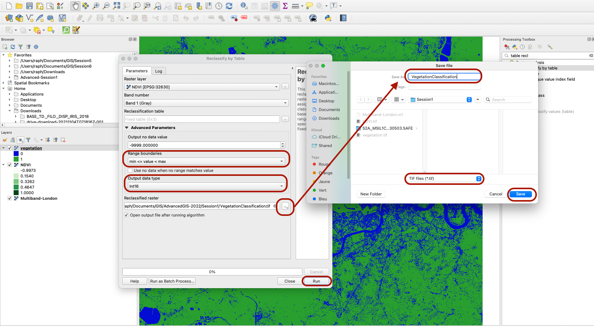
Now, we can actually produce a finer reclassification using a different tool. In your Processing Toolbox look for “Reclassify by table” under Raster analysis. Pick NDVI.tif as the Raster layer, then click on the three dots next to the Reclassification table parameter.
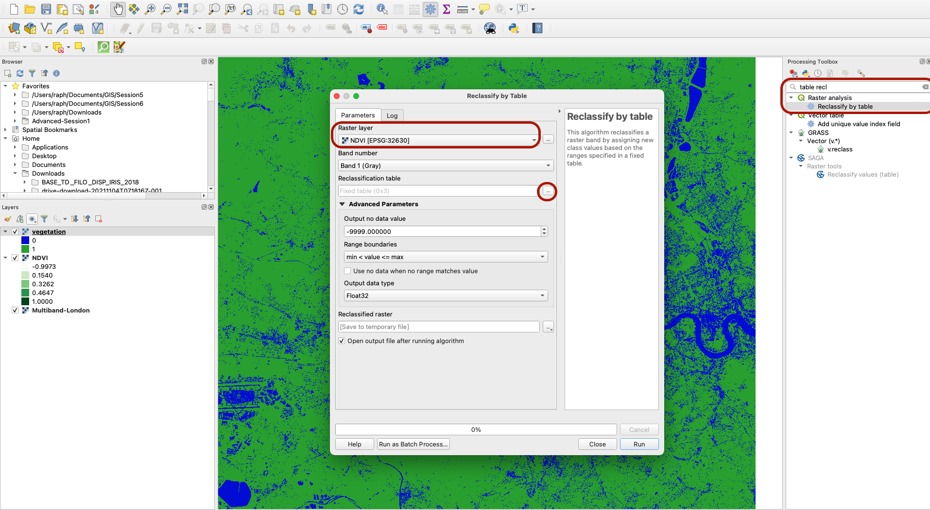
Click Add Row fuive times to add 5 rows. We are basically going to reclassify all the values in the NDVI layer. We can only use numbers when reclassifying but when this step is complete, we can translate those 5 categories into meaningful classes (0= no vegetation, 1= very little vegetation, etc). For now, when the value is negative, we assign it to the category 0, when it has a positive value but close to 0 (between 0 and 0.1) we assign it to the category 1, between 0.1 and 0.25 we assign it to the category 2, between 0.25 and 0.4 to the category 3 and finally for all values above 0.4 we assign it to the category 4.
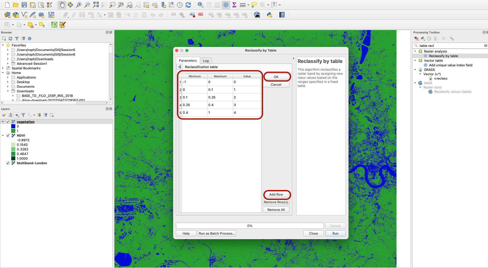
Press OK and go back to the other parameters. Make sure the range boundaries you are picking are such that our minimum values are included but maximum values are excluded. Choose Integer16 as the output type since our new 5 values are full, non decimal numbers. Save as “VegetationClassification” and choose TIF files format.
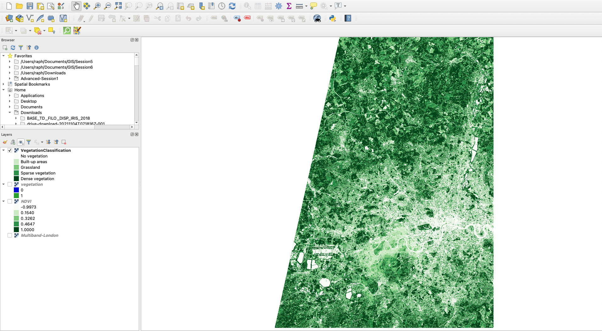
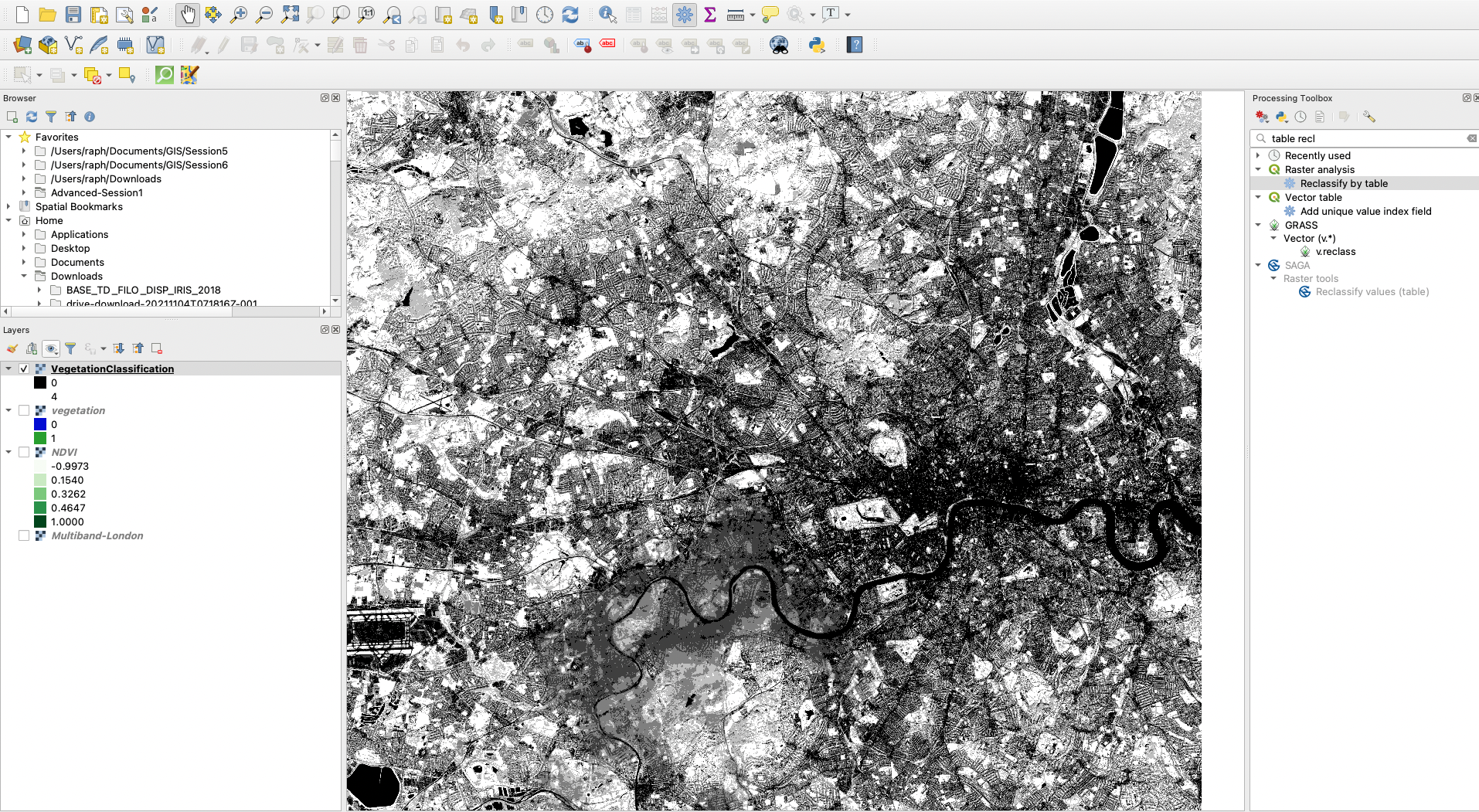
You now have a new, more finely classified layer to represent vegetation density!
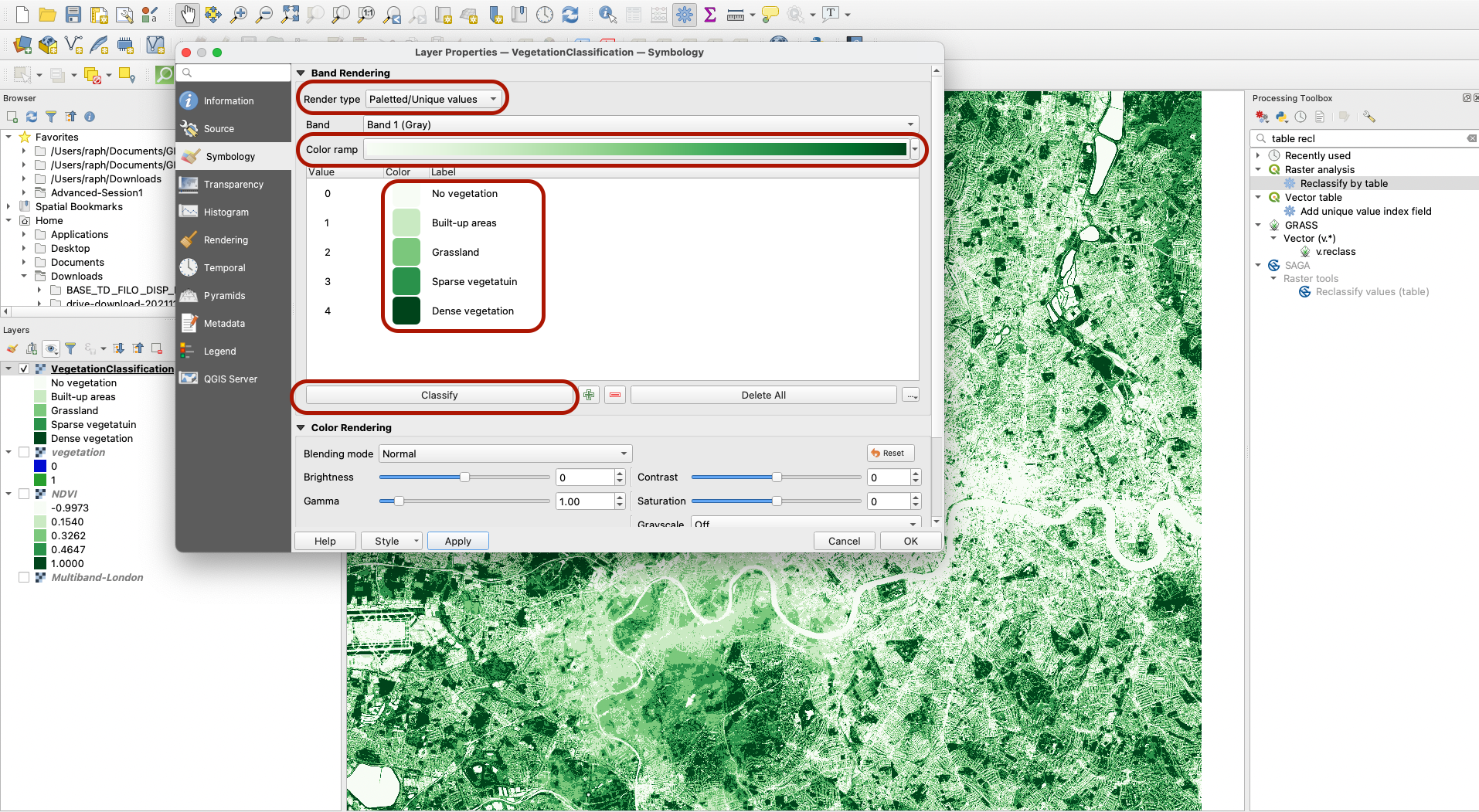
Let’s as a final step use the symbology tool again to use a green colour ramp and edit the legend. First, use the Paletted/Unique colours rendering style. Choose the green colour ramp then press Classify to bring up the values. Then you can double click on the legend values to edit them manually:
- 0 = No vegetation
- 1 = Built-up areas
- 2 = Grassland
- 3 = Sparse vegetation
- 4 = Dense vegetation
Well done, you have successfully calculated the vegetation index for West London based on January 2022 satellite imagery! You can save your project as a QGZ file, or practice exporting the map using print layouts.